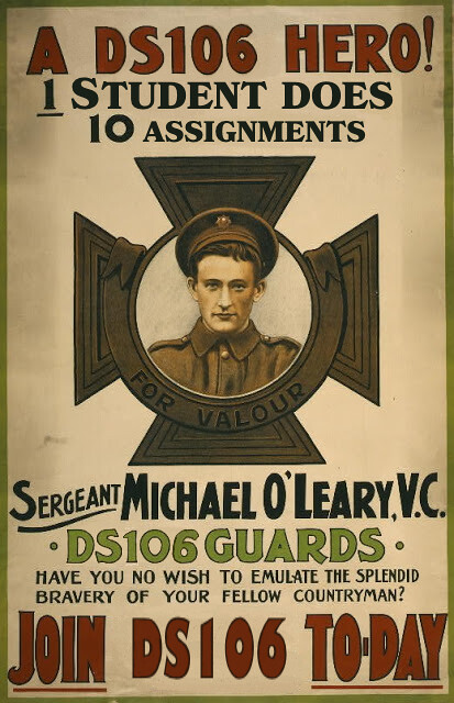
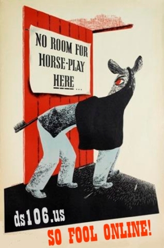
For my final design assignment, I made a propaganda poster for DS106! I have always loved the aesthetic of propaganda posters, mostly because regardless of the topic or intent, they are so heavy-handed in their rhetoric that they can often be unintentionally comical. I decided to also tie this into the course theme by having the message of the poster be about telling your own story in the way that only you can. Here was the result:

For this assignment, I worked in Adobe Animate once more. I chose an American color palette to immediately bring forth the cultural connotation of WWII propaganda, especially since my messaging was heavily influenced by 40s war-effort rhetoric. First, I sketched out a rough idea of the poster. Then I blocked out the colors, specifically choosing shades of red, white, and blue that felt faded or dusty to further evoke a retro feel. Next, I drew the figure, supposedly shouting this message through their megaphone. I tried to draw in a style that would feel like an illustration from the 40s or 50s. Finally, I added the text, spacing everything out so that it would feel balanced and so that the overall message would be easily understood.


