one word

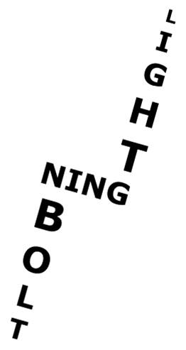
okay this assignment was way too easy. honestly it should have been worth one point. I don’t know maybe it would be harder for somebody who has no graphic design experience.

thief
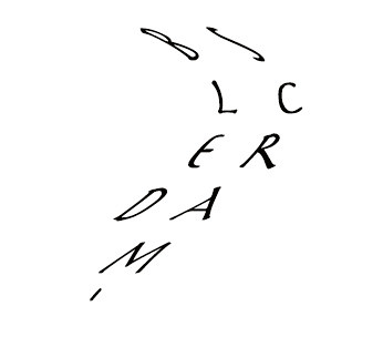
The assignment is to write one word and not use an color or effects or anything and let the font speak for the tone of the word. So here’s is the word “thief” in  italic courier new. I wanted it to be slight and swift, like Cleo Barrow. And courier new looks a bit old fashioned which fits for the time period. It doesn’t really match the time period they’re from, but it gives off an old time-y feel. Oh, and I just did it in photoshop, but I could have done it in paint really.

Mayfield

For one of my week five assignments, I chose to do the assignment, Word that was submitted by Rabia Aman.

The assignment is to, “Pick one word. Select one single typeface, and communicate your word. Do not use colors or any other graphical elements. The goal is to select a type face that represents the meaning of the word, and if needed manipulate the font using different sizes, bold, italics, counterform (spacing) etc to visualize the word.” The assignment is worth 2 points.

I picked this assignment because I thought it would be really cool to manipulate a word in a cool way. I wanted to do this assignment and dedicate it to the 6 stars we had to do for our character dossier this week.

When I was thinking of words to do, I was thinking of a lot, but I narrowed it down to one word: Mayfield. I picked Mayfield because not only is Shirley’s last name Mayfield, but it is also the name of their family’s department store. I think that it has a lot of meaning for my character.

I used Microsoft Word to create my word. I used WordArt. I created each letter individually and then rotated them the way that I wanted them.

Screen Shot 2015-02-15 at 7.52.45 PM

I really enjoyed doing this assignment! Manipulating the letters was really fun!

A Strong Word – Design Assignment 1

ds106 Design Assignment for Word PowerFul

I picked this word because to me it represents strength in what you do. You may talk about a speaker, but once you put the word powerful in front of it, you are stating this person is an expert in what they do and this makes them stand out as powerful.  Whatever you are strong in, you are powerful.

I  used the word document and decided to take the 3 letters you hear when you break it up into a syllable and left the rest of the letters in a smaller font and the entire word and style is in adobe Gothic.  The word powerful alone is strong just by the beginning letters of the three syllables.

Style for Word Assignment

Smiling

smilingimage

made this with word and screen shot it to put it into an image format.


I thought it was cool :)


I am happy because I get to spend time with family and Amanda this weekend. Thanks merica

DS106 Design Assignment #2

For my second design assignment, I decided to play around with how the meaning of a word can be reflected in how it is written. Here is what I came up with:

class

I think that I am not alone in saying that when I see newspaper letters cut out and taped together to create a word or message, I think trouble. This is a classic ransom notice technique. It is a way to send a message, often a vague one, and remain anonymous and mysterious. I thought that the word deception is exemplified by using this technique.

To start off I opened Word and went through the different fonts. I came across “Earwig Factory”, which I’m pretty sure comes standard with Microsoft Word: class

Then, after typing out the word, I played around with the size of each letter. Some I made bold or italicized, while others I left in the original font. I had to fight the urge to find another font to use or add color to some of the letters; I thought this would add to the effect yet the assignment specifies that there was to be no color and only one font. I hope everyone likes it!

In a Flash

For my second Design Assignment of the week, I decided to tackle Word. I love using color and images as symbols, so I knew this would be a challenge for me. I tried creating something around the word “Sunshine” in the spring time theme of my blog, but discovered very quickly why most of the previous examples of this assignment were created around longer words. Longer words, or phrases, make for a larger canvas, as you have more letters to work with. I finally decided on “Lightning Bolt” keeping in the weather motif.

Image


After I decided on my word, I did a quick Google search for Lightning Bolt for some shape inspiration. I then used PowerPoint for my design. I created three shapes without any borders or fill color and typed “light” in one of the shapes, “ning” in the second shape, and “bolt” in the third. I wanted to use a sans serif font with a wider look and settled on Verdana When looking at examples of a lightning bolt, I noticed that the two ends of the bolt taper off, so I created this effect by re-sizing each of the letters to gradually grow larger and smaller at each end. Because these were shapes, I was able to adjust the angle of the images to fit into on another and create the final shape. Once I achieved the look I was going for by moving the pieces around one another, I grouped the shapes and saved as a JPEG to embed in this blog.

While it made for a great subject of this assignment, I hope we don’t see any of these any time soon!

Word Assignment- 2 Stars

Screen shot 2013-02-24 at 10.26.31 PM


For this assignment, I had to think pretty long and hard about which word I wanted to use. Then, I was cleaning out some stuff, and found my old Lucky Brand hoop earrings, which are in a peace sign. At this point, I just finished my design safari, and was thinking about design elements (in particular metaphors and symbols) so I thought, “Oh, hey, I can use the word ‘Peace!’” So, I used Polyvore, one of my favourite collage sites to rearrange the letters into a peace sign. I think it’s cool how our mind can take certain symbols and associate it with a single word, phrase, or meaning.

All Shook Up! Uhuuhuhhhhh, OOOO, Yeahhhhh! Word- 2 Stars

Word Assignment

I found the assignment at this link here: http://assignments.ds106.us/assignments/word/

Thanks Rabia Aman for a cool, simplistic assignment! I love playing around with words, and fonts. Simple things such as typefaces can say so much about something. This is what this assignment captures so beautifully, without the need for flashy pictures, or colors, animations, and so on. I probably could have done this in Pages, but I decided to complete it in Photoshop. I wanted to make a word that was all mixed up, kinda like Crabdlsem eggs, ;o. I found a pretty cool font using the Type tool on the left Toolbox. I made the text all warped by clicking on one of the settings up top. The layout here was simple. Plain, white background for the array of letters to be placed on, nothing flashy. Anyways, I think this suits the word I chose pretty nicely, and I hope you all enjoy! As always, love the comments, so please! Comment. Because otherwise…

Word

http://www.flickr.com/photos/ericgreenlaw/8065564264/in/photostream

I had thought about doing disorganized, then I thought about doing silly, and a few others like lazy, red (in red font), and long (lllllooooonnnnnggggg), but I liked the idea of backwards.  I just thought it was a cool idea, although not super duper original because everyone does backwards words, but I thought it was a perfect idea for this assignment.