The word assignment was to create a word, and only use the word to describe what it was. This assignment was worth 2 stars, and I decided to use the word backwards by writing it backwards. I thought this was a nifty idea, and kind of ironic.
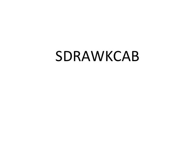


The word assignment was to create a word, and only use the word to describe what it was. This assignment was worth 2 stars, and I decided to use the word backwards by writing it backwards. I thought this was a nifty idea, and kind of ironic.
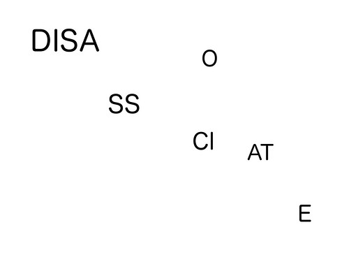
I found this design assignment to be rather cool. I chose the design assignment called Word, worth 2 stars. The object of the design assignment was to just use font and the word it self to express the meaning of the word. I chose to use the word disassociate, which comes up a lot in my classes. Disassociate, in simplistic terms, means to break apart. To display the word through typography, I opened up gimp and I used multiple text boxes. I first placed the first three letters into a text box and then throughout the image I placed 1 or 2 letters of the rest of the word all around. By dispersing the letters of the word into different regions of the image it helped to show the meaning of the word disassociate, to break apart.
Once the image was saved and uploaded onto flickr I placed the tags: DesignAssignments422, DesignAssignments, ds106, and disassociate, onto the image to help organize where it will be displayed on the internet.
adj. Lacking enthusiasm and determination; lacking life, spirit, or zest; carelessly lazy; languid.

From the WORD assignment: Pick one word. Select one single typeface, and communicate your word. Do not use colors or any other graphical elements. The goal is to select a type face that represents the meaning of the word, and if needed manipulate the font using different sizes, bold, italics, counterform (spacing) etc to visualize the word. (2 stars)
I used dafont to find A La Nage and Adobe Photoshop Creative Suite 6 to manipulate my letters. I have loved this word since the sixth grade where I “created” the lackadaisy for my foreign land. This word has been kind of lazily interspersed in my daily vocabulary, but it exists. This is the short story of the lackadaisical word who can’t even spell himself but at least he completed his own word.

So the assignment was to select a type face that represents the word you are typing. I thought this was pretty easy. There are many “fancy” swirly, cursive writing fonts on Microsoft Word. So I just picked the one I liked, copy and pasted it to Paint so I could crop it and then uploaded it onto Flickr.

For my second assignment I chose to do a design assignment called “Word” and directions for this assignment was to not using any colors try to represent the meaning of the word through manipulating the word itself.
I chose upside down because I first thought about making the word look upside down but decided that it wasn’t creative enough so i decided to have each word turn toward becoming upside down.
I opened up photoshop and first time each letter to spell Upsidedown. Then putting them in a row I rotated using ctrl+t on each letter to make it seem like the word is slowing rotating 180 degrees.
I think the picture explains the word well and this assignment was a blast and learn some new skills for photoshop


![]()
For my second assignment I chose to do a design assignment called “Word” and directions for this assignment was to not using any colors try to represent the meaning of the word through manipulating the word itself.
I chose upside down because I first thought about making the word look upside down but decided that it wasn’t creative enough so i decided to have each word turn toward becoming upside down.
I opened up photoshop and first time each letter to spell Upsidedown. Then putting them in a row I rotated using ctrl+t on each letter to make it seem like the word is slowing rotating 180 degrees.
I think the picture explains the word well and this assignment was a blast and learn some new skills for photoshop
![]()

The Assignment:
Pick one word. Select one single typeface, and communicate your word. Do not use colors or any other graphical elements. The goal is to select a type face that represents the meaning of the word, and if needed manipulate the font using different sizes, bold, italics, counterform (spacing) etc to visualize the word.
The Process/Story: I got the idea for doing this assignment after seeing Yue and Paul‘s takes on it. I chose the word car because it was simple, and thought it would probably be easy to make a car picture out of the text.
All I did for this was open Photoshop, created a new image, and used the text tool to type the word CAR. The font I used is called “Hobo”. I didn’t really pick it for any particular reason, it just happened to be the font I used the last time I opened Photoshop.
After that, i just free-selected the letters, rotated them around in different directions, then positioned them so they were right next to each other.
I like how it turned out because it reminds me of the car in The Jetsons:

And I guess you can call this Wordshopping, since I worked with words instead of photos in Photoshop. ![]()


![]()
 After seeing Yue’s creative “Fish” entry for the DS106 Word assignment, I decided I wanted to give it a try too.
 At first I wanted to ‘Tangerine’ with the ‘T’ as a stem and the rest of the word circling it, but sadly it looked too much like a melon. I then tried ‘Temple’ and made something that was ‘ok’ but was really much more of a small Christian church inspired design that I didn’t think represented the word temple well.
Finally, I came up with the idea to do the word ‘Bible’. I’m an avowed atheist, but I thought it’d be a fun word to do because the two B’s could act as pages. That’s ultimately what I did in GIMP. To make it seem more like an open book I used the perspective tool to make the B go upward and then copied it, pasted it, and flipped it to make the other half. the remain letters, ile, didn’t inspire me much so I just put them in the center. The font I chose was “Modern No. 20″ which was primarily for the letter B, loved the font.
When I first started on this assignment I actually thought I could do a more interesting design. I was a bit surprised at how long it took and how many ideas I went through before I came to something that was decent.
Also, I did myself too ![]()

The assignment requires us to pick one word, select one single typeface,
and communicate with this word.But, it is not allowed to use colors or any other graphical elements.
The goal of this assignment is to select a type face that represents the meaning of the word,
and if needed manipulate the font using different sizes, bold, italics, counterform etc to visualize
the word.
I am inspired by the sample photo, ‘Magic‘. I think the idea is so bulliriant.
I tried to think so many words to make up great ideas.
First, I thought about ‘Shadow’ and ‘Smile’.
For example, make the word ‘Smile’ looks like smile mouth.
Finally, I got idea from the Christian Fish.
About B.S. 4 century, fish was the symbol of Cristian.
After Roman kingdom decided Cristian as country religion.
Then, the cross symbol replaced the fish one.
Im not Cristian, I wish the story is correct.
To create this photo, I simplely add a text on a new layer.
By the way, on the photoshop, there is a function,
which adjust a text into the different shapes, such as a fan, and fish.


![]()


