This is Good Advise!

Inventing a Public Service Advertisement (PSA) for Design Assignment 817 that may fit with my long story and our good friend Bob’s theme of Joy in all that we do, well, seemed to be to get out of the house and go hang with your peeps! Imagine that what you see below is a HUGE billboard somewhere off of Hwy 1/Emancipation Hwy/Richmond Hwy/Cambridge Street. It’s supposed to be a PSA billboard about something that really aggravates me about people, society, the world, etc. So I’m aggravated about being cooped up for so long because of COVID. So many cancelled trips and visits with close family and friends. It’s slowly changing and I am joyfully optimistic that we are coming out of our collective cocoons. It’s time to start planning and visualizing all the get-togethers you see in the pictures below, so go to the website (virginia.org) and let’s get out there!

I used Canva to create the billboard and their presentation template because it approximated a billboard’s scale (it actually had the 16:9 aspect ratio that you find in many monitors at home). The images came from pexel.com and I did a search for “getting together” to find the photos, trying to be as diverse as possible in ethnicity, gender, age, urban and rural. I was also looking for background colors in both warm and cool tones to maintain visual weight and balance in the images. I used “Permanent Marker” font for the header and subheader because of it’s more casual look, then used “Archivo Black” font for the call to action of “Go to virginia.org” so people could quickly, distinctively see it. The art is all simple, light on text and easily read as a person would drive by. The words “Been Cooped Up?” is hopefully catchy as a person drives by and would be remembered, like the “Got Milk?” slogan years ago. It was suggested in the instructions that I frame the billboard by superimposing a photo of an existing billboard on it, but that became a bridge too far when I couldn’t find any art that was workable. I did pick a background texture that looked like billboard paper.

Get out There and Enjoy by Jenny Holbert

PSA Billboard

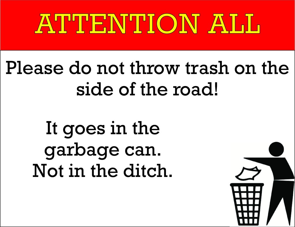
For this assignment I was tasked with creating a billboard addressing something that aggravates me about people, society or the world. I thought this would be a great excuse to let people know that just throwing trash out the window of your car isn’t cool and they should wait to find a trash can.

Annoying

For my other Design assignment I did PSA Billboard. This assignment was to create a public service announcement billboard on something that really aggravates you about people, society, the world, etc. Rated 4.5 Stars

One of my pet peeves is Blowing up bubble gum. I just find it somewhat annoying to hear that noise especially if it is done numerous times. So for my billboard I decided to talk about how NOT to blow up gum. I went to google images to find a picture of any empty billboard. I then imported that into Gimp and used the text tool to write my message and edit the font and size. I then looked for a picture that would be a person blowing up gum. I sued the scale and move tool to position and size the picture. This was my first time creating a billboard so it was interesting to come up with ideas.

PSA: We are all Animals

? A wild ride, over hallway ground
Such a lust for school, the circus comes to town
We are the hungry ones, on a lightning raid
Just like a river runs, like a fire needs flame, oh
I burn for you to get out of the way ?

Def ‘Melody’ Leppard

Animals! For this assignment, I created a PSA Billboard to address one of my pet peeves (which I believe I mentioned in a previous post). The task for this assignment was:

“Using Gimp or a similar program, create a public service announcement billboard on something that really aggravates you about people, society, the world, etc. It can be serious, goofy, but not offensive. Use a 680 x 300 work space in order to mimic the space of a billboard and have fun with how your positioning, font, colors, and images can help get your message across in a small space. Take it to the next level but superimposing it on a photo of an existing billboard!”

I had fun conceptualizing one of my biggest pet peeves: when groups of people block the hallway or walkway! Admittedly, this was a bigger issue at GMU. I swear it was like everyday that students would take up the entire width of a hallway with no regard for other students just trying to get to class. At UMW, crowding is more of an issue under the walkway near the nest. If it’s a hallway, UMW students are more likely to bowl you over in their rush to get to class in the too-brief 10 minute time span in-between classes than they are to crowd the space.

So how could I represent this annoying occurrence? I knew that I wanted a school hallway, but crowds of people didn’t feel attention grabbing. One way of thinking about design is to exaggerate an element, and/or use a play on words. If you like making puns, design could be for you! The punnier, the better. So what’s the exaggeration of crowds? Ah, what if I had a huge elephant blocking the hallway? But then how do I connect that to crowds of people? Well, a pack of animals is like a crowd!

Once I had my idea, I started playing with taglines while I superimposed animals onto a school hallway (This can be done a multitude of ways: you can select the background and delete it, or just use the eraser tool if the contrast isn’t high enough to accurately select areas). Additionally, I wanted to include an image of a ‘stuck’ person trying to get past the animals, and for this I used an image by Ivo Mayr, who has a whole photo series of people stuck to buildings. I even toyed with the tagline of “Feeling Stuck?” but decided against it because that message would have been aimed at the person trying to get through, not at the people who block hallways.

I decided on “Crowds Belong at the Zoo,” and “Keep it moving.” The hardest part of design is usually playing with type, and this was certainly the case with my phrase. It’s difficult to keep text readable when you are placing it over top an image. To make the text readable, I first turned the image into bold colors and simple shapes by using the cutout filter on the hallway, and the dry brush filter on the animals/person. I then set the type to be around the 100-200 pt range, and moved them around to create a nice flow. I decided to put “at the” vertically next to “zoo,” because the text has to live in the dark green space to be readable, and also because I wanted to keep the reader’s eye at a certain height, which limited me to 3 lines of text instead of 4. If you look, there is a little stair case of eye flow: text to animals to text.

For the text itself, I needed a simple font because the background is quite busy! If you have a simple background, that’s when you can embellish fonts. I chose ITC Avant Garde Gothic Pro and set it to a pink color to contrast with the green. I played with the levels of the hallway to make it darker, and used the stamp tool to make the whole top left corner dark. Lastly, I added arrows to increase eye flow and to emphasize my taglines.

Final result:

Superimposed onto a billboard:

Et voilà! My pet peeve in billboard form! It’s a little too busy to be practical in the billboard world, but I think that it gets the message across. Keep it moving, peeps!

Keep Your Music to Yourself

Using Gimp or a similar program, create a public service announcement billboard on something that really aggravates you about people, society, the world, etc. It can be serious, goofy, but not offensive. Use a 680 x 300 work space in order to mimic the space of a billboard and have fun with how your positioning, font, colors, and images can help get your message across in a small space. Take it to the next level but superimposing it on a photo of an existing billboard!

Assignment Bank- Design Assignments

I decided to make my billboard very simple. Its gets the message across, nonetheless. I thought it would be funny to bring attention to drivers who blast their music.

The topic of the billboard was between waiting until a lane ends to get over and playing loud music. I am not completely sure why I chose playing loud music, but my message makes for a fun billboard. Whenever I drive, I appreciate seeing funny or witty billboards, so I thought it would be cool to make it kind of funny.

It was hard to figure out the right sizing of text for this size. At first, I made the listen too large, so there was not enough room for the other text and image to fit nicely. I was kind of hesitant to put the signature in cursive, but I thought it might add some humor like the billboard is a letter. The cursive is not too difficult to read, too, and I think it ties the design together.

I also had a hard time deciding how the text should be flushed. I originally had “Listen…” on the left, the body of the text in the middle, and “Sincerely” towards the bottom right. I wanted to add a picture, but it did not fit very well in this format so I moved things around until I got the final product.

I’m really happy with how this billboard turned out, and I can’t wait to design some more this week!

Rocket and Sportsmanship

Have you ever seen a billboard promoting either a product, film or even a public service announcement and thought to yourself, “I can do better than that”. Well that’s exactly what I thought as I was able to create my very own billboard thanks to the awesome website PassItOn. The site allowed me to use a template and create my very own public service announcement. For this activity I wanted to once incorporate my created character, Rocket Richard. To do this a began brainstorming ideas of how I could create a public service announcement around the character. I thought of the traits and values Rocket exemplifies and settled in on sportsmanship, as this also pertains to hockey. The billboard features Rocket displaying sportsmanship qualities with fellow NHL players as well as large text that shows the boards overall meaning. The activity was fun and the process of creating it was fairly easy, minus the brainstorming. Overall I like the template I used and I am happy with the way mine turned out, as I could see something similar in real life.

Sorry Chikfila

When traveling through the South, especially when traveling to Richmond, VA, I always see billboards for Chikfila. There is usually a cow painted on the billboard which is instructing the public to eat more chicken.

For this assignment, I created my own billboard and advertised a chicken telling the public to eat more beef. I created this assignment by looking for a blank billboard image and a chicken cartoon image on Google. I then put the images and text together on Paint.

Keep Our World Wet

If not Global Warming, Then What?

Continuing along my steam-train of thought with the question of the week, I decided to consider the environmental issues that would be associated with a developing world that ran on steam.  Even in the real world, power-plants rely on steam generation to create electricity: nuclear, coal-fired, and gas-fired plants boil water to create pressurized steam that spins turbine generators.  Without the internal combustion engine, cars and other motorized vehicles use steam or electricity for propulsion in this alternate world.  Since non-renewable resources must be used regardless, the amount of water being vaporized in the millions of steam-motors all over the world must be the object of criticism.  One can only imagine how much steam would be required to drive the many vehicles in the United States, let-alone all the vehicles in the world.  The PSA Billboard assignment for four-and-a-half stars proved to be an excellent outlet for this fictional environmental concern.

Go Green, Ditch the Steam

Today was no different than any other in Detroit. A heavy haze glowed red with the rising sun, impeding the rays of light from reaching their intended destination.  The fog grew denser each day in Detroit: while its increase in intensity was hardly noticeable from one day to the next, the change in the city’s air-space over the years was anything but subtle.  In nineteen-ninety-eight, visibility in the city had been reduced to around four hundred yards, and the twenty years since then saw further reductions.

Along with the increase in fog came another environmental phenomenon, a ten percent drop in the water-level of the bordering Lake St. Clair.  Experts visited from the science institute in Washington D.C. to study the changes in the Detroit environment.  It came as no surprise when the statement was aired declaring a correlation between the rise in fog and fall in water-level.  Which one was the root cause was easily answered; the fog of course was to blame.

But what exactly was the fog, and why had it continued to hang over the Detroit skyline all these years? The experts gave the haze a special name, emberatic-brumulous fog, stemming from its two primary components: steam and soot.  Being the highest producer of coal-fired steam-propelled automobiles in the country, Detroit and its atmosphere was slowly choking to death on the by-products of the of its only industry.  Every working-age person in Detroit worked for the Detroit auto-makers and drove a Detroit-built car, and one in every five Americans outside Detroit that owned a car owned a Detroit-built car as well.

Though the auto-manufacturers had claimed that vehicular-produced steam quickly entered the cycle of precipitation, they began to back-pedal their initial assurances after the government statement.  The scientists concluded that, due to the overabundance of steam and ash together in the air, the steam was holding onto the ash in the air, preventing the natural evaporation and clearing of the fog.  Intentionally or not, the auto-manufacturers had lied to Detroit, and now Detroit was suffering.

The National Coalition on Global Drought, NCGD, entered the spotlight after the report.  Lobbying in D.C. for stricter ash-emission regulations had been unsuccessful before, but with the support of the Detroit Auto-Worker’s Union NCGD was able to gain influence in the Capital.  Soon, billboards promoting electric cars became prevalent throughout the United States, encouraging consumers to purchase more environmentally friendly vehicles.  Limiting steam power to major power-plants was the goal for the coalition; containing steam and ash production to such highly regulated facilities would greatly reduce emberatic-brumulous fog in Detroit and the other cities that were beginning to call attention to their own problems with oddly persistent haze. In time, after enough people take the advice posted on the billboards, perhaps Detroit will once again see the light of day without having to squint through ash-colored glasses.

Leave it to the Lobbyists

Instagram Photo

How it all Came to Be

I prepared a video tutorial on YouTube on how to create this image.  The video can also be watched on my tutorial post embedded below.

Keep Our World Wet (Tutorial)


dear virginia drivers – design assignment –

Well hello again.

I decided to do a 4-star design assignment rather than re-doing one from earlier this week because…reasons. But for today’s assignment I went ahead and did the PSA Billboard which I found very rewarding.

For those of you who don’t know…I absolutely despise a good 99% of Virginia drivers. I have literally driven in other states and have never experienced the stupid amount of crazy accidents and traffic caused by said accidents. My hometown of Charleston, SC doesn’t have this amount of traffic and the amount of accidents and even though Los Angeles had some bad traffic, very rarely was it because of accidents. But I have began to notice why a heavy majority of VA drivers…for lack of a better word, suck. THEY DON’T KNOW HOW TO BREAK, USE A TURN SIGNAL, OR LOOK AROUND PRIOR TO MERGING INTO A DIFFERENT LANE. It’s sad and I cannot count how many times I have been so close to wrecking my vehicle because of another driver’s error. Please understand, everyone makes mistakes including myself, but some of these people literally do not give a crap about other people’s safety…so I made this PSA Billboard to release some of my tension and anger.

PSA announcement

Oh yes, please enjoy my desire for a pink vehicle. For this assignment I used a clip art of a vehicle that was originally grey, but made pink because I’m sassy and don’t care. As for the fonts, I used “Abril Fatface,” “Trashhand,” and “Schoolbell.” After situating everything where I wanted it to go, I then found a billboard template to use because the assignment dared me to and BLAM. Here it is. DRIVE SAFE VIRGINIA.

Here’s a step-by-step tutorial on how I made this PSA Billboard;

Click to view slideshow.

What do you think of VA drivers…or any other state drivers?

Taylor

This is a PSA to Please Use Your Blinkers

If you are on the road with a legally obtained driver’s license there was a time in your life when you had to have taken a Driver’s Ed class. That class was either only in class instruction, a road test, or both. At some point during that time the use of blinkers must have been mentioned. They are not optional. For some reason, german auto manufacturers, in this example BMW, have a terrible reputation of attracting drivers that do not use their turn signals. For this assignment, I created a PSA for a billboard that gives a friendly reminder to please use their signals.

In this PSA, It includes the phrase, “If you drive one of these, use one of these.” In order to not confuse and target other drivers, a BMW logo is used to garner the attention of the correct group. There is an arrow pointing to the nondescript vehicle with the turn signal illuminated. The small red lines around the light indicates that it is on and flashing. This poster is not that complex and offers a simple graphic and arrow that shows what BMW drivers are being reminded of. After all, we wouldn’t want to leave them more questions than answers.

Going from using Canva to Gimp was like a baptism with fire. It’s such a jump from complexity that I nearly forgot how to use it. Learning the keyboard commands with Gimp makes everything so much smoother, and easier as you’re not looking and clicking through menus to select a tool. Most often then not, a tool is easily selected by a single letter on the keyboard.