Design Creation: Put a Rhino on It!

Vote PSA Billboard1.jpg

This week we were asked to complete a project from the DS106 Design Assignment bank. I spent a lot of time looking through these assignments (I even started last week), and really had trouble finding one that spoke to me in the right way – the right way being that I could accomplish it within a week and fit my theme of “the future” into my final product. I was really tempted by a couple of book cover assignments, but the ones that appealed the most didn’t really inspire me in regards to my theme.

I finally decided on the PSA Billboard. I liked that the design aspects were clear and a bit different than some of the other things I’ve worked on, and that it was a pretty simple matter to include a topic of my choice.

In last week’s Digital Story Critique, I discussed how the anticipation of the future might affect the present. Voting is a great larger-scale example of people taking agency in building a societal future. How we vote is both individual expression and, presumably, commentary on how will think things will/should go. In elections, we also tend to see those fears about the future pop up a lot – for better or worse, it seems to be a large part of how campaigns seek support from voters.

The process of creating my billboard started with creating a simple slogan: “Take charge of your future. Vote today!” Part of my decision to go with that slogan also involved art that might go along with it. I immediately thought about including a photograph of a rhinoceros. Along the way, I adjusted the plan and drew my own rhino using Autodesk Sketchbook with the Bamboo Digital Drawing Tablet. I then imported a photo of a billboard (from Denver!) and layered in the text, drawing and background. All finishing work was done in Autodesk Sketchbook.

I tested my billboard out on a few different people for readability and general feedback. I then gave my design two days of rest and then came back and made one change: I italicized “charge.” I got a couple of, “Ooooh, that makes more sense,” comments from my feedback group. From this reaction, I discovered that the relationship between the words and the image was’t apparent without the italics (and that no one had said anything about it). This experience showed me that I need to ask questions when I’m having people look my work over as they won’t necessarily think to mention these things themselves. Good to keep in mind!


PSA-Animal Welfare

This week’s DS106 Assignment Bank is from Design.

Animal welfare psa

I chose to do this assignment from the Design Assignment Bank. The assignment says:

Using Gimp or a similar program, create a public service announcement billboard on something that really aggravates you about people, society, the world, etc. It can be serious, goofy, but not offensive. Use a 680 x 300 work space in order to mimic the space of a billboard and have fun with how your positioning, font, colors, and images can help get your message across in a small space. Take it to the next level but superimposing it on a photo of an existing billboard!

In order to create my billboard I downloaded and used GIMP. Once I opened the application I sat there and stared at the screen for a bit and clicked all sorts of buttons to figure out how to get started. Once I figured out how to create the working space for the billboard I then played with all the tools to add the text and images as well as change the background color.  I would say that it took me about 30 minutes after I learned the tool to complete the assignment. I chose the color because it is eye-catching and the photo of the dog because it is sad looking and looks as if it might be a pit bull. I think my statement is straight to the point so that there is no confusion.

I chose this PSA because I think that there are many people who don’t understand animal welfare. I think it is important for people to become aware of animal welfare and understand where they are on the issue. Treating all animals humanely is not about captivity or not but really providing basic needs.

Hook-Up.Com

Cutty is a doing all he can to be a solid brother. Reform and Re-entry into society is his new game, he has set his priorities in line with this focus. To that extent he is promoting himself through activities that will support his success in accomplishing those goals. The best way to stay out of the mix is by finding a Bae, a Bonnie, a Ride or Die Chick that will consume his time and keep him from all the hard head corner hustlers in B-More!

For the first TDC of week 15 Cutty is advertising for his next arm piece through a “PSA Billboard” ,for 3 stars and a chance at securing possibly the love of his life.

ImageChef.com - Get codes for Facebook, Hi5, MySpace and more

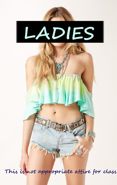
PSA: NO CROP TOPS ALLOWED

One thing that really rubs me the wrong way is when girls show up to class wearing crop tops. Crop tops are party going outfits, not classroom attire. Wearing a crop top to class makes you look unprofessional. Professors do not care to see your stomach and lower back. Other students should not care either. We are in class for an education, not a fashion show. While I am all for expressing yourself with the clothes you wear, you should still cover up while in class. That is all.

PSA-NO CROP TOPS ALLOWED


I made this billboard using GIMP. It was really difficult to figure out at first. I googled “crop top” and found the picture. I decided to cover up the model’s face first. I was going to just blur it, but it didn’t look at good. Then I decided to cover it completely with a black box. This is supposed to look like the pictures where people hold up signs with their secrets on it. I made the rectangle black and took pigments from the shirt to color the word “ladies.” Finally, I added the text at the bottom. I made all the lettering large and bold to make it easier to read. Then all I had to do was merge down the layers!

The Ultimate Merger

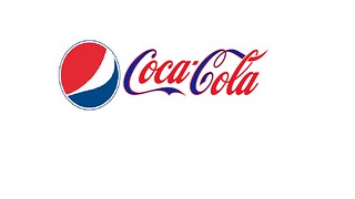
The ultimate merger assignment worth 3.5 stars is where you have to merge two different business logos. I decided to go with two very competitive companies Coke and Pepsi. Using Paint, I took the circle logo from Pepsi, erased the word Pepsi, and then inserted the Coca-Cola logo. I then decided it was way to plain so I added the blue color from the word “Pepsi” and put it inside the two “c”s of Coca-Cola.

Ultimate Merger

YOUR TURN SIGNAL. USE IT. – Design Assignment #2

Turn Signals PSA

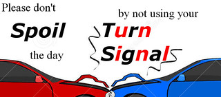
This is perhaps one of my greatest pet peeves on the road – people who don’t use their turn signals. I’ve been driving for 5 years without any sort of accident happening to me or because of me, and I think at least 10% of that 100% success rate is because I LET PEOPLE KNOW WHEN I’M CHANGING LANES OR TURNING OFF MY CURRENT ROAD. Not much to the story behind this PSA besides that. The alternating red letters in the last part of the PSA is supposed to represent a turn signal blinking on and off, even though I know it looks tacky. It’s my hope that people will remember the text because of that same tackiness. Was also neat that I could align “Signal” with the drifting smoke to make “Signals”.

The making of this was actually pretty minimalistic – I used two different fonts for the text and stuck bold/italics on the words I thought should be remembered the most, to reinforce the idea that using turn signals is a good thing. After the multiple experiences I’ve now had using the text insertion function in GIMP, that was relatively simple. Same for the photo of two cars – the photo I placed in the background came from Dreamstime, I simply cropped it to the 680 x 300 pixel workspace recommended in the assignment prompt.

PSA Billboard

After a particularly infuriating trip to target, I decided to use the DS106 PSA Billboard assignment to vent my frustrations (Why do people think they can just walk around shopping, playing horrible music LOUDLY on their iphones?!). To accomplish this submission, I messed around with Gimp – a free photo-editing software. Although graphic design isn’t my strong point, I’m still pleased with the results. This project was rather therapeutic.

Directions for the DS106 assignment can be found here.

PSA

Don’t Be That Guy!

It’s been busy lately. Project deadlines are conspiring against ds106 work. But, I was able to combine work and ds106 for the public service announcement.

Using Gimp or a similar program, create a public service announcement billboard on something that really aggravates you about people, society, the world, etc. It can be serious, goofy, but not offensive. Use a 680 x 300 work space in order to mimic the space of a billboard and have fun with how your positioning, font, colors, and images can help get your message across in a small space. Take it to the next level but superimposing it on a photo of an existing billboard!

As one of my many side gigs, I found myself shooting a dance recital for
DVD. Pretty easy. Set up two cameras and let it roll. Or so I thought.

Who knew staying in your seat during performances was NOT common knowledge. Or the giant camera positioned behind the audience wouldn’t be a large enough clue to stay put. This guy kept getting up and wandering back and forth ruining a bunch of the dances. At least for that angle.

So I thought I’d help out any live event producers anywhere by making this public service announcement.Dance PSA  

I grabbed a frame of Public Enemy #1 and threw this together in photoshop. I think it gets the message across and hopefully can be put to good use.

I hope no one you’ve ever known has wasted money on this.

loudcarFIN


This is one of my biggest pet peeves.  Since when was it cool for your car to be really loud?

One of my friends got rid of his muffler.  Whats the point and why is this necessary?

Made this in GIMP and thought I would add the Jackie Chan rage face to help you understand my frustration.  Here is a link to the rage face and here is the assignment assignment.

Difficulty: 3 stars