Movie Mash-up

This was lots and lots of fun! I had to pick two movies that were similar and create one mashup poster. I thought that the perfect two movies would be Cop Out and The Other Guys. This was the perfect combo in my head because they were both movies that had to do with buddies that were cops that get along at the end and make everything work out. I think that it was hard to play with perspective but I wanted to make sure that it said “Cop Out Guys” and I think I achieved that well.

Stars: 4.5

Movie poster mashup

http://assignments.ds106.us/assignments/movie-mashup/

This assignment is called movie mashup and is worth 4.5 stars. For it I had to take a poster from a movie I like and mash it up with a movie it is often compared to. One of my favorite movies is Love Actually so I decided to go with that as the poster of the movie I like. It is often compared to the movie Notting Hill, so I used that one as well. I decided to use http://pixlr.com/editor/ to edit these posters together. I used a picture of some of the cast of Love Actually as the original layer and took the part of the Notting Hill poster with Julia Roberts in the background and layered it on top and made it a little opaque so it is easier to see the two. I decided to put the cut out of her head next to Hugh Grant because he is one of the reasons the two movies link together and are often compared to each other. Then I took the words Notting Hill from that poster and took the word actually from the other poster and layered those together on top so it looked like the title is now Notting Hill Actually. I think that it turned out pretty well and enjoyed making it.

StarStarStar

????½

Similar to the last assignment I did, I found this movie mashup assignment, where I have to make a movie poster for a mashup movie. Instead of choosing two movies to mash up, I chose a mixture of movies and TV shows. To be specific, I mashed up Star WarsStar Trek, and Battlestar Galactica, all three of everyone’s favourite Star series. Together, they form StarStarStar. The poster that I made is something of a mixture between the posters for A New HopeStar Trek:The Motion Picture, and various things from Battlestar Galactica, since that’s a show and thus doesn’t have a movie poster to take things from.

starstarstar

The tagline up at the top is a mixture of famous quotes from each series. “A long time ago in a galaxy far far away” from Star Wars, “To boldly go where no one has gone before” from Star Trek, and “All this has happened before, and will happen again” from Battlestar Galactica. They actually fuse together pretty well.

The transparency on the rainbow ended up a little wonky, since Paint.NET isn’t too great at making a gradual change from opaque to more transparent. I would’ve just left it fully opaque, but I wanted to put Darth Vader up in the same corner he’s in in the poster for A New Hope, so it had to be transparent enough for you to see him. Still though, it looks pretty good for what I had to work with.

Rocky Raging Bull

The four and a half star assignment Movie Mashup was completed using the two movies Raging Bull and Rocky. The assignment directs us to create a movie poster utilizing the elements of two movies. I used both of the movies’ main characters.

raging-bull

Rocky and Raging Bull are both boxing movies that have been compared to each other. I took stills from both movies and combined them into one poster utilizing the MacOSX application preview.


Shining Gump

Here is the original assignment.

Movies have created lasting impressions of us. Some scenes are iconic, while others are forgettable. Movies sometimes cross paths, such as when the topic is of a war or humanitarian effort; otherwise, each movie is in a world of its own.

Forrest Gump is an adventurous journey of a man with low intelligence who seemed unlikely to become successful. However, he ends up living an enjoyable life as he astounds those around him. Forrest tells the adventures of his life to people who sit on a bench with him, hence the iconic scene below.

The Shining has become a renowned horror film since its release in 1977. It tells of a man driven into insanity who attempts to murder his wife and kid. Below is an iconic image from the movie:

Imagine Forrest Gump telling his great stories to Jack Torrance from The Shining? It may look something like the image below…

mashup-2

It seems pretty scary to me, but Forrest doesn’t seem intimidated!

Process

  1. Download two images from iconic movie scenes that might go well together.
  2. Load the images into an editing program such as Microsoft Paint.
  3. Arrange the images.
  4. Perform editing, such as air brushing the images to meld them together.
  5. Save the final image.

Thanks for reading! Enjoy!

Baymax and Joy;

Disney makes some amazing movies. Their most recent ones, Big Hero 6 and Inside Out, have stolen my heart. The psychology major in me appreciates Inside Out’s story line, and the child in me loves Baymax from Big Hero 6. What better combination than these two for the Movie Mashup (4.5 stars)?

To do this, I used Pixlr’s online photo editor. I googled the poster images (Big Hero 6 and Inside Out) and added them into the editor. To add a picture on top, I selected Layer and then added an image as a layer (see photo below). I added words from the Inside Out poster and it was done!

poster 3

Here’s the final product!

poster complete


Isn’t That Kinda Like..?

“Take a movie that you really like.  Now think of a movie that has been compared to it, and make a new movie poster that incorporates the two!”

– 4.5 stars

Real


When I graduated high school in 2012, the first of the Hunger Games movies was released. I was excited because it was a book series I had read a year or two earlier and one I really loved. Not to mention, the final Harry Potter had already been released and I was itching for another book-to-movie franchise to hook onto. Little did I know, the release of the Hunger Games was just the beginning of what would turn into several years of dystopian thrillers, one right after another.

The next major book-to-movie series that followed this post-apocalyptic story line was divergent, which follows Tris as she fights against the corrupt faction system. It’s plot, characters, and setting were eerily similar to that of the Hunger Games trilogy, and likely contributed to the success it has enjoyed since being released.

Because of their similarities, I decided they would be the perfect movies to use for this particular assignment. I did some digging on google images to find movie posters where the characters were in similar poses, were around the same height, and where the lighting was close to the same. I figured having these aspects of the posters match up would equal a more cohesive ‘mash-up’ in the end.

Unfortunately, I forgot to take screenshots during the process so I’ll just have to settle for explaining it here. It’s been awhile since I worked on any assignments using GIMP, and it took some readjusting before I was able to get comfortable again. I decided to use the Hunger Games Poster as the base layer since it featured a rocky cliff that would help cover up the fact that Tris has no feet (they weren’t in the frame in her poster). I also just really liked the water color-ish background and wanted to keep it. Using the free form tool on GIMP, i very carefully traced over Tris’s outline until I had moved all the way around her and connected the trace. I cut her image out, opened the window containing the Hunger Games poster, and pasted her in. I decided to place her in the corner because 1) her dang feet, and 2) I liked the idea that it looked as if she was standing on some kind of cliff just out of eye shot.

When I cut out Tris, there were a few white spots that made the poster look pretty hastily thrown together and bad. I decided to use the color matching tool and the paintbrush to match the color near the white spot and fill it in. Once zoomed out, you can hardly notice that the brush spots seem more blurry than everything else and the poster just looks a little less choppy altogether.


Movie posters sourced from:

Divergent poster

Hunger Games


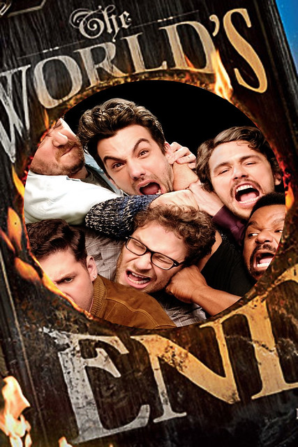
This is The World’s End

This Is The Worlds End

It was just a normal day for this group of friends until something went wrong. The world began to shake and split open. All Hell broke  a loose and now these guys are trying their best to scavenge and survive  while finding a way to be accepted into  Heaven. Little did they know, some other guys in Britain are trying to prevent the from ending by heavily drinking in a pub. That’s an odd way to fix things, but will they be able to before time is up? Find out what happens when this mashup film hits theaters this summer!

For this four and half star assignment, I decided to take two similar movies that released within the same year  and mash their movie posters together. I don’t remember the movies, The World’s End and This Is The End, ever being compared, but it’s interesting that they both released around the same time and basically had the same plot. They also had similar ratings with about 50% on Rotten Tomatoes, so nothing could go wrong mashing them together. Combining the two movie posters was pretty simple using software like GIMP.

After saving the images to my computer, I opened The World’s End poster in GIMP and used the Ellipse Select Tool to add transparency to the image.e

The next step was to open up the This Is The End movie poster as a layer and move it behind the other poster. I then used the Scale Tool to make the image larger and help it fit well in the circle.s

The last step was exporting the file and upload it to Flickr for it to be viewed by everyone online.


She’s the Twelfth Night

Movie Mash-up:   Take a movie that you really like. Now think of a movie that has been compared to it, and make a new movie poster that incorporates the two! (4.5 stars).

For this assignment, I had to use two movies that are similar in themes, or really, just been compared before, and make a new poster that shows this!

I have watched She’s the Man, which is a great movie about Amanda Bynes’ character Viola, pretending to be her brother in order to play soccer because her team got cut. Here is the poster for this movie:

dfad

The next movie that has been compared to She’s the Man, is Shakespeare’s play, The Twelfth Night. This play, which is much older than the first mentioned, weirdly enough, shares a lot of the same character names including Viola, Olivia, and Orsino. Another big give away is that the main character in the play, Viola, disguises herself as her brother who she thinks has died at sea.

Twelfth_Night-_Or_What_You_Will_FilmPoster

The similarities are crazy, and here is a YouTube video I found comparing and contrasting them.

Anyways, I made a cool poster combining the two above. I found both images on Google, and cropped the title from She’s the Man and pasted it on the Twelfth Night poster using Preview on Mac. It was very simple to just cut and paste.

Screen Shot 2015-11-18 at 7.54.47 PM


I covered up the original title to replace She’s the Man with. I wanted to have both movie/play highlighted in the new poster because I thought this would bring in the crazy similarities from both to show them together. Its also cool to note the difference in times of them. She’s the Man came out in 2006, while The Twelfth Night was first performed in 1602.

Here is my final poster of the mixed, oddly similar movies. I really think the similarities are crazy.

jnkn

—SALTY SKINN

review 11-15-15

This week was how we say EHH!?!. I was not a fan. It seems to me that in reality this course is full of mashups, whether you want to call em that or not. I can think of only a hand full of times I have been asked to create my own content. I find this extremely disheartening.  Oh well, I guess, I would like to do some work though that applies to the real world. Something that requires planning and coordination, maybe even team work. Any how, my projects this week were short and sweet which is not a bad thing considering the course load I am under currently. Here are a few links to my assignment this week.

http://digitalmediakiller.com/creative-work/to-bad-he-isnt-british/

http://digitalmediakiller.com/creative-work/that-doesnt-belong-there/

the second one was ehh, risque’ but I am not really worried. we are in college and also adults if there is a problem please contact me so I can let you know I am not concerned with your offence.