Legally Smeagol

IMG_3536

For this assignment (4.5 stars), I had to mash together two movies scenes into one. I chose to do my favorite movie Legally Blonde and picked the ending scene of the movie. I also chose to use Smeagol from The Lord of the Rings and placed his head on Emmets body for this scene in Legally Blonde! Thought it was pretty funny. And Oh look! That’s Agnus’s hat in the corner of the picture. Right before this hearing in Legally Blonde, Agnus had a hearing for her speeding ticket she got and must have left her cowgirl hat at the court room! Silly Agnus!

In order to complete this assignment I used the app Fotobom and found it to be fairly easy and fun to complete!

Jack? Jason?

For this assignment I decided to combine two scenes together from two movies I enjoy. It’s not as subtle as I’d like but I still think it’s quite funny. This wasn’t that hard to do however, I did have to YouTube a tutorial on how to combine two images. I used images from google an combined them in paint to create Titanic the 13th.

jasonn

This assignment was worth 4.5 stars.

This Doesn’t Belong Here

This Assignment was supposed to combine two random movies and put them together. So I decided to Mash up my character with Darth Vader from Star Wars. This is my Western Gal shooting at someone, and she is with the “squad,” and that is Darth Vader. This assignment is starred 4 1/2, which puts me at 9 stars out of 12.  I had fun creating this project, it was cool picking out which movies I wanted to combine, because I love movies. Screen Shot 2016-04-05 at 11.04.10 AM

Mashup Assignment – This Doesn’t Belong Here

iconic combo

I guess I wasn’t super subtle, but I couldn’t help myself! The two iconic images I chose to mash together were the flare scene from Jurassic Park and the kiss from Romeo and Juliet.

mezzanine_133.jpg.resize.1280x72078084-grant_jurassicpark_57611

I first removed the character from the Jurassic Park scene by cloning the rain around him. Then I added the romeo and Juliet scene as a layer where I removed as much of the background as I could. I merged the resulting image with the Jurassic Park image where I then attempted to clone more of the rain scene onto the image. It’s not as smooth as I would like, but hey, I get an image of the T-Rex looking at his next snack.

Mashup Assignment: This Doesn’t Belong Here

cAPTAIN hEADER

Mashup Assignment from the DS106 Assignment Bank:
This Doesn’t Belong Here…or…Who’s the Captain of This Here Ship?!

*I am currently working my way through my fourth semester of the Information and Learning Technologies master’s program at University of Colorado, Denver.  This is the fifth post within a series of Creative Assignments that I’ve been tasked with completing for a course titled Digital Storytelling.

The mashup assignment that I chose from the DS106 Assignment Bank is called This Doesn’t Belong Here.  It states, “For this assignment you need to mash up two different iconic movie scenes. However, you should aim to be as subtle as possible. Perhaps a famous prop that simply doesn’t belong or a character that looks a little out of place.”

So, who’s the captain of this here ship?  (I say it’s the tiger.)

Who's the Captain?

*Original image from movie, Life of Pi.
*Captain Jack Sparrow added from this image.
*Header image from here.
*Mashup image created with Adobe Photoshop.

Movie Poster From the Future Past

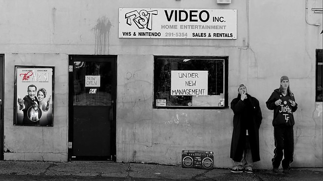
For the This Doesn’t Belong Here assignment, we had to take two scenes from two different movies and mash a picture out of them.  I used one scene and technically a movie poster, but I feel the affect is the same.

Movie Mash Up

Clerks is a movie released in the 90’s that was filmed in black and white because of budget constraints.  The Artist is a movie released in 2011 that was filmed in black and white as a stylistic choice.  Thinking about it, the poster for The Artist doesn’t feel too out of place.  Someone in the 90’s probably wouldn’t think of it as a film that would be made two decades later.  Considering it’s place in the scene as a poster outside a video rental store (yeah, it’s the 90’s), the effect is magnified.

I enjoyed both of these movies, despite their completely contrasting styles.  Clerks is very raunchy and vulgar comedy, while The Artist is a very stylized film that makes you think.  I think both of them are iconic in their own ways.  They are both creative in telling two completely different stories without needing the overly imposing computer effects of Hollywood.  Thinking about it deeply, they don’t feel completely different from each other.

How I made it:

  1. Found the two images on Google and downloaded them
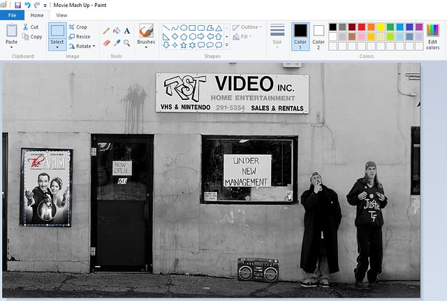
  2. Opened them on Microsoft Paint
  3. Moved the poster into an appropriate spot

Capture13

4.  Saved the image and uploaded it to Flickr

Schindler’s Shawshank

Hello!

Another mash-up assignment done!

The Assignment

This assignment is worth 4 stars and can be found here. It is called “This Doesn’t Belong Here” and the exact instructions are: “For this asignment you need to mash up two different iconic movie scenes. However, you should aim to be as subtle as possible. Perhaps a famous prop that simply doesn’t belong or a character that looks a little out of place.”

The Story

First, the requirement was iconic scenes so there were already a few movies I thought of. Shawshank Redemption is on the top five best movies of all time on IMDB and it’s because it is a truly classic and beautiful film. Because it takes places in a gloomy prison atmosphere, I knew that I needed something else that would fit well and blend but still stand out as “odd” when one is really looking at it. For the thing I was going to “mash” into my Shawshank picture, I chose a person from Schindler’s List which is another classic movie and equally, or probably more morbid. Shawshank Redemption has to do with a man who is wrongly convicted of murder and follows his time in prison to his final escape. Schindler’s List is a film about a man who secretly helps jewish people during WWII. Both are films about kindness in the hearts of people and how even in the darkest times, there is some hope. I think the picture is perfection. The girl in the red dress is from Schindler’s List and she is also one of the few instances in the whole movie in which color is shown. I believe it is to demonstrate her innocence and how the innocence of many children was taken during those times. Red is usually a bold and passionate color. Red is also the color of blood.  I made the whole picture black and white because I wanted her to stand out and to make it seem like the whole image was original.

The Product

ShawshankSchindler

The Dinosaur Before Time

Here is the original assignment.

Have you ever gone out to see a new movie, but were surprised to find out that it was similar to one you had seen before? Many movies are created in the image of previous ones, as it is supremely difficult to generate novel ideas.

Released this past week was The Good Dinosaur, a film by Disney Pixar. The film had reminded me of movies I had watched when I was a kid, The Land Before Time.

These movies featured the adventures of kid-dinosaurs through scenarios of drought, migration and more. They were really fun to watch because the tones were lighthearted, although serious at times. The characters each had unique personalities, and each had developed to become a stronger character by the end of the movie.

In The Good Dinosaur, the protagonist (Arlo) reminded me a lot of the main character from The Land Before Time (Little Foot). Both characters are feeble brontosauruses who had a lot of developing to do. They are both swept away into adventure, and both end up protecting their loved ones in dramatic fashion.

Below is a mashup image of the two movies.

The Good Dinosaur / The Land Before Time

Process

  1. Find 2 images online that you would like to combine into 1.
  2. Open up an graphics-editor program such as Microsoft Paint.
  3. Paste both images into the editor.
  4. Re-size / align the images.
  5. Save the newly composed image.

Screenshot of Paint

That’s it! Enjoy!

Something’s Not Right…

This Doesn’t Belong Here- 4 Stars

The prompt for this assignment is:

For this assignment you need to mash up two different iconic movie scenes. However, you should aim to be as subtle as possible. Perhaps a famous prop that simply doesn’t belong or a character that looks a little out of place.

The Work Itself

Doesn't Belong

The Story Behind the Story

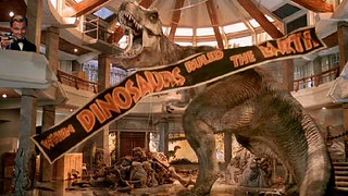
Have you found what is out of place yet? Okay I’ll tell you, I put Gatsby toasting to the T-Rex at the end of Jurassic Park.  I love the movie Jurassic Park (haven’t gotten around to reading the books and the second and third movies of the series are quite mediocre), and this final scene always gets me so pumped so naturally it pumped into my right away when I read the prompt. Another favorite movie (as well as the book) is The Great Gatsby, it is such a timeless and iconic movie, I absolutely love it. The scene that pops into my mind from the Great Gatsby is when he turns to toast Nick at the party, quite iconic in many ways. The contrast of the movies also made me want to combine them even more because I thought they would be quite funny together.

The T-Rex and Gatsby also have similar characteristics which I thought paired nicely with one another. They both end up being the unexpected outcome of the story. During The Great Gatsby, everyone roots for him to get the girl, Daisy, but by the end of the story, Gatsby proves to be a fraud but so does Daisy. By the end of the movie, no one wants the two to be together. Now in Jurassic Park, the T-Rex is killing people through most of the movie but by the end of it all, the T-Rex ends up saving everyone from the Velociraptor and comes out the hero of the movie.

Narrating the Process

This assignment was pretty simple and I accomplished it in the following steps:

  1. Google images of the iconic scenes I want to use
  2. Open each image into Photoshop Elements 11
  3. Crop and copy Gatsby into the Jurassic Park scene using the “Quick Selection” toolScreenshot (68)
  4. Adjust the size accordingly (Gatsby turned out to be quite large over the Jurassic Park scene)Screenshot (69)
  5. Flatten the image togetherScreenshot (70)


This Doesn’t Belong Here

pizap.com14479549057641

This assignment was to take a scene from a movie and insert something that clearly is not supposed to be there. So I thought about one of my favorite movies “Coach Carter”, and since it is such a serious movie and the fact that is a true story. I thought it would be perfect and pretty funny to make it kind of a joke.

This specific scene is Coach Carter meeting his players for the first time, introducing himself and letting them know all the rules and guidelines that they need to follow. Laying down the law, and making sure everyone is on the same page.

So I decided to take a couple characters from the Minions movie and threw them in there as if they were also listening to the coach speak to the players. One of them taking some notes down, while the other is interrupting with questions.

To complete this assignment I found the picture of the scene on google, for the two minions I found their pictures on google also but I had to crop them from out of their pictures because it had  backgrounds that simply wouldn’t go well with this movie. Then I used an online picture editor (piZap.com) to edit the two pictures together and put the two minions in their places. Them simply saved it to my computer when I was finished.