review 11-15-15

This week was how we say EHH!?!. I was not a fan. It seems to me that in reality this course is full of mashups, whether you want to call em that or not. I can think of only a hand full of times I have been asked to create my own content. I find this extremely disheartening.  Oh well, I guess, I would like to do some work though that applies to the real world. Something that requires planning and coordination, maybe even team work. Any how, my projects this week were short and sweet which is not a bad thing considering the course load I am under currently. Here are a few links to my assignment this week.

http://digitalmediakiller.com/creative-work/to-bad-he-isnt-british/

http://digitalmediakiller.com/creative-work/that-doesnt-belong-there/

the second one was ehh, risque’ but I am not really worried. we are in college and also adults if there is a problem please contact me so I can let you know I am not concerned with your offence.

That doesn’t belong there

This week is mash-up week, and we are off. I would like to state for the record that the world of the internet we live in today is full of intellectual theft. As a photographer any time I give some one the right of use for any of my pictures I always give them the standard BS. “Don’t alter them, Don’t crop out my logo, If you can site me as the author.”  The mash-up is sort of a perversion of free speech. I do think that you should be able to use anyone’s work for education. I also feel the use of another’s work for criticism and press is vital to my love of liberty in this country. However, using other’s work for rebranding is unprofessional.

With that being said here we go with my first theft of intellect. for this project I use the assignment bank assignment called “this doesn’t belong here”

http://assignments.ds106.us/assignments/this-doesnt-belong-here/

and here it is

hardly movie scene

the background image is Halle Berry and the foreground image is from mystery science theater 3000


Monster M.A.S.H.?

So what do you get when Pope Ramzes refuses to talk?

Mash1323

Ever get the feeling something isn’t quite how you remember?

Mash1511

Well, sit back, relax, and laugh it off.

HA!  Suck it YouTube!

[contact-form]

This doesn’t belong here

15533

this is another mashup assignment worth 4 stars. I put the ship from Titanic and made it sink in a scene from Forest Gump. I made this using Photoshop, I cut out the ship and put it subtly in the background.

Mash Up 2

144746713236569


This assignment was worth four stars in the assignment bank. The assignment was to combine two movie scenes or covers. The change couldn’t be obviously. I chose tow pretty common movies and I think it turned out pretty well. Especially for my first time doing something like this!

This doesn’t belong here- Disney Style

144738233185721

This is a mash up assignment and it’s worth 4 stars. The task of this assignment was to mash up two major movie scenes and to make it seem like it was meant to be there in the first place. I am a child at heart so I decided to put Lady and the Tramp with Beauty and the Beast. I took the scene where lady and the ramp are eating spaghetti together as if it was a fancy date with a candle lit dinner. I decided for this assignment to take my favorite character lumiere from Beauty and the Beast and replace the candle that was there and put him there instead. It makes it seem natural because there was a candle that was there and because the animals talk it wouldn’t be too surprising to have the candle also talking in the movie. I used luna pic to blend the images together and I made it an oval shape for Lumiere to make it seem like he isn’t standing out too much in the image. If there was anything that I could do to improve this assignment I would really like to have photoshop because I think with that I would be able to cut him out better and layer him in. I think that would really bring more authenticity to blending the two movie scenes together.

HEEEEEERE’S COLGATE!

What’s a remix without a little Jack Nicholson? Victor recently decided he was going to start his own company and, being an avid fan of dental hygiene, figured he’d try his hand at the toothpaste trade. With Jack Nicholson’s permission, he released an ad based on The Shining. He wanted it to be subtle, though. Thoughts?

im not gonna hurt ya im just gonna BRUSH YOUR TEETH

This was created for the This Doesn’t Belong Here assignment! It’s worth 4 stars.

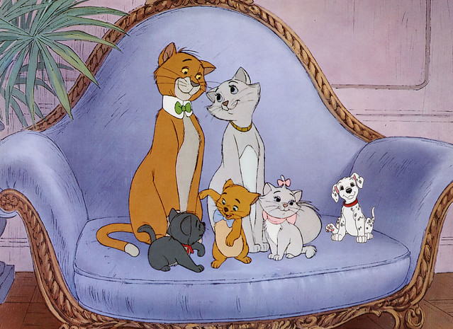
Are You Sure They’re All Cats?

For 4 stars this week, I completed the This Doesn’t Belong Here assignment.  I didn’t quite know where to start, but we had to choose movies.  I originally was thinking of trying to combine The Walking Dead and Breaking Bad.  I started by doing a Google image search for The Walking Dead, and came across the poster of Rick and Carl walking on the train tracks.  I immediately thought of the scene from The Aristocats when the kittens are walking along the train tracks.

For this assignment you need to mash up two different iconic movie scenes. However, you should aim to be as subtle as possible. Perhaps a famous prop that simply doesn’t belong or a character that looks a little out of place.

Once I started looking for scenes from The Aristocats, I thought it would be a great juxtaposition if I did The Aristocats and 101 Dalmatians! After finding both images online, I used Photoshop to add the puppy into the cat picture.  Since the colors of the cats were sort of grey, the white of the dog stuck out like a sore thumb.  I used the same color as Marie to try and darken the whiteness of the dog, so it looked like he blended in more. I probably could have gone for a shade or two darker on the pup, but I didn’t want to risk greying out his spots.


The Aristocats?

We’re Going Down!

For this mashup assignment, we had to take two iconic movie scenes and mash them together.

My inexperience with media in general is a detriment to this assignment. Iconic movie scenes? None ring a bell.

I ultimately did find a scene I thought would be appropriate to mashup, this movie poster of a scene with the Enterprise crashing down to earth gives a plot of action and a convenient blank space to work a little magic, something where inserting something won’t make it seem crowded because if anything, the space is TOO blank.

star-trek-into-darkness-poster-excerpt-660x577

So what to put into it? I didn’t think much of the movie itself, so why don;t we insert something that pokes fun at the plot? The Enterprise is crashing, so why not give it a reason to crash? I considered putting in a spaceship from some other series, like a star destroye, but ultimately decided that would be too expected. So, to keep with a somewhat comedic feel here, I bent the rules of the assignment and swiped an object from what I consider an iconic opening scene of one of the better TV shows to travel the airwaves:

So, I brought up powerpoint, indserted the movie poster in a slide, then a picture of the barrel monkey from the futurama wiki. Thanks to the raltively constant background, powerpoint had no trouble removing the background of the photo when I inserted it into the slide. Just to keep some perspective, I also tilted the image slightly. The end result:

Monkey Trek
I was relatively happy with the end product. I considered darkening the gorilla and planet to make it fit in better with the dark colors of the movie, but I also wanted to keep the lighter cartoony feel that the brighter colors provided. The ship is central, but the brighter color almost demands attention, but it is small enough to get second notice.

One of these Ents is not like the other

Where is Groot?
Where is Groot?