Here Comes the Radio Show!

My poster for the upcoming DS106 Radio Show!

This post will serve to display both my poster for the radio show as well as outlining my planned contributions for the upcoming radio show of #SpiritXpress. (this way I can siphon off more hits, haha!)

First I’d like to discuss the part I will be playing in the coming ds106 radio show.  I will be talking about traditional fall foods, especially my favorite fall comfort foods.  I might even share a recipe or two!  But I’m sure the episode will be heavy on the pumpkin, so be prepared.  I’m also planning on interviewing several friends about their favorite fall foods.

Next: the poster itself.  I’m really into Halloween and jack o’lanterns and the like so I figured it’d be nice for the poster to show how we can turn something spooky into something delicious like pumpkin pie.  I decided to paste them both together in a single poster format and then added individual text boxes and manually aligned them to the left for the top image and then increased the size of the bottom text to kind of draw the attention of the reader.  Then I followed Amber’s post here to help me with filling in the backgrounds to make the text stand out a little more.

Arial may not have been the best choice, and white may not have been the best text color, but I wanted to do something basic and stylish.  I’ve always viewed arial as a classy font ever since I used to use it for headlines when I did layout for my high school newspaper.  But, in practice, it doesn’t work that well with a poster.


The Noble Radish

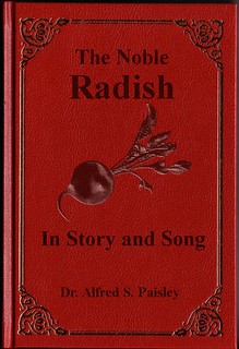
My contribution to the ds106 Weird Book Room. It seemed like the sort of thing someone named “Paisley” would write.
It was a big hit with the botanists

I love book covers. I love them so much, you don’t even understand. There’s that trite old phrase about judgement, sure, but the fact is the cover of a book (or a movie, or an album, or whatever) can make or break a sale. I’ve picked up books more times than I can count for their cover art alone; I actually have a few favorite cover artists, and favorite editions of much-loved books based solely on the cover art. Each one is a little designed story all on its own, which I find fascinating and wonderful.

Designing this particular book cover ended up using much less of my eye for art and more of my technical skill. I wish I’d come up with something that stretched my design muscles a little more, but I am damn proud of that radish.

I found the clip art for the radish at Daily Clip Art and the book cover on DeviantArt via an image search. The hardest part of this assignment was getting the radish to look like it was embossed onto the red leather in the same style as the decorations on the cover, instead of a big splot of awkward color that didn’t fit. I tried using Justin Baker’s tutorial on how to make a photo look like a drawing, but but because of the image’s low contrast it just gave me a super-bright outline of the radish with a couple sketchy-looking shadows thrown in. After fiddling with the Gaussian Blur process a bit more, I decided to try the “Emboss” filter to see if it was worthwhile. That turned out much better, and reducing the opacity got me exactly the kind of image I wanted. Sadly the same process didn’t work on the black lettering, but reducing the opacity of the text layers was almost as good.

In terms of design, most of this assignment came down to placing the elements I wanted in logical, aesthetically pleasing locations. The thing about book covers is that we’ve been creating them forever, so there’s a lot that people read into them without even realizing it. A book with a leather cover, embossed decorations and a sparse cover design is older, and probably about a more serious subject. A glossy paperback with a lot of pictures on the cover is probably a how-to book of some kind and is more modern. If the author’s name is the biggest thing on the cover, you’re buying the book for the storyteller, not the story; a dominant title suggests it’s the other way around. I played into that a little by making the title dominant and the author’s name smaller, and the Serif font I chose also suggests a more serious work through its lack of frills.

Weirdly enough, this book is one I’d totally read. Radishes feature in a bunch of legends from around the world, including the iconic Radish Spirit (he’s the big white blobby dude in the front) from Hayao Miyazaki’s epic “Spirited Away.” His character was based on a daikon radish, which is used in a lot of traditional Japanese cooking, and in that way represents the  more traditional elements of Japan’s history.

My Big Break

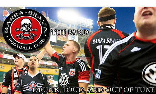
National television knows La Barra Brava, and I’m a proud member. In Major League Soccer, there is no team with as much success as DC United, and their biggest supporter group is La Barra Brava. La Barra is always highlighted on broadcasts of DC United games, because we always go hard for every game. We are one of the best traveling supporter groups in any sport, and have become iconic in Major League Soccer for the atmosphere we provide for DC United to win, with our motto “The Only Thing We Fear is Running Out of Beer!” Every game, La Barra can be heard cheering on DC United with a number of songs and chants both in English and Spanish.

Well, our songs and chants have gotten us a private record deal and I designed an album cover (with me on the front of course [far left]). I took a picture that Wilson Roa (offical photographer of La Barra Brava) took of a group of us standing up and chanting, and I added the La Barra Brava logo, along with text that I changed and altered to make more offical looking on Adobe Photoshop.
Barra Brava Band

Bumper Sticker… 2 Stars! FINISHED

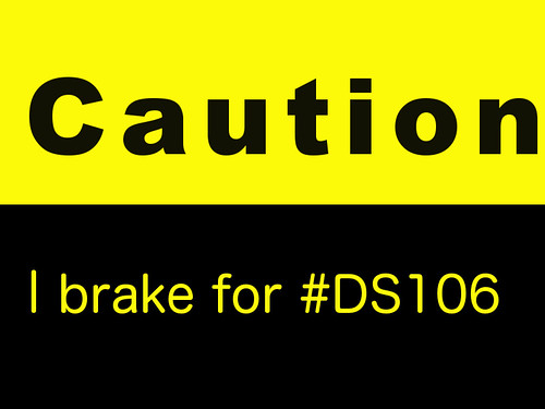
When I saw that one of the assignments was to make a bumper sticker for DS106 I got super excited. This one of of my favorite classes and I couldn’t help but make something cute/funny. I googled ‘Bumper Stickers’ for ideas, I saw one that said ‘I brake for hookers’ I though… I would brake for DS106. I stop all other work for it anyways. So The product ended up being ‘I Brake for DS106′ I used GIMP again to create this. I made a 2 layer image one layer being yellow, one black, and inserted the text. Super simple.

 Bumper Sticker

The Little Caption… 2 Stars

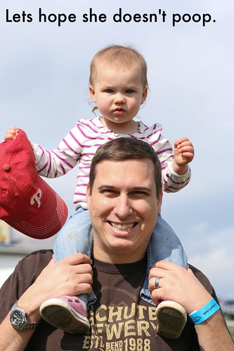
I did the assignment The Little Caption. I chose a picture from the Creative Commons portion of Flickr. I chose this picture because the small child on her dad’s shoulders looks really disgruntled. The first thing that popped into my head was “wow, that would suck if she pooped.” So that became my caption.

poop

My Ohana

This design assignment was one that I was struggling with earlier in the week. I was trying to use Paint to place text over the image, but I couldn’t figure it out and it was really frustrating. So in order to try and figure things out, I was looking at a lot of examples of the work other people were doing. I was looking for people describing HOW they did things so I could try what they were doing and see how that worked for me.

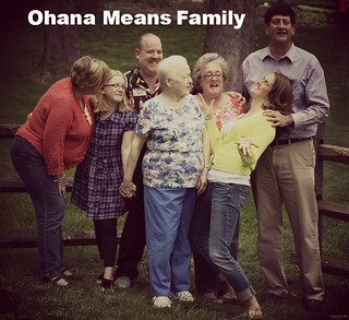
I saw that PicMonkey was mentioned a few times so I decided to give that a try! It turns out that it worked really easily for me and I was really happy with it! It was very simple and easy to use and I really like the effect I had. I looked at the other people’s works who submitted this assignment, and they all kinda tended to use pictures with their friends, showing them having a good time. So I thought about it and decided to use this one picture of my family from this Easter that I really liked. We’re all being silly (really only me) and I love it!

So I uploaded it to PicMonkey, used the “Dusk” effect to give it kind of a cool effect and added some text to it. I wanted to have something with family in it like “Family Fun” but decided on “Ohana Means Family” just because! :) So here is my album cover, for my  family, which I think would consist of folks songs that you could sing and harmonize with your family!

Family Band

3 STARS

TOTAL STARS: 9/15


PROTIP: SAVE YOUR WORK

That way when GIMP decides to crap out (because it will. It will.) and you are faced with the Immovable Filters Menu and nothing works even though your Task Manager says the program is running, you will not end up whimpering pathetically in front of your laptop and staring at this:

EVERYTHING IS RUINED FOREVER

I’m going to re-do this assignment. I WANT TO FINISH THIS WEEK DAMMIT. But I also wanted to show that yes I’m working and doing stuff and. Just. UGH.

Why is everything going wrong this week? WHY?!?!

Cartoon Headed Obama

Seriously, I cannot get enough of this Big Bird stuff. Politics gold.

Anywho, for this assignment, I decided to cartoon a picture of Obama and Romney after the debate. I choose the same Big Bird picture I did in the other assignment. Political bias aside, I think what Romney said was one the biggest gaffes of the debate/campaign, including the 47% remark.

For this one, I opened both pictures. On the Big Bird pictures, I selected his face, including his beak. Then I right clicked in the selection and pressed copy, then I went to my Romney/Obama picture and hit paste. Then I went to my layers panel (tip: hit control + L or command + L on a Mac to make this panel appear) and right clicked the “pasted” layer and hit “to new layer.” Then I moved Big Bird’s head to sit on Obama’s and used the scale tool to shrink it a bit.

I am just eating up all the political hilarity from the debate.


Top Gun

From the Movie Trading Cards assignment: Design trading cards for your favorite movie. Use a screenshot from a film an use it to create a trading card in the spirit of the class Star Wars movie trading cards. Also see the imagine trading card for The Shininghere. Idea inspired by Sean Hartter’s rendition of Brazil trading cards inthis post.

It is one of the cheesiest movies I have ever watched, and I watched it for the first time in my life last night as part of my ongoing movie education.  I loved it.  I thought it only fair to create a movie trading card in GIMP of Top Gun.  I got my images here and there. I layered the images and used a sans serif condensed font to write in the little tidbits of information.

Roadtrip Radio Shirt

So for one of this week’s Design Assignments, we had to create a poster/bumper sticker/t-shirt advertising for our show. So I decided to just create a shirt because I figured it would be fun to do!

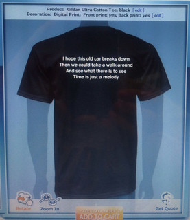
I googled “design your own t-shirt” and clicked on the first link. I just followed the prompts and made my own shirt. Since part of our radio show involves the car breaking down, I wanted to include that on the shirt somehow. I knew there was a song by J Cole called Breakdown and also one by Jack Johnson with a similar name. I chose lyrics from the first four lines of Jack Johnson’s song “Breakdown” and formatted that onto the back of the shirt.

Roadtrip Radio Shirt Back

I hope this old train (changed it to CAR) breaks down
And I (changed it to WE) can take a walk around
And see what there is to see
Time is just a melody

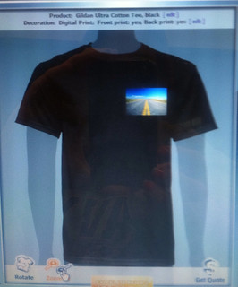
For the front of the shirt, I just googled an image for “roadtrip” and the perfect picture came up. I really liked this picture of a road that seems to stretch on forever. So I saved the image and uploaded it so that I can put in on the front of the shirt where a pocket would normally go. I think it looks pretty cool!

Roadtrip Radio Shirt Front

2 STARS

TOTAL STARS: 6/15