W O R D

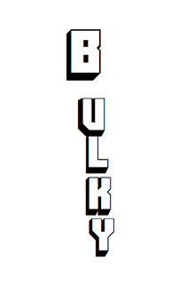
The next design assignment that I thought I would complete dealt with a WORD. The idea of the assignment was to make a word (any word) represent it’s meaning through it’s font. The example used on the assignment was the word Magic… which had the letters “agic” coming out of the center of the M. I thought this was a very creative way to have the word “Magic” show it’s meaning…. It made me want to do a word, but thinking of the word was not very easy. I decided to do the word BULKY….. Bulky is defined as “large, thick, or lofty”… I found a font that would easily represent the meaning of Bulky and then I figured out how to put it in a manner that best represented the word to an observer. I realized that this wasn’t a word most commonly used, but it is an adjective that can be used in many forms. I used a word document to place the word in the manner that I wished, but I made the B have more of a presence …. because it actually looks kind of BULKY. Without any color and any actual drawing… I think I represented the word “BULKY” in the best manner that I could using simply the font and it’s shape.

BULKY


1 vote, average: 2.00 out of 51 vote, average: 2.00 out of 51 vote, average: 2.00 out of 51 vote, average: 2.00 out of 51 vote, average: 2.00 out of 5
Total = 6/15 Stars!


My DS106 Postal Stamp!

I decided to participate in Andrew Forgrave’s ds106 Goes Postal [design] assignment! I just used Paint from my CPU to design a stamp! It was easy and worth two stars! “If the postal service was going to honor DS106 with a stamp, what might it look like? Design a stamp that features ds106 elements. Make it commemorative and collectable.”

Vanessa Hudgens and Zac Efron say whaaaat?

May I just say I am REALLY REALLY enjoying finally putting my prom pictures to good USE! haha. I decided to take part in Celeb Mashup, by Samantha Bert! (: “Take a picture of your favorite celebrity and put yourself in the picture with them somehow. This is really easy to do! First pick a celebrity, pick a picture of yourself, and put them together!”
The [design] assignment was worth two stars! and it was a lot of fun! I just pasted both photos into Paint! and Viola!

I am also using this post as an example for my [design] creation!

Crazy Right?!?! WHAT ARE THE ODDS?

How I Met Your Mother

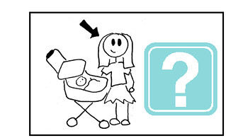
I saw this assignment on a random try! It was to design a minimalist poster for a tv show/movie. Immediately, I thought of doing something with How I Met Your Mother. I don’t know why that happened, it just did! So I wanted to do something simple (duhh cause they said so) like a picture of a mom’s face with a question mark by it. The whole premise of the show is finding out who Ted (narrator and one of the main characters of the show) marries and has children with because he’s telling his kids the story of how he met their mother.

So I searched “mom clipart” on Google Images and found a perfect one! I made a rectangle shape on a Word document, put the mom clipart to the left of the inside. Next, I searched question mark in the clipart on the Word document and found one I liked and put it on the right inside of the box. Then I selected all 3 items, grouped them, then copied it and pasted it into Paint. I saved it and uploaded to Flickr and here is the product:

How I Met Your Mother

3 STARS

TOTAL STARS: 17/15

Pitbull as Scarface

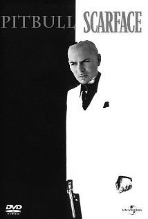
Few movie covers are as iconic as that of Scarface. The vertically split cover between black and white, the red Scarface font, and Al Pachino with a gun and his name on the other side. I thought for a while, who is the most iconic hispanic person in pop-culture today with the same gangster style that would fit the Scarface role, and I came up with the rapper Pitbull. Though no one can replace Al Pachino in that role, Pitbull seems to fit too. I Photoshopped Pitbull’s head on Scarface’s body, and changed Al Pachino’s name to Pitbull, and vallah!
Pitbull as Scarface

Waitttt I am a CARTOON?!

For [2/15] stars for [design] week, I decided to make a cartoon ME! haha it’s based off of the assignment by Nicole Rimes, Cartoon You! “Remake you (or someone you know and love) into a cartoon character. Draw you on a piece of paper, on a tablet, take a photo and use software to convert it to comic book style, or use online programs to create a cartoon version of your character.”  I added a flare by making my roses and lips POP! I used a photo from my senior prom, then used photoshop to “cartoon” myself! (: Here is the finished result! (:

Name That Single

This assignment is an interesting one because you have to guess the song from the design. So like charades for DS106! This was cool to think about what song to design for. At first I thought it would be funny to do another Adele song, I thought Set Fire to Rain would be fun to try to design, but I wanted to try something new. So here is what I created:

http://www.flickr.com/photos/laurstray20/8065096508/in/photostream

I’ll give you a few hints: the thumbs ok is more contextual not really literal, that’s a certain kind of insect that loves honey, and the singer of the song, her last name starts with an M. Can you name that single?!?!

2 STARS

TOTAL STARS: 14/15


Betty White on the cover of Teen Mag!

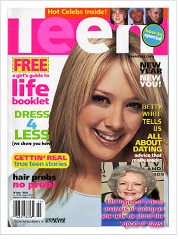
I’m not going to lie, sometimes, I make myself laugh. I thought for a while about who would be effective for a questionable figure to put on Teen Mag. Well, it came to me when I Googled Teen Mag images. I saw my opportunity in the corner of one were the magazine said “All about dating!” Who else would be better than a woman who has been dating strong for 80 years? Well, maybe teens might not find her advice very instructive, but imagine all you can learn in 100 pages of Betty White’s reminicing. I used Photoshop to implant Betty’s picture, and I incorperated the magazine’s words with mine. Only struggle was the font color choice began to clash at the bottom, so I did what I could to keep with the design template of the magazine and it’s font colors. I added shadowing around pink and it came out alright.
Betty White Teen

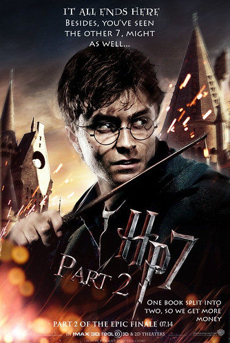
Truthful Movie Poster for HP7pt2

Face it, if you followed Harry Potter from movie 1, you were going to watch the rest of them. I fully support the fact of splitting the movie into two parts because some of the other movies seemed crammed for time, but it’s still fun to give the directors a little grief. They know by splitting the movie in two, they squeaked more money out of out pockets, which is okay. I used Photoshop and found a font that was close to the Harry Potter font, and edited the font so that it blended well with the movie poster. I used the words that the poster provided, and added to it. This is what resuted.
Harry Potter 7 poster

Dora Me?

For [2/15] stars I decided to attempt Cartoon the head! by Feng Chen. “Take any person, thing, or animal and apply a cartoon character head to it.” I really enjoyed this assignment!

I took a picture from my graduation album and then searched for an image of Dora the explorer’s head. I then added both pictures to paint then selected Dora’s head outta the image and then pasted it on my head(: It was a simple assignment and a lot of fun!