Team RAD-Tastic!! Radio Poster- 2 Stars!

Radioposter

The link for this assignment is here: http://assignments.ds106.us/assignments/ds106-radio/

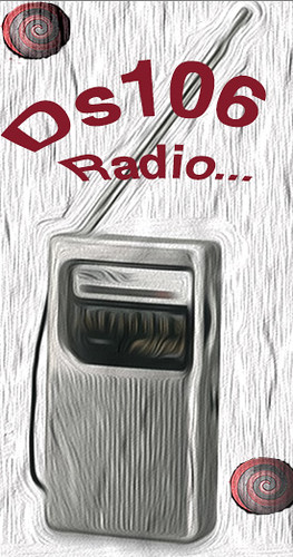
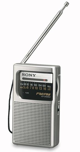
I really enjoyed making this poster for our radio group. I feel like it entertains the creepy aspect of our theme and contains some elements that give it an odd feeling, which is what we want to do. I got the original portable radio picture from a Flickr user Hytok. Thanks very much to you, sir!
Radio Sony ICF-S10MK2

The first thing I did after importing this radio picture into Photoshop was that I added an Oil Paint filter to the picture, giving it that grainy look, which I thought was super cool. I messed around with some of the settings that the filter came with, and gave it that swirly look that you see. A lot of cool things can happen when you just simply experiment with different settings, and I encourage everyone to try this sometime. Even if you come up with something completely crappy, you can always try something different, so, it never hurts to try. Next, I wanted to find a cool font and give it a pretty deep red color that resembled blood. I warped my text after I included it in my design. I thought giving it sort of an upper arc look would be cool, and would make it look almost tired. I added the 3 dots at the end of DS106 radio to give it a daunting feel. Lastly, I found this creepy eyeball on Google, and added that to the design a few times, by playing around with some of the layer settings. I basically used the Magnetic Lasso to cut around the eyeball to make it somewhat unclear what was creeping up in the background of the poster, but alluding to some type of danger that will be signified in the upcoming show. Anyways, this is my creativity for Team RAD-Tastic, and I am proud of it! Enjoy!

All Shook Up! Uhuuhuhhhhh, OOOO, Yeahhhhh! Word- 2 Stars

Word Assignment

I found the assignment at this link here: http://assignments.ds106.us/assignments/word/

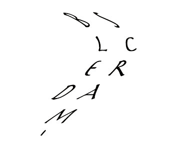
Thanks Rabia Aman for a cool, simplistic assignment! I love playing around with words, and fonts. Simple things such as typefaces can say so much about something. This is what this assignment captures so beautifully, without the need for flashy pictures, or colors, animations, and so on. I probably could have done this in Pages, but I decided to complete it in Photoshop. I wanted to make a word that was all mixed up, kinda like Crabdlsem eggs, ;o. I found a pretty cool font using the Type tool on the left Toolbox. I made the text all warped by clicking on one of the settings up top. The layout here was simple. Plain, white background for the array of letters to be placed on, nothing flashy. Anyways, I think this suits the word I chose pretty nicely, and I hope you all enjoy! As always, love the comments, so please! Comment. Because otherwise…

ZOmBify myself (Don’t be mad Alan!!)- 2 Stars

Zombify Myself

The link to this assignment is here: http://assignments.ds106.us/assignments/zombify-yourself/

I found the tools to complete the ZOmbification here: http://creative.avatarlabs.com/zombieland/zombify/

 
I saw a tweet by Alan debating whether to Zap this or related assignments, and I can’t say I blame him…

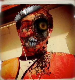
Basically, I went to this Website and “designed” myself as a zombie. I can see his point though, as all it took were uploading a photo and toying around with some zombie effects and overlaying them onto my photo. Needless to say though, I had fun with it, and I think I make a badass zombie.

My Very Own Pokemon Card :) Tres Stars

Courtsideazard

The link to the assignment is right here… http://assignments.ds106.us/assignments/pokemon-card/

So this assignment here was my very favorite one to do. I probably spent the most time on this, being fueled by a load of passion. I can remember spending an unearthly amount of time as a kid collecting Pokemon cards, and battling my buddies in games. We would all bring our cards to school and work on trades, gawk at our holographic edition cards, and duke it out. This assignment really brought me back to my childhood, and gave me a shot at really delving into my creative layer further than I have ever gone.
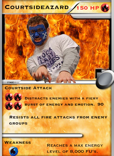
To start my Pokemon card creation, I downloaded a blank card template from the Interwebs to work from. I chose a Fire Card template because, well, they’re sweet. My next step was to get one of my most awesome self-shots from my computer and to upload that to Photoshop. I called upon the trusty Magnetic Lasso tool to select around the perimeters of my body that I wanted to cut out of this photo:
courtside crazies

Cutting myself out was pretty easy. After I did this I cut and copied my selected self out of the original photograph and pasted it into the slide with the Card Template in it. I needed to reduce the size of myself to fit inside the picture space in the Pokemon Card. I did this by going to Image in the Settings bar up top, and went down to Image Size. Here, I reduced the size of the image so that it would fit better when I placed the cut out layer on top of the card template. With me so far? I hope so.

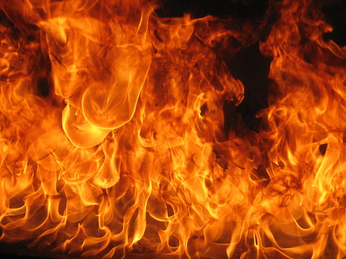
Next I downloaded a picture of awesome flames, courtest of paloetic on Flickr.
flaming gold

I dragged this over to the window with the Pokemon Card and proceeded to use the Clone Stamp Tool in order to clone the flames, and color in the background of the picture area on the card. This was pretty simple, just kind of time consuming, but very well worth it.

The next thing I did was to take the Magnetic Lasso again, and copy the round fire symbol at the top right of the card, and pasted four of those down below my picture. I used old Pokemon cards as my basis for creating this. The rest just included playing around with fonts and making up cool stuff about myself that sounded Pokemon-esque. The round Water symbol I got by extracting it the same as the fire symbol, but from another card, and pasted it into the card window. Anyways, this was the whole process, and I am super pumped that I could share with you all. I’d love feedback, comments, critiques, etc!! Happy blogging!

Design: Missing Persons Poster for Dr. Oblivious, 2 Stars

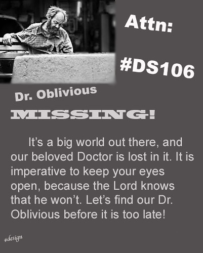
Here’s a nice little poster in regards to finding Dr. Oblivious! Oh no! He’s gone missing, what will we do?!?! I found the assignment at  http://assignments.ds106.us/assignments/missing-persons-poster-for-dr-oblivion/ .

dr. oblivious

First off here, I opened up a blank canvas and entered different pixel values to enlarge the canvas until I was pleased. I decided on a size that was far longer than it was wide. I then chose the Brush Tool in Photoshop and decided on a color that I liked for the background, which was Gray. After doing this I decided to take the picture of the lost looking guy I had found from Google. I decided to post him up in the top left corner of my poster, and I used the blur tool to make the edges of the photo blurred and less distinct. I thought that this allowed the picture of him to blend into the poster well and not distract people. Basically the rest of the assignment I played around with fonts, text orientation, and celever wording for my Design Poster. At the bottom left corner, I put in very tiny text, a design hashtag, so to make my art distinct and unique. Anyways that was pretty much the process.

My inspiration for doing this assignment came from a desire to have some fun with an assignment. I took it as an opportunity to take something that was really a joke in all of its elements, but at the same time, create a serious undertone to it, which I thought that I accomplished in a humorous kind of way. I found another person’s work on the same assignment through the assignment page and really enjoyed their take on it. It can be seen here–> http://wynncissp12.wordpress.com/2012/01/28/missing-the-lock-for-the-key-the-lockman-monster-lost-lockman/

Anyways, that’s all I have for now. Hope you enjoyed!

Design Assignment: Where the H E Double Hockey Sticks did that guy come from?!! 3 Stars

Star Wars/ Hannibal Lecter

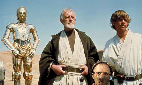
This assignment was super awesome. I’d always wanted to try my hand at something like this, so I felt I had struck gold here. I took a scene from Star Wars with C3PO and company, and decided on added the Anthony Hopkins character “Hannibal Lecter”. I took a picture of his shoulders up to his head with the mouth restraint on that I extracted from Google.
At first, I experimented with placing him behind the shoulder of someone but it did not fit so well. So I moved Dr. Lecter around some more until I decided to bring him down low in the scene. The end result: Hannibal looking directly at you from the bottom of the frame, haunting your nightmares, threatening to EAT YO….!!!

Better late than… post-apocalypse?

A bit late for a radio...

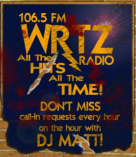
Team RadTASTIC’s radio show poster! Obviously all is not well wherever this DJ is broadcasting from…

It’s the zombie apocalypse, and this is the last radio station you’re bound to pick up for a long, long while.

With that as the theme of our team’s radio drama, I immediately thought of creating an in-context poster for our show instead of an advertisement that could presumably be used to advertise for our show. I wanted to create a beat-up poster that looked distressed and torn, like it’d really been through hell, and it was a blast getting it just right.

First I had to design the original poster. I guess some of the design elements from my Movie Trading Card were still puttering around in my brain, hence the blue-and-gold theme. Not a bad choice, since I had to pick colors that were distinct and easy to read, but that would also clearly show the blood splatters I wanted to put in later. I chose a font that was also really clear and blocky to reflect the top-ten-hits theme of our fictional radio station and added a lightning bolt to the tail of the “R” with the paths tool (something else I had to look up—like the heart monitor line from my first attempt at this assignment, a lightning bolt is a really specific cultural image). Our team came up with the station name “WRTZ” during our second meeting; RTZ stands for “RadTASTIC Zombies,” and the “W” is generally found in front of FM radio station titles. I decided on the band “106.5″ because it reflects the name of our class, and because we have 5 people on our team. DJ Matt and the call-in requests come up in our show’s script and worked excellently as a way to fill up the bottom part of the poster, as well as giving me something to play with symbolically (more on that later). Finally I slapped on a generic radio tagline onto the image in a configuration that mirrored the lightning bolt, stuck a random lens flare filter in to create some contrast, and moved on to messing it up.

Over the summer I downloaded a ton of GIMP brushes from DeviantART in an attempt to incorporate the feel of traditional art mediums into my digital art. The majority of them are worthless, but they do give you some interesting edges if you pick and choose them correctly. I flattened my image, added an Alpha channel to create transparency and stuck a picture of some bricks I’d taken earlier that week behind the poster. Then I chose a brush with funky edges and went about creating a “burned” look for the bottom of the poster. I painted in some dark brown crispy bits, then erased away the rest with my weird brush, making it look like some of the poster was missing. I used a few other wonky brushes to dirty it up a bit, and then added rips in the poster with yet another weird-edged brush. I’m really proud of the rips, actually—I erased the poster layer with a brush that had uneven edges, then created another layer between the bricks and the poster. On that layer I used the same brush to paint in just a little hint of white around the torn edges, the same thing you’d seen on a torn piece of colored paper. I put one of the rips through “HITS” to emphasize the violence of that word, and the second one through Matt’s name. I’ll let you guess why I made that particular design choice; needless to say it’ll all become clear once you listen to the show. ; )

Finally, the blood splatters. I was so relieved to find a simple, straightforward blood splatter tutorial for GIMP, and fiddled with it until I had just a suggestion of serious violence—not enough blood to overwhelm the poster, but enough to clearly indicate that All Is Not Well wherever WRTZ is playing.

Overall, despite how abysmally late this thing is, I don’t think I’ve ever created a piece of visual art I’m more proud of. I LOVE the way it looks and the way it clearly evokes the idea of a post-apocalyptic scenario by playing into well-known cultural tropes. I never like the stuff I’ve made, and while I would absolutely go back to fiddle with it and make it perfect, this is definitely a created thing I’m proud to call mine. : D
Caption!

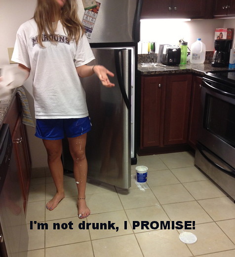
The next assignment that I decided to do was “The Little Caption” …. I thought this was a really funny assignment to design… simply because there are so many pictures that leave you without thought, or that you have NO IDEA what it means. I have so many pictures that I take that I know very few people would understand…. or have any idea what’s going on in the picture itself. I thought I would do one of my roommate….. who actually does a lot of weird stuff. She spilled her yogurt all over the kitchen the other day and basically began whining about it until I came out of the room to see what she did. I just had to capture it in a picture, she looked RIDICULOUS. No one would understand what the caption means… but she’s just the type of person that does weird things.. or has weird things happen to her NATURALLY and people always assume she’s under the influence or just plain crazy. I thought I’d caption it “I’m not drunk, I promise” …. just to create some humor :)

The LITTLE caption

6 votes, average: 2.00 out of 56 votes, average: 2.00 out of 56 votes, average: 2.00 out of 56 votes, average: 2.00 out of 56 votes, average: 2.00 out of 5
Total= 15/15 Stars!

Word

http://www.flickr.com/photos/ericgreenlaw/8065564264/in/photostream

I had thought about doing disorganized, then I thought about doing silly, and a few others like lazy, red (in red font), and long (lllllooooonnnnnggggg), but I liked the idea of backwards.  I just thought it was a cool idea, although not super duper original because everyone does backwards words, but I thought it was a perfect idea for this assignment.

Cartooooooon

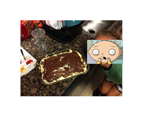
The next design assignment that I decided to do was the assignment that allowed us to cartoon anyone’s face. The idea was to pick a picture of anyone or anything and place a cartoon character’s head as their head. I too a picture of my friend with the cake that we baked earlier this week….. and then I thought it would be very hilarious if I added a funny cartoon face to that picture. I am a very big fan of the cartoon series “Family guy” so I thought I would google search a picture of that and apply it to her face. I know that she will certainly find this humorous…… I had Stewie from the family guy look a little surprised at what he saw in the cake, it kind of looks a bit real!

Cartoon that Head


2 votes, average: 2.00 out of 52 votes, average: 2.00 out of 52 votes, average: 2.00 out of 52 votes, average: 2.00 out of 52 votes, average: 2.00 out of 5
Total= 13/15 Stars!