A Place I’ve Never Been: The Land Down Under

It has been my dream to visit Australia for some time now. Mostly to snorkel in the Great Barrier Reef. I would love to experience the diversity of fish and sea creatures that the coast has to offer. It also has unique wildlife such as kangaroos and Koala Bears. These are the thoughts that went through my head when I came across the assignment A Place I’ve Never Been.

For my collage I included some key elements to Australia. For some reason orange is the color that always comes to my mind with Australia. Something about the sands and the sunset really screams orange to me. I used that as the background color along with an outline of the actual continent. The next element was the Great Barrier reef. It is one of the seven wonders in the world and in the top 5 places I want to visit. I also included the Sydney Opera House because of it being an iconic symbol and architecture for Australia. The last key element was a Kangaroo. Many Kangaroo species are endemic to Australia (meaning they are only found on that continent) and have also become a symbol.

To create this collage I resorted to google images. I knew what I was looking for and carefully chose each picture. I then used Pixlr to crop pictures and place them together. I had first crop the smaller pictures and copy them onto a layer that was the outline of the continent. I then re-positioned each in a way I thought fit. I think used my snipping tool to take a picture of the image so I could add text. I uploaded the image to Microsoft Powerpoint and added a text box. I included the name of the continent as well as the slogan by which it is known for. The typography was quite tricky. I wanted something bold, but nothing seemed to fit. I just kept trying different ones until I came across “Matisse”. It fit the somewhat tribal theme of Australia and really brought the image together.

To find out more about Australia visit here.

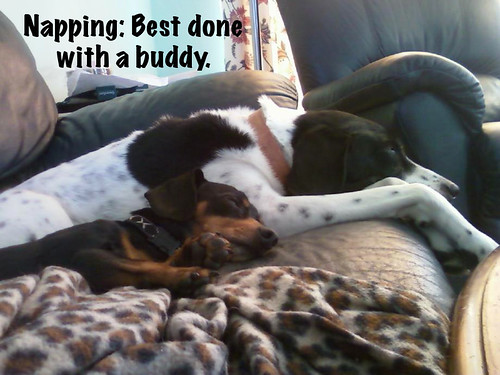
Napping….always better with a buddy.

The Little Caption design assignment I thought was a really cute idea, worth 2 stars.  The first image that came to my mind was of my dogs napping and how they always are cuddling.  Also sense I am tired a nap themed assignment photo seemed fitting.  I found an image that I took of them napping and uploaded it into gimp. I then added a little caption “Napping: best done with a buddy” to help added a theme to the image.

dusty-nike napping

Once the image was created i saved it and then uploaded it onto flickr where I applied the tags: DesignAssignments64, DesignAssignments, puppies, cuddling, nap, and ds106.

TWINKIES – The Debut

From the Your Big Break assignment: You finally got your big break in the Music Industry and you are releasing your first album, and guess what you get to design it yourself. The assignment is to design a new original album cover where you are the artist, you can use any genre and theme you want just be creative and have fun with it. It might even be good to have the back with a creative song list (3 stars)

I used GIMP to alter a painting I scanned in and because the pixels didn’t match up to what I copied the cropped version into I kept the random colors.  The face was put in with a bunch of transparency layers of a screenshot of myself on an oovoo conversation (my friend drew a picture of me and I held the face pose and the layered images show those two parts).  TWINKIES are what Asians are called when they think they are white on the inside.  This is me sometimes.

I used GIMP to crop a picture that I had taken a few weeks ago.  Using the cropped image I played with my hue, saturation, and contrast, and added the soft glow filter.  The text is bolded with minor font alterations for spacing.  A lot of the titles are some things that have recently been on my mind (Samos from my Greek art class, Boom Bible when I was teaching Jill the parts of the Bible, Humpback whales are my favorite and I want to be one, etc.).

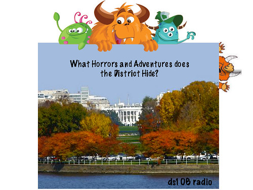
Radio show poster!

I thought the task of making a radio show poster was going to be daunting but it turned out to be actually a lot of fun to create.  The poster was under a design assignment called Ds106 Radio, worth 2 stars.  The radio show that my group is doing is based on things to do around DC and what horrors tourists can face when visiting DC.  For my poster I used an image of DC in autumn and than found a few monsters to place around the image of DC, to represent the “horrors” of DC.  To create the poster I used gimp and placed the monsters as different layers onto the image of DC.  I then added text to it to catch the audiences attention and then also added a ds106 radio label.

Radio poster

I than saved the image and uploaded it to flickr where I tagged it with the tags: DesignAssignments50, DesignAssignments, ds106, ds106radio, and radioshow.


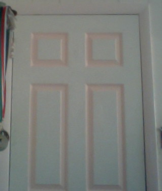
What lies behind…no wait on the door!

I always found hidden letters inside everyday objects to be cool, so when I saw the design assignment, Letters in Your Surroundings, I was instantly intrigued. The assignment was worth 3 stars.  The image I chose to do was of my bedroom door, sense it was right in front of me when I found the assignment.  I took a picture of the door and realized that it had more than just one letter hidden inside of it, it just depended on how you looked at it.  At first I saw just the letter “i” but when I took a better look at the door, I noticed multiple letters hidden including: “A”, “t”, and “ii”.

The hidden letters inside the door

I uploaded the image onto flickr and added the tags: DesignAssignments420, DesignAssignments, ds106, A, t, and ii.

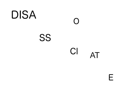
typography worddd

I found this design assignment to be rather cool.  I chose the design assignment called Word, worth 2 stars.  The object of the design assignment was to just use font and the word it self to express the meaning of the word.  I chose to use the word disassociate, which comes up a lot in my classes.  Disassociate, in simplistic terms, means to break apart.  To display the word through typography, I opened up gimp and I used multiple text boxes.  I first placed the first three letters into a text box and then throughout the image I placed 1 or 2 letters of the rest of the word all around.  By dispersing the letters of the word into different regions of the image it helped to show the meaning of the word disassociate, to break apart.

Disassociate

Once the image was saved and uploaded onto flickr I placed the tags: DesignAssignments422, DesignAssignments, ds106, and disassociate, onto the image to help organize where it will be displayed on the internet.

One Movie, Four Snippets

From the assignment One Story / Four Icons: This idea was first suggested by Tom Woodward and has been a long standing popular ds106 assignment, but mis-filed in the Visual Assignments category (see the 80+ examples done there). This is really a design task, so hang ‘em here from now on.  The assignment is to reduce a movie, story, or event into its basic elements, then take those visuals and reduce them further to simple icons, four of them. Write your blog post up but do not give away the answer, let people guess! The challenge is to find the icons that suggest the story, but do not make it so easy. (3 stars)

I drew all of these on paint (that little accessory thing on my computer).

Good luck.  I hope it’s not too easy.  Poo.

2 Stars- MacGuffin-ing it up

This was for the “Messing with MacGuffin assignment that said to change an important moment in a movie.  I can think of no more crucial moment in a movie than the choice Neo, I’m sorry, Mr. Anderson makes in the Matrix.  What would happen if Mr. Anderson didn’t go down the rabbit hole?

I pulled a picture from the movie by taking the picture from google images.  It was really simple from there, just putting in the text layer in GIMP and picking the font (Arial, because it’s a typical font that captions are done in).  Sorry it wasn’t more complicated.

10/15 Stars down, 5 to go!

Letters in your Surroundings…3 Stars

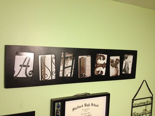
I cheated a little on this assignment, not going to lie. I did this awhile back… a couple years actually. I made one for myself and my best friend Ryan for christmas. We have them hanging in our rooms, his in North Carolina, mine in Virginia, to remind us of each other.

Letters of Ashley

You’ve gotten a little glimpse of my room as well. It’s pretty spiffy.

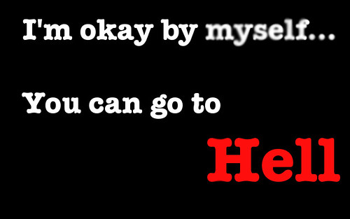
Lyric Typography…2 Stars

I chose to do the lyrics from Go Radio’s song Go to Hell for my Lyric Typography poster.. It’s a song I frequently listen to after a hard break up. It empowers me to move on from hard times. I chose to keep it simple because the song is very straight forward. The poster itself is on a black background with white letters to accentuate the red of ‘hell’. I also chose to blur the word ‘myself’ because the song might show empowerment after a break up but the singer is still broken, faded, lost. I might actually print this out and hang it on my wall. It is a really great song.

Goradio