3 Stars: Coming Soon

This is my favorite thing I’ve ever done.  Let’s just say I’m very proud of the way this turned out.  I decided to do the “Truthful Movie Poster” assignment from the design repository.  Before I go any further, I will say that I genuinely enjoy Clint Eastwood.  I think he’s a very good actor and a good director as well, but man he keeps playing the same character in every new movie he’s done.  So, I remembered that “Trouble with the Curve” came out recently and decided to pick up the poster and try to fiddle around with it.

I started by watching a couple of tutorials on youtube on how to remove text from pictures. It was a longer process than I expected.  First, you zoom in as far as you can into the image and then use the color select dropper (keyboard shortcut O) to pick the color that is closest to the letter you want to cover up.  Then you just use the paint tool to paint over the text (CAREFULLY).  If you look closely at the poster you can still see a few spots where the colors don’t quite match up with the background.  I found this one particularly difficult because the text was portrayed over clouds, which had different colors and consistencies so I couldn’t precisely remove the text.  From there it was just a matter of laying on an extra text layer and bingo!

8/15 Stars down!


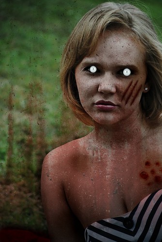
Zombify Yourself… Or Brigid… 2 Stars

I chose to Zombify my friend Brigid because I have a million pictures of her on my computer and I couldn’t find a decent face shot of myself. Plus, Brigid is scary gorgeous as a zombie. I used PicMonkey to Zombify this beauty.

 Brigid Zombie

Creepy huh? Imagine waking up with that staring at you.

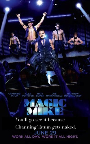
Truthful Movie Poster… 3 Stars!

I chose to do a truthful movie poster about Magic Mike, a movie about Channing Tatum’s career as a stripper before he became the most gorgeous actor on the market. It’s definitely a girls movie, granted I’ve never seen it. But who wouldn’t want to see Channing Tatum take his clothes off!?

Magic Mike

It’s so truthful it hurts.

We Can DS106!

This is 3 star design assignment 367,  “DS106 Propaganda Posters.” The instructions were “Create a propaganda poster for ds106. Use your photo editing software of choice and write a message to inspire your fellow ds106ers.” I edited a Rosie the Riveter poster!

I’ve always been a fan of Rosie the Riveter. She is a cultural icon in the United States even to this day! She represents feminism and all of the women who took over men’s jobs  and worked in factories to produce supplies for the war during World War II. Who wouldn’t look up to Rosie?

I used PicMonkey to edit the poster!  It was pretty simple! So fellow DS106ers, WE CAN DS106! Make art.

I wish I had a Storm Warning

This assignment is called “The Big Hip Hop,” this is Design Assignment 12 worth 2 stars. These are the instructions: “Take any photo from The Big Picture and overlay it with lyrics from a Top 100 song. Similar to The Big Caption project. “


I chose this photo of South Korea getting hit by a typhoon because as soon as I saw it I thought of the song “Storm Warning” by Hunter Hayes. In his song, the “storm” is actually a girl, but it still works! :)

This is the chorus:

She’s a beautiful mess
The kind you love to love
But what happens next
I got a feeling when the sun comes up
I’m gonna wish I had a storm warning
I’m gonna wish I had a sign
I’m gonna wish I had a little heads up
Little lee-way, little more time
Some kind of radar system
Locked in on love
I got a feeling by the time the night finds the morning
I’m gonna wish I had a storm warning

I used paint to create this photo. At first I just had all the lyrics typed in regular formation, but I hated it. Then I decided to try to make the words “storm warning” look like they were flying in the debris, but that looked stupid and you couldn’t tell what it even said. So finally I tried to break it up some just making “storm warning” different. I like this design much more! It is so much less boring. I do wish I could have made it look like it was flying in the debris though.

An App That Can Save A Life

Being an Emergency Medical Technician (EMT) and spending nearly ALL of my time outside of school volunteering and working in the Emergency Medical Services(EMS), I thought it necessary to create an app that can save someone’s life:

Okay, well that’s actually a snapshot of my phone and some of my apps, but the one in the bottom right (A.E.D.) is the one I created. A.E.D stands for Automated External Defibrillator. A.E.D.’s are a simplified device that provide a shock to a patient that has gone into cardiac arrest. In Cardiopulmonary Resuscitation (CPR) classes, you are taught how to perform CPR and how to use an A.E.D. You are also taught that in the event that someone collapses, the first 10 minutes of someone who has experienced cardiac arrest are the most crucial. With this app, you can not only call 911 with your phone, but you can also begin life-saving procedures with your A.E.D. App. Depending on where you are, the response from an emergency crew may be upwards of 10 minutes and that means you could turn the tide of events by being proactive with CPR and this app.

How is this going to work? Don’t you need pads to shock the patient? I present iDefib Pads:

The iDefib Pads use an iPod, iPhone, or even iPad dock connector and draw energy straight from your device. The A.E.D. App and iDefib Pads are fully compatible. Cross platform for Android, Windows, and Blackberry devices coming soon.

15/15!!

Images used: iPhone Connector, AED Pads, AED Logo

Wait, where’d Big Bird come from?

Since the only thing anyone got out of the debate last night was that “Romney hates Big Bird” I decided to make a picture for “Wait, where’d that guy come from?” of Big Bird and Romney about to debate.

I started by finding pictures of Big Bird and Romney before the debate with Obama. Then I selected around Big Bird in his picture and copied and pasted him in GIMP from his image to the debate image. Then, I went behind Big Bird (whom I placed over Obama) and used the “clone tool” over him, stamping with the blue background (which is why it looks so funky). Then I went over the blue with the blur tool because it looked wonky (still does) and made Big Bird visible.

Romney is such a silly goose… er bird.


To Kill A Thunderbird

Is not a popular novel, but To Kill A Mockingbird is, and that is the book I chose to recreate. The assignment was to create a computer book for kids. Some examples can be found here. I know To Kill A Mockingbird isn’t exactly a “kids” book, but it is a well-known and awarded novel. From there, I took a lesser known email software, Thunderbird, and combined them to create To Kill A Thunderbird. I went online and used the cover of the book and the Thunderbird logo and came up with this book cover:

I started by editing the original mockingbird off of the cover by selecting an area of blue and re-pasting it over the image. I then dropped in the Thunderbird logo and flipped it around so that it would look like it was flying away from the nest. The next task was changing the title. Sure, I could have went and found the text online for it, but instead I just used the existing letters in the title. The hardest letters were the ‘H’, ‘U’, and ‘E’. I had to steal the ‘H’ from Harper and then change the color. For the ‘U’ I took the ‘O’ and chopped off the top and tried to color in the bottom with the orange color. Lastly, for the ‘E’, I took the ‘I’, copied it 3 times and cut those mostly in half and rotated them 90 degrees. Surprisingly using GIMP to do this assignment went very smooth, phew!

13/15

Visit Buddy in the North Pole!

This is 3 star design assignment 57, “Minimalist Travel Posters Based in Movies.” The instructions were “Create a minimalistic travel poster for a location in film, TV series, etc.

I decided to create one for the North Pole. I love watching Christmas movies in the winter! Elf was my inspiration for this project. It was kind of hard coming up with a fake place for my poster, but I gave it some thought and decided why not the North Pole! The North Pole always looks like so much fun! I used to want to be an elf that worked in Santa’s workshop. (I was a weird kid, I know.) I used Paint to create this. The grey curvy area is suppose to be the frozen water for ice skating. I did my best to make it as simple as possible.

Lillian is really doing it!

This is 4 star design assignment 448, “Movie Trading Cards.” This assignment was to create a trading card for our favorite movie! I chose Bridesmaids, shocker I know.

I used PicMonkey to create my trading card. I chose the scene where they all get food poisoning and Lillian goes outside to find a bathroom. She doesn’t make it to one in time, so she just uses the street instead. It was very funny because all this occurs with Lillian in a WEDDING DRESS. I tried to give my card a girly touch since it is a girly movie, but a girly trading card just seems weird. It isn’t as good as Jim Groom’s trading card, but I am okay with that.