A Tale in 4 Pictures

I came across the One Story/Four Icons and thought it looked really cool and a bit challenging. You come up with 4 distinct elements that describe a story. The challenge for me was to come up with a story I could come up with 4 different elements that would describe it. I went through a few of the recent movie stories, but none of them worked out the way I wanted. So, I went into my memories of the oldies but goodies and got to work using clip art from Microsoft Word.  I’m not giving the answer out so guessing is good!

Guess away!!

The Truth is Out

Movie posters never tell the truth. They are meant to compel you to come see the movie. When I cam across the assignment to reveal the truth, I knew I had to do it. I’m not sure why, but when I saw this assignment the first movie that came to my mind was Friends with Benefits. In the end, the two “friends” do end up falling in love. But, in the movie poster you aren’t supposed to know that until you watch it. I decided to go ahead and reveal the truth about this movie.

First, I googled the movie and got the original movie poster. I then uploaded it to pixlr and edited out the title. It turned out to be very convenient since the title was on a black background. I then saved the image and uploaded it into powerpoint. I played around with fonts for a bit, but couldn’t get the exact one. I got one that I think is pretty close. I changed the colors to match the original title and then saved it. It was quite a simple process and the results are great!


3 Stars: I choose you!

So, for today’s assignment I chose to make a Pokemon card for a cool, breezy 3 stars.  We had to choose a good picture of ourselves and imagine ourselves as a Pokemon.

Here is the Wino’s pokemon card.  Abilities include my unique ability to not give a shit (note, not actually a unique ability).  Also, I enjoy cooking/baking.  Here’s something else I made today, although I did not injure myself today.

Yeah, the braids suck. Deal with it.

Hey girl, let me challah at you. HAHAHAHA I’M SO FUNNY AND ORIGINAL.

Gonna go through the steps it took for me to make the first masterpiece.  First, I chose a card from this site.  I heavily used the tutorial from G O’Brien’s blog here.  It was not easy, but I really had a lot of fun messing around with the clouds feature in the filters-> render menu.  Unfortunately, I couldn’t get the text at the top to work properly.  I couldn’t quite remove just the text from the image.  I think a better option for me to do would be to use the rectangle select tool and just delete the entire text top part and then try and replace the color with another cloud layer.  But, alas, I didn’t have the foresight for that.

5/15 Stars down.  I think the designs are getting better. Kind of wish I had saved this assignment for later in the week so I could keep improving.  Oh well.

WRTZ Poster

I don’t want to spoil the show or anything, so don’t continue reading if you plan to listen to our show!!


But if it’s necessary, we were required to make a poster for our radio station this week and this is what I came up with!


So I don’t want to give up many details from our show, but you should get the idea. This poster actually took some effort…and tons of frustration. I almost quit on GIMP today because it wouldn’t do what I wanted it to. Thankfully what I couldn’t do/figure out in GIMP, I was able to do in Paint. I’m proud of the headphones I was able to get on the zombie, and even more proud of stealing the XM symbol and converting it to DS106…DS106 RULES!! LISTEN TO OUR SHOW!

7/15

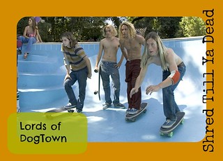
Lords Of Dogtown

Lord of Dogtown trading card? I think YES! Lord of Dogtown is a classic movie about boys trying to make it big skating. I picked a scene where several of the main characters are “shredding” or skating a drained pool. I used picmonkey.com to create this trading card. I gave the picture a boarder to create the card look. I then added some words and the name of the movie to make it legit.

lords-of-dogtown1


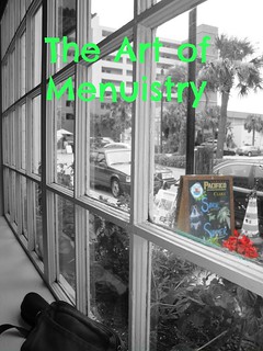
Weird Book Name

The art of Menuistry : what is really behind those random drawings on a sidewalk menu. This book has all the answers to those deep questions. Honesty, this was just random inspiration. I took a picture from my photo album that with a unusual angle. I used my photo splash app to highlight a random part of the picture. Then, just made a name that would make anyone say “REALLY!?..Why?”

menubook


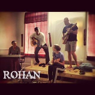
Rollin at Rohan

This past Saturday some of my friends made breakfast at their house. [Props to the Chefs]. Somehow we ended up performing. Gilly on the Ukulele, me and my one note show on the piano, and Q. and Ryan on the guitar.  So when i read the design assignment of making a album cover. This picture was my first thought. We may not be the best, but at least we look cool. :)

Rohan


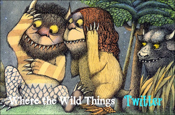
Children’s Book Remix

I’ve now used Where The Wild Things Are twice for a blog post. I guess that’s one of my favorite children’s books. Haha. Well I used a different picture then the book cover for this design assignment. I decided to use one of the pages from the book. I thought the expressions of the monsters went with the remix. I changed the title to “Where the Wild things Twitter”. I wanted to make it “Tweet”, but i didn’t think that was exactly what the assignment was asking for. I imagined if the monsters from this book had a twitter, the things they would tweet would cause similar faces to those in the picture.

WTWT Twitter


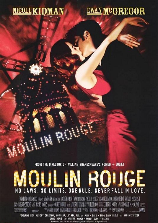
Moulin Rouge and Forcing You to Cry.

Mine:

IfMoviePosterTold

The Original:


For the record, I love Moulin Rouge. Seriously. The flashy dances, the taboo life of a prostitute, and the music mash ups. Except the sad ending. I won’t ruin it for you, but you’ll cry if you have a heart. Anywho, I correctly changed the tag line from “No Laws. No Limits. One Rule. Never Fall In Love.” to “No Laws. No Limits. One Rule. Cry.” by using the paintbrush tool in Gimp and painting over the original in black to blend in and then using the text tool to “fix it”. I found the original poster here, and naturally, the assignment here.


Ds 106 Poster/Ad

DS106Radio

Our radio show is obviously going to be about autumn and “everything nice.” I first googled autumn trees and found the background and decided I had to involve pumpkin spice in there some where. Then, for my ad/poster, I pretty much plunked everything on the same picture after cropping it and added a cute little saying: “Fall into Autumn”.

I think it gets the point across quite nicely.