2 Stars: The Tragic Tale of Mr. Wine

Tragic Tale of Mr. Wine

It was early morning on June 6, 1991 when the tragedy of Nathaniel Francis Wine began.

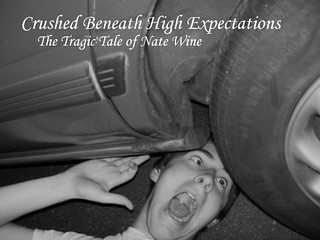
For this assignment, and to kick of design week, I chose to do the assignment “Design a Cover of your Autobiography.”  It was a fairly easy assignment: just choose a picture that you think summarizes who you are.  Naturally, I think who I am somehow involves being crushed beneath the wheel of a moving vehicle.  This was a photo I took back just before I graduated high school in 2009.

I chose to desaturize the color in GIMP because I felt it added a rustic feel to the image, as if I really had passed on and this was my surviving autobiography.  Then I came up with the title and made sure that the white text would stand out against the gray background so that the reader could actually, you know, read it.

2/15 Stars down.

ROAD TRIP

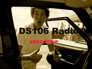
Our Ds106 Radio group decided to do our broadcast themed as a road trip. ( So be getting excited for that!). I designed a Poster for our radio show using picmonkey.com. I upload a picture of my boyfriend Nathan from a trip to OBX. Then, used the “add text” option on the website to put words to his expression. Which, I personally think is hilarious.

Ds106 roadtrip


DesignBlitz

It took me a few days to ponder about the designblitz. I had to first think about which elements I wanted to do and if I could do them effectively (or ineffectively to prove a point). I first started by reading the assignment document and looking at a few examples. However, the examples didn’t really give me any good ideas. There were definitely some cools ones, but no inspiration came from them. So I just randomly started taking pictures. Some I liked, some were trash.

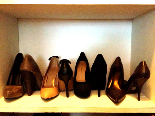
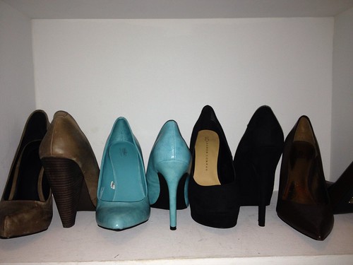
The first picture that I took that I really liked was the one for color. It says in the document that color is really supposed to catch my attention. Well, as I was walking down the sidewalk I slipped off the side. It was a bit embarrassing, but I noticed the bright yellow that should have been my warning. I decided that was going to be my color picture. From there out I started noticing these elements everywhere. When I went into my closet to do a bit of cleaning I noticed my shoes were arranged in a rhythmic pattern. I also noticed that I had a bright pair of blue shoes. I decided to test color out again and put the bright blue shoes with my other neutral colored shoes. I included both color pictures, however I like the sidewalk one better because it really is meant to draw your attention (could also be function). The next picture came to me easily. As I was reading through the document I came to the section on function. It is supposed to be of an object that conveys its meaning or the opposite of what is supposed to do. I have many wine bottles being used as flower pots sitting around my apartment. Technically, they aren’t supposed to hold flowers but they sure do make a cute flower pot. The last picture I had to search for. I wasn’t sure what element to do, but as I was walking down our hallway I remembered our wall art. We have these inspirational quotes all over our apartment also. This one happens to be my favorite, not only because of the pretty font but because of it’s meaning. I used this picture for typography.

Most of these pictures I uploaded to pixlr and adjusted the hue and saturation and color balances. But my iphone takes such good pictures that nothing else really needed adjusting.

Rythym

Function

Color#2

Color

Typography


The next step is to add my examples into the assignment document!


THIS Is What I Do

Chugging along the DS106 Design week, I created the lovely “What people think I do” meme. Staying true to the Emergency Medical Services, I created this:

Okay, so I cheaped out and used a meme generator that was given on the Assignment page. I originally was going to make my own…until I went to the page for reference and realized they had a link to the site where you placed your photos and wrote your text and it placed it! Sure, this would have been a quick create in GIMP, but why pass up an opportunity to just drop in some photos and have the computer do the work…that’s why we have them, right?

I don’t think the meme needs an explanation, but I’ll give one anyways. First, when we’re not on calls, we get a lot of down-time. So we wash units, tidy up the station, watch TV, pose on ambulances…yeah. Second, it’s not only the police, but most people think we drive super-fast like madmen…well there are some people like that, but it’s not encouraged. Third, since some of us are volunteer, the Fire Department thinks we’re a bunch of idiots and we kill people…NOT TRUE. They are just pissy because a good fire comes few and far between. Fourth we have the public. ALL of my friends outside of EMS think I’m some kind of god and can perform miracles. Although we do some pretty awesome stuff, it’s really exaggerat….scratch that, it’s true, we create miracles. Fifth, the Emergency Room staff HATES us because 95% of our calls aren’t “true” emergencies…so yes, we are somewhat of a $$$$taxi service$$$$ Lastly I chose a picture that shows cooperation between Fire and EMS and what we do.

5/15

It’s That Time Of Year!

I bring to you…

Fall Leaves

and of course, everyone’s favorite….PUMPKIN SPICE LATTES!!!
Wait, seriously? That’s what time of year it is? (Well, yes, but..)HELL NO!!!!
It’s time for zombies, guts, and horror!

Check this out:
The Walking Dead returns to AMC on October 14 at 9p! YES I CANNOT WAIT!!!
and
Paranormal Activity 4!! Saw a preview on TV the other day, sweeeeeet!

But that’s not why I brought you all here, we have DS106 Week 6! Also known as Design week, and I chose to turn myself into a ZOMBIE!

Haha, YES! And this was sooooo simple! What a great way to start my design week. And, if you go to the site which is recommended, you may get a laugh at the fact that it is still advertising Zombieland! (On a side note, Emma Stone is a TOTAL babe) This assignment could not have came at a better time of year!

2 stars down, 13 to go!
2/13

Bridges

I did the letters in your surrounding assignment this week

“Create your name from objects in your environment. Use either Creative Commons images, ones of your own, or a combination of both to find the letters of your name hidden in your surroundings. ”

For this assignment I decided to give myself a theme: Bridges. I really enjoy traveling and I think this photo portrays that, I’ve actually seen at least on of these bridges, maybe more.

I used photos of bridges I found through a search on the creative commons site, saved them to my computer, opened them in powerpoint and then took a screenshot of the photos lined up. This probably was not the best way to create the project but I don’t have any photo editing programs on my computer (yet) so it was the first thing I thought to do.


DesignBlitz

So I did the design blitz, a majority of it in the library and I’m sure some of you were judgin’. I learned a lot though


My example of Typography:

USA Today

At first I didn’t think this was typography. But the font and the design of the person sitting in the seat make it look like examples of typography I’ve seen. I believe this is influential in the “design” world simply because typography is popular on the internet and therefore younger people would recognize it and it would grab their attention. This example emphasizes the name of the newspaper by the large and plain font and then the date in blue below it.

Also, I should have rotated it before uploading it. Whoops.

My example of (Lack of) Color:

Paris.

I think sometimes the lack of a design element can make something stand out. For instance, that is what made me buy this lovely poster of the Eiffel Tower. It makes things stand out. Obviously, the addition of color would help the viewer understand your message. For instance, the black and white makes it seem “quaint”, but if you added color and turned the saturation way up, it would attract a younger viewer because of the almost neon colors.

My Example of Metaphors:

Oh Lord Baby Jesus...

So I saw this leaving the bathroom. Naturally it is a metaphor of a stick man running for a fire. In case you haven’t seen this, you need to because I stood there and sang “Oh Lord Jesus, there’s a fire” while taking this picture. I’m sure I looked crazy. Anyways, a metaphor portrays exactly what the creator meant to the viewer (run from fire by taking the stairs). They’re important in design because everyone can tell what is meant by the picture and you don’t need to read into it.

My Example of Minimalism:

Apple Logo.

The Apple logo is the epitome of minimalism. Only one little lit up apple and that is all. This is important to design because minimalist designs are not only eye catching, but in today’s society, they are very popular. The only problem is that they take more thought on the viewer to know what you as the creator are thinking.


All Things Must Change

A design assignment I really liked was Design the Cover of Your Autobiography

“Design the cover of your autobiography. What pictures would you include? What would you title it? “

My autobiography would be titled “All Things Must Change” and the cover picture is a photo of changing leaves in the fall that I found through the creative commons site. I like that the photo is focused in front and blurry in the back, which to me symbolizes not knowing what’s coming next.

My autobiography would be a story of change. In the past few years my life has completely changed in ways I did and didn’t expect, and I know more change is coming this year after graduation. Life is always changing, and my story would be about recognizing opportunities and challenges are usually temporary in the grand scheme of things, and making the most of both while you can.

I realize this explanation is a little cryptic, if I actually wrote the book it would be more clear, but that’s the jest of my theory on life.

I made the cover by uploading the photo to Picasa and adding text. I choose a  simple font as to not take away from the photo and made it green to be visible, but cohesive.

Switch It Up

Lightswitch Art

“Create a work of art that incorporates the switch into the art.”

I think of light switch art as something you would see in a child’s room, after that thought I remembered the Daily Create last week where we had to draw our favorite animal, I drew an Elephant, which was more difficult than I thought it would be. So, for this project I decided to look up how to draw a cartoon elephant. I think it turned out well, It would look great in a zoo themed child’s room.


What Pre-Vet Students do…

I have always loved the “What I think I do” memes. They have always made me laugh. I even find myself relating to them sometimes. I loved the idea of creating your own. I decided to do a Pre-Vet student from my point of view. There are ones of med students, Veterinarians, and doctors, but none on an actual Pre-Vet student. I do believe that everyone has a different view of jobs in society. My friends really do think that I scoop poop all day. Granted, it does come with the job, but that is not the main thing I do. My parents really do ask me “how was playing with the dogs all day?” when I come home from work. Another thing that is part of the job, but not the main thing. I have my reasons for doing this job. When I was young all I wanted to do was hug a tiger. I now know that is probably not going to happen. But it was what really started this pathway for me. However, in the end as a Pre-Vet student the main thing I do for now is study.

To create this meme, I decided not to use the creator, but to make one on my own. It turned out the same, I just preferred not to use it. I actually just opened up powerpoint because I know I can manipulate the pictures and fonts easily. I just put the pictures (graciously used from a few google searches) and the wording together and BAM, it was created. I think took a snapshot of the actual slide with my snipping tool and saved it. I came up with the pictures from actual experiences of people trying to relate to “what I do”. They came to me quite easily. I wanted to use a simple bold font, and Aharoni won out that contest.