Normal To Extrordinary: The dot effect

I really liked the assignment for Normal to Extraordinary. It creates normal pictures (of extraordinary people) into something different. I knew I immediately wanted to do my best friend, so I went through the pictures I have of her and came across one she sent me when she was bored one day (accompanied by pictures with “I” and “you”). I really liked this picture because it describes her. She is such a sweetheart. I used Pixlr again and started playing around with effects. I came across the “pointize” effect and thought it looked like an old pop culture painting. I took the background out and added the pointize effect in purple. But, I didn’t like the way it was just one color, but I didn’t want to add to much since it was already quite a busy picture. So I decided to change some of the white dots into pink ones. I also highlighted the heart and made that pink too. At the end, I randomly added in a swirl effect which made everything much more smooth instead of so harsh cut. It was just a few simple adjustments but I think the combination of the effects and the colors really turned out cool!


Adds 3 more stars: 5 stars down, 5 more to go

A hint of Color

I have done a few color splashes in the past, and they have become one of my favorite assignments. I have done a Cinderella slipper, Little Red Riding Hood, and of course my dog. I wasn’t sure what picture I wanted next but started going through my pictures and looking around my room to see if I wanted to take a picture. I finally came across this picture of my boyfriend. He was wearing an all black uniform, and of course lucky pink socks. It made me laugh because it fit s him perfectly. I decided I wanted to highlight his pink socks. When I did these assignments before, I had all kinds of software on my lab computer, but I don’t have this software anymore. I ended up googling “photo editor” and came up with Pixlr. I uploaded my picture, but couldn’t find out how to turn just his socks pink. I ended up trying to use the “bucket” tool. It turned a little more of his leg pink because of shadowing, but I thought it looked really cool, so I kept it! It has sort of a rustic appeal to it (if pink can be rustic) which I think fits perfectly with the somewhat fuzzy picture.


2 stars down, 8 more to go!

Returning to the scene of the crime… of cute!

photo-1
photo

I couldn’t decide between the two of these pictures. One is of just me, at 2 years old. The other is of my brother and I before school one year, don’t know how long ago.

The theme is GREEN!

This is visual assignment 615. The directions were “Make an alphabetically themed collage. Compile images to represent each letter of the alphabet within a chosen subject area or theme. Create a collage. ” My theme is green! To make this collage I used GIMP.

First, I found all of the photos I was going to use and saved them in one folder. (I renamed them so they would be in alphabetical order, this made is A LOT easier.)

Now, open GIMP. Click on the “File” tab and go to “New”

This dialogue box should pop up, you can change the Image size to whatever you want. Then click “ok”

Now you should have a beautiful white space to work with:

Next, click on the “File” tab and go to “open as layers”

Highlight all of the photos you wish to use, then click “open”

Now you should have 26 layers of photos! (AKA pure chaos!)

Now all you have to the is move, scale, and rotate the photos however you want. (The tools move, scale and rotate are circled below)

Just keep playing around with it until you get the product you want!

This is what my collage ended up as:

I hope this helps you make GIMP collages!


2 Stars… Splash the Color

N. Ready to Party

This child is my favorite. He is perfect. Minus the drool coming out of his mouth in this picture. We had a formal dinner on our cruise this July and his mother dressed him in a tuxedo onesie for dinner.

An Album Fit for a King

The Golden Path

Oh boy, getting a jump start on this weeks assignments!  Ok, so I decided to try my hand at the “An Album Cover” assignment from the visual assignment archive.  It was only worth two stars and wasn’t too hard.

I started off by randomizing a wikipedia article.  Unfortunately I kept getting song and band names; I must’ve gotten 3 in a row.  Finally, I came up to “The Golden Path,” a chinese television show.  Weird choice for a band name, but I’ve seen weirder.  Then, for the quote that would be the album name: I ended up getting Oprah Winfrey’s quote.  Finally, for an album cover I picked “All in a Row” from flickr’s last 7 days feature.  From there, it was a really simple process of importing the image into Gimp, cropping it, and then adding in text using the text feature.  Mini-rant time! I don’t really like the text feature in Gimp.  It feels as if there should be more features.  Really all I could do was play around with where I placed the text and what color and font I wanted; there were no options for text placement, like vertical text, or any really cool features to make this stand out.

Because of these lack of features, we’ll say that The Golden Path is a relatively new band struggling to get on its feet.  They’re a kind of midwestern emo, twinkly kind of band, although they do have some poppier songs.  Hopefully they find their feet in a genre that is dying out.

How to draw a horse!

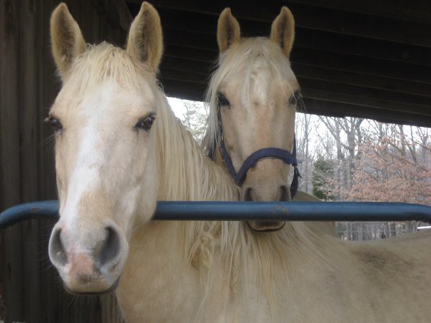
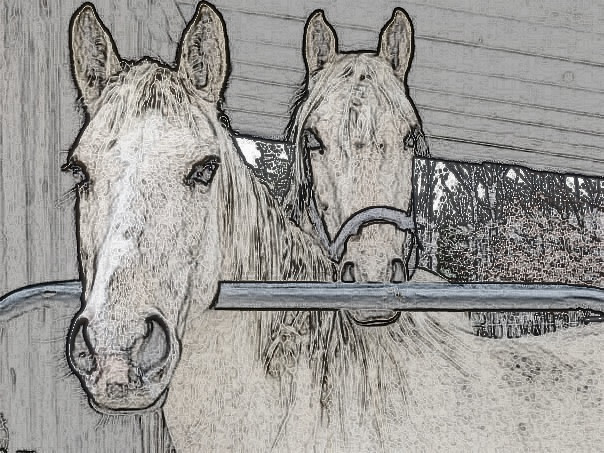
This is my assignment and tutorial (using GIMP) for the 2 star Visual Assignment, Draw it. I hope you find it helpful!

DRAW IT BEFORE

I used GIMP to transform a photo of my horses into a sketch!

First, open gimp and drag the photo you wish to use into the GIMP screen. Now click “duplicate layer” under the “Layer” tab.

Next go to the “colors” tab and choose “desaturate.” (When the dialogue box pops up choose “lightness” and click “ok”) All color should now be gone!

Like this:

Now click on the “filters” tab ? “edge-detect” ? “edge”

Once you do this, a window will pop up:

You can play around with the Algorithms if you’d like. I chose Prewitt Compass. (They are all about the same) When you choose the algorithm you want click “ok”

Now your screen should look something like this:

Looks creepy I know! But we aren’t done quite yet!

Next, you need to click on the “colors” tab and then “invert”

And you get:

Yay! Much better!

Now if you want to take it a step further and add a little bit of color:

Go to the “Layers-brushes” window…

Now make sure the layer you manipulated is selected and lower the opacity from 100% (I lowered mine to about 70%)

And now we have our final product!

DRAW IT AFTER

I hope these directions help, Please let me know!


3 Stars worth of Gif

Here, enjoy a gif of my dog biting me. I love him but he’s a pain in the butt.

Photoblitz pictures/experience.

Phew! This photoblitz was stressful.

When I started:

Time I started

Take a photo of two things that do not belong together:

Pumpkin and Pens

Take a photo of an interesting shadow:

Soda Pop Top

Take a photo dominated by a single color:

Pink Make Up and Post Its

Make an ordinary object look more interesting, almost supernatural:

Supernatural Hairbrush

Make a photo that is abstract, that would make someone ask, “Is that a photograph?”:

Highlighter Marks.

Time I ended:

Time I ended.

This was kind of stressful. I chose to do this in my dorm room because I could run around without people judging and staring at me holding my dinky dumbphone (opposite of the smartphone, of course) taking pictures. Also, I would have resources to use. It was fun though, running around my room, throwing things on the floor to use in the pictures. The easiest photo was the single color one because I have way too much make up and I could just throw my pink stuff on the table with some post its. Plus I feel like this was the best one.

5 Sound Story

I had fun with this assignment as well. It look a little bit of maneuvering concerning how to time each sound, and what sounds would be effect when underlain. It also took some time browsing www.freesound.org  for sounds relating to the story I wanted to portray. It isn’t anything out of the ordinary, or super spectacular, but that wasn’t what I was going for. I wanted to lay out something was very simple, yet so known to us that it became almost beautiful. I hope you guys enjoy listening to it!


Sounds of Morning

http://assignments.ds106.us/assignments/sound-effects-story/