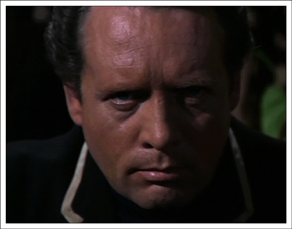
“Number 6 Ain’t No Comic (first attempt),” animated GIF by @aforgrave
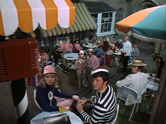
Bill Smith (@byzantiumbooks, on Twitter) tackled the Visual Assignment 341: Comic Book Effect earlier today, and the actual task itself popped up on my screen this evening as I was poking around in the Visual Assignments looking for my next challenge. I know I have an iOS app on my phone (called Halftone by Juicy Bits) that effortlessly creates this effect — I wanted to approach the task from closer to first principles rather than relying on a purpose-designed app.
I’d experimented with the halftone filter in Photoshop once or twice before, to it didn’t take too long to locate it and obtain the result displayed above. Essentially, the effect creates four different coloured images of dots and offsets them to created the pixellated look that is so familiar in comic books. The eye recombines the colour layers to create the colour-blended image that results. I did a bit of research just now and determined that the dots originally used in the 50s pulp press were known as Ben Day dots — in that implementation, the dots were all the same size, resulting in a very characteristic look. With halftone, the dots vary in size or spacing (from very small on a gradient up to very large) which allows for a more continuous and even transition.
Photoshop lets you select the maximum radius of the dots, which determines how “fine” a detail your image will have. In the original 631×480 MPEG Streamclip screen image, the ratio of smallest maximum pixel radius (4 pixels) to image was too large — it was too difficult to get a fine enough detail. So I scaled the image size up (Image>Image Size) so that the relative smallest maximum pixel radius ratio would be smaller (follow?) and was able to get a finer halftone from the same image.
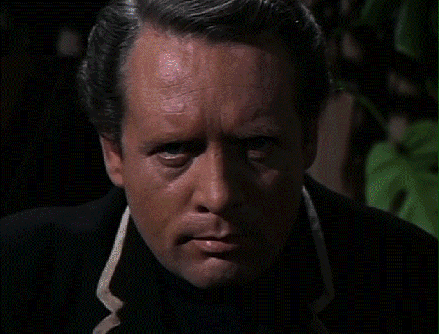
“Pixel Composition,” animatedGIF by @aforgrave
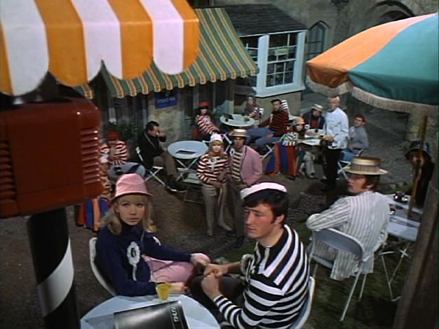
After fiddling around with the maximum pixel radius and the image size, I took a look back at the assignment description. I noticed that there were a couple of tutorials for the assignment. One was no longer available, and the second one was done using Picnik and Chogger. However, Picnik closed up shop in 2013, and Chogger was only used to add speech bubbles. So I searched for “halftone comic book effect using Photoshop” in Google, and immediately noticed an identical image in the Google Image results to the one that sits in the thumbnail on the Comic Book Effect assignment’s page. Following that image to its source page led me directly to “Give Your Photos a Retro Comic Book Effect,” which I will now apply to the original image for comparison.
Tutorial Exploration
- Start with a fresh copy of the image.
- Apply Image>Adjustments>Levels, (I liked setting Input to 29/1.22/94, which seemed to give a nice contrast.)
- Apply Filters>Artistic>Film Grain, with settings Grain:4, Highlight Area:0, Intensity:10 as suggested
- I then created several duplicates of the original photo layer, in preparation for step 5..
- Applied a different filter radius (trying maximum pixel radii of 4, 8, 12, and 16) to a each new layer.
- Added a light frame, black border, an orange radiant-filled top caption box and a white bottom narration box.
- Downloaded and installed the font Digital Strip and used it to add a caption and narration. The leading red M was created by increasing the font size, choosing font colour of red, and applying both a stroke and drop shadow effect from the fx menu.
- Used File>Save for Web to create a png file for each halftone variation.
Here are the various results:
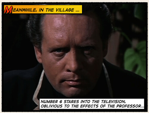
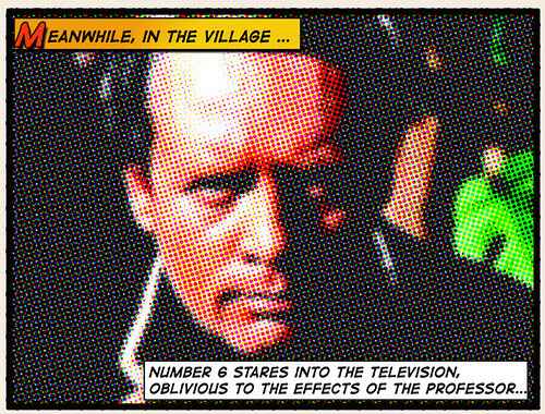
“Meanwhile, in the Village PRE1″ by aforgave, on Flickr.
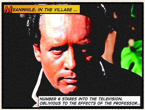
“Meanwhile, in the Village PRE2,” by aforgrave, on Flickr
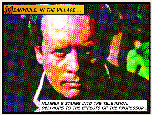
“Meanwhile, in the Village 4,” by aforgrave, on Flickr.
“Meanwhile, in the Village 8,” by aforgave, on Flickr.

“Meanwhile, in the Village 12,” by aforgave, on Flickr.

“Meanwhile, in the Village 16,” by aforgave, on Flickr.
What the Heck, Let’s Try the Halftone App
For comparison, I uploaded the original photo to my phone and experimented with the Halftone app. It was very easy to replicate the elements, albeit with slightly less control over some specifics of the finished product. Dot size and strength are easily adjusted with sliders, which allows for a rapid experimentation. The app also applies the frame, the border and makes for easy creation of the caption and narration boxes and text. It also applies a rustic antique look to the image.
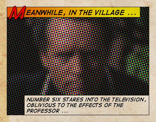
“Meanwhile, in The Village (Halftone app),” by aforgave, on Flickr.
In Closing
Wow, that was quite a bit of work for 1 Credit Unit. But maybe the value obtained from the learning and the exploration is sometimes more valuable than the actual credit obtained.
BCNU


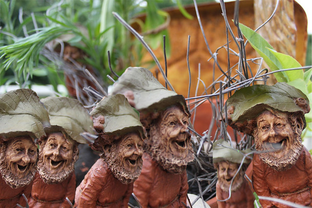
 Icelandic Week at the Bovine County Fairy Tale Festival seems to be causing multiple sightings of wee forest folk! Cousin Ron has hinted that we are not alone in Bovine County – but I am seeing more elves, fairies, and gnomes than terrestrial beings so far.
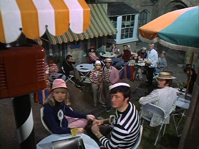


