A mysterious vacation

Screen Shot 2015-01-26 at 7.37.16 PMScreen Shot 2015-01-26 at 7.37.16 PMScreen Shot 2015-01-26 at 7.37.16 PMScreen Shot 2015-01-26 at 7.37.16 PM


So for this assignment, Mariah and I worked together to show a little bit more of the story behind Bev and Damon. In this instance, Bev takes Damon on a trip to Bali as a sort of mea culpa. However, as is the noir106 way, things get a little mysterious: the trip was not completely agreed upon; Bev opens up, but not too much; and eventually she disappears.. but not before getting the information she wants from Damon.

Check out the trip here.Ā 

This was fun because Mariah and I came up with the idea together and worked on a few different assignments to develop this story. When we say this was collaborative, we mean that we literally sat next to each other and worked on a bunch of different assignments all centered around the idea of this trip.

It was fun to work with someone else and find ways that our characters could intersect and work together to create some cool content. For this, Mariah and I worked together to find the photos, and I took lead on writing the dialogue that went with our story. Be sure to check out our other assignment posts this week for more information on how this story developed…

Rigged for Pleasure

Victoire Absinthe glared at the paper back she held in her hands. It was her newest romance novel, “Rigged for Pleasure”- it was trashy and terrible but housewives bought it up like hot cakes and kept the money rolling in. She was so glad she went by the pen name Scarlet Divine. She shuddered…. what would her mother think?!? Robbing banks and killing people is one thing, but impropriety?!

The package was delivered to her at her hotel earlier that morning, while she was finishing her coffee and preparing to go on a walk around the city. She took the package from the poor boy, (who still couldn’t meet here eyes) and went upstairs to her room to see what the stupid ladies at the publishing company had done for a cover.

The book was a rip roaring sexy adventure, complete with a dastardly villain who turned to be a reluctant hero with a crazy libido and hard on for the damsel. Victoire designed a cover accordingly. But instead of her beef cake cover, the publishing company decided to go with a pedestrian version showcasing a pirate ship and fluttery banner. Disgusted, she threw the paper back aside and sat at the tiny desk under the window.

She watched a couple cross the street to the bakery on the corner. The woman doubled over in what appeared to be giggles, clutching the arm of the man whose erect posture reminded her of a proud showman. Victoria’s lip curled. She hated men who showcased their dates but she hated the women who allowed themselves to be showcased even more. She closed the blinds. Stupid. Love was stupid. Ā Her eyes fell upon the note that was shoved under her door that earlier that morning.

“You.Me.Dinner.7.Tonight.” it was signed, “L”.

The note had been read and re-read. She didn’t know how she felt. Lawrence was certainly a man but what kind of man was he? She had no time for romantic pitfalls or screw ups. But the sex was good, so she supposed she could make the time for dinner.

He had to have a motive. Or did he? And, more importantly, what did she want in return?

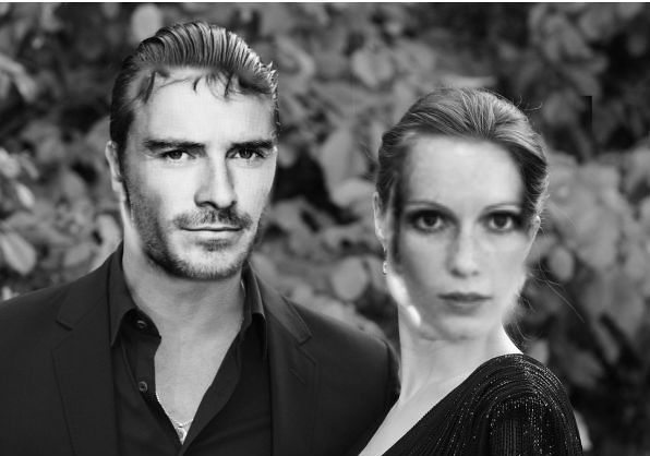
(AUTHORS NOTE: ok so I am working with Tiffany Yowell’s character Lawrence in this scene. She’s written some great stuff about how Lawrence secretly loves Victoire, and I am building off that to create a cool narrative. At this point, Victoire is used to calculating events and how they transpire, and not really into relationships without a reason. Including good sex. For this assignment, we were supposed to create a book cover. I know that the book covers themselves don’t play a HUGE part in this story, but I know I have mentioned that Victoire was a trashy romance novelist in the past, and wanted to incorporate what she wrote into this post as well as her relationship with Lawrence. It is undeveloped at this point, but as time continues, motives and feelings become clearer as Victoire becomes closer with Lawrence. For the images, the ship in the first image is one of my own, and the buff dude is from the huffington post)

Edie and Isabelle’s Trip!

This week I had the pleasure of working with Aubrey Howland. We decided to knock out two assignments: a writing one which actually describes in depth what our visual assignment depicts.

TheĀ visual assignment we chose to do was theĀ Story Map for 4 stars. Check it out here!

Our story is based around our two characters: Edie and Isabelle Franklin. Edie is a bar tender with murderous tendencies and Isabelle is a scientist who’s just trying to make things right in the world even though she goes about it the wrong ways.

We tried to figure out how the two characters would interact if they actually met and go from there. They took issue with the way Prince Jasper treated his people and Andorra and travelled there to set the record straight.

Most of the pictures for the word map were found on google. Most are the actual images of the places Edie and Isabelle travelled to or are representative of the people Edie encountered as the trip occurs from her perspective.

Beware Lawrence Spitler Poster

3 stars
Lawrence Spitler posterBeware of Lawrence Spitler! A true ladies man.

I decided to create a poster about Lawrence after our radio show. In our show, as well as his character description, he is one with the ladies. Has a different woman every night and only leaves tears and heartbreak. All of which lead to his demise you’ll hear in our radio show found here: Broadcasting Week 7. After her… quick encounter with Lawrence, Veronica was so furious and upset she created a poster warning all ladies of Lawrence!

I wanted to keep the poster simple so that the main ideas got threw. I bolded the title to catch attention and also made key words red to pop out. I also highlighted Lawrence’s name so it was seem quick and easily. For the text I went with a less is more approach, and came up with a catchy rhyme. So watch out Lawrence, the women are after ya!

Lawrence may or may not be a man whore with bad gas

So for my second assignment involving my character and another character this week, I chose Me and BaeĀ (worth 2.5 stars). The description of this assignment was to find a picture of a celebrity couple, crop out their faces and place the faces of “you and bae” into the picture and then write a description of the photo. Instead of my own bae, I decided to use one of Lawrence’s.

Here is the final picture

Description:

After a night out on the town, Lawrence and Shirley stop to pose for a picture…although, it seemsĀ neither of them are too excited about taking the picture. Ā Lawrence had some bad gas as you can tell from his face and Shirley wasn’t too thrilled to be around him at that point in time. The two ended up having a grand time, there was just some bad wind.

Lawrence and Shirley

This is the original picture of the celebrity couple (Brad Pitt and Angelina Jolie) which I googled on the internet.

angelina-jolie-brad-pitt-maleficent-london-05082014-12-600x450

I then had a picture I had used of Lawrence in the past that I used which is below

tumblr_ledv1jyMkf1qbvp7no1_500

and I found a picture of Shirley on a link from Stephanie’s blog.

Screen Shot 2015-03-11 at 11.13.21 PM

I then used pixlr to edit the photos together to come up with the final result pictured above.


A BIT TONGUE IN CHEEK?

Time Cover

So I was looking through character dossiers to see who I could mesh well with, and I found Sylvia. No last name, only Sylvia. She seemed nice- a black widow, a reporter, and a fellow admirer of red lipstick. I then saw this 3.5 star assignment, and it was simply calling my name. What could be more magazine-worthy than good young ladies suddenly turning naughty?

I found this TIME magazine from the 50s and this hot lady to use as my images. First, I put the magazine into GIMP and set it as the alpha channel. Then, I covered up the original text and inserted my own. I thought that these lines would be eye-catching and a bit ironic, as TIME is a respected magazine and wouldn’t publish something so clickbaity. Right? Then, I put Gene Tierney’s image on top of Winston Churchill in a new layer. I resized and cropped it to fit. Then, I made a new layer and used the scissor select to black out her face and put a question mark on. This is another clickbait strategy, as it causes curiosity. We’ve all seen those 10 WAYS HE SAYS I LOVE YOU- YOU WON’T BELIEVE #8! slideshows.

I’m pleased with how this assignment turned out. I do see some issues in the details, such as the difference in image quality between the old text and the new, but I don’t know how I could change that. If anyone has criticism, please go for it. I’m all ears.

Collab: Layla and Damon’s Warning Poster

This assignment required you to create a warning poster for anything. I decided to use this as a collaboration between Jonathan Polson’s noir character and my own. It is a slight continuation of my group’s radio show which can be found here. It ended with Damon and Layla escaping from Bev’s “interview”. This poster is a result of that encounter with Layla’s father enraged by the kidnapping. As such, a notice has gone out to Bev, whoever works with her and all others that would try to cross the Arkwoods. Layla’s Father does not kid around and Layla’s personal bodyguards are not happy about the interview and they would just love to have a chat with whoever was responsible.

Warning Poster


Say it like the peanut butter

This assignment was to “Make an animated gif from your favorite/least favorite movie capturing the essence of a key scene. Make sure the movement is minimal but essential. ”

My favourite movie ever is Cloudy With a Chance of Meatballs. Say what you will, but this movie is brilliant to me. I never read the original books, but the humour in this movie is perfectly pitched and actually hilarious. The voice cast is also killer and the animation & character design fit the story perfectly.

So what is a key scene in this movie? I thought a lot about what my favourite part were, but in the end decided that the real key scene has to be the one where Flint first sees food (hamburgers) raining from the sky.

This was my first try:

cloudy with a chance of burgers

Which is fine, but then I though about the directions of the assignment (particularly the minimal movement part) and cut out the beginning, creating this:

CWACOM2

Shame you can’t distinguish what exactly the burgers are without that closeup image afterward :

illustrator on point

ds106 wallpaper

Ds106 wallpaper! heck yeah! Initially my plan was to make it just a starry sky as Cleo would see it if the gang spent the night camping in the car, and then I decided that a rocket ship would be cool to add. Who cares if rocket ships hadn’t been invented in their time? it looks cooler than blank space.

I made the whole thing in adobe illustrator using the pen tool for all the illustrations. Here’s a tutorial for using the pen tool. Figuring out the font was tough. At first I wanted to try and pick two different fonts to go together, but then I found aovel sans and decided the best move would be to use a light next to bold version of the same thing. And I picked purple for the rocket because I wanted to do analogous colors and I didn’t think green would be a good color for a rocket. I could give you step by step screenshots but it’s nothing special really, just me slowing drawing everything out.

edit: i forgot to put the link to the assignment

Sealed With A Kiss

seal with kiss


Victoire Absinthe flipped through the pages of her magazine while waiting for dinner to be served. The blonde had finally left her, leaving behind a copy of some local magazine. She settled on the glossy image of an advertisement selling lipstick. Victoire smiled to herself- the ad spoke to her more than she thought it would, and that in and of itself was funny. She actually related to something. That was a first.


This design assignment was about creating an advertisement with a cartoon. I chose a character from the movie Atlantis to advertise a bright pink lipstick. Ā Considering Vignelli’s advice about simplicity, I decided not to include a picture of the product at all, assuming that the swak would be enough, and the fact that I used the word, “kiss” in the advertisement itself. Like in my other design assignments, I have kept the number of elements in the image to a minimum, and kept the font simple. It took me a little while to decide where to put the text, though. Which is surprising. I thought it would be super easy to find a good space for it, but apparently not! That’s ok, though. I have a bit more appreciation for it now.