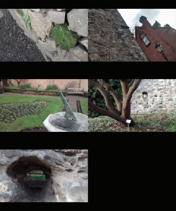
Gun Loops, Large Holes Agin the King

Gun Loops Gardens

Gun Loops Gardens

Between the algaed stone and the imposing handle

Ancient and modern

Secluded formal gardens tucked

No shortage of benches for lunches

Perpendicular to Newarke Wall’s large holes

Now peeping on the graveyard

But in 1645

Gun loops for Parliament’s shooters

Soldiers agin their King

Republic in waiting

Just for us Ladies

tacky invitation

Victoire Absinthe put her suitcase down and collapsed on the bed. The morning sun was shining through the blinds of her hotel room on to the bed. The polyester blend quilt scratched her nose. The day was just beginning but for Victoire it felt like the end to a very long day. Groaning and rising from the bed, she cast a glance around her room. Everything the ad had promised her about the Chartreuse Paradise Hotel was right. There was a pool, and private bathrooms. You could see inside from the bed. The room wasn’t exactly “paradise” but it was nice enough. Most importantly, it was quiet. Victories footsteps were muffled in the green carpet as she crossed a few steps over to the dresser. She started putting her things away. Normally, she would’ve kept the bag packed, but she planned on staying here a spell.
“The place ain’t bad,” she thought to herself as she eased back into bed, preparing for a long nap, “Thank God it’s quiet. Not a bleeding neon sign for miles.”
There really hadn’t been. From the train station she had hailed a cab and rode the long 45 minutes in compatible silence with the old driver. He asked once why a pretty dame like her was traveling alone. Didn’t she have a man? Was he off to war? She had refused to speak. Sometimes when making a new identity, it was better to play it cool and let whoever it was make their own decisions about your past. Keeps things simple. There really weren’t any neon signs at all. The place was in the middle of nowhere, just a bunch of trees and some flowers trying to grow from the front lawn. She kind of liked it, and hated it at the same time. There was a small town a little ways off. She didn’t know what she expected from the place. All she wanted was something different.
Victoire rolled over. Shadows cast themselves on the floor. She looked at her watch. It was nearly 4. Groaning, she pushed herself into a sitting positing and rubbed her eyes. Lord, she felt like shit. Pulling herself together she ran her fingers through her hair and adjusted her lipstick in the mirror. Pulling on her shoes she noticed a crumpled letter that appeared to have been pushed under the door.
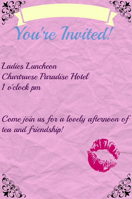
It was the stupidest invitation she had ever seen. Written in the overly elaborate script of some woman, with a kiss on the lower right corner. “Ladies Luncheon.” What the hell did that even mean? She turned it over. Nothing. There wasn’t even a date on the thing. She noticed the time- 1 pm.
“Well,” Victoire said to herself, smirking,  “looks like I dodged a bullet there.”
She crumpled the invite and threw it in the bin. Unbolting the door she wandered down the brightly lit hall. Gaudy wallpaper lined the hall, doors all locked. She reached the staircase and made her way down to the lobby. Her heels clicked on the cheap linoleum. She made her way to the front desk, wanting to ask where she could find something to eat. A curvy blonde looked up from her romance novel. She was just a pair of big blue eyes and big pink lips that formed a little “o” when she looked up, which broke into a big grin.
“Well, hey there sleeping beauty! You done slept the whole day away didn’t you?” Before Victoire could say anything, the blonde had whipped around the table and took her hands, and pulled her towards what she could only assume was the dining room, “Now don’t you worry dinner’s just about to start! Did you get my invitation?! It was supposed to be today but nobody came so I’m having it tomorrow you should most certainly come…” the blonde continued to yammer away as Victoire was pulled further into the hotel. Victoire groaned to herself. Damn. Damn it all.

For this assignment, I went ahead and tried to make the silliest and most poorly designed invitation I could. One that was at the same time overly decorated yet really not decorated at all. I think I succeeded. Like, the invitation isn’t bad looking, but it ain’t great, either.

I like what I’ve done so far in terms of Victoire’s story line… I’ve been trying to implement the assignments for the week in the story itself. I think I saw this done in a book, once, and I liked the idea. Why shouldn’t it correlate into a blog? I wanted this design assignment to reflect what was happening in my story, rather than just a random invitation. I’d like my posts to be somehow connected, and I’m experimenting with using the assignments as props to the story itself. Since this almost seems just like the beginnings of this, I’ll continue to see what happens.

If you have any ideas or comments on how I can improve or, really, anything at all, go ahead and leave a comment!

Groom Groom

walking-dead-season-2-image-01


You’re welcome Groom…

My Wallpaper

UntitledThe challenge was to create a new wallpaper for DS 106. I was attempting to capture the Noir essence, but my software didn’t allow me to design the typography I was aiming for.

Wanna Play A Game?

Minimalist Movie Poster

 Victoire Absinthe, like many of us, find the movies to be a place to forget everyday worries and woes. This movie is one of her favorites. It soothes her, in a strange way. She’s often thought about why such a film would soothe her. And then she realized. The sloppiness she saw in the film went un-noticed for an absurdly long time. Now Victoire, she was anything but sloppy. Sometimes her bank visits were planned months ahead of time, and sometimes she didn’t even have to leave her hotel room. Never mind all this violence.
Not saying that the idea didn’t thrill her.


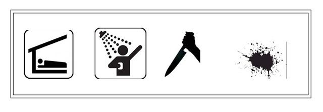
In terms of designing this poster, I knew it was important to keep the style of each of the icons as similar as possible. Otherwise I felt it would have looked really strange and disjointed…and not in the good way. Google helped a lot in terms of finding the right images. As a hint, I also tried to put the icons in order of how things in the movie happened… but that’s all I’ll say on the matter.

I actually went ahead and made this poster as a word document, then screen shotted the image to upload to Flickr. It was a lot easier to move and size the images to the way I wanted in Word, and to add a border around it. I think it gives it a more collected and put together look with the double lines working their way around the design.

I won’t tell you what movie this poster is of- I wanna see if you can guess.

Magic!

Screen Shot 2015-02-11 at 3.28.39 PM Screen Shot 2015-02-11 at 3.31.48 PM Screen Shot 2015-02-11 at 4.16.32 PM

Screen Shot 2015-02-11 at 4.22.31 PM Screen Shot 2015-02-11 at 4.25.57 PM Screen Shot 2015-02-11 at 4.29.14 PM

MAGIC is in the air! Or rather, Magic the Gathering. I’ve played the game before, so I got a giggle out of the fact that I could make my own cards. I had a lot of fun picking out different character and land cards to make out of classic noir characters and scenes. To be honest, I’m not great at this game, and it’s been awhile since I’ve played. So, please don’t pay TOO much attention to whether or not these could actually be playable cards.

For the characters, I stuck with the main three. The femme fatale, the detective, and the Garçon. Which is a nice way to say, “the everyday dude who’s got a crush on the femme fatale but doesn’t stand a chance”. I went ahead and tried to make their “attacks” contemporary to the characters in noir. So, the femme fatale can seduce and destroy, the detective can calm the femme fatale down some. The garçon is just kinda there and kinda serves as fodder. If you’ll notice, each card has numbers at the bottom, like femme fatale has 7/7, detective has 5/7, and garçon has 1/1. These numbers show the attack and defense strength of the card. So, considering I am such a big fan of the femme fatale, she has the strongest attack and defense.

For the land cards, I used noir landscapes. So we have the city night scape where the detective and the femme fatale hang out, the diner which the detective drinks away his problems and eats cheese fries, and the nature landscape which neither the femme fatale or the detective really want anything to do with, so it’s reserved for garçon.

As a side note, because I am a nerd and know this, the colors of the cards also have something to do with it all.

Black cards are stereotypically the destructive cards, so they are all about destroying those around them in terrible ways. (Case and point, femme fatale)

White cards are about gaining life and are usually considered the, “good” cards. (Ehh?! See what I did there?!)

Blue cards are water. (….That’s actually I know about blue cards sorry so take a wild guess to why I put this color to garçon.)

Yup! I had a pretty good time making these. Hopefully you all will get a kick out of them as well!

If you want to try out the assignment, click this LINK. Here is the LINK to the generator.

It’s All An Extension

Screen Shot 2015-02-11 at 3.20.32 PM

Taking  a break from Victoire Absinthe, I actually really like this idea for a laptop cover. I used the website, My Custom Skin in order to make this. I used picmonkey.com to edit the image itself. I took the picture myself in Amsterdam while I was visiting this past summer. I used a number of filters on the image in order to give it an antiqued kind of look (which I kind of like), then I super imposed the word, “Freedom” on to the image. I faded it out, and viola.

For the font and font color, I took Vignelli’s tips under consideration. (See Canon for a bit more information about what I thought of his work and design tips.) Essentially, he said that you only really needed a couple different fonts in order to create effective design. He liked to use Helvetica, Times New Roman, and other (one would assume) boring or standard fonts. But by understanding the legibility of the font and the simplicity it gives to a design, the fonts can be incredibly visually interesting. This font isn’t technically Helvetica or the like, but I thought it was close enough to do the job. I tried to match the red of the font to the red of the bicycle. I thought that there was a correlation of color there, and that by using the same red, the words would seem to, “belong” rather than stick out like a sore thumb. I wanted to integrate the word into the design, rather than isolate it.

To be honest, I thought about doing one of my other self proclaimed, “crappy digital art projects which I love”. For an example, look at this Valentine I made:

true love

See? It’s fun and I love it, but I wanted to try to do something different for the laptop cover. Class it up a bit, I suppose. Either way, I actually really like how the skin came out. If it wasn’t 24 dollars, I would consider getting it. : )


Montage-O-Bay

‘Create a surreal panorama by first making a panorama (duh), and then munipulating the photograph to make it out of this world. However, don’t go out and just make a panorama via your iPhone!!! Take some pictures and mash them together!’

So, dear reader, I mashed, in response to Visual Assignment 1330 ‘Surreal Panorama’ of the digital storytelling open course ds106:

Montage-O-Bay

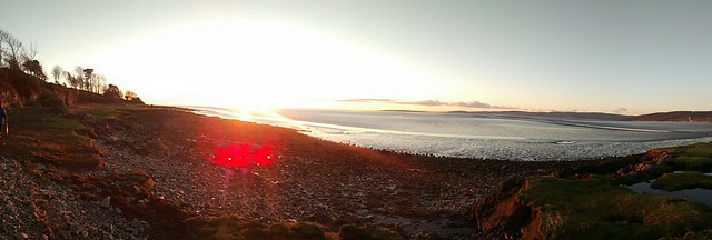
This composite image began a few months ago with recent experiments with the panorama mode on my Android phone. It doesn’t always work – sometimes it just takes multiple individual photos rather than stitching multiple photos into a single panorama. But when it works, it can produce some very satisfying images:

Morecambe Bay

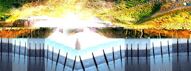
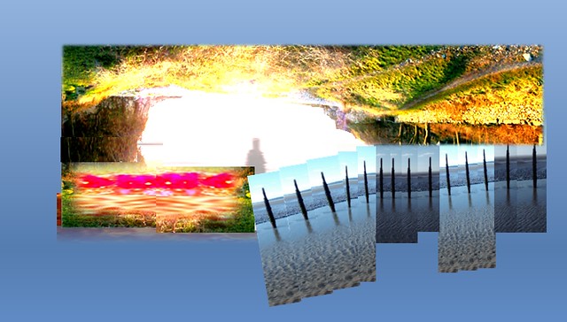
I had in mind that for this assignment I would montage a few similar panoramic landscapes taken on Morecambe Bay in PowerPoint, cutting them up, slicing, copying, rotating, altering brightness and contrast, and so on to create something still recognisable as a landscape, but abstracted, more architectural, and pushing the over-exposure further:

surreal panorama montage

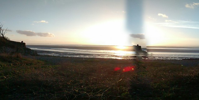
The earth is in the sky, but the in the darker contrast areas there is an attempt to make a bridge or perhaps a pier. I could have spent more time making it more fantastic or surreal, but there came a point when further manipulation seemed pointless. I couldn’t entirely eliminate the horizontal strip effect, but it has a certain amout of visual tension and patterning of the inverted earth-sky and the repeated posts that is OK. But I think that the original Android camera panoramas look more ‘dreamy’ and surreal than the mashed version. This one even has a glitch that suggests a parallel scene within a scene:

Morecambe Bay with Glitch

In the end, though, sometimes, as we well know, ‘good enough’ is good enough.

Welcome to ds106radio

Here’s my ds106radio bumper! This assignment took me a pretty long time to complete. First, I had to find the perfect song that conveyed the noir feeling I wanted. I knew I wanted to do something with a jazzy feel to it, so I looked at some of my favorite jazz musicians. I decided on this track from Wynton Marsalis, “When It’s Sleepy Time Down South.” I liked the sound of this because it was simple, yet the music is really beautiful. It also crescendos in a way that allowed me to play with different areas where I could insert my voice.

After clipping the song and recording my separate audio, I had trouble figuring out how to merge the tracks into one. Luckily, as I mentioned in an earlier post, I was able to turn to my trusty Audacity online manual to find out how to do just that. Here I found out a lot of cool tips on ways to play with the two tracks and make them blend more cleanly. I specifically liked the envelope tool, which allowed me to fade out the music around my audio in order to amplify it and make a clear sound. 

Screen Shot 2015-02-04 at 12.45.32 AM


Still, after all the fun tricks I learned in this manual, I still couldn’t figure out how to merge the two tracks into one. Then I realized that editing the two pieces of audio in a single Audacity file was how I was merging them. Something so simple that I made so confusing in my head. Well, at least I learned something new. 

I like the finished product of my radio bumper. It sounds very old school to me, and the visual I see with it is an emcee at a smoky nightclub walking up to the microphone, announce the next act, and then falling back into the shadows. I think it feels pretty noir, but what do others think? 

Edie’s Cloud

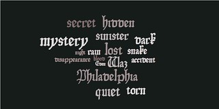
In this visual assignment (1 star) I created a word cloud with words about my character Eden. I chose this assignment because I wanted to see if I could make the cloud seem noir and relate to her life.

In order to make it, i used this website, which is different than the one listed for the assignment. I did this because the other one would not work on my computer.

Below is my word cloud which includes the words Eden, Waz, dark, sinister, blood, mystery, secret, hidden, etc.

Edie word cloud