to yoga, to yogurt, to rice and beans and cheese

I really like Rent– the musical, not the economic thing. It’s set in Christmas of 1989 (yes I know I’m pushing it but it counts!). My favorite song from Rent is “La Vie Bohème”, a group number with all the main characters singing about anything and everything and life as an artist in New York. Its an amazing song and even better if you watch the choreography with it (interested? check it out!). This song has a lot of iconic quotes, some more pg than others- the title of this post being one of the pg lines. My favorite quote from Rent, however, is the line “to being an us for once, instead of a them”. This (two star, visual) assignment was to pick out a quote that stands out to us and pair it with a photo that fits with the vibe. And in all her glory, here is the final form.

So umm. I love this photo; just a pic of my friends and I hanging out and enjoying each others company (being an us!). And I love this quote; its sweet and cute and promotes some nice community and inclusion (which is 10/10)

but.

I kind of hate the end result.

Like, I am certainly just being dramatic because I am tired and otherwise stressed, but I legitimately just do not really like how this came out, but I’m not skilled enough at photo editing to make it better. I’m also not exactly sure what I specifically dislike about it. I think my issue might be how clearly edited in the words look, and the red color that I chose to be the background for the words feels out of place with the rest of the photo. However, I’m just having trouble grasping how to use all the tools and also how to paint using colors that aren’t already in my photograph (hence the weird color choice). I am going to do some basic research and training this weekend to try and figure out at least the basics, but for now this will have to do.

However, there are a few things that I do like about it. For example, I think this quote and photo go really well together. The quote, to me at least, is all about being together and close and supporting one another, rather than tearing each other down; and this photo, of me and my close friends, shows us doing exactly that. Additionally, “La Vie Bohème” is a really funky-good and fun song, and the events surrounding this- nothing sketch, just hanging out!- were very much funky-good and fun. I like the look of the smears of color behind the words, I just wish it looked more professional.

As for how I created this piece, relatively straightforward. Thought about quotes I liked, scanned through my apple notes app note of Good Quotes, and then remembered the existence of Rent, the musical set in the late 1980s. From there it was just a matter of pinning down the meaning of the quote in my mind and choosing the right photo. I put the photo into GIMP, struggled with colors, decided to save the research for another time bc its been a Trying Week, and then added the quote and background color.

viva la vie bohème -liz

ft the goodest girl

I love my dog. So much. She’s such a good girl and I love her with all my soul shes so photogenic and really really cute and thus I just HAD to do this visual assignment (make a collage of a pet/animal) in her honor! She’s a rescue, former VT research animal (lab dog) and so shes stupid timid, but she loves me and I’m her favorite and I just. love my dog. Have you picked up on that?

Voila the finished product!

Shes so photogenic! gorgeous! For this project, I scanned through my snapchat and camera roll for pictures of her, which were Abundant, and then compiled all onto this website in order to make a collage (I’m really vibing with collages this week lol). Pretty straightforward! The one thing that I sort of struggled with is formatting the pictures so that they’re centered and all look nice, and making sure the layout and sizes of each is funky fresh and interesting to look at. My favorite photo here is the bottom center one, shes just SO cute and she had turned out around to look at me and it was positively delightful.

send me dog pics -liz

Week 4 – Multiply Yourself

ayyyyy that took way too long

and i would walk 500 miles

The goal of this (3 star, visual) assignment was to walk around taking a photo every 10 steps, and then make a collage out of the photos you got. I took a little ~creative license~ with the regulations (i.e. 10 steps is not very many so sometimes it was more like 12-13) but ds106 is all about creativity so I think it’s valid! This assignment was a really really fun one because it forced me to think outside the box- because 10 steps is not a lot and I wasn’t trying to take the same photo 10 times. I’m not vibing with putting all of the individual photos in here, so I’m just going to stick with the collage- which has all the photos in it so its fine! et voila!

This looks really really cool and I’m high key ridiculously proud of it! I’m really happy with how all the colors look, and I think the collage as a whole came together tremendously well! I mostly just took normal photos, but did ~spice it up~ for a few photos. I used flash for the gold heart photo in an attempt to show how shiny it was, which I sort of accomplished. The flash also had the side effect of making the background floor look all dark and cool. I also used flash for the photo with the drain thing (bottom left) and, combined with the forced perspective to make it look big, and ended up with a really neat secret tunnel type vibe which I’m super proud of.

I’m kind of upset that I couldn’t get the suspended rock photo (leftmost center) to focus, but I will admit that the blurriness is kind of a cool vibe, even if it doesn’t really mesh with the clear cut style of the rest of photos.

Out of all of the photos I took, I think my favorite is the one all the way left with the abundance of rocks. Something about all the colors and shapes just really ~speaks to me~. Closely behind it is my drain tunnel pic. My least favorite is the photo of the staircase from above. Its a little off center on all sides which makes it look just the slightest bit ~bad~, and the staircase just looks kind of dirty, which is unideal on all accounts.

In order to actually create this assignment, I took my starting point (the door with the golden hearts), took my photo, and then took about 10 steps to the fire alarm, took a photo, rinse and repeat about 8 times/until I ran out of interesting things to photograph. Then I went to this website and chose a layout and added photos! and voila! a lovely little collage!

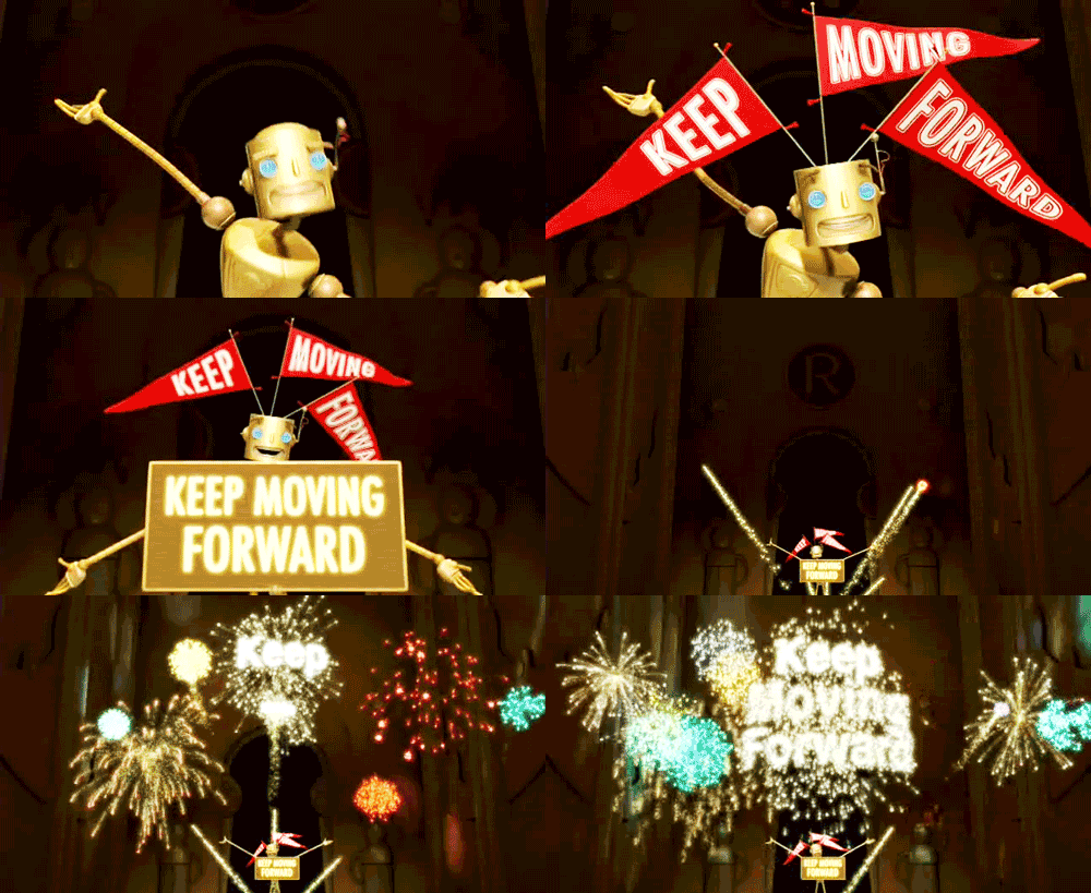
keep moving forward! -liz

keep moving forward teen titans GIF

important ps: thoughts and feelings on this movie?

Week 4 – Summarize a Movie with Animated GIFs

Who Said What

This Visual Assignment required me to pick a photo of a secret agent, then add a quote from a different secret agent, before finally attributing the quote to a final secret agent. I saw this as a good opportunity to work in the course theme. Obviously, James Bond came to mind when considering 80’s secret agents but I had to recruit the help of Google to come up with two more. After a little digging and a lot giggling I decided on 3 secret agents. I will let you all tell me if you know what “secret agent” was actually responsible for my quote. Hint: it wasn’t James Bond or Maxwell Smart!

Combophoto

This particular assignment involved splicing a pair of pictures together to make one single image, however, I took my own artistic liberties and ran with this assignment. I decided to make my dream animal by combining my 3 favorite animals into one beautiful creature. I had to really dig deep in my memory bank to be able to pull this assignment together because it has been a few semesters since I really worked in depth with Adobe Photoshop but it was a nice refresher course so to speak.
I introduce you to my creation: cow body, cat legs, and dog tail.

Graphic Gift

Here is a picture of a vintage microwave that a cleaned up. (I think its from the 80’s!) This would make great clip art.

Me and the boys raising the flag at Iwo Jima

Me and the boys raising the flag at Iwo Jima.

Colorize It

For my third assignment I chose colorize it which wanted you to take a picture youve already taken and change the colors in it to seem more unrealistic. I used the app “Color Pop” which I downloaded off the apple store on my iPhone. The app was okay, it dd its job but as you’ll be able to tell in the picture it doesnt let you get clean smooth shapes that dont have straight edges. You cant adjust the brush size so I just tried to do my best of not going outside the lines.