On triple trolling

ds106′s Triple Troll Attack assignment.

Photo: Ronald McDonald
Quote: KFC
Signature: Burger King

So. Who’s up for some pizza?

UPDATE: A little bit on my thought processes for this work. So basically one of the key elements that makes for an interesting submission here I think, draws from the fact that you’re trying to relate the 3 photo, quote and signature elements together somehow with something that draws them all together. Thinking about it though it’s most effective when that connection becomes quite obvious and not too “loose” as to seem arbitrary, which is what IAmOdessa does in a submission that is quite different thematically, but which shares the same concerns, I think.
In this way the draw for my work above, or so I hope, is that one is able to laugh just a little harder seeing not only the disparate elements put together, but simultaneously how they jar with each other in terms of the accepted differences between various fast food chains.

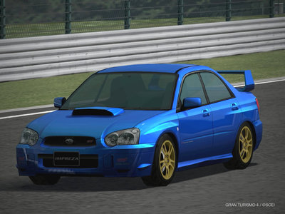
Car Lust

I got this image from a blog ??????????????written by??????
This car is Impreza STI of SUBARU( WRX STI specC typeRA-R).
There are some versions of Impreza, and this version’s Japanese nickname is ??(tear eyes).
I just love the blue color of SUBARU and the tear eyes.
I also love the butt?so cute!
I got this picture from  BLUE?ZERO??????????Don’t forget to try in mind written  by zero-1128.
This version’s design is so girly for me, so STI is a GIRL! ( for me, lancer evolution and GTR are guys).
It’s a kind of small, very round and cute design. And the blue is so attractive and the gold wheels are just perfect color for it. 
It’s not a super expensive or powerful car like Ferrari or Lamborghini, yet I just love the design. 

ds 106 ClouDoraemonchu

The blue boy’s name is Doraemon, the main character of an anime.
Needless to say, “Pica-chu” is the voice of the Pikachu, the popular Pokemon.
If you don’t know about Cloud Strife, click here to jump wikipedia.
I used adobe Photoshop CS4 to this assignment.

ds106…?

I am totally lost so far but trying to figure out what I have to do.
I kinda made a design and I have no idea if it works for the assignment or not.

Here is my design;

It shows playing Mario; game controller represents video game obviously, the mushroom in the game, the Piranha Plant (???????? in Japanese), and the crown shows the princess, Peach that he saves in the story.
I used adobe illustrator CS4 to this assignment.

Movie

all movies teach us a value’s and lesson’s, guess the movie and learn the lesson. learning how to join the ds106 plz enjoy.

On 4 icons

My 4 Icon Challenge submission for ds106.
What movie???

Aaand the answer:
Here’s the How:
  1. Think of 4 images/concepts as per the assignment (in this case a visual “X”, “Man”, a Nazi swastika referencing WWII, and a mushroom cloud to reference the clash between the main characters Professor X and Magneto).
  2. Search for suitable images on Google images (keywords “male toilet sign”, “nazi swatika”, “mushroom cloud”; the “X” was made easily enough :P ). Images provided below.
  3. Put images together on Photoshop (but any image editing software will do).
  4. On Photoshop, just for style, turn all images into silhouettes. Alternatively people can just add the word “silhouettes” to their Google image search to find more suitable images that do not require editing.
  5. Submit. :D
Images from Google image search.

Mr. Dangerfist’s Four Icon Challenge

We’re trying to learn how to use this ds106 thing and its a bit murky. I’ve decided to start with the four icon assignment. I scribbled these out in MS Paint because I don’t make enough money to so much as look at photoshop or buy a Mac. Also, I did this in class quickly to see if I could simply “learn by doing.”

It basically works like dailyshoot, but instead of taking a picture you make a piece of artwork.

Anyway, can you guess what the movie is?

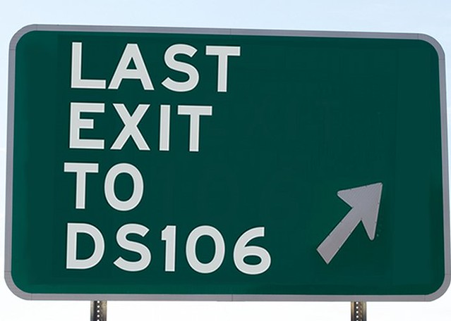
Last Exit to ds106

Inspired by Cogdog’s ds106 image compulsion, I decided to have some fun with a recent gem “You Cant Exit ds106.” I basically used that image as a backdrop for my own sign slighting riffing off his sign. I’m still mucking around in GIMP, but I have to admit sometimes I miss Photoshop. Importing fonts into GIMP to get the right roadside fonts failed for me, so I had to approximate. Actually, scratch that, I found these road these Road Geek fonts as a free download. After copying them into my Mac fonts folder in the Library directory and restarting GIMP I could use them no problem. Much happier with this than I am the first go around—I have to learn to stick with design, it doesn’t come easy and maybe that is why i like it so much.

This assignment falls under the Visual category, more specifically “Illustrate 106.” I never get tired of the significance this number has taken on beyond a course number.

A Minimalist Movie Poster from my TA

A Minimalist Movie Poster from my TA: Prof Lockman

My TA in Tokyo came up with something pretty good for the ds106 3rd week assignments. Unfortunately, he wasn’t able to connect his blog to the ds106 syndication machine.

I therefore took the opportunity to post his recent offering so that the students in Tokyo can learn how the syndication works. Further, Prof Lockman has been instructed to provide a tutorial as to how to produce such as his and the Four Icon Challenge I shared earlier.

It would certainly do his tattered soul a bit of good were some warm-hearted someone so compelled as to visit his little blog and attempt to read about his methods and so on.

Minimalist Travel Poster: Paris Sizzles

Jim Groom added the Minimalist Travel Poster assignment to the ds106 assignment bank sometime in early 2011. The instructions are to simply create a minimalistic travel poster for a location in a film or TV series. The assignment was inspired by the amazing Star Wars based posters created by Rob Frappler at Screen Rant.

Looking at Liddell’s, Eric’s and  D’arcy’s impressive submissions, I began to have doubts as to whether or not I correctly understood the assignment in coming up with this poster for Paris, Texas. Perhaps I shouldn’t have used an image from the film for the poster. But this is one of the intriguing things about the ds106 process – we are free to interpret the assignments as we wish (or so I was led to believe).

As for the process here, it was not so tricky. A Google image search delivered the still from the film (it would have been better to have grabbed the image from a DVD but the library was closed so I couldn’t get the DVD). A line of advertising copy came to me almost immediately after choosing and downloading the image. I was thinking of a line in a Cole Porter song: I love Paris when it sizzles.

As I’m relatively inexperienced with photoshop and have already forgotten some details in making this poster, it will helpful for me to list the steps in list form (later I can come back to extend or revise the list).

  • open the image with Photoshop
  • duplicate the layer and make the top layer invisible
  • adjust exposure, hue/saturation and color levels randomly until the desired look emerges (it really is hit and miss with – I just keep moving the sliders until I see something I like)
  • make the top layer visible so it looks like the original photo again
  • use the pen tool create a path around the red had (this seemed like something I wanted to stand out from the rest of the image)
  • convert the path to a selection
  • invert the selection and press delete (this removes all of the top layer except for the selected area around the had
  • adjust saturation ann hue values randomly to make the hat extra red
Those are the basic steps for creating the image above. As mentioned before I wanted to use the line “I love Paris, Texas when it sizzles” as the copy for the poster. But when trying to lay the text over the image, it soon became apparent that this would be difficult. I’m still new to working with text in image editors like Photoshop so this was a useful learning experience. I quickly developed a sense of what I can’t do.
I wanted the text to be distinct and jump out from the image. Instead it looks both flat and jagged around the edges. I realize that it is probably more effective to have text against a solid background. I’m going to look at text on graphic images more closely in the future and try figure out how to make it look better.
If anyone wishes to share some painters for working with text in Photoshop or any other suggestions related to this paper, I’m all ears.