Album Cover Visual Assignment

Random Album Cover

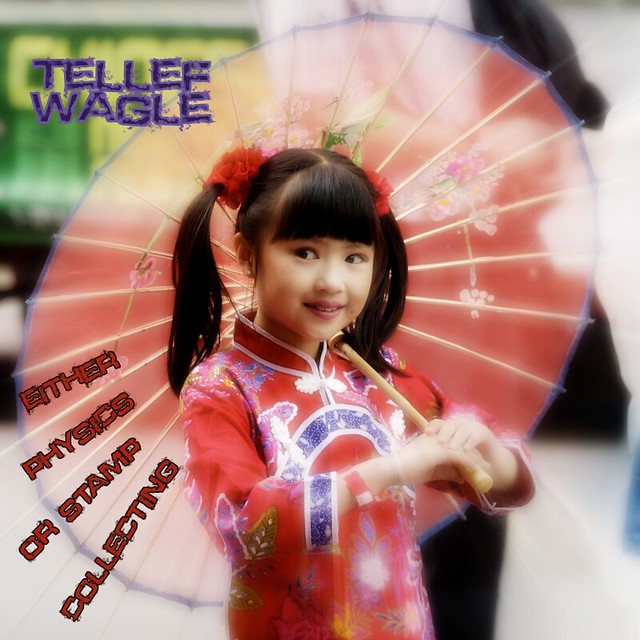
This image is a derivative work based on Chinese New Year by Brian Yap, available under a Creative Commons Attribution Non-Commercial license. Here is what the original looked like.

My random wiki page gave me “Tellef Wagle” as the band name. The quote I got was All science is either physics or stamp collecting. Ernest Rutherford (1871 – 1937), in J. B. Birks “Rutherford at Manchester” (1962)

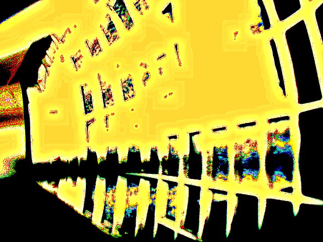
Instead of using the random interestingness Flickr search that the assignment post suggested, I used FlickrCC, because it generates a random search of Flickr Creative Commons licensed images when you load the page. I chose the third image from that search per the assignment, and followed its link back to Flickr to get the full size image and attribution information.

I did a few image manipulations to the original photo in Photoshop:

I made three copies of the image to three different layers. The bottom layer got a Diffuse Glow filter.

For the middle layer I applied a radial blur. But I didn’t want to blur the whole image, I wanted the blur to radiate out from an oval approximating the shape of the umbrella, so the girl’s face would not blur, but the umbrella spokes would blur and extend toward the edges of the picture. To make that happen I first used the shape tool to create an oval and rotated it so that it more or less matched the shape of the umbrella. Then I CONTROL+clicked on the shape to load a selection of that shape, feathered the oval by 80 pixels or so, and inverted the selection. Then I hid the oval layer, selected my middle image layer, and applied a radial blur with zoom. Then I set the opacity of the middle layer to 50% so it would allow some of the bottom layer to show through – it just looks prettier that way.

For the top image I applied a gaussian blur of 10 pixels and set the blend mode to soft light. This softened the image but allows detail from the two bottom layers to show through.

Once I was happy with the image I worked on the text. The font I chose is called Defused. I sampled purple from the girl’s sleeve and used that to write the album name. Then I sampled lighter purple to make the stroke. I used my CONTROL+click trick on the text layer to select just those pixels, then used Edit > Stroke and applied a 3 pixel stroke using the lighter purple color. I like!

By the way I picked purple to contrast against the yellow and green color up there in the corner.

For the album title I added the text in four stages so that I got four separate layers. I rotated each one using transform and moved them where I wanted them. I sampled red from the girl’s clothing for the text color. I liked the stroke effect so much that I did it again for the album title, but this time I sampled near-black from the girl’s hair.

For completely random elements to start with I think it came together in a nice way. This was a fun assignment.

Missing Poster: Lost In O’Blivion

I have two poster ideas.  Actually, three.  This is the first.  I hope that I have time to create the next two before Monday!

O'Blivion in Oblivion

O'Blivion in Oblivion?

It’s not my favorite creation, but I do like the colors and the play on words.  Five hours of work. Boy, oh boy.

Visual Assignment: Averaging Stories & Rainbows

“Take a concept, one word, and plug it into Flickr and take the first 50 images and average them using Photoshop or similar program.”

averageStories

stories

averagingRainbows

rainbow

Essentially, what we are looking at is the Flickr community’s overall concept of what “stories” and “rainbow” means.

I don’t think that sentence properly conveys how cool that idea is.  Let me try again.  In this part of the World Wide Web (the whole WORLD), it is possible to create what is, essentially, a visual representation of an ABSTRACT concept.  These images are the results of FIFTY different perspectives on ONE idea.

Now that is cool.

Visual Assignment #1

Here’s my first visual assignment. I wanted to do the album cover because I thought it would be neat to see what you could get when you combine three random things together. The random wikipedia article gods decided that my band name should be synochoneura, and all though I don’t know how to pronounce it it sounds like a solid band name to me. Then my album title is the last part of a quote from Margaret Cho, which also seems like a fitting title to an album. Finally when I went onto flickr it gave me this nice little picture of a sunset to use. I thought the pretty was pretty cool as it is so I didn’t want to do anything to alter it, but I did resize it so it isn’t as big. Hope you guys like it!

Visual Assignment: Ordinary to Extraordinary Leigh to Leelzebub

The visual assignment that immediately caught my attention was the one where you take someone in their ordinary getup and transform them into something totally different.

Well, taking a cue from my good friend Leelzebub (and using her as my model) I’ve come up with a story (that she may or may not approve of :P )

Leighanne Ellis: College girl. Plays video games, loves her boyfriend, writes frequently.  Likes to make guacamole and eat burritos.
Leelzebub:  The devilishly mischievous one.  Plays pranks on her roommate.  Taunts her cat.  Turns heads and laughs loudly wherever she goes.  Feeds on bacon.

Both of these personas exist in Leigh, but I wanted to exemplify them both separately.  I hope I accomplished that :)

So what I did is pretty simple.  The first steps came from real life, where I forced my roommate to sit down and let me play dress up with her.  I curled her hair, did her crazy makeup, and put her in a skirt.  It was wonderful girl-bonding time.

Next, after the preliminary pictures were taken, I picked the two I thought conveyed the most “Leelzebub devil” side and began to edit.

The first thing I changed was the contrast.  I wanted her to look like she was coming out of the night.

Next, I changed the color of her eyes.  Free select tool, etc.  Then, used colorize to get the effect.  I did the same thing for the hair, which took a lot longer than the eyes did :)


fragment number ???

trying to reproduce Haneke’s masterpiece of angst and despair…

Please, Escape This Way

*tweek the colors of an everday object.

Escape

Two Different Realms…

For my last assignment I decided to do the “Common Everyday Object” that is meant to take a picture of a common everyday object and then to manipulate the colors. While a rose may not be an every day object, it is still something we see everyday in our lives. Especcially in the fast paced lives we live, sometimes we do not get the chance to appreciate a single beautiful flower for the joy or simplicity it may bring.

I chose this picture initially

Touch Of Sun

After manipulating the colors using Gimp…this is the final result. It was really hard to learn all the tools in Gimp. But one of my good friends actually was exploring with it and came upon the tool that allowed us to do this. Shout out to Schulz! ;-)

newflower

if jesus wouldn’t wear it, should you?

*I do not agree with the statement above.

This was not painted by someone famous but I had the urge to break the rules.

… and I just realized I didn’t explain. when I saw the westboro baptist people holding those “colorful”(which is an understatement)((but they do use colorful backgrounds)) signs that really leave you with an awful taste in your mouth, I knew those guyz had it wrong, way wrong. I was wondering what image could possibly change those people’s mindz.   this is what I came up with.


I Swear You Two Look Alike…

For the final project, I wanted to complete something that has always been an interest of mine and that fascinates me: when people tend to have doppelgangers, or celeb look-alikes. When I saw the option of completing that as a project, I took the chances and pulled the trigger. My friend Mohamed has, for a long time, been compared to look very much like an NBA player that currently plays for the Los Angeles Lakers, Matt Barnes, and so I’ve decided to show that similarity and see if you guys think the same thing:

MoBarnes1

MoBarnes2