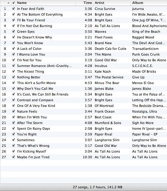
Visual Assignment – Tell a Story Through iTunes

I decided to do the project about telling a story for several reasons.
I’ve been doing picture after picture for this class so far. It was refreshing not to have to grab my camera for an assignment.

I’m a big music person (aren’t most people?) so this was a perfect assignment for me. Maybe it doesn’t make sense, but to me, it sounds beautiful.
My process was fairly simple. I went through all of my songs, picked out the ones with the best titles and put them in a playlist, then I shuffled them around until I got something I really liked. Used Grab to get the screencap and boom! That’s it!
I think that stories told through music are the most important.

ds106: Visual Assignment: Troll Quotes

Visual Assignment 25 brief

Find an image of a well known figure, add to it a famous quote by someone related in some way to the figure in the image and then attribute the quote to a third, related figure. From the official site: How It Works 1) Get a picture of someone people idolize. Obi Wan Kenobi, Barack Obama, Captain Kirk — any beloved public figure will do. 2) Slap on a famous quotation from a similar character from a different book or movie. Pick something close enough that a non-fan might legitimately confuse them. If you’re using Captain Picard from Star Trek: The Next Generation, for example, you’ll probably want to grab a quote from Star Trek: Deep Space Nine, Babylon 5 or Battlestar Galactica. 3) Attribute the quotation to a third character, from yet a third universe. This way, nothing about your image is correct, and you’re trolling fans of all three characters at once.

My Troll Quote

I attempted to troll with a film still from Aliens, a quote from the stockroom scene in The Matrix, and then attribute it all to Dr Dave Bowman from 2001: A Space Odyssey. I’m not sure anyone would respond to my troll. I usually don’t feed trolls.

Adventure

Adventure by theunwiseman
Adventure, a photo by theunwiseman on Flickr.

The image above is the combination of the first 50 images found when searching for the word “Adventure” on Flickr.

This was a very adventurous exercise. I definitely enjoyed the process more than the end result. I feel like the picture is really bland. This reminds me of the time I got excited for the spectroscopy lab in astronomy class, and we got to view the emission spectrum for Krypton. It was very bland. I expected at least some green, but no–none. To me, my collage looks the same as everyone else’s.

But downloading Picasa and watching it superimpose all the images together was very exciting! I originally tried to use GIMP, but I couldn’t figure out how to do it without hacking together some python script, and I’m a bit rusty with my python. But overall it wasn’t that difficult.

From what I’ve seen in others’ collages, the words which make the most distinct collages are those which have explicit visual meanings–color names, like “blue,” made interesting collages.

Also, a word of advice to anyone having a problem blogging to WordPress from Flickr needs to remember to enable XML-RPC remote publishing before Flickr can accurately validate your WordPress account.

Visual Assignment: Adapting Klimt’s ā€œHopeā€

The Assignment: ā€œAdapt a famous artist’s work to change or reinforce its possible message.ā€

Here’s how this is going to work for the most dramatic of reveal effects. First, I am going to show you the original. Then, I am going to tell you what I changed and why. Finally, the result.

I chose to modify Gustav Klimt’s masterpiece entitled ā€œHope, IIā€œ. Here is the original:

Hope by Klimt

“Hope, II” by Gustav Klimt

I undertook the manipulation with two goals: To emphasize the golden luminosity that is one of Klimt’s hallmarks, and to darken the main subject’s skin.

Now, I absolutely adore Klimt’s work for his use ofI would have been pleased if I could have made the background literally move, glowing darker and brighter, but modifying the rest of the picture to my standards was long and difficult enough without attempting to make a gif as well.

The choice to darken the woman’s skin was based on my interpretation of the picture. Klimt titled this piece ā€œHope, IIā€ for a reason. When I saw this picture, I interpreted it as a pregnant (or simply fertile) woman being carried (literally or metaphorically) by her peers/other women. The position of her hand is nearly religious, making me wonder if this is a representation of Mary, pregnant with Jesus. In that case, the women carrying her are carrying the hope of humanity on their backs. They might represent the unique sisterhood women share by simply being women, or perhaps they express the lineage of women that eventually lead to Mary. It makes me think of the famous sentence Isaac Newton penned, ā€œIf I have seen further it is only by standing on the shoulders of giants.ā€ Essentially, Mary is standing on the shoulders of her female ancestors.

Now, I recently watched ā€œChildren of Menā€œ, an amazing, heavily thematic and thought-provoking film, the premise of which is that women have become infertile, leading to a world of humans without hope for a future. They are, essentially, all just waiting to die. When a young woman named Kee becomes unwittingly pregnant, it throws the world for a loop. There are many religious and spiritual motifs, the most obvious being the Nativity story.

In a bold move, the director Alfonso Cuaron chose to cast Kee as an African, in response to the recent African origin of modern humans hypothesis that suggests that humanity began in Africa and moved across the world from there. I loved this choice, and wanted to ā€œupdateā€ Klimt’s ā€œHopeā€ to reflect this scientific possibility. Mary may not have been African, but as a symbol of humanity’s origins (in a sense), I think this works.

Here is the result:

"Hope, II" Re-Invisioned

“Hope, II” Re-Invisioned

This didn’t take me nearly as long as some other projects I’ve done so far for this class, but I thought I would be cool to make a time-lapse video. It starts out about half-way through the job, and covers about 45 minutes of work in 4 minutes (couldn’t really get it down to anything shorter).

[TO BE ADDED]
Bear with me, this is a journey

I have fallen in love with Tim Owens’ Averaging Concepts using Flickr visual assignment. I liked it so much I did it before #ds106 Summer of Oblivion even started.

Then today came Lou McGill’s post Layers, which took the idea to a whole new level. I still aspire to make something as wonderful as the final image of his her dad. But that’s not the direction I went today, though I did push this averaging thing a little further along in a different direction.

It was Tim Owens’ averaging tutorial post that pointed me toward the work of Jason Salavon, in particular his portrait project. I am crazy for these things, these “atmospheric meta-portraits”.

As it happens, I had a ready-made image series to experiment with. In summer of 2009 I took a Drawing I class, and our final project was this: dress up as your alter ego, shoot a bunch of photos of yourself, pick the best one, crop it to the right proportion, print an 8×10, and use that as a reference to enlarge and redraw at 16×20 inches using our choice of media. We could draw black and white or color images. I chose to create mine in color using art markers. So you can see the photos I started with, here is a video I made documenting that drawing assignment.

So from the photo shoot from the drawing project, I had 62 photographs that were of similar composition. I decided to make an averaged portrait. I followed Tim’s tutorial. When I saw the result I was happy with it, but I still wanted to try adding it to another photo, like Lou McGill did. I tried some other photos in my catalog of images but I just wasn’t happy with the juxtaposition for any of them, and then it hit me:

Animated GIF.

I brought my final selection photo, the one I made my drawing from, and masked it using the Quick Selection tool to grab only my skin, feathering the selection about 60px and then turning that selection into a layer mask. I liked the Soft Light blending mode, but you could still see my face too clearly, so I reduced the opacity to 10%. Then I made an animated GIF, playing with the timing and whether the masked photo layer was on or off, varying the opacity when it was on. I only needed eight frames to get what I was after – a sort of flickering in and out of the more discernible version of my face.

So here is my final result, an animated GIF + amalgamated self-portrait using averaging. I’m liking it.

DailyShoot 587 and Visual Assignment 3!

For my daily shoot assignment on something that shows attraction I decided to focus on the idea of magnetic attraction. I thought lots of people would do something dealing with attraction based on other people or something like that (not that there is anything wrong with that), so I decided to switch it up a little and take a picture of my fridge and some magnets on it that shows magnetic attraction. Also don’t mind the little check off to the side and please don’t try to steal my dads identity, I don’t think he’d like that too much.

For my visual assignment I wanted to do “Pick a Bad Photo, Apply a vintage affect, and write somthing”. I’m not very skilled at photo shop or any other photo editing software so I thought by doing some assignments that involve using that, that it would help me get better. Who would’ve thought that practice makes perfect? So I went on Flickr and searched for bad pictures because I figured that Flickr would be a better judge of bad pictures than I would. And it led me to this funny little picture with a ‘bad’ stuffed kiwi bird, and I knew that I just had to use it. So I uploaded the picture in Gimp, and used an old photo effect on it. Then typed the age old phrase “birds of a feather flock together”. I know I didn’t use hevetica font like I was supposed to because for some reason my computer didn’t have it on their although I thought it was pretty much a standarded font but oh well. So instead I just used arial and tried to make it look a little artsy. I think it turned out alright for a guy who didn’t know what he was doing, and no matter what I’m 99% sure this picture will always make me giggle a little, and isn’t that what matters the most in the end?

Illustrating ds106

I am catching up on my visual assignments, and I don’t think I had done Alan Levine’s (we miss you CogDog!) illustrate 106 assignment yet, so here is one that is quick and easy and almost catches me up.

This was made easier given I had bought those reflective address ds106 stickers in the hardware store with the intention of slapping them on my laptop, but I had forgotten and they were languishing in the manshed. But then Alan Liddell did his visual assignment with a quick and easy posterize effect in GIMP and I said “Bam! I can do this for the Illustrate 106 assignment.” And there you have it. No idea is born alone.

? Tutorial: Creating an Album Cover

With the Summer of Oblivion course technically only being Monday – Thursday there were many of us left wondering what would happen on ds106TV on Fridays. While it appears Dr. Oblivion has gone missing I figured I would jump on and broadcast a quick tutorial on how to create one of the visual assignments. A big part of ds106 is not just showing the work you create, but also leading others along by showing your process. In that spirit I think having folks jump on ds106TV and document how you created assignments and what you’ve got cooking is an excellent use of that channel. If you want to know more about how to broadcast on ds106TV there’s a helpful page at http://ds106.tv/how-to-broadcast/. Here’s the album cover I created yesterday and an archive of the process:

ds106: Visual Assignment: Flickr-ised Playlist Poetry

Visual Assignment 62 brief

Take your Playlist Poetry Assignment and find Creative Commons Flickr photos to illustrate your story. Try using a slideshow tool to interweave the song titles and images.

My Flickr-ised Playlist Poetry

I used Storify to compile my Flickr-ised Playlist Poetry assignment. IĀ  had some problems embedding my compiled Storify in this instance of WordPress, so I included a screen capture in the post.

ds106: Visual Assignment: An Album Cover

Visual Assignment 44 brief

So here’s something fun for everyone to do, should be quick and easy, but try to make it pretty. First, go here: Wikipedia: Random article The title of the article is now the name of your band. Next, go here: Quotations page Go to the bottom of the page. The last four to five words of the last quote are the title of your first album. Lastly, go here: Flickr – Explore / Interestingness / Last 7 Days Select the 3rd image. It is the picture for your album cover. Manipulate the picture, resize it, add some other color, whatever. Do the same with the band name and album title, put them over top. However you wanna do it. Make it look cool.

My album cover

I always wanted to be in a band. I didn’t want to play any instrument in particular, I just wanted to be in a band. I guess this is my chance. Here’s the album cover art for my new band Periyar Maniammai University. Our album is called Great fortune there is a crime. It’s pretty wild, I hope you like it.