Visual Assignment # 4

This is by far my favorite visual assignment, take a bad picture? Who doesnt have one. This is me checking out Malik’s ass after class, hey, I have eyes that admire wonderful creations and so if it appeals to me, I will look. Lol! I didn’t do much with this picture, aside editing it in Picasa with the Glow effect, cropping and straightening it for a better view. I know this assignment requires that we use the Helvitica font but I do not have it on my computer so I chose Arial.

Visual assignment # 3

ha! HA! I hope this is not a crime against humanity.Ā  I took a picture of my little cousin Giselle and transformed her from a very gorgeous baby into a scary baby. I am really proud of myself. I used Picnik and an effect called the focal zoom! All you have to do is click on which art of the face you want to zoom out and then effects according to your preference.Enjoy!

Visual Assignment # 2

For this assignment, I used a picture I had taken for the dailyshoots. I did a little bit of editing in Picasa but the changes weren’t so major so eventually I settledĀ  on Picnik. Am not the most creative person out there and am not ashamed to admit it. This is my best shot.

Rainbow Collage

For my last Visual Assignment, I decided to pull out the stops. I anchored down and did some serious bulkr downloading and Picasa creating. If you read my previous posts on averaging collages, you’ll notice I found a rather boring element of uniform “fogginess” in the finished products, with the exception of one collage I saw which was made from the first 50 results of the search for “Blue” on flickr. This got me thinking. I decided to make an averaged picture for each of the seven generally-accepted colors in the rainbow. This set begins with my results for Red, Orange, Yellow, Green, Indigo, and Violet. I then made a 7×1 grid collage of those averaged pictures in order from Red to Violet. I still wasn’t too satisfied with the final result; sure, it looked like a rainbow, but a dull one. So I decided to explore Picasa’s other image-editing tools. After tinkering for a while, I tried the “I’m feeling lucky” button, and the rainbow took on a vivid, luminous quality! I’m very pleased with the finished product, and I consider it my favorite of the Visual Assignments.

Ishtori Happarchi – Face to Face With Another Problem

My random album, band name, and album cover

Ishtori Haparchi – Face to Face With Another Problem

My random article wasĀ http://en.wikipedia.org/wiki/Ishtori_Haparchi.
My random quote was Ā ”All progress is precarious, and the solution of one problem brings us face to face with another problem.” (Martin Luther King, Jr.).
My random picture was Weirdo, by Lord Jezzer.

I’ll confess that I didn’t pick the original image that came up. It was a waterfall. I liked this more. When it came to writing the text on the cover, I chose to write it freehand with my Bamboo Pen tablet. I did this because I hate picking out a font. I really should make a random font picker. I’m really pleased with the result, but I don’t think it’s because there’s anything objectively awesome about it. I think most of this assignment is valuable based on the ambiguity it brings to the finished product. This has helped me see the averaging assignment in a different, better light.

Minecraft Average

Minecraft by theunwiseman
Minecraft, a photo by theunwiseman on Flickr.

Via Flickr:
I took the average of over 50 Minecraft screenshots. This is what Picasa gave me.

I particularly like how well the HUD stands out. This almost makes it look like you’re playing the game in some eerie fog.

Again, I thought I would enjoy this more, but the only thing I like about the averaging in this image is the way the HUD stands out. Still looking for a good average. I have an idea brewing, but it will take some time…

Primary Colors with 50 Flickr Images

Red

yellow

blue

First off thanks Timmmmyboy for creating this assignment and the tutorial to go with it. It was great to be walked through a tool I had Ā never used before in Photoshop. And second thanks to ds106 for always finding ways to exercise your creative side!

I deviated a little from Tim’s assignment by selecting 30-50 photos from the top 100 when searching for the terms: red, yellow, and blue. I also spent a little time resizing photos in each layer so that they filled the entire layer as well as allowing me to make a some choice about which part of the image I wanted to use. Finally I played around with the various Stack Modes. In the end I chose to use the “Median” for each smart object.

It’s kind of humorous to me how Photoshop basically has created an “Abstract Expressionist” filter for a bunch of images. I wonder what Mark Rothko would have thought about this process. His “multiforms” feelĀ eerilyĀ similar – here are a red, yellow and blue.

My deliberation was a mixture of search, selection, and reframing combined with an algorithm. Actually sounds quite “Modernist.”

Four Icon Challenge – Deliverance

John Boorman’sĀ survivalistĀ film Deliverance rendered in four icons.Four Icon Challenge – Deliverance

An ā€œAverageā€ Day with DS106

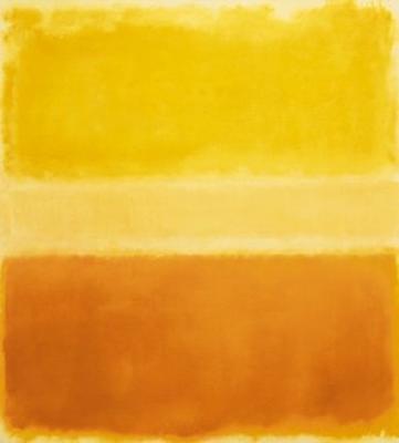
averaged composite of colors taken from 50 recent ds106 images on flickr.

For those that have been sending me tweets, e-mails, voicemails, and carrier pigeons trying to figure out what exactly ds106 is……I’m sorry. It really can’t be explained.

That’s not to say I haven’t tried! However, the sheer preponderance of ds106 means that describing a typical day of one’s participation involves explaining the use of no fewer than 5 pieces of desktop software, twitter, blogging, youtube,Ā  streaming internet radio, and live TV broadcast via the internet. I’ve tried the very conservative approach with colleagues:

ds106 is a digital storytelling course, where we get to experience using a bunch of different tools like Photoshop, iMovie, and Storify to tell stories.

Honestly, that answer gets the most nods of understanding from people, but it makes me weep a bit inside every time I say it. So to those a bit more savvy when it comes to technology I can comfortably tell them:

ds106 is an exploration of story telling, media design, and the influence that creativity and design has over our lives and attitudes.

That’s a much more pleasing answer to convey, and it usually does a pretty decent job of expressing to those that are more experimental with technology that ds106 is more of a test-bed for media interaction and creation, not a primer. Still, it doesn’t get to the very core of ds106. At it’s heart, ds106 is an amalgam of ideas, emotions, connections, and community. Imagine if you were, to take a snapshot of all the wonderful moments in your life from the previous year, mash them together into one hazy, swirly image of contentment, and that’s actually what ds106 is all about. Whether it’s the active role playing that occurs heavily within the course, or the incredibly awesome tutorials for creating pretty things with computers, ds106 is all things to all people. It’s not just what you put into it, but the connections and familial feelings of fondness and fraternity that come with going just a bit too far down the rabbit hole with an amazing group of highly creative individuals.

ds106 is a way of life…..a lens with which we perceive the world around us, and while I would LOVE to explain it to you, I can’t; you have to experience it for yourself (although some of you most likely already have without even participating in the course). There’s nothing “average” or typical or regular about the way ds106 takes shape, it is what it is, each and every moment of the day.

Reimagined Road Sign Tutorial

I know we are past the visual assignments week in #ds106, but since I submitted the Reimagined Road Signs visual assignment, I should provide some how to. I am also using this post to submit my fourth visual assignment, which I didn’t finish yesterday because I was packing for a month in the UK.

The assignment description is:

Reimagine the scene in a road sign. What is going on outside the iconic depiction in the sign itself? Find a road sign image online or photograph it yourself. Redraw it to show the rest of the scene you imagine, and show us the before/after on your blog.

Before

After

after

Credit: To create the finished version I used Photoshop and Illustrator to create a mashup of my original photo plus Michael Jackson Silhouette by munchester2cool.

How To

Illustrator purists get annoyed with me for showing anyone how to use LiveTrace, but I don’t care, I think it’s a really useful alternative when you just need to get a quick and dirty vector image. I suggest you don’t rely on this technique as a crutch though, because you can make much cleaner paths by working with the Pen Tool, and it is well worth learning. Also, LiveTrace does not work well in all situations, but for this assignment it is nearly perfect.

Watching the YouTube version is your best bet; it should look good played at full screen (especially if you switch up to 720p). The QuickTime version is included for anyone who subscribes to my podcast via iTunes.

So, this tutorial should be useful for either the Reimagined Road Signs assignment or the Four Icon Challenge. Anytime you want to make an icon actually. And it covers:

  • Advanced image searches using Google (to find images licensed for reuse)
  • Illustrator: LiveTrace for pasted or placed pixel-based graphics, Rotate, Erase tool, working with Layers
  • Photoshop: Quick Select and Magic Wand tools, Threshhold adjustment, Transform (skew) tool
  • And much more!

I hope this has been useful. Your feedback on the tutorial would be awesome. Share and enjoy!