One of our final ds106 assignments was to make up two of our own assignments. For my first one I actually decided to use an assignment that I had already kind of made up previously. Back in design week I started doing an assignment and kind of got carried away making it my own (you can see the original post here). I got way off the original assignment and decided to start over and do the assignment how it was originally intended. At the time I was quite annoyed at myself because it meant I had twice as much work to do, now I am quite thrilled because I get to recycle my mistake into something new. I really loved what I had made previously so I am excited I get to bring it back.
So this assignment is called my favorite lyric. In this assignment you are to pick your favorite lyric from a song and make it into something visual. You can do this by picking a background image that gives off the same feeling that the song does and layer the lyrics over it. Since this came from a pretty creative and free place for me, I wanted people who did this assignment to feel the same way. The main goal is to make the final product evoke the same feeling as the lyric of the song.
For mine I decided to do the song Never Grow Up by Taylor Swift. This song is super pretty and always evokes some kind of emotion in me when I listen to it (especially right now when I am only a few weeks away from graduating). I choose the lyric “even though you want to, please try to never grow up” as the specific lyric in the song to make my visual for.
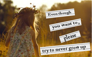
While I was playing around I ended up putting this simple picture of a little girl as my background. I felt like this little girl displayed happiness and innocence that I relate to childhood. I then started to add in the words. At first I just was trying to lay them on the picture, but I then decided I wanted to mount them on something first. I decided to use notebook paper as that mount. I opened the notebook paper into a new page and cropped it to be the size and shape that I wanted and then just copied it in over by background. I did this for each set of words that I had on my background. I then added my words using the text tool. I played around a lot with the angles, fonts and size of everything before finding something that I really liked. I am pretty thrilled with how this came out.
Here is my final product. I hope you enjoy and have fun with this assignment!!


