Telling Stories in Photos
I listened first to photographer Jason Eskenazi’s video on the art of using photography as a method of storytelling. I never thought of the idea of changing a 3D world to a 2D world – the words “clean, simple, direct” are often not associated with art. We try to pack things with so much meaning that I think sometimes people try to make it =too= obvious what they are trying to say, instead of leaving “mystery” as Mr. Eskenazi says, and letting people come up with their own ideas about what the photo means. Geometry, repetition of form – all this goes to the idea of seeking the right imagery in 2-D form. I definitely related to his idea of trying to find images that “don’t have things sticking out of people’s heads”. Those kinds of awkward juxtapositions often screw up what I think are really good pictures. The problem ends up being that it works on one plain, but not on another.
The Story Behind a Photo
It’s fascinating to read what Dorothea Lange went through to get this iconic image. (I love reading about how things like this are created or come together – there are always so many “what if’s” that could have turned out another way). What struck me most about the story was Lange’s patience(it took almost a month) as well as the fact that she trusted her gut at the most crucial moment – when she saw the sign for the pea pickers camp and went back find the migrant family one last time). The obvious answer to the first question posed by ds106 is that if Lange had had access to a blog at the time she took the photo, she would have been able to share her story of hardship at the time the photo was taken. That story, accompanying the image, may have helped drive home the desperate state of affairs facing the migrant families at that time. On the other hand, if she was able to blog and send photos out in real time, she may =not= have felt the need to stay on the road for so long, Considering the fact that social media seems to shorten peoples’ attention span for any one topic, it’s reasonable to assume that she may have “maxxed” out her audience’s appetite for this story well before she ever got around to taking the iconic photo. As for the question of whether there’s more to a photo that just the image, the answer is: of course. As we see in many of recent American history’s most iconic images, the people or things in the actual photo often stand for something much larger – becoming conduits for an emotion attached to a larger issue. For the migrant photo, it was the plight of the working poor. For the photo of a Vietnamese man being shot in the head, it was the frustration over the Vietnam War. For the picture of firefighters raising a flag at Ground Zero, it was the sadness and patriotism that followed the 9/11 attacks.
 he
he 
It can also spur social or political change – both the Vietnam and migrant photos can be seen as a catalysts for social activism.
Becoming Better Photographers
I learned about composition and contrast a long time ago – the idea of having something in the frame that you are focused on makes it easier to compose (rather than trying to jam a bunch of stuff into the picture with no clear emotional center). I believe the advice regarding use of lens, aperture and shutter speed is becoming more and more of an art as people turn to automatic phone cameras and move away from manual ones. I would like to learn more about this – I’m sure expertise when it comes to lens, etc. can help set my pictures apart.
Lectures about photography
Watching the D106 lectures about photography, I was intrigued by the advice to shift the point of view (the horizon for example)… Also, it was helpful to see the difference in playing with the exposure… I’m definitely going to try the effect of using a slower shutter speed to capture the long strings of street lights… I would also like to crop my photos more – manipulate pictures after the fact. I loved the fascinating examples of how to shoot from different angles, use different light, look for unusual images…
Commenting on others’ blogs
I must admit I am still not comfortable tweeting to people about their blogs (trying to comment with a digital trail via #d106). Once I do it, I somehow find myself waiting for an avalanche of tweets from the recipient and the rest of the blogoshpere asking why I’m wasting everyone’s time and I’m doing it wrong besides. That said, I reached out to various people on our d106 blog list – Kimber Mattox (who favorited my tweet), GoodNews/Seventh Self (I could only comment through wordpress – twitter link was busted), Lucid Dreams (again through wordpress), Virtually Foolproof (which included an interesting discussion of licensing creative work on d106) and Andre’s crazy blog.
PhotoBlitz


So, in order, I took pictures showing an interesting shadow/reflection, my cat’s paw, a photo that doesn’t look like a photo, a photo dominated by a single color, a photo of two things that don’t belong together, a photo of an object that looks more supernatural, a photo from an unusual angle and a photo emphasizing light/dark tones. Hey – 8 out of 15 ain’t bad! I enjoyed this project, although I realized after the fact that I didn’t use my camera’s settings to mix up the look – i.e. sepia tone, black and white, etc. That said, I enjoyed going on the hunt through my house, paying special attention to light, color and shadows – basically a different look at things I see every day. Uploaded to Flickr with the “ds106photoblitz” tag – and commented on a few photos with that tag.
Visual Assignments

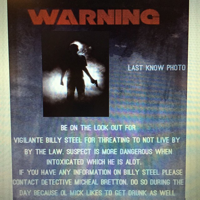
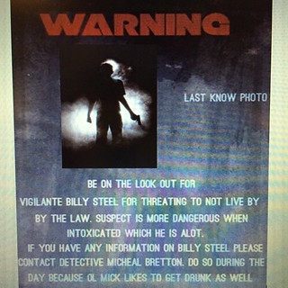
This is visual assignment #1 – a warning poster. Took a few shots of my son right after he came home from school and this was the best one. I asked him what he thought we should do a warning poster on – first he said smoking, then he said ISIS. I opted for something sillier. (3 stars) (VisualAssignments1549)

This is visual assignment #2 – poetry art. Tricky figuring out how to manipulate text over the image, but I think it worked out. The poem is by one of my favorite poets – Charles Bukowski, although its difficult finding poems that aren’t dark. This one barely qualifies as not dark. (3 stars) (VisualAssignments1550)

This is visual assignment #3 – taking a common everyday object and manipulating the color. For this, I ended up using Picadilo – a free photo editing online program that doesn’t require you to register or anything. The picture is of my coffee cup from earlier in the day. I bookmarked Picadilo – it is a program worth exploring further. (2 stars) (VisualAssignments107)


This is visual assignment #4 – Normal to Extraordinary. I played with Picadilo again. Gotta love this program. (3 stars) (VisualAssignments102)
Summary
I found this unit to be fascinating and extremely helpful. I found myself driving to work this morning, catching the contrast of colors on the street signs, looking at the light trails and checking shadows. The photoblitz in particular helped give me a new perspective on everyday objects. I also took a lot away from the lectures on taking pictures – the details to pay attention to, etc. It gave me hope that just because everyone has a camera now, it doesn’t mean that you can’t still take an extraordinary photo if you take the time to compose it and are patient enough to wait for those extraordinary moments to present themselves.