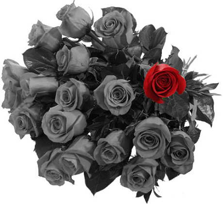
You Should Have Seen it in Color

bouquet-of-18 roses 1 is redThere is a country song I really like called, should have seen it in color that was the inspiration for this photo. The song features a grandfather telling his grandson son about what it was like in the “good old days,” the chorus is something along the lines of, “A picture’s worth a thousand words, but you cant see what those shades of gray keep covered, you should’ve seen it in color.” There is a verse in the song he is telling the boy about his grandma and points out that the rose was red and her eyes were blue and it really struck me powerful. Red is so often the color of love and power and evokes strong feelings. For that reason I decided to use an image of a bouquet of roses and make the entire bouquet grey but one rose.

I created this image using Photoshop. First I found a color image of a bouquet of roses. Then I opened the bouquet images in Photoshop. I added a background layer so I could manipulate the image. then I used the quick selection tool to select the rose I wanted to keep red. I pasted it into a new layer above the original image. Then from the adjustments tab, i created a back and white layer. I modified the layer slightly, making the red (most the image) a little lighter then it was originally. I made sure the red rose was the top layer and moved it slightly so it was exactly on top of the black and white rose. The last step I did was saving the images as a PNG file.


Week 3 – Visual Assignment – Splash the Color

01_colorsplash

I pulled this from my earlier Photoblitzing Safari exercise. It was the image that was “dominated by one color” and so I thought it would flip the original intent and mute that dominating color to see what was left behind. The effect was a blue emphasis on SunTrust shaded in the afternoon sun. Though the original yellow brick color was taken out of the picture, what did persist, however, was the repeating pattern of brick upon brick. This actually had the effect of emphasizing the isolation of the blue SunTrust sign.

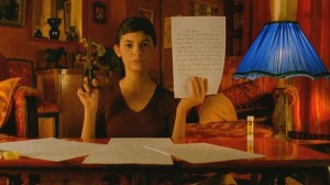
This exercises and reminded me of one of my first experiences, or at least notable experiences, with color splashing was the movie Amelie, which was dominated by earthy tones of yellow, red, and brown. In the case of the film, it was a modified color splashing, where instead of taking all the color away, you have the dominant colors that establish the base norm. Throughout the movie, the director would occasionally throw in a random blue object. It was never an object of importance to the storyline, but it was something that had an indirect effect, if anything to tease the audiences perception of the current reality.

amelie-600x337

Focus on the yellow lab

For this week you should complete two ds106 visual assignments, each should be posted to your blog, appropriately tagged and categorized.

Color Splash

I used the app on my iphone called Color Splash that others have used to post great photos to Instagram or facebook. It really makes highlighting a color simple. I started to use photoshop and then realized I had that simple app that would make my life so much easier!
So here is an image of Bo (Yellow lab) and his owner (my best friend) April. The thought of having an image that just showed the yellow of his fur kind of made me smile since he is also a yellow lab. So to erase all color minus yellow was fun. Not only that but this dog is the joy of my friend’s life and this dog has gotten her through a lot. So how fun to take something so joyful in her life and highlight it through color. I took this photo back in October when I first visited so he was only a month old maybe. He is a lot bigger now but still a joy none-the-less.
Once I had the photo in mind the app lets you use your finger to un-gray an object of your choice.
Here are the results:

Color Splash Bo

Color Splash Bo

Splash the Colour – assignment 1

homecoming scotland - Islay

So I’ve decided to focus all my projects on Homecoming Scotland 2014 celebrations for a couple of reasons. Glasgow, my home town is hosting the 2014 Commonwealth games in the summer, the initiative is promoting Scotland as a tourist destination and we are having an Independence Referendum in September so for these reasons I’m feeling uber-patriotic.  I’ve chosen this assignment because I can use Photoshop in a basic fashion and used to know how to do this so thought it would get me started quickly, however the version of PS I now use is newer and I’ve had to think up a work around.

This is a beautiful image taken at Bruichladdich distillery on the island of Islay that I have visited and I grabbed the image from the homecoming website, knowing in the back of my mind that in the UK there are copyright exceptions when using images for education. Researched a little on the JiscLegal website and am confident that my purpose is legitimate.

“Copyright material can be copied for educational purposes if the copying is not done through reprographic means (e.g. by means of photocopying, facsimile, scanning or other mechanical device) and the source is acknowledged. The copied material cannot be used for commercial purposes.”

So the work around involved duplicating the layer containing the original image>adding a black & white adjustment layer> then using the eraser tool on the top layer to expose the coloured layer underneath.

I like the result !

image from http://www.visitscotland.com

Red Splash: VisAssign

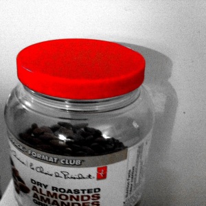
Red Jar Lid
Lid of the almond jar…

Visual Assignment #340: “Color splash is a technique to emphasize details- you remove all color from a photo, and then restore original color to a single object, e.g. a green apple on a table. Think of the Girl in the red dress from Schindler’s List.

You can do this in a number of ways with photo editing software or using mobile apps. The answer lies in the Google”

Photographed and post-processed on an iPhone using PhotoStudio and the Hollywood FX/Predator Vision filter.

Seaside Haunts

I LOVE long exposure shots…especially water. And when you isolate just the water I think it gives the photo an ethereal feel. Take this image for the ds106 assignment Splash the Color.

Seaside Haunts

I think the color of the water and the ghosting of the waves rolling in and out leaves a surreal impression of the bay. And could that blue color be any more awesome? Being the horror movie fanatic I am, I can just imagine what sort of creature is rising from the depths….

This photo was a long exposure (2 seconds) and a 27mm focal length (on my 16-35mm f/2.8 lens). I also used a neutral density filter to cut down the light since the shutter would be open so long I didn’t want to overexpose the photo too badly. I’m quite happy with how this turned out.

What a little color can do…

Flower


I just realized my sums for my stars were off so here is my last visual design assignment of the week.  I actually enjoyed taking this photo more than editing it. I got to play with my macro lens, which I don’t get to use much. I didn’t expect that much detail to show up but I’m not complaining. This is also one of those that isn’t hard for me, but could be annoying daunting for someone who isn’t used to it. In a perfect world you use a tool to select the flower and promote to it’s own layer, and change the first layer to black and white. However I have yet to find a program that chooses exactly what the user wants every time. Lots of time zoomed in at 500% scrolling to make sure the pixels selected flow properly so it doesn’t look out of place. I find it fun, so I guess that’s all that matters here.

Splish Splash

Musician at Work

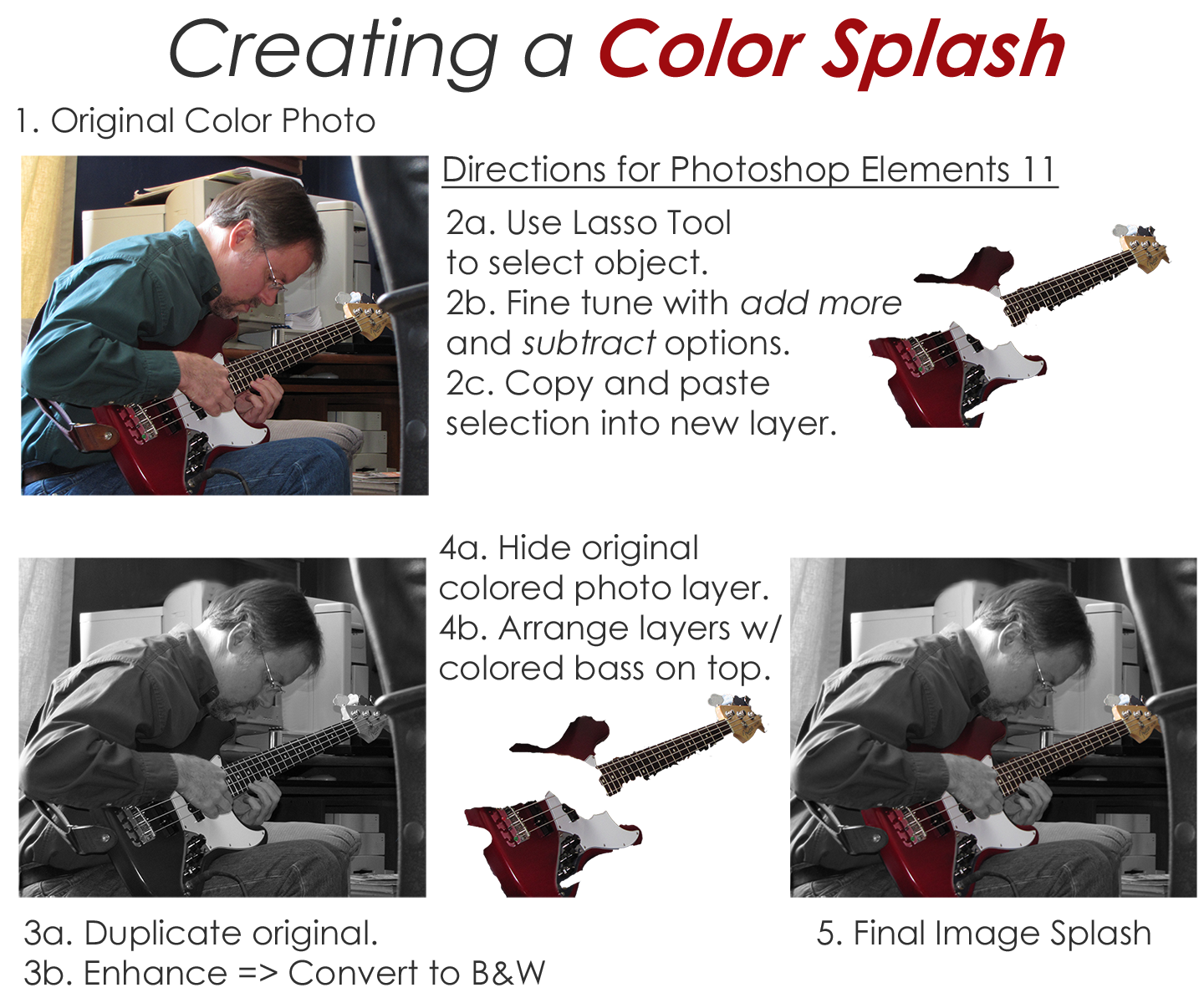
DS106 Visual Assignment 340 asked me to emphasize details- remove all color from a photo, and then restore the original color to a single object. Here’s one of my favorite examples from a project I did a few years back along with a printable 1-page directions handout.

My partner is a singer/songwriter who also plays bass and guitar. He’s been a great sport letting me experiment with new digital story telling tools over the last couple of years.  One day while in the recording studio laying down new tracks for his latest CD, he agreed to let me take photos of him in action. The original color image I use in this example is nice enough. It tells a story of a musician hard at work in the studio. But I wanted something that would really grab your attention.  I decided to highlight the bass by leaving it in living color and tone done the rest of the photo by making it black & white.  This was especially powerful when you see his black & white hands holding the colored bass. Talk about a SPLASH.

The trickiest part to accomplishing this effect using Photoshop Elements 11 is the use of the Lasso Tool.  You can pretty easily select the bulk of the object you want to leave in color- or make it a B&W object for another perspective. The hard part to making this look nice is the fine tuning you need to do while using the Lasso Tool.  I had to zoom in very close and use the add more and subtract options alternately to select only what I wanted. You then copy and paste the selection into a new layer.  As long as you don’t move any of the images in the individual layers themselves they will all align properly.

ColorSplashDemo_8X11


The colorized zone

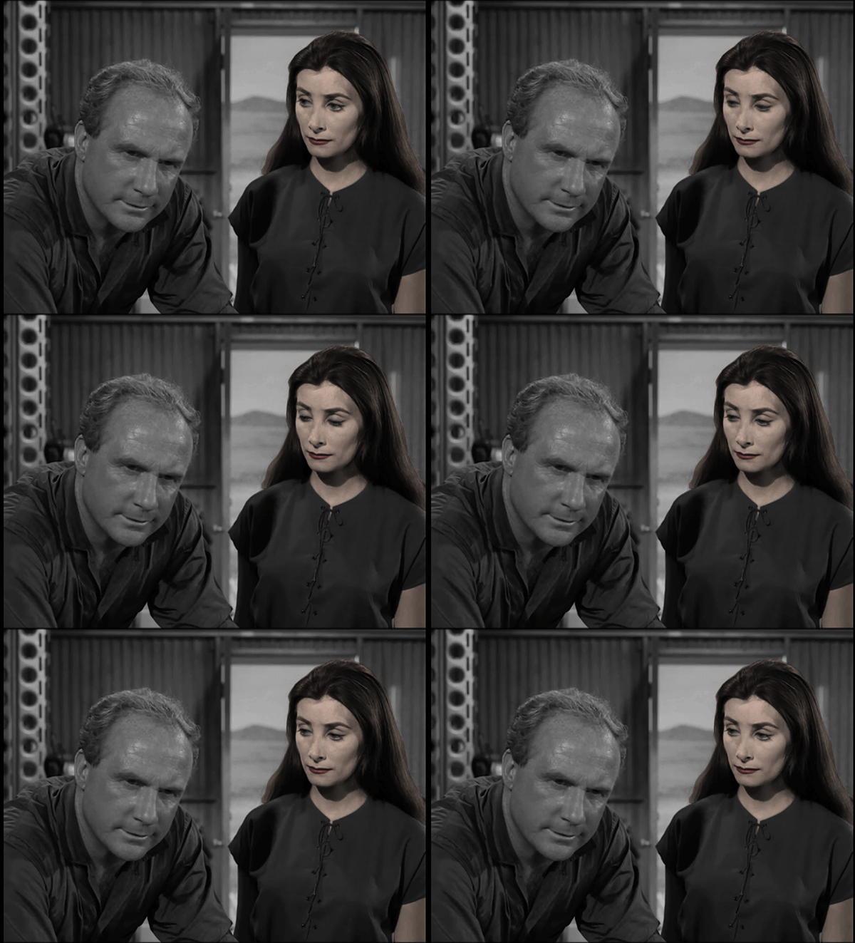
tzoneblinkThe seed for this idea came from seeing @arlanamcbear’s take on the color splash assignment, and when the idea was seconded in a comment by Andrew Forgrave, I had to do it. The scene comes from the Twilight Zone episode “The Lonely”, where a convict is serving a 50 year sentence in solitary on an asteroid. The sympathetic commander of the supply ship drops of a female android to keep him company. I liked this shot because she’s relatively motionless except for the blink, so it has easy GIFfing possibilities.

I used QuickTime Player on my Mac to capture a screen recording of the segment of the episode. I brought the recording into Photoshop through FIle->Import->Video Frames to Layers, then deleted a lot of frames until I was down to eight.

I made a new layer at the top of the layer stack and used the lasso tool to select around her lips. Then I filled that with a reddish color, and played with the layer blending and opacity until I thought it looked okay. Emboldened by my success, I moved on to her hair, then her skin. That part was a little tricky because I didn’t want to give her skintone eyeballs. So with her face area selected, I deselected the eye area by holding down the option key as I made a second selection path around each of her eyes. I was a little worried about how that might look when she blinked, but it’s a small area and a quick movement so I thought it would be okay. If you freeze the frame where her eyes are closed, the uncolored area just looks like eye shadow.

pshopThen I decided I wanted to freeze the male character. I took the top layer of the stack and copied and pasted it into a new image. I cut a hole out of it where she was, using the lasso tool with a feather setting of 3 px to soften the edges, and then pasted what was left into a new layer at the top of the stack on my original file.

pshop2And voila! Blinky colorized robot companion! It doesn’t look quite real, but that’s okay because she isn’t supposed to be quite real, even in the Twilight Zone.

Visual Assignments: Color Splash

This is an old ad that I used Color Splash on!

foodplate1http://www.flickr.com/photos/67520151@N03/8834155266/


Color splash is a technique to emphasize details- you remove all color from a photo, and then restore original color to a single object, e.g. a green apple on a table. Think of the Girl in the red dress from Schindler’s List.

http://assignments.ds106.us/assignments/splash-the-color/