Greetings from Outer Banks

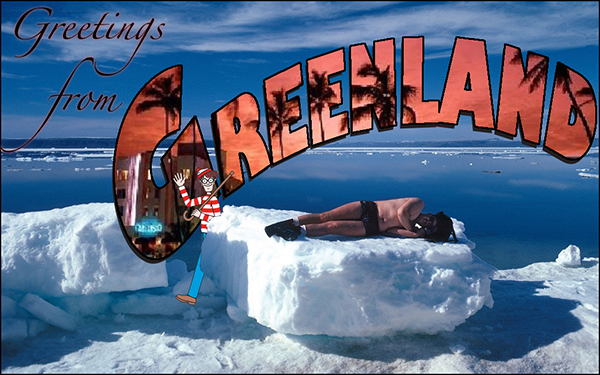
Greetings from DS106-2.5 Stars

Tell us where you are, where you’re from, or simply where you’d rather be and build a greeting card.

I think postcards are pretty cool so I was excited to find an assignment that allowed me the chance to make one.

The Work Itself

Postcard


The Story Behind the Story

I think considering how the weather has been this past week, we all want to go somewhere else. Obviously, I do not want to go to the Outer Banks in the current state it is in. I would actually like to go back in time to this summer and then go to the Outer Banks. I miss it so much and just want to lay on the beach and read a good book instead of get rained on constantly.

I do not know many people in my life who would not mind to go somewhere else, whether it is for vacation or forever. It seems to me that we all want to be some place else.

I took this photo about three and a half years ago while my family and I were on a ferry ride at the outer banks. The Sun was making everything around me glow and I then we passed this particular part in the photo and it seemed so picturesque to me so snapped a photo.

Narrating the Process

For this assignment I used Photoshop Elements 11. I began by opening up the picture into the program and then creating a “Canvas” that was bigger than the photo in order to create the border.

Then I analyzed different postcards that I found and chose the font that most closely resembled the one on the post cards. I also used the warped tool to give the words that “dipped” effect that they each have.

Finally I found postcard stamp online and copied and pasted it onto the postcard and there you have it! An Outer Banks postcard.

Greetings From Scotland

The assignment guidelines can be found here. This design assignment is worth 2 and 1/2 stars.

The postcard I made is from a place that I want to be right now. My family lives in Scotland and I haven’t seen them in so long! I would love to go visit them, but I’ve just been so busy. However, Scott and I worked out a schedule with our News Agency and I’ll be able to visit them in a few weeks!! I’m so happy to work with people like Scott who put such an emphasis on family and spending time with them. I can’t wait to see them (:

Screen Shot 2015-04-05 at 1.38.20 AM

Greetings from Andrea Carr’s Hopes and Dreams

This is where Andrea wants to be. Right now. Just like nothing happened. Just like everything was fine. She misses her life of privilege, the parties, the clothes. But she wants her husband back more than anything.


PicCollage

Link to Assignment (2.5 Stars–Character)

Greetings from Fishersville

Greetings from Fishersville, Virginia. Nestled in the Blue Ridge Mountains, we are a close nit community. Fall is here and the most beautiful season for us. No matter where you go in the valley you are promised a beautiful view of the colorful mountains. Come visit us, you won’t be disappointed by the scenery or the southern hospitality.

Screen Shot 2014-10-02 at 9.53.14 PM

Worth 2.5 Stars.

Greetings From DS106

scotland

2 1/2 stars

There is just about nowhere on this earth I love as much as Scotland. When I saw that we had the option to make a postcard from somewhere we wish we were, it was a no brainer because I always wish I was in Scotland.

For this assignment I pulled a picture of a highland cow with the highlands in the background. These cows are everywhere in Scotland and the UK and they are extremely adorable. They’re like the unofficial mascot of the country.

Making this card, however, was a massive pain in the butt. In order to get it to work the way I wanted, I used Photoshop and created about ten different masks, tied them all together, and then cut out the letters to reveal this beautiful cow. I’m pretty sure that there was an easier way to do it, and later this week I (hopefully) will write up a detailed tutorial about how to make and manipulate masks in Photoshop. I think it’s a pretty essential skill for a graphic designer to have.

What I like most about this design is that, to me at least, it truly looks like a real postcard or poster!

Greetings from a land of the midnight sun

greetingsfromgreenlandI watched the Midnight Sun episode and thought about what kind of assignment could go with it. Splash color on one of the paintings? Maybe, but I did something like that already. I thought about the radio guy doing the weather and how that might be a nice audio assignment – something like, “Do a radio weather report, but make it colorfully descriptive.” But then I decided to look through the design list to see what was there. I thought there was a travel poster assignment. I could do Visit Sunny Alaska! I found the Greetings from DS106 assignment and clicked the remix button and got a Where’s Waldo? card. That had possibilities.

I did a Google image search for Greenland and found the picture of the swimsuit guy on the ice block. Another search found a good picture of Waldo. I did a third search for “greeting from” pictures, mainly for font inspiration. That gave me the curved type idea. There’s a way to do that in Adobe Illustrator by creating an ellipse and using the path type tool. I used Gill Sans Ultra Bold because it has those really thick strokes, which are necessary if I was going to try to do that image-inside-the-letterform thing. I saved the Illustrator file, opened up the Greenland photo in Photoshop, and used File-Place to bring in the type from Illustrator. I opened up the Waldo image and used the magic wand tool to select the white background, then did Select-Inverse so that I had just Waldo, and copied and pasted him into the Greenland picture. He came in about the size of the Statue of Liberty due to the difference in pixel dimensions, so I spent quite a bit of time resizing him. When I had him at the right size and place, I made his layer invisible and used the polygonal selection tool to trace around the ice block where he overlapped, then turned the visibility back on and deleted that chunk of him so it looks like he’s coming out from behind it. I wanted to play on that temperature inversion idea from the episode so I did another search for images of Miami Beach. I pasted the Miami picture in as another layer, sized it, then made al the layers invisible except for the Greenland curved type. I used Select-Color Range to get the black type, then switched to the Miami layer, made it visible, all while keeping the Greenland selection outline, and copied and pasted that portion of the image as a new layer. I moved it slightly to get the drop shadow effect. I needed to make the upper edges of the letters a little more solid, so I used the magic wand/Select-Inverse trick again to get the type, then did Edit-Stroke to put a black line around the letters. I stuck the “Greetings from” in the corner in a font called Zapfino and moved the “from” so the ascender flows into the descender on “Greetings.” I flattened the layers and saved it as a JPG 600 pixels across. It could use more work – I think the type could be more legible – but I don’t feel like going further right now.

Whew! I think typing this up was more work than making the design.

Greetings From DS106

greetingfrom


I would love to be in the Philippines by now. The bamboo frame was an installation on the shore for photo opportunities. I took this photo last summer, I finally get to use it for something.

I used GIMP to edit this photo.

 LINK TO ASSIGNMENT

M-I-S-S-I-S-S-I-P-P-I

For my last assignment for my final project I did Greetings from ds106 (again). I previously did this assignment here, but for the stake of my final story I went ahead and did it twice (it will make more sense when you see my whole story together.

For this assignment I made my postcard for a small town in Mississippi.  It wasn’t a specific town just one that is quite small.  I knew I wanted to make the postcard quite simple.  I feel like the a small town would obviously have a less elaborate and decorated postcard that somewhere like Chicago would.

I started off by googling small town Mississippi.  I ended up finding a lot of pictures of small town roads and I even came across a sign that said Small Town Mississippi.  I guess that town is quite proud of their small size.  I ended up going with these to pictures to start:

Street

small town mississippi

As I played around in gimp I realized that I wanted it to say welcome to in some way as well.  I started off trying to find a font that would work but I wasn’t finding anything that I liked.  I ended up deciding to go with the welcome to part off of this sign:

welcome-to-mississippi

Here is my final result.  I feel like I captures the feeling of a small town pretty well.  What do you think?

Small Town Mississippi

Oh, Chicago

For my next assignment I did grettings from ds106.  This assignment is to tell us where you are, where you’re from, or simply where you’d rather be and build a greeting card.

To make this greeting card I started off by finding my pictures.  I’m not going to tell you why (if you really wanna know you have to read my final story post when it comes out) but I am doing this greeting card for Chicago.  I decided that I wanted to use a picture of the skyline and the Chicago bean for my picture.  Knowing what I was looking for made it pretty easy to find these two pictures:

Chicago Skyline

bean4

I then imported them into gimp one and a time and rotated them so that they were are about a forty-five degree angle.  I imported the sky line one on the bottom and the bean one on the top.

I then imported a plain cream background to go over the middle of the two pictures where they overlap.

1CreamBackground

I then cut away the cream until it was just overlapping the middle of the two pictures.  I then added in the words “Welcome to Chicago.”

Here is my final product.  I hope you enjoy!!

Chicago

Hi from the Happiest Place on Earth!

I totally got this idea from Kailtyn and her post greetings loved ones.  As you may have read on here by now (at least twenty times),  I AM GOING TO DISNEY IS LESS THAN A WEEK.  And I’m kinda pretty excited about it.  So I find it totally fitting to do the assignment greetings from ds106 which is worth two stars!

I started off by importing a picture of Cinderellas Castle into gimp.Castle

I the wrote the words DISNEY WORLD over the picture in the font summertime lovin. Then using the free select tool I cut around the words so that all that I had left were the words and the part of the picture that was inside the words.

words

I then found a picture of a red fabric covered in mickey heads and cut it and put in it a new window of gimp as my background.  pattern

After that I pasted my words that I had over top of my background font and used the free select tool to cut them out again.  I decided to leave a little bit of white space around the words to really make them pop off of the background.  I then used the font honey script to add the greetings from at the top of my post card and cropped it to the size I wanted it to be.  Here is what I came up with.

greetingsfromdisney

Hope you like it! Only two stars left!!