The Social Network ā€“ Minimalist Movie Poster

Facebook

I created this using photoshop. First by using the rectangle tool to create the button. I gave it a black stroke of 4px, and used the line tool set to 3px to create the white lines within the rectangle.

I then searched the font Facebook uses which I found out was Lucida Sans. I used that in bold to write “Add as Friend” layered on top of the rectangle button. I then got the mouse cursor vector from google images and applied a drop shadow to it.

Finally, I used the gradient tool to apply the blue-white gradient effect on the background and added the Like and Comment buttons in the bottom.

I chose this movie because it was one of my favorites and it’s story can easily be captured with minimal design.

Source Materials:

http://tinyurl.com/7gvxce4

www.facebook.com

Angry Birds and DS106

I created the following images for a blog post on using Angry Birds in the Classroom.Ā  I know Angry Birds isn’t a film or novel, but there is a story that is being told throughout the game. Click on the … Continue reading

Minimalist TV/Movie Poster

_cokwr: Create a tv/movie poster that captures the essence of the story through the use of minimalist design/iconography. , _cpzh4: Design, _cre1l: http://bionicteaching.com/wp-content/uploads/2010/02/Picture-8.png, _chk2m: Tom Woodward (via Martha), _ciyn3: 43, _ckd7g: , _clrrx: , _cztg3:

Deliverance Minimalist Movie Poster

Seeing Jim Groom’s minimalist movie poster for the The Thing finally get some love from Web UrbanistĀ inspired me to finally take a stab at this assignment. I actually don’t need a lot of prodding to make a piece of design (especially for ds106).

Deliverance Minimalist Movie Poster

My poster is for the John Boorman classic “Deliverance” starring Jon Voight. The song Dueling Banjos was made famous by the film, though apparently the original composer went uncredited (didn’t know that until now). The scene in which Drew plays the guitar and a boy plays the banjo is probably one of the most memorable scenes, and sets the tension in the film between the “city boys” and the “locals.”

I made the poster mashing a couple of previous ds106 assignments actually. I’d done a four icon challenge of Deliverance from which I reused the arrow, banjo, and title. And the background was reused from the “averaging flickr assignment.”

A little extra work was done to create the hole in the banjo from the arrow using the vector tool in Illustrator. And I did some hue/saturation work on the background in Photoshop to rework the yellow averaging flicker image into a muted green.

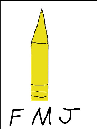
FMJ Minimalist Movie Poster

FMJ_Minimalist by theunwiseman
FMJ_Minimalist, a photo by theunwiseman on Flickr.

For my last design assignment, I chose to make another Kubrick movie poster in a minimalist style. I know it’s not very well done, but it was a rush job. I did my best not to make it look like a crayon, but hey, I’m no art major. Also, I’m not sure how that black border ended up around the left and top side of the image.

John Carpenterā€™s The Thing Minimalist Poster

I love the minimalist poster assignment over at ds106, and going through the process again allows me to do something with The Thing which I had promised last semester, but never delivered on. I ended up doing The Birds instead, and I think I thought it was better than it really is—but whatever it’s mine. That said, I like my take on The Thing even more–maybe I am getting better? Doubt it, but there is something to practice, practice, practice.

How did I do it?

I have been playing with Photoshop all night, and what I wanted to do is grab an image of the iconic head that grows eyes and legs and scurries off and that capture it as a kind of silhouette or black icon and use that as the poster. So, I found this image and used the magic wand tool to select the head and then went to Select–>Inverse to to select everything but the creature head and cut it all out. This left me with a silhouetter of the head surrounded by white.

I then had an issue with the legs of the monster on the right, so I copied the legs on the left and pasted them in the image and used Edit–>Transform–>Horizontal to make them fit right side seamlessly. I then hid one of the three legs so it didn’t look too symmetrical by grabbing the background color with the eyedropper tool and then brushing it over with white.

I then went on a search for the font used in The Thing poster, but realized it would be easier to just grab the poster and use photoshop to turn the white title to black by using the same method for grabbing the head I outlined above. The only difference was that once I had the title, I inverted the selection and filled it with black by going to Edit–>Fill–>Black.

After that, I used the transform tool to scale the title to how big I wanted i, and finished the whole thing off with a border that I created by selecting a perimeter with the selection tool and using the eyedropper to keep my blacks consistent. After that, I just grabbed the brush, made it a bit bigger and filled in the outlines of the site to give it a tight border that finishes it nicely.

There it is, hopefully I can revisit this and do a better play-by-play with screenshots, but I got it all down for the record at least.

Pre-Black Friday Week-End

For my minimalist movie poster I choose the 1967 Godard film, Week-end. It’s one of my favorite films and one of the first that came to my mind when I thought of iconic/rememberable scenes.

Near the beginning of the film there is a lengthy single take of the protagonists (sort of) driving through a traffic jam in the countryside. The scene is extremely long, almost tortuous. Here is the link to the scene.

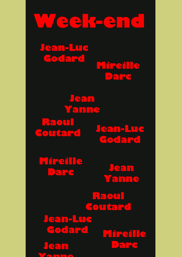
At first I tried to present this scene vertically, like a traditional movie poster would. I chooseĀ  to have the credit texts (correct term?) in a jumbled, disordered, and repetitious manner, echoing the way the cars in the scene are arranged. I did not like this initial attempt though. Not only was it not that minimalistic, but I didn’t think the vertical represented scene. I was also not too happy with the color.

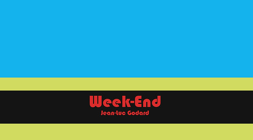
So I redid it in a horizontal. In this new version I changed the color scheme and also tried to keep it more simple. I think it was worthwhile to try a new approach; the second one is superior, I believe.

Here is the original, vertical version (the text is intentionally cutoff, btw).


And here is the second, horizontal version.


ds106: Design Assignment 43 ā€“ The City of Lost Children

Design assignment 43 brief

Create a TV/movie poster that captures the essence of the story through the use of minimalist design/iconography.

The City of Lost Children

I chose the film The City of Lost Children as the subject for this minimalist design assignment. Some of my favourite features of the film are the relationship between One and Miette, the lush emerald-green colouring and the Cyclops.

The City of Lost Children

Minimalist Movie Poster

Guess the movie…

Incidentally the poster was made with Adobe Illustrator. The bullets were made with the 3D revolve tool.

Glengarry Glen Ross

Alternate Title: “Have you MADE your DECISION for CHRIST?!”