Here is my second design assignment for the week! This one is a 3-star Minimalist TV/Movie Poster. All you need to do is pick a movie/TV show and then create a poster that “captures the essence of the story.”
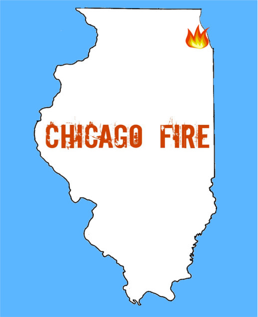
For this assignment I choose the TV show “Chicago Fire” it’s one of my favorites currently and if you are not watching it now, I highly suggest you check it out! The show is basically about firefighters and EMTs lives in a Chicago Firehouse. There is drama, romance, and action- I feel it’s a show that can apply to many.
In trying to be minimalistic, I decided I’d go with an outline of the state of Illinois. The blue background represents a color in Chicago’s Flag. The little fire marks “Chicago” on the map and I just added the title.
I used GIMP, paint and Picmonkey for this project and it was very annoying and frustrating. I just couldn’t really get things how I wanted them, thought I’m pretty happy now. I choose this font in picmonkey because I thought it had a “fire-y/burnt” look to it.
So we have officially made it to design week. For this week we have to get fifteen stars (and I’m kind of freaking out a little bit). I decided to get an early start of this week since I have awful at getting started anytime before last minute lately.
For my first assignment of the week I decided to do Minimalist TV/Movie Poster which was worth three stars! For this assignment you had do “create a tv/movie poster that captures the essence of the story through the use of minimalist design/iconography.”
I wasn’t quite sure which movie or TV show I was going to pick at first. As most of you know, I love everything Disney but I decided to pick something else for this assignment. I am much more of a TV person than I am a movie person, so I decided to choose Friday Night Lights. I have talked about Friday Night Lights on here before in my post about the shape of a story but in case you missed it I am going to share my all time favorite Friday Night Lights video on here again.
After I decided what show I was going to use the rest of this came pretty easily. I decided that the picture I would use for my poster had to be a picture of the state of Texas. One of the greatest thing about this show is how they make the setting a character. Dillon, Texas is almost important than any of the characters. I also knew that I had to use blue and yellow as my color scheme because those are the colors of the Dillon Panthers. I used gimp to make my poster and was pretty pleased with how it turned out. Hope you enjoy it.
In order to help recruit a new trainer for ISIS (and the on-going space mission), I have created a series of design media.
1. Propaganda Poster
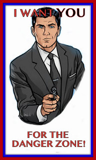
This poster corresponds with the Propaganda Poster Assignment in the design assignment repository. I created it by taking a screenshot of this picture of Archer. In Photoshop, I carefully edited out everything around him, and left only his upper body. From there, I saved the picture and opened it up in the ever-so-handy Picasa. I used this WWI poster as inspiration, and added the typography to the poster, and threw on a ‘museum matte’ boarder using red and blue to give it the patriotic touch that it needed. This poster also poses as something a little less with the color theme that you will see in the next two posters.
2. Minimalist Poster
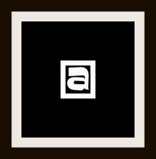
Corresponding to the Minimalist Poster Assignment in the design assignment repository is my minimalist poster for this glorious tv show. To achieve said poster, I took the “a” from the title of the show–literally cropped straight from this picture, or a bigger version of it–and edited it in Picasa. This time, I used two features in Picasa, the ‘museum matte’ and the regular old ‘boarder’ feature. I stuck with the original color scheme, because it suits the show, and makes it more recognizable for the audience–if they have seen the show at all.
3. A “How To Archer” App
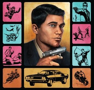
This is the icon for an app that teaches the Archer fanatic How To Archer. It corresponds with the Create Your Own Smartphone App assignment in the repository. I also got the idea from a book that was actually written for the show called How To Archer, written by Sterling Archer himself. I even used part of the original book cover in my icon, so that the targeted audience can relate back to it. Perhaps it will become the logo for the show one day–this or the minimalist poster would be cool.
This series of design assignments sets me at an initial 8 stars. More to come soon. We are on the brink of recruitment!
I decided to make a better more improved minimalist movie poster and let you all know how I did it.
Here is ma poster:
Well to accomplish this assignment you either have to have some way of making all those cartoonish looking drawings on a computer, or spend a couple of minutes messing around with a photo editing program. Rather than using my usual go to photo editor of pixlr.com I was adventurous and tried to do the whole thing in GIMP. I sort of accomplished this.
My idea was to make a minimalist poster for Office Space, one of Mike Judge’s non-King of the Hill related works.
Here’s the original Movie Poster
So what I did was that I found a stock image of the classic red Swingline staplers that almost anyone whose even heard of the movie knows about. After I found one I wanted I loaded it into GIMP.
This is where my experimenting began, but for you I’ll skip to the meaty parts. Once the image is in, darken it a little. Just like when we made the stencil image, things just seem to work better when the original image is a little bit darker. DON’T mess with the contrast; we’re trying to make a hand drawn looking picture here so the lines can be a little simplistic. Once darker go ahead and click “posterize” and take that number of layers down to 2.
Now we’re halfway there, things are starting to look simpler and more minimalist by the minute. After we’ve poserized the image, go ahead and use GIMP’s filter labled “cartoon” under the “artistic” tab. Lower the number of black marks, because too many, again, add to must definition. Only do this once, don’t repeat this step. After this go back over the image and “clean it up.” By this I mean eliminate anything that seems messy or too defining. I tried to keep the number of colors no more than three: red, white and black.
The matchstick was a personal choice, but if you choose to include it ONLY cartoonize it. It doesn’t really need to be posterized.
This is were I reverted back to my old ways and used pixlr, mostly because I don’t really understand how text-boxes work in GIMP. All I did was pick an office-y looking font, slap in the words “Office Space”, added my two GIMP images as layers, “free transformed” them around till they looked good, and then flattened the images.
The good thing about making a minimalist movie poster is that it doesn’t have that many steps once you figure the basics out. The most important things to remember is to posterize THEN cartoonize.
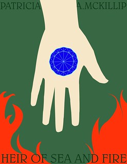
Continuing with my theme of “let’s parody every awesome line from Riddle-Master,” I give you my minimalist poster for the second book in the trilogy, “Heir of Sea and Fire”!
MINIMALISM, AHAHAHAH. Why the heck did I ever think I could attempt minimalism? MY FAVORITE ART STYLE IS ART NOUVEAU, WHICH IS LIKE MINIMALISM’S POLAR OPPOSITE. While settling on an appropriate design and getting to its execution was super frustrating, I am extremely pleased with how this turned out. It isn’t perfect by a long shot but I am GIDDY over those nice clean lines, especially the jewel in the center and the fire in the bottom right corner. Mmmmmm, fire.
All of the images and colors in this poster were carefully chosen to reflect elements from the book. The hand represents Raederle of An, who is the “Heir of Sea and Fire” of the title. Near the beginning of the book another character, Astrin, takes her to the ruined city of the Earth-Masters at a place called King’s Mouth Plain. The plain is scattered with artifacts from before the Earth-Masters destroyed themselves in a massive war, and Astrin finds a small faceted stone there and gives it to her. Later, Raederle uses the same stone to craft an illusion of light so powerful that it blinds several warships, and she and her companions can continue on their journey to find her would-be-husband, Morgon.
The fire factors into the story when Raederle begins to understand the full scope of her powers. Eventually she learns that she is descended from a shape-changer, the same creatures that are trying to kill Morgon, and therefore has power over both fire and the sea. For Raederle, shaping fire with her hands is an admission of her link to the shape-changers, and she spends much of the book struggling with what that power, and her wanting of it, makes her. After she shapes fire for the first time, looks down at her hand and finds that the pattern of the twelve-sided stone from Wind Plain has been etched into her palm:
She sat up abruptly, staring down at her hand, in which the fire had burned like an extension of herself the night before. On her palm, scored white, were the twelve sides and delicate inner lines of the stone Astrin had given her on King’s Mouth Plain.
McKillip has a knack for ending chapters with lines that knock you on your ass, and that’s no exception.
It’s only much later that the connection between the shape-changers and Earth-Masters is, and I won’t spoil it for new readers. Overall, I wanted to convey the sea with the green color of the background, the blue stone in Raederle’s palm, and the flames she’s reaching towards to represent how she does long to claim her intrinsic power, and how that struggle becomes her main point of character development. I also wanted the font to be evocative of a fantasy setting, but subtle enough that it wouldn’t be distracting, and happily the Gabriola font was perfect. It even mirrors the font on the cover of the copy of Riddle-Master that I own, which is kind of neat.
Although this poster isn’t minimalist in the strictest sense, I’m still quite happy with it, and I’d love to try my hand at more minimalist designs in the future.
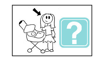
I saw this assignment on a random try! It was to design a minimalist poster for a tv show/movie. Immediately, I thought of doing something with How I Met Your Mother. I don’t know why that happened, it just did! So I wanted to do something simple (duhh cause they said so) like a picture of a mom’s face with a question mark by it. The whole premise of the show is finding out who Ted (narrator and one of the main characters of the show) marries and has children with because he’s telling his kids the story of how he met their mother.
So I searched “mom clipart” on Google Images and found a perfect one! I made a rectangle shape on a Word document, put the mom clipart to the left of the inside. Next, I searched question mark in the clipart on the Word document and found one I liked and put it on the right inside of the box. Then I selected all 3 items, grouped them, then copied it and pasted it into Paint. I saved it and uploaded to Flickr and here is the product:
Design Assignment 43: Create a tv/movie poster that captures the essence of the story through the use of minimalist design/iconography.
Inspiration
I’m no Bergman connoisseur nor real film buff for that matter, but Bergman’s The Seventh Seal has a scene that is pure poetry, verbal and visual. To set up the scene, a knight, Antonious Block, returning from the Crusades, challenges the devil to a game of chess believing this to be a clever ploy to stall for more time, life. Delaying the inevitable, the knight along the journey back to his castle meets a juggler, Jof, and his wife, Mia, and young child, Mikael. The wife shares the family’s meal, strawberries and milk, and Block remarks:
I shall remember this hour of peace: the strawberries, the bowl of milk, your faces in the dusk. Mikael asleep, Jof with his lute. I shall remember our words, and shall bear this memory between my hands as carefully as a bowl of fresh milk.
[He drinks from the bowl.]
Block’s comments really resonate with me and remind me of my constant quest to live in the moment or hour and make the most of the rich yet simple encounters that make up a life. I think that for all of the pleasures and opportunities that the digital world brings that it also antes up the challenge to live mindfully.
You can watch this scene on YouTube and if you’re as intrigued by Bergman’s work as I am then you’ll enjoy this retrospective on his work by Woody Allen. Allen was seriously influenced by Bergman’s work and work ethic and believes that Bergman’s films will stand the test of time and still be enjoyed and studied when the trendy films are long forgotten. It is both the soul and the technique of Bergman’s work that inspires Allen.
Process and Reflections
A minimalist poster seemed quite appropriate for Bergman’s metaphor-rich film.
I knew immediately that I would integrate a nod to chess and to the bowl of strawberries in my poster. The simple black and white squares I think conjures up a chess board and hints at the good/evil dichotomy of the story. I placed the bowl of strawberries on a diagonal to draw the eye immediately there. The one red strawberry adds a touch of the surreal and lets the viewer know that all is not as it seems. Finally, I used the Google Languages tool to translate the title into Swedish, Bergman’s native language.
Aspirations
I cut the bowl of strawberries from clipart and made some effort in GIMP to smooth the edges. I’d really like to learn to use a program like Illustrator that I’ve heard others mention to draw an abstract bowl of strawberries in black and white. Then I’d colorize the one strawberry for effect.
It just occurred to me that my friend Norm always closes with “That’s my story. Any questions?” and I always seem to end with a question to help me tell my story better. An appropriate sign-off for me.
This week I found another block of time through which to sprint after a number of ds106 design assignments. I had some trouble narrowing down which assignments to tackle until I began them; clearly, I do not yet have the patience or chops for some of the work, so it’s great that the ds106 community has shared so many different ideas for assignments. I hope to contribute some ideas this summer and fall as I try to implement a more ds106/MOOC feel in my middle school classroom.
Here are my basic hardware and software specs for the week: MacBook, OSX 10.6.8, 2.26 GHz Intel Core Duo 2, 2 GB of memory, Chrome, Wacom Bamboo tablet, SketchBook Pro (for drawing), Acorn (for fills and copy).
This week the work is not in any particular order. I made an animated comic book cover that looks pretty crummy next to all the awesome examples out there. I don’t yet have the animator’s patience to pull off a decent attempt, so I’ll pass on sharing for now. It was a simple snikt effect.
I’m becoming interested in how the community categorizes tasks. At times today, I definitely felt like a designer; at other times, I felt more like I was tweaking a pre-existing design for my own education (which seems more like a visual task to me), or mashing-up a number of designs. Some of the visual assignments feel like design tasks, too – like the album cover. I’d love to hear more about how contributors and organizers think of course- and task-design.
I take a ton of screenshots in Minecraft. I love discovering new sights in Minecraft, as well as new perspectives on familiar places. I ask students to take a ton of screenshots, too, so I can share their work easily through blogging. (Teaching in a multi-age classroom in a middle school, I haven’t yet solved the riddle of whole-class social media use, so I try to collect and share as many digital photos and artifacts as possible.)
For this assignment, I looked through my ds106-server screenshots, found a picture I liked, cropped it some, and then appended a snappy postcard/bumper-sticker-ready punchline in Acorn. Lastly, I mocked up a simple back for the card and let it be.
Since I wrote about how much The Road terrified me when I posted my Liminal States story-shape, and since The Road showed up as the exemplar for this assignment, I went back to Liminal States and riffed on my fake album cover assignment; with Liminal States you really can’t go wrong with a boy and his dog.
However, I wanted to use a different image this time around, so I found
“>a picture of a boy dressed as a cowboy riding a dog in The Commons on Flickr.
I brought the photo into Acorn and composed the rest of the cover there, darkening the bottom band to offer better contrast for the tagline.
The boy dressed up as a cowboy reminds me of my [privileged, white male] love for archetypes, even though many of those archetypes make horrible, horrifying decisions, like the genre-riffing characters of Liminal States. Moreover, in the book, youth – the eternal kind – is not all its cracked up to be. Considering the source material, it’s also significant that the boy and the dog clearly have different ideas about what’s going on and are, in fact, headed – or at least looking – in separate directions. The presence of grass is germane to the novel, as well.
I picked Trajan Pro for the font because it has that somber, elegiac, official feel like the title of a Tom Brokaw book.
The tag line is neither entirely true nor entirely false in its description of the book.
I’ve cartooned myself many times – some examples can be found here, here, and here. There’s even a short comic I drew about the first year of our school out there in a filing cabinet somewhere.
I find using a cartoon alter ego to be very helpful in breaking up the monopoly that text holds over my blogging, and I like to use drawings in class materials, as well. Cartooning is a good way to and bring some humor to the engrimmening proceedings of American public education.
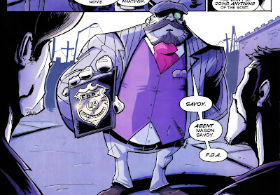
For this assignment I wanted to draw myself differently than I normally do, so I went online and searched after
“>an image of Savoy from the comic Chew as drawn by series-artist Rob Guillory. (I have no idea why I’ve never cosplayed Phillip Seymour Hoffman playing Chris Farley playing Savoy, but I know I could rock it.) I like Guillory’s style – it’s cartoony, dynamic, busy; as with Jeffery Brown’s completely different work, it makes me think I could draw a comic. It gives me hope.
I tried to capture Guillory’s sense of Savoy’s form, but left much of the interior clean, as I tend to do in larger work; paradoxically (maybe)I detail little doodles like crazy. I also colored myself for a change since I usually work in black and white.
I drew myself in SketchBook Pro using a 2.5-sized brush rather than a 4.0-sized one so that I my line would look more like Guillory’s and less like mine. I began with a blue-line drawing and then added a layer for a black-line drawing to bring into Acorn. Then I deleted the blue-line layer, switched to Acorn, and colored myself.
To make my own, I went for a popular, yet nerdy, property – The Lord of the Rings. In looking at spacesick’s use of patterns, I decided to use a ring motif to build Mount Doom and to perch Suaron’s eye atop it. I used a different color/material for each level of rings: silver for the Elves, bronze for the Dwarves, and iron for the humans. While that progression isn’t canonical, I used it to bring more color to the page and to communicate of how Middle Earth rank-orders its species. I could have made the other rings all white and left the one ring golden, but I am not at all unhappy with this design. I wonder also about linking the rings to show their interconnectedness in a chain-mail kind of way.
I used Acorn to compose the cover. I read up on spacesick’s fonts
“>here. The projector is the only element I lifted directly from any of spacesick’s covers.
Finally, I opened the image in SketchBook Pro for some final touches with textured brushes to worry the cover.
I’m really eager to see more of these designs from the ds106 community.
I’m not sure why this assignment is worth zero stars; I think it should get two.
For this task, I decided to make a children’s book cover for a hard science fiction novel – House of Suns by Alastair Reynolds. I love that book. It gives me hope.
My cover, however, gives me the giggles. It’s so profanely incongruous – and yet so weirdly apt – that it delights me.
House Of Suns for kids
I drew the cover in SketchBook Pro and then colored and lettered it in Acorn.
As I hunted down stray pixels in Acorn, I discovered that it’s much easier to draw and paint in that program while zoomed in a level or two (this is both an a-ha and a duh moment). I still prefer SketchBook Pro for drawing, but it was satisfying to find a way to draw and color productively in Acorn, as well. At the default zoom, even a medium-sized brush can disappear on-screen in Acorn because its reticle isn’t persistent. That means if you’re trying to paint stray pixels in Acorn without zooming in, you lose the tip of your brush if your brush color is the same color as your background. That frustrated me greatly, but now I know that it’s easier to keep track of your brush tip while zoomed.
I hope others will jam on the idea of making children’s book covers for novels meant for adults.
Aude aliquid dignum: dare something worthy. I try to approach teaching and learning as if they were the most worthy things I could do and help others do. I think it’s important to ask kids to do worthy work. I think it’s important that teachers dare to resist the standardization of education. I think it’s important and worthy that we talk about how to subvert the status quo in our primary and secondary schools so that learning matters to kids, their families, and their communities. So here it is:
Aude aliquid dignum
I made the image in Acorn. I tried to minimalize the sans-serif text’s presence on the page without making it illegible (I probably cut too much of the “g”). Then, while trying to stay away from the Dr. Manhattan symbol, I made a little hydrogen atom to frame the words, with the “e” inside the electron. Hydrogen is a pretty minimalist element, but the proton and electron are also the building blocks of everything else. Hydrogen can exist by itself, but atoms do great and terrible things together. We humans can do the same, inside and outside Minecraft, a game about building – and/or destroying – alone and/or in a community!
I put another atomic particle in the upper right-hand corner so that the eye would be drawn there in an attempt to connect the two white spaces with one another over distance, which made me think that maybe the electron (which wants to create a bond) is also little person or organism looking to the stars and wondering how to connect with another being over a vast distance. I think connecting is worth daring.
I found a CC-licensed picture of a glorious, insanely detailed, embroidered Moss, brought it into SketchBook Pro, and traced over Moss’s hair and glasses. I used green in homage to the show’s pixelated, primitive CGI credit sequence. Then I went into Acorn to fill it in and clean-up white speckles left over in Moss’s hair and glasses.
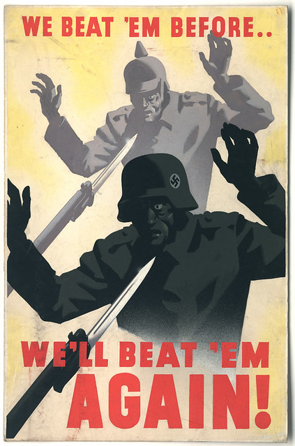
For this piece, I searched The Commons on Flickr for propaganda. I went into my search looking for an ad or poster about building a shelter. I wanted to make a visual pun on our Minecraft work. However, when I found this picture, I switched gears. I hate Creepers. I’m playing the ds106 server on survival mode right now, and the Creepers have not been kind. If you look at my stretch of the beach on the server (behind camp), you can see how much Creeper damage I’ve had to patch. Finding a way to rally against the Creepers was just what I needed to lift my spirits.
I grabbed a CC-licensed picture of some Creeper cosplay. I took a screen shot of the head and cut out the background in Acorn. Then I brought in the propaganda poster. I used the scale and perspective transformations to size, angle, and position the Creeper heads. Then I made the heads monochromatic and color-matched them to their bodies.
Beat the Creeper
Now I’m ready to go back on the sever. I hope someone will put this poster into a ds106 texture pack for Minecraft!
#DontBlogNow starring Martha Burtis and Alan Levine. Somehow featuring the Bava, Timmmyboy, and Slaughterhouse 4. I did a lot of cutting, filling, and smudging in Acorn. I grabbed the movie poster here. I found Martha here and I found Alan here. I sepia-toned their faces, shrunk their heads, and then altered their saturation and brightness to help their faces better fit the gestalt of the photo in the poster.
#DontBlogNow
I love how different their expressions are, as if Martha has caught on to something that Alan is asking about again. “A serial killer in a red raincoat? Really? Was that a deliberate design decision? Where?” “Over-ay ere-thay, Alan-ay! Et’s-lay o-gay!”. Why someone snapped a photo of them at this moment I will never know.
I picked Don’t Look Now to avoid making a quick and easy visual pun about a movie I loved. I despise Don’t Look Now. I loathe that movie. I will never go to Venice. I refuse to look at myself passing on a boat. Forget it.
I will, however, spend hours remixing the film’s poster.
I just wish I was better at digital production – I really like the way the poster turned out, but I wanted it to be perfect, like my utter, unutterable, intangible, illogical contempt for this Don’t Look Now.
That’s it for today’s products. As I go further into the ds106 experience, I’m trying to stick with at least a few assignments per week that push me out of my comfort zone. I also want to balance the camp nature of camp with the profundity of the learning experience available to me here. I need to socialize more with my fellow campers, too.
I try to teach to what kids are doing in my classroom; in the same way, I’m learning to design what I discover instead of trying to design what I plan. It feels good.
For the Minimalist TV/Movie Poster design assignment we were to Create a tv/movie poster that captures the essence of the story through the use of minimalist design/iconography. Here i chose a couple of my favorite movies.This assignment was fairly simple i just added text to pictures that convey the idea of the movie.
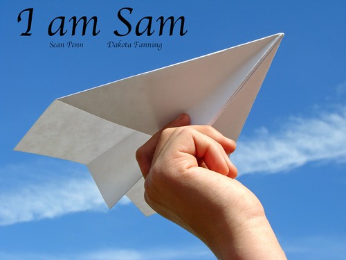
The first movie i chose was I Am Sam,
In the movie Sam who had a mental disability, was a kid at heart. With a kid of his own, he found ways to entertain her by teaching her how to make origami and paper planes. I found the simplest picture of a hand holding a plane against a blue sky to show that although he has a disorder he could not be stopped. He was above all the negativity, criticism and judgement and just lived to make his daughter happy.
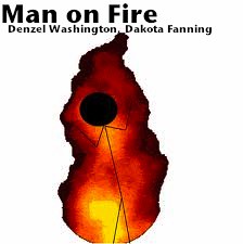
My second selection was my alltime favorite movie Man On Fire,
here i found an image of a burning stick figure which has no relation to the movie at all but i figured that it is clever because technically most people in that movie did get burned.
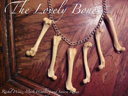
My final choice was The Lovely Bones, alothougth the movie made me cry, my creation made me laugh.


