Design week started yesterday and I could not get my ‘pointy head’ around it. Each week I feel…


Inspired by Cogdog‘s awesome “I Can Read!” gif poster for “Eye of the Beholder,” I decided to make a poster of my own in a more minimalist style for “Time Enough at Last.”
I started this RIGHT after listening to Tim and Jim (hey that rhymes!) talk about The Noun Project and Adobe Kuler, so I made use of both of those.
The color scheme I worked with is called “Day of Reckoning,” which I thought was almost too on the nose for this assignment, but hey, I like how it turned out. I was looking for a five-color group that included two different blues for the sky (different sky colors in the lenses would give a sense that the times were different, or so I figured) and two colors that could work for the ground beneath those skies.
The green was left over, so I went and split the poster down the middle and painted one side with it. Originally, the whole thing was going to be white.
Then, also based on Tim and Jim’s discussion, I went ahead and played a little with typography. I kept it all one typeface in the beginning, which I changed to four separate typefaces for the second slide, to give a sense of the chaotic feeling at the end of the episode, and also communicate a sense of fracturing, like poor Burgess Meredith’s glasses.
And how about a hand for B-Murge? That guy is killing it.
Eye glasses by Francesco Terzini.
House information icon by Nicholas Menghini.
Ruins icon by Paulo Volkova.

![]()

Create a tv/movie poster that captures the essence of the story through the use of minimalist design/iconography.
For this assignment i thought it would be the perfect way to get the image of Agnes Moorhead completely butchering the aircraft out of my mind. Even though the invaders were a large part of the story and probably could have worked for this poster, i honed in on the word minimalist and focused on the minimal design that the invaders craft used. With the exception of the US logo located on the craft, it can be broken down to be two circles and a long rectangle. Fitting very well into the minimalist frame. I was lucky that the template i used offered a text that was similar to the Twilight Zone text so that i could add a few key word elements to the poster.
In order to create this poster I used a Poster template in microsoft word. Once i picked out my template (movie poster) i changed the color scheme to Grayscale so that it remained within the framework of the black and white time period that the episode was produced in. The template came preloaded with text and a picture so i had to delete all of that and add in my own text. On the bottom i chose to include the air date for the episode to allow for it to seem more like a movie poster with the release date listed. In the top left hand corner I added the Episode title and TV series. The font used is called Mistral (heading). In order to make the picture of the air craft, I used the shapes feature and made one large circle, placed it on the bottom and filled it in with the darkest grey to try and stay as close to the color used in the actual episode, i then drew a smaller circle and made it one shade lighter than the base circle. I then changed my shape to be a rectangle, made it equal in length to the diameter of the circle and filled it in black. Once that was complete and the rectangle did not extend past the larger circle, i filled it in using the darkest grey shade offered. Because of its dark nature, it could not blend in with overlapping the smaller circle, i had to format the smaller circle to bring it to the front of all of the images so that the rectangle was not sitting on top of the small circle.
Word does not allow for the exporting of actual documents to a JPEG file, instead i had to save the picture to my desktop, then save another version as a PDF, from the PDF file I was able to export the poster to be a JPEG file, then upload it to Flickr and to the this post.
Create a tv/movie poster that captures the essence of the story through the use of minimalist design/iconography.
This second assignment is worth 3.5 stars bringing my total to 6.5/15 stars for the Design assignments.


![]()
Season 1 Episode 2

Really there are no words needed.
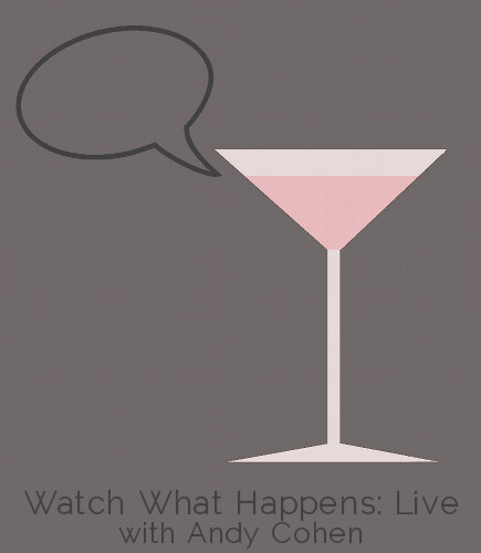
I guess you can say that I’ve fallen in love with making minimalist posters this week since this is my third one. I have been enjoying the challenge of making them this week and learning how to use GIMP in the process. My best friend got me hooked on Bravo’s Watch What Happens: Live with Andy Cohen, the only talk show on late night tv to feature an open bar. I wanted to emphasize two key elements of the show, the talk and the alcohol through the symbols I used for my take on the Minimalist TV/Movie Poster assignment.
I cropped down this image of a martini glass and cocktail shaker and recolored it with a gray and a grayish pink and changed it’s background to a medium gray. I added this speech bubble to the image, resized it, recolored it from black to a darker gray and rotated it so that it looked like the martini glass was talking and added the text using Raleway, a minimalist font I discovered this week in a slightly paler gray than the speech bubble. I prefer to use shades of gray, even subtly over the standard black and white, which I have heard people find too harsh.
This was the hardest assignment for me this week and honestly, I’m not totally happy with how it turned out. I love the design and layout of it but not the edges of the martini glass, which I could not figure out how to make sharp while removing the darker pixels around the edge of the glass.
For this week’s assignments, I am focusing on design.
For my birthday on February 23rd, I received both seasons of Game of Thrones on Blue-ray/DVD. I can’t stop watching it. So my mind has been on Game of Thrones all week.
The moment I saw this assignment to make a minimalist movie/tv show poster I knew I had to do Game of Thrones.
I started by writing down a bunch of ideas for the poster. How can I represent an entire series with one symbol?
I thought about a crown or the throne of swords–but how overdone is that?
So I went with something that is poignant and representative.
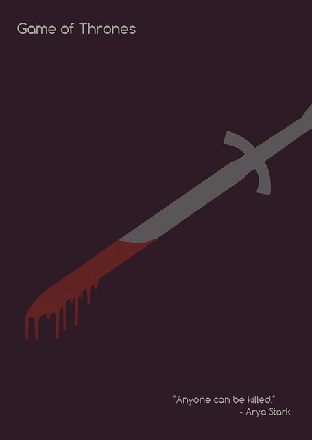
If you haven’t seen the series, you may not get the reference, but it’s a pivotal moment in the series.
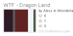
I wanted soft colors that weren’t too bright. So, I went to a palette site called Colour Lovers. Naturally, I searched, “Game of Thrones.” On the first page was this masterpiece:
I knew I wanted something with grey for the sword, but also red for the blood. How perfect is this?!

I found my blood drip brushes on Deviant Art. You can see and download them here.


I would write a tutorial for this if I didn’t have to switch between Photoshop and Corel PaintShop Pro to complete it. Photoshop, I learned, does not like to replace black and white colors. So while I needed to use Photoshop for just about everything else, I had to turn to PaintShop to use color replacer.
I absolutely loved making this poster, and I wish I could make a ton more for this class (if I had the time, I would do it for fun!).
As per usual, another post is being dedicated to Cinderella. What can I say? She’s my favorite. So it was only natural that when I had the opportunity to create a movie poster in the most simplistic manner, I chose to do Cinderella’s cover. Just out of curiosity, I decided to search what some Cinderella covers had looked like in the past, and certainly came across a large variation depending on the version and the year. Here were just a few:
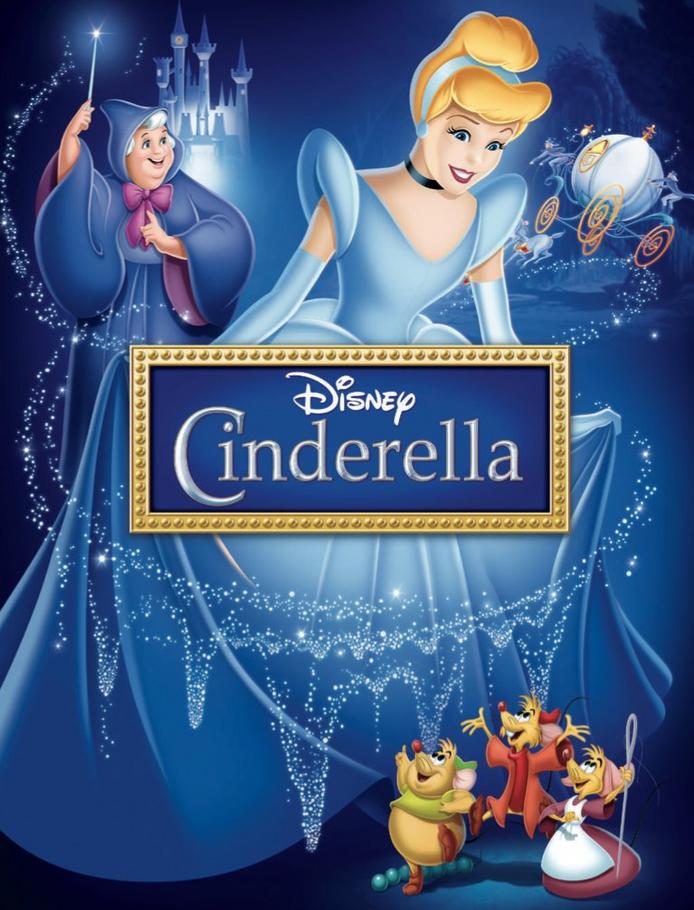


but the one that caught my interest the most was:

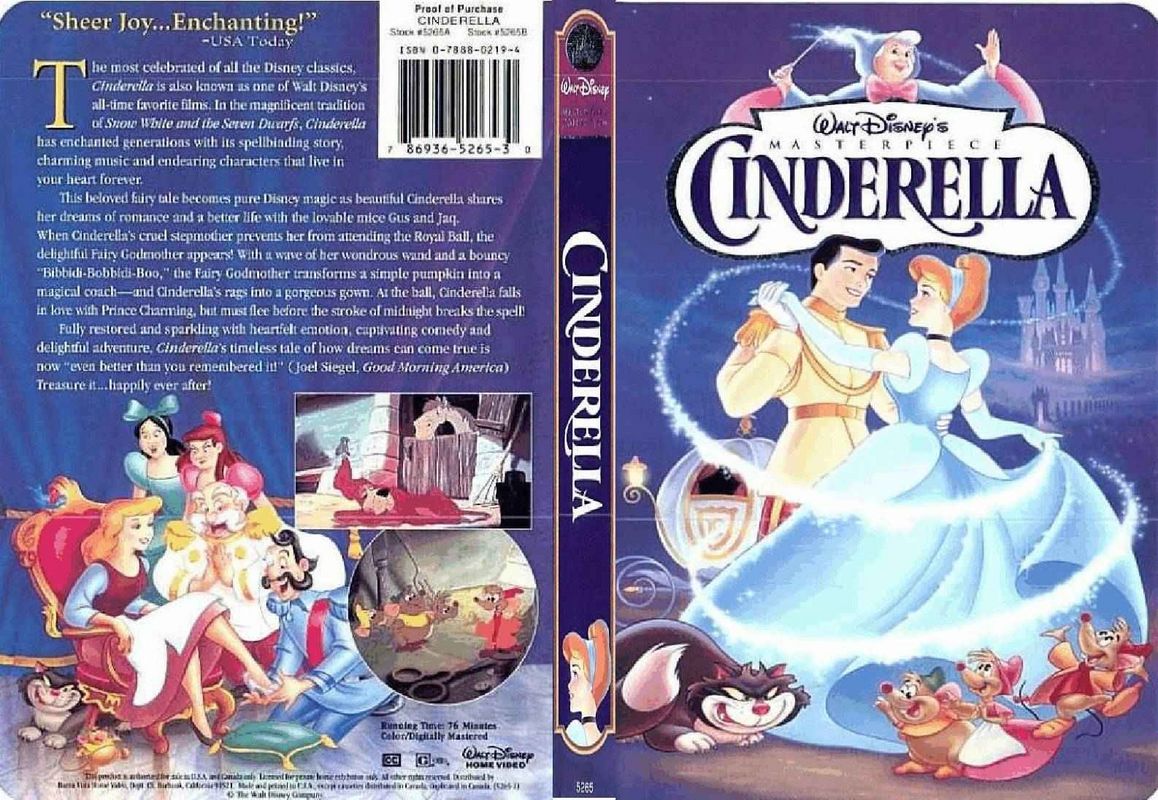
Sure this last one may not be a movie cover, and typically playbills are a bit more simplistic (I am absolutely obsessed with Broadway Plays). But I just loved everything about this. In fact, I actually saw this picture after I had already made my movie poster. The first time I saw this assignment I knew I wanted to do the iconic glass slipper, because it is after all the dream.
So I wanted to make my poster have the glass slipper, so I googled an image of a glass slipper and I put a light blue background as the background layer. I did have to also paint the blue around the slipper, which was a very tedious process. I then added some text and wanted to put it on the right side just to create a bit of a balance between the shoe location. I did all of this with the lovely help of GIMP, and got this amazing result that I really like:

Thanks for reading!
Princess Karissa
For this assignment, we had to make a minimalist design that reflected a movie or tv show. Instead of doing exactly that, I chose to do video games. The first one I did was Mario. Here it is.
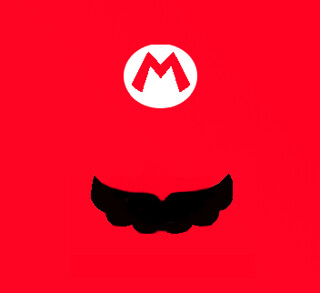
I did this all in Gimp. First I took a picture of Mario’s head and opened it with Gimp. Then I highlighted the area around the M of Mario’s hat and then loaded it into another frame that I had opened and just simply painted red. Then I just drew a moustache in. I didn;t really like the entire work, mostly because of the high amount of red. I think realistically I should have made the entire hat on a white background instead of making everything red. I made another because I was frustrated with it.
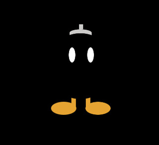
I did a Bob Omb instead and it turned out a lot better I think. The dominance of the black really makes everything come out better. I only used the shapes and paintbrush for this. First I made the background black using the Bucket Tool. Then I used the oval tool to shape the eyes. When I decided on a good shape, i painted it white. Then I copied it, pasted it back in, and used the move tool to put it in a good place. Then I went for the feet and, again, put in some ovals using the oval shape tool and put them where I wanted them. After that, I copied and pasted it across to the other side again using the move tool. Then I made the legs using the rectangle tool. After I found a good shape, I painted it the orange color using the bucket fill tool. Again, I copied it into the opposite foot. The last thing I made was the fuse-cap. I used the oval tool to make a round top and then the square tool to make the fuse and extend the oval down to make a box with a round top. I filled all these using the bucket fill tool. The last thing I did was use the oval tool to shape the body of the bob omb. I didn’t fill this one because it wouldve gotten rid of the eyes. Instead, I used the paintbrush tool to simply go around the edges of the circle with black. The advantage of this is that the paintbrush can’t paint out of oval selection, so nothing will be messed up. This made the round edges of the legs and the round edge on the cap, finishing everything.