MasterChef Junior

TVposterfinal


“Create a TV/movie poster that captures the essence of the story through the use of minimalist design/iconography.”

3.5 Stars

Okay, I’m going to be really honest with you this time around. I have a folder full of slightly different versions of this poster on my desktop. This assignment was hard, and I had to finally stop myself and just go with one. So here it is. I went ahead and designed a poster for one of my favorite TV shows, MasterChef Junior. I love watching the kids cook amazing meals that I would never be able to do my own. It’s also cool to watch the judges, who are so famous for being hard and mean, mentor these kids and show their softer sides.

I knew immediately I wanted the image to be a simple child’s whisk. I went with a rainbow colored one to make it seem young and child-like, but also still professional and serious. I recently downloaded a Disney font for one of our daily creates and knew it would fit perfectly here. Nothing screams “kid!!” like Disney does. Making the poster was relatively easy. I opened up the image of the whisk in paint and increased the size of the page to make it look more like a poster. I then scrubbed the background to get rid of the pixels from the image and make it appear as white as possible. I did this with the eraser tool in paint. After that, I inserted a text box and added in the title of the show.

This is where things became tricky. I could not for the life of me decide on how to line up the text and image. I spent about 30 minutes trying different font sizes, effects, and positions until I settled on the image you see here. I used the square line tool to make the border and double layered it because I found it aesthetically pleasing. I bypassed flickr and uploaded my image directly to WordPress so I could mess with the size and alignment more easily. And there you have it, a minimalist TV poster!


Citizen Kane: Minimalist Movie Poster

Create a tv/movie poster that captures the essence of the story through the use of minimalist design/iconography (Minimalist TV/Movie Poster)

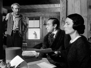
The concept for this design assignment came to mind immediately based on this scene from Citizen Kane (1941):

947223-citizen-kane

Cinematographer Gregg Toland pioneered a deep focus photography that enabled complex storytelling to be achieved in a single shot. In this part of the film, the parents of the young Charles Foster Kane are handing over supervison of the boy to a banker who will oversee his education and entry into a life of power and privilege using the proceeds from a gold mine found on the Kane property. It is a key scene on a number of levels. While the young Kane’s future is being discussed inside the house, we can see him playing happily outside oblivious of the new direction his life will take. Thus begins the problematic downside of his emotional impoverishment that will dog his use of power and wealth as an adult. Although we don’t know it at the time of this scene, Kane is also playing with the sled called ‘Rosebud’, Kane’s final word uttered before his death in the opening of the film and a mystery that drives the investigative plot. The sled, then, seen at the end of the film being destroyed deliberately as an unwanted and  lost possession of the dead Kane, is a powerful symbol of childhood contentment betrayed by parental insensitivity and (particularly a mother’s) ambition that we recall with new resonance from this earlier scene at the Kane home.

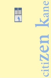
Therefore, the image of the boy Kane playing with Rosebud framed by the window is a good basis for creating an essential and minimalist motif for the film. The film still was imported into Paint and isolated by overpainting the rest of the image as background. The window motif was then copied into PowerPoint and arranged in portrait poster format with the window placed toward the top left of the poster creating a sense of some perspective depth. The font is Adobe Devanagari with serifs that hint at Kane’s position as a newspaper magnate. The title of the film was also placed along the vertical edge of the frame to also try to create a sense of depth and the font enlarged in the middle of the title to make it more figurative or architectural and to play around with the word ‘zen’ to associate kane with the idea of self-enlightenment. But, I decided that this was getting less and less minimalist and that the original colours chosen (light blue and sand) were inappropriately related to the beach:

citizen kane film postert

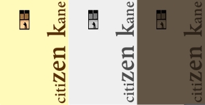
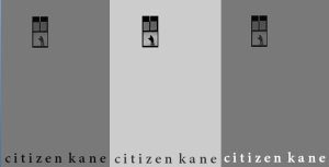
Other colourways were tried:

kane 3 ways

And moving the position of the text and getting rid of the mixed font sizes to create a sense of deep focus:

kane deep focus

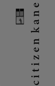
In the minimalist spirit of ‘less is more’, the text was placed at the bottom and various colour combinations tried (using the ‘Format Picture’ Recolour tool):

kan 3 text bottom

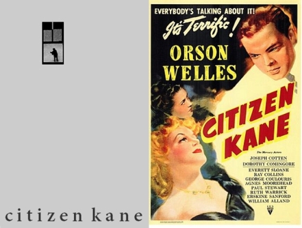
So, this is the final version chosen (next to the original theatrical poster from 1941), but I no longer know which one is best, so you decide:

kane posters old and new


The Ascent – Movie Poster

Weeeeeeeeeeeeeeeeeeeeee

Portlandia Poster

minimalist portlandia poster

For this assignment (worth 3.5 points), I had to make a minimalist poster for a TV show or a movie. I chose Portlandia, a show I have recently started watching and greatly enjoy. I decided that this was a good choice for a show because most of the main characters are portrayed by the same two people: Carrie Brownstein (left) and Fred Armisen (right). I chose the color scheme to match the tones of color commonly used in the show.

I went with a 2×3 ratio (aka the “golden rectangle”) for the poster because Vignelli didn’t die for me to be using American paper sizes. To create this image, I first took an image of the Portland skyline and, cropping out the sky, painted it orange. I used this to fill the bottom third of the image, writing “PORTLANDIA” over it in a font that I felt fit the mood of the show and adding a brown background. Then, I took images of Fred and Carrie and reduced them to a limited color palette. I then filled in these images with the colors I had already used, keeping Carrie’s iconic red lipstick and Fred’s dark hair. I balanced these two images side by side in the top 2/3rds of the image (a square).

Minimalist Poster

This Design Assignment can be found here: http://assignments.ds106.us/assignments/minimalist-tvmovie-poster/

Minimalist Poster

This is a minimalist poster based off of my character dossier, Sterling James. The cross design was taken from my minimalist icon assignment:

Minimalistic Icons

As this was a minimalist piece, simplicity carried the most impact on this overall design. That being said, I just played around with the space, layout and colored borders to accent this image.

Conway’s movie poster

PicsArt_1424056781797

One of this weeks assignments was to create a movie poster that captures the story through minimalist design. I created this poster for my character Conway. It is a black and white picture of the magazine and bullet to his gun that he does his “work” with. It looks noir to me using the contrasts and shadows. I took this image and then used an app called Picsart to give it the black and white color and to add the text. This was a very fun and creative assignment. The original assignment can be found at http://assignments.ds106.us/assignments/minimalist-tvmovie-poster/. It is worth 3.5 stars.

A Minimalist Murder Mystery

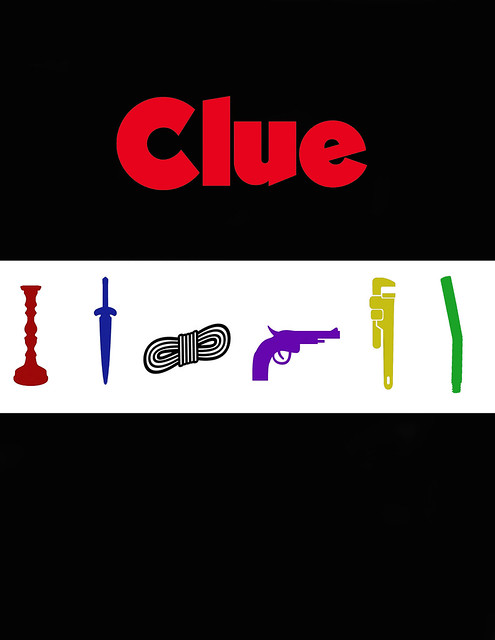
I’ve always thought minimalist posters were an artistic and creative way to show the plot/main focus of a story through only a few shapes and colors. For this assignment, “Minimalist TV/Movie Poster” we were to create a poster that captures a story through minimalist design and iconography. I decided to use the movie Clue as my inspiration because I felt that the characters and their corresponding murder weapons are central to the film and the board game it is based on. I was wanted to use a film with noir elements for this assignment. Even though Clue is a comedy, some aspects of it lend themselves to film noir, like the atmosphere of a dark and stormy night at a large mansion, murder, and the femme fatale character of Ms. Scarlet. I created this poster by using icons from The Noun Project website and the Clue logo from another movie poster and editing them on a template in Photoshop. I edited the murder weapons to be the same color as the person who receives them in the film and made the majority of the poster black so that the weapons stand out on the white strip cutting the poster in two. The Clue logo I kept red because it contrasts well with black and catches your eye quickly. I then made the poster a jpeg and uploaded it to Flickr and this blog.

Clue Minimalist Poster

Assignment Value: 3 1/2 stars

Minimalist TV Poster

This assignment was interesting! I decided to use Photoshop for this one. I found this one kind of difficult as I was trying to figure out what I was doing while in Photoshop itself. But I definitely got the hang of it though! I really like the thought of this assignment, trying to capture the essence of the show with just a few things on the poster itself. So I started out with a new project in photoshop, where I made the poster an 8×11. Then I made the background this blueish purple color. I was trying out different colors because I wanted to get a color that conveyed what was going on in this season. Because this season is focused on the port, and international trade, I pick the blue. I put in the text after that, using the text box tool. After I found the right placement I googled truck clipart, to find the truck that was put in this poster. I had to cut out the background to just have the truck without the white background. Then I found the image of the broken pill. I put this on the truck because I thought this would say another thing about the season because of the smuggling that goes on in this season. I feel like the placement of the text combined with the placement of the truck helps balance out the poster as well. I really enjoyed trying to find good a good design for the poster, and experimenting with the different placements.

Here it is on Flickr!

Here it is on Flickr!

A Dream Inside A Dream Inside A….

For my second design assignment for the week I decided to do the Minimalist TV/Movie Poster assignment. Our task was to create a Minimalist style poster that captures the essence of the story for the selected Movie/TV show. For this assignment I decided to use the movie Inception for my movie poster. For those of you who haven’t seen Inceptionit came out in 2010 and is Directed by Christopher Nolan, starring Leonardo DiCaprio. It is essentially based off of hacking into people’s dreams (and in cases multiple levels of people’s dreams), and planting ideas within a person’s subconscious. If you haven’t seen it, I definitely recommend it. It’s ranked 8.8/10 on Imdb, and is ranked their 13th best movie of all time.

Now that you know at least some of the story, here’s my movie poster:

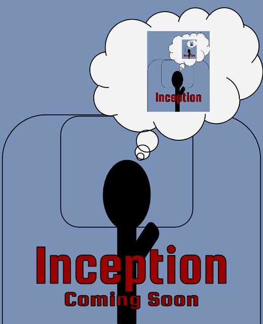
Inception (Minimalist Poster)

I created this poster using Google Draw. I created everything in the photo using simple shapes and manipulating colors. I chose the red “Inception Coming Soon” text because it represents the real movie poster very well. And here’s the original movie poster:

When designing my movie poster, I wanted to capture the idea of dreams inside of dreams into it. Hence, the main theme of my photo being a person laying in bed dreaming the movie poster, and so on and so on, in a recursive style. And to be honest, creating this it was very difficult. I had to place the movie poster inside the dream cloud, for multiple levels, and it became very tedious at points.

I believe that my movie poster captures the essence of the story perfectly. If you ask almost anyone about this movie, I guarantee, one of the most memorable things is that it is about dreams inside of dreams. And I believe I captured that in my poster. I also believed that I captured a minimalist style too in it. The idea behind minimalism is that “Less is More”, and to accentuate that, I tried to add the simplest objects and structures to this poster. Nothing in my picture is highly detailed or super complex. The idea of dreams inside of dreams, is complex, but the design is not.

Overall, I really liked this assignment. I like creating movie posters, I think it’s fun and really allows you to get creative. This also was difficult because I tried to be creative in the simplest way possible. This assignment is worth a total of 3.5 out of 5 stars.

Giving me a total of 7 stars for the week, leaving me 8 remaining stars for the week.

I hope y’all enjoyed this post, I spent a lot of time making my poster, and I think I did a good job on it. If you’d like to check out the assignment, you can find it here. Til next time peeps. See ya.

Minimalist Aqua Teen Poster

For the Minimalist TV Poster assignment I decided to make a minimalist poster of one of my favorite tv shows, Aqua Teen Hunger Force (also known by several other names if you know the show). To truly capture the show I needed to include the whole gang in one minimalist poster. They are what the show is all about. This show, for those of you who don’t watch it is about a meatball named Meatwad, a floating box of fries named Frylock, and a milkshake named Master Shake. They all live in a house in New Jersey and get into some weird antics usually do to a revolving door of side characters.

To make the poster I just added images into google docs and cropped images together into one file. I found an image of Master Shake but for the other two I decide to use an image of a meatball and fries and then post their faces on top of those other images. It was a fun getting the poster all set up especially because I love the show. The assignment is worth 3.5 stars.

Aqua teen hunger force