Minimalist TV/Movie Poster

ARCHER

For this assignment, I chose the tv show “Archer”, which focuses on spy working for the intelligence agency, ISIS. Archer is known on the show for being a lush and is almost always seen with a drink in his hand, so I thought it would be fitting to make alcohol the theme for the poster. I chose a simple photo with just the bottles, and I put a label on the bottom with the show’s name in it, to kind of make it look as though he was a liquor himself.

Minimalist tv poster

This assignment is worth 3 stars and is called minimalist tv/movie poster and in it you have to create a new minimalist poster for a tv show or movie. I chose to make one for the tv show How I Met Your Mother. I love this show so I thought it would be fun to use it. The central plot in it is that Ted is searching for his wife and at one point he comes across her yellow umbrella, so I used that as the focal point for the poster with the title underneath. It is very minimal but it also shows something very central to the show

“Be Our Guest!”

For this assignment, I had to create a TV or movie minimalist poster. The hardest part for me was picking a movie or TV show that I wanted to create a poster of and as a result I choose the Beauty and the Beast. I absolutely love the movie ever since I was a child and I am excited for the human version of it. This assignment was awesome to test my creation skills because I am really good at designing many things. I had to create the poster showing only icons and use the icons to tell what the movie was about.

I searched google for the iconic rose and monster claws. Then I went to paint to crop it to fit the poster and added the title to the poster. Eventually I had finished the assignment. I came to enjoy this one very much since I loved the movie and could use it for one my class.


Finish product:


The Sound of Music

This is my favorite movie ever and you can probably tell that I love music. I love the G clef for its simplicity yet compelling element. There’s something about G clef that says more than just a music note; instead, I feel like it brings all of them together. The color of the font also complements G clef’s simplicity well and having black against white makes the image pop, even without the use of color. For this assignment, I used Paint to incorporate the G clef icon and pieces of writing together onto a single image.

In regard to my character, I think Agent Nice Guy’s alter ego is more of an outgoing, active, and energetic individual. Not that she is not one, since she is friendly to all, but it’s more natural for her to take on that role as her alter ego since she does get stressed at the end of the day after building relationships. While she may be building ties for and/or against friends and enemies, traveling the world and finding beauty in every country is the “real” purpose behind Agent Nice Guy’s pursuit.

DesignAssignments, DesignAssignments43

Minimalism and Movies

In this task, we were asked to create a minimalist poster for a TV show or movie. This I thought was a really interesting idea and something that I could really run with creatively. The essence of the story had to be captured but only using key icons, props, and characters.

The first idea that came into my head was a poster of a superhero movie and I landed on the idea of doing a minimalist poster of “Captain America: The First Avenger” movie.

I thought it was a good idea to do this because Captain America’s shield is something very iconic.

cap

So using Adobe Photoshop I used the shape tool I recreated Cap’s Sheild in the iconic colours. Then I added a slight amount of shading on it to make it look metallic and more like the shield that we see in the movies but also in keeping with the minimalist idea of the task.

I eventually ended up with this shield graphic. screen-shot-2017-01-15-at-13-59-51
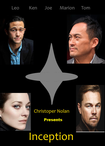
I would have liked to have added more detail to this graphic butI feel like if I added any more it wouldn’t be in keeping with the minimalist idea of the task.

All I had to do now was to add the title.

Screen Shot 2017-01-16 at 15.41.06.pngOverall I feel like the graphic worked best on its own but I wouldn’t have a poster without the title of the movie.

Not so minimalist poster remix

notsomin

For one of remixes I went back to the minimalist poster design I did as a design assignment. The remix was to flip the mood of the assignment. Since this was supposed to be a minimalist design I had to make it the opposite. My way of doing this was to was to add a lot of details to the assignment to make it not minimalist. I wanted to keep it similar to the original so it was a remix and not something new. What I did was add pictures of the stars of the film to the poster to take away from the spinning top symbol that was supposed to represent to the movie. I did this the same way I made the original by using MS paint. I also added more text like Christopher Nolan presents.

Minimalist TV/Movie Poster

For this assignment I decided to make a minimalist poster for one of my favorite TV shows, Avatar the Last Airbender. To make this poster I took the main title logo and used the main character’s signature tattoo and glowing eyes and layered them over a background. I used an orange background because that is one of the color of the main character’s nation.

Avatar poster

Week 5 pt. 2: Minimalist Poster

Minimalism.

Link to Assignment: http://assignments.ds106.us/assignments/minimalist-tvmovie-poster/

Stars: 3.5

Process: After deciding to use the TV show Chuck, I moved to Google Images. I gravitated towards icons, both because of the last assignment and due to their inherent minimalist nature. After finding a plethora of images I felt were related to the show, I took them to Photoshop to create the poster. These images required slight color change and rearrangement, but nothing too intensive. The challenge (and compromise) came in choosing title font. Chuck’s font is a major component of the title screen and of posters of the show, but it is a proprietary subset of a very general font family (Impact). In an effort to keep similar feel while branching towards minimalism even in font choice, I went with American Typewriter. While it’s not quite so iconic, it’s something I’m happy with.

minimalistposter

Stardust Minimalist Poster

minimalist poster

For this 3 1/2 star project (Minimalist TV/Movie Poster), I chose the movie Stardust, based on the book by Neil Gaiman. I love this movie a lot; the story and characters are so engaging and imaginative that it pulls you right in. (My favorite character has got to be Captain Shakespeare, no question.)

I made this entire poster in Paint, using the text tool, star shape, and the line tools. I also created four custom colors for the background color (chosen because stars can only be seen at night, but I didn’t want to use black), the interior of the gem, and the two shades of gold used in the necklace. The darker shade I also used for the text of the poster. I chose a star for the same reason that the novel is called Stardust; the plot centers around a fallen star named Yvaine. A side plot that turns out to be a major point is the ruby necklace that will determine the next King of Stormhold, the magical kingdom most of the novel takes place in.

I originally had the background as a light blue, and when I changed it to a more midnight blue, some of the original lighter color stayed around the text of the title. I ended up leaving it, because I think it gives the text a slightly glow-y effect. Also, going around each individual letter with the pen tool fixing individual pixels was guaranteed to drive me insane.

Overall, I’m pretty happy with the way this poster turned out. I think everyone who’s seen the movie would be able to understand why I chose the images I did, and the color palette turned out nicely. Now I just need to find a copy of the book, because I really really want to read it now but the library doesn’t have it.

Minimalist Inception Poster (3.5 star)

inception

For the minimalist movie poster Design Assignment I made a poster for Inception. I really liked this movie and I thought it would be easy to do since it has a small symbol that I could easily outline for a poster. That symbol is the spinning top that Leonardo Dicaprio’s character used to tell if he was in the real world.