I chose to create a movie poster of the iconic American Western actor John Wayne.


Still in design I have now completed this 3.5/5 stars assignment. This assignment consists on designing a minimalistic movie poster:

Trying to go with the sense of minimalism I have used 2 icons as my images, some text for featured stars and also the title name. I have also added a space background faded into the background using opacity on Photoshop so although it perhaps has more than what be classed as ‘minimalist‘ I believe for a movie poster it has to tell you partially what it’s about.
What I see when I look at it and how I wanted to convey it:
On the top of internet use, It’s so important to use the internet safely by securing passwords, being careful who you talk to etc. We have all heard of the things that can go wrong with using the internet yet are naive to think these things would never happen to us until they do. I myself as a generation brought up with the internet am also at fault for this. However, also brought up by parents who didn’t really grow up with this level of technology force their worries on to myself at times with the likes of cyber bullying and password protection.
My fear of the internet: Not knowing who is watching you or able to affect your life while remaining anonymous.
My love of the internet: The flexibility, the accessibility, the speed it evolves.
6.5 stars completed!

I LOOOOOVE Lord of the Rings and I had a pretty good idea of what to make. I did it using Paint and a ring image from Google Images. The ring symbolizes the one ring which the protagonist must destroy in this story. The dark background serves the emphasize the evil of this object.
For my first assignment this week I chose one worth 3.5 stars. This one said to create a minimalist poster for a movie.
WARNING! MOVIE SPOILER BELOW!!!
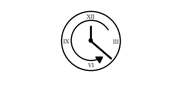
For this poster, realistically you probably would have had to see the movie to completely understand the poster. I chose the movie Benjamin Button. A reoccurring mention in the movie is this clock that runs backwards, the same way that the main character does. The movie is about a man who is born old and his body grows young as his mind grows old. So I created a simple clock with roman numerals for the main numbers. Then I had to add the arrow so that the running backwards concept could be understood. I tried to simplify the image as much as possible, but I knew without the numbers it would be practically impossible to figure out. If I could, I would add an animation to this poster to have the clock run backwards instead the arrow. However, since it is a poster I had to be realistic.
This is my second attempt at minimalist design for a movie its a different assignment but I just wanted to really work on this one and I really enjoyed how it turned out! I used Gimp this time and figure out not exactly how I wanted it because I couldn’t figure out how to get the red pattern to shift to the background but I like how it turned out either way! I also used the website clippingmagic to cut out the images hair it was simple to use!
Can you guess what it is? I think this one is much more obvious lol


Creating a movie poster based on Khatyrka, I immediately had the idea to show a woman’s shoulder with a tattoo of a quasi-crystal. The first mission was to find a quasi-crystal image I though would work. While googling for images, I came across some hard mental octagonal die, and thought about changing the concept to incorporate just the die. I ultimately felt this left out the human element of Khatyrka story, and as a psychologist and healer, I felt that imagery would be too cold.
Once I found a simple quasi-crystal tile formation, I attempted to hollow out the background several ways , trying t wo different free online programs, as well as paint without any luck. I wasn’t getting the result I needed. I finally relented and decided to use Microsoft Word for the editing. I was able to remove the background as well the space between the tiles so that when super imposed on the image of a woman’s back, you could still see her skin.
Next, I found a stock image from Ann Elliot Photography with a blue tint, giving it an eerie, cold, and still quality. Using a cropped portion of this image, I laid the quasi-crystal image on top. Unfortunately, despite multiple attempts at adjust the color and adding shadow, the “tattoo” still appeared to be resting on  top of the image, rather than than a part of her skin.
I began adjusting the ‘effects’ option, and because of the blue hue of her skin, the effects blending well as a scar/birthmark/lasered of tattoo. I think this may be an even more intrigued mark than a tattoo, so I decided to roll with it and I’ll just have to incorporate it in her story as it processes.
For the fourth design assignment, I chose to make a Minimalist Movie Poster – I really like the look of minimalist posters, ads, art, makeup, etc., so I thought I’d try my hand using a movie that I’m a big fan of. I actually didn’t see the movie until I was in high school, probably 5 years after it came out, but I like to think that if I was 12-going-on-13 and saw the poster that I had just made, maybe I would have seen it in theaters.
Imagine. It’s a Saturday in late Spring of 2004 and you are 12 years old. You’re a little bit of a weirdo and you have maybe two friends, and you’re at the theater with your family. What is there to pick from? Shaun of the Dead… you’ve probably already seen that. Kill Bill? Not old enough to go in. 13 Going on 30? Yeah right, mom! Hang on though. By the end of the concession line, there’s a horrible poster just DRIPPING with pink. You’re going to throw up. Pink is so… pink. And you’re 12 and cool and you stay up until 3am with a voice recorder trying to see if there are ghosts talking about whatever thing ghosts talk about. One thing sticks out though. This poster is offensive as heck.

What the frick is a baby prostitute? But 12-year-old you can already kind of relate to the one singled out girl. Yeah! You know what it’s like stick out! To be ostracized! Lindsay Lohan, though? “Maybe she’s the one that smells like a baby prostitute,” you might snort. Surprise: she is. Mom buys you a ticket for Mean Girls, and you’re lucky to see it in 2004 instead of years later, after never getting any of the references. And you love every second of it.
That’s my dream scenario, anyway.
This was a tough thing to make. I went for minimalism but I think I still wound up with a pretty busy-looking poster. It also kind of looks like a polaroid picture, to which I think Karen would say something like, “but it doesn’t look cold…?” And Regina would roll her eyes, because she can’t shake her head, because her back is broken. Anyway, here’s a gallery of the steps I did. As usual, I did this all in my preferred program, Paint.net.


The icon that I used is “girl” by N.K. Narasimhan and is licensed under CC BY 3.0. The original image was resized and recolored for this poster.
Silicon Valley is a popular TV show that airs on HBO after Game of Thrones. The show is in its third series which is airing in April. The show follows a group of young engineers in Silicon Valley that are trying to make it big with their start up, Pied Piper, a data compression company. Along the way they face some hardships including lawsuits, crazy investors, and problems with human resources.

The directions of this assignment were to be to be minimalist. All I have included is the title of the show, and the company logo, a hat of the pied piper. The poster also includes the names of the actors in the series. I decided to use the color green because on the company in the show has a green logo. Green also symbolizes something new or refreshing, and it fits the show because it is fairly new and many tech companies in that area try to create an impact whether it is technically, socially, or environmentally.
For this assignment I used Canva because I had already used it once to create a postcard and they’re not much different. Canva includes very easy steps to insert text, images, and properly center and line them up. I will definitely keep using canva for later assignments simply because of its ease of use.
The assignment I decided to do was the Minimalist Movie Poster, and for some reason, I was instantly drawn to Thor. Mind you, I am not a big avengers fan but have you seen the new poster? It’s so cluttered and I feel like it doesn’t need all that much.

Really it only needs a hammer and people are going to know what it is. So using the same colors as the original poster, and keeping the essence of what it is going for, The god of Thunder, I made a minimalist version of it.

But hey I get it, it looks like a 5 year old did it, but that is the extent of my artistic skills so we all just have to deal with it.
This assignment was rated 4 1/2 stars.
This was based on the assignment found here (http://assignments.ds106.us/assignments/minimalist-tvmovie-poster/).
I tried to make a minimalist poster for the show mobile suit gundam. I tried to make the head of the titular unit. It was difficult trying to convey it so it is remotely recognizable without adding too many details.
