Gunsmoke Visualized

Gunsmoke

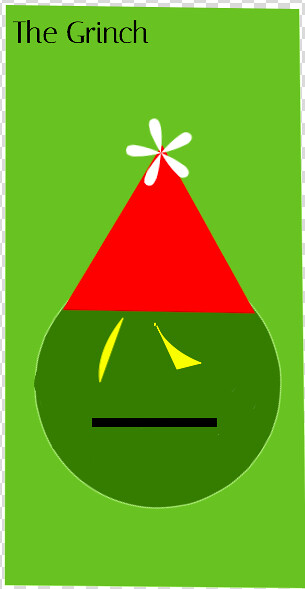
This poster came out of an assignment that asked us to make a minimalist TV/Movie poster. Unsure of what to do, I decided to go with something I’ve been enjoying quite a bit lately: Gunsmoke, an old radio show which later got a TV series adaptation.

I made this poster to reflect the Old West idea from the show, the pale background and the gun in the center. I created the work in Paint.Net and found the gun icon on Noun Project. I didn’t pay for the icon, so the credit is listed in the bottom corner of the poster.

Out of the projects I’ve done this week, I think this one has to be my favorite. It turned out the most visually attractive and elegant despite its clear limitations.

Edward Scissorhands

This assignment was a lot of fun! I had to create a minimalist movie poster. I chose to do Edward Scissorhands. In order to try and capture the meaning of the movie, I decided to use his scissorhand (because obviously, that’s what the movie is about). In paint, I pasted the image I found on google and cut around them to fit them onto the poster. I chose a dark red for the font to go with the destruction aspect of the movie (and all the blood). I had a great time creating it and it took me longer than expected to decide exactly what I wanted to do. I thought about having his scissor hand go through some type of barrier but realized my skills are not advanced enough to make that look good yet (maybe another time). Here’s the final product:

scissorhands

HIMYM Minimalist TV Poster

For this 3.5 star assignment, I had to either create a TV or Movie Poster using a Minimalist design. I’ve always liked looking at things with Minimalistic design qualities, so I was looking forward to this assignment. The only tricky part was picking one TV show or Movie which I would make a poster for. It was such a tough decision because I like so many shows and movies. Then I thought of one my favorite shows ever as I was scrolling through my Netflix that day. My decision ended up being “How I Met Your Mother” which lasted for 9 great seasons. It has always been my favorite shows because the episodes are short, and can always make me laugh even if I am watching it over again. After picking a show to create a minimalist poster, an idea immediately popped into my mind.

The idea that popped into my head was to use a simple Umbrella icon to represent the Yellow Umbrella which belongs to “Mother” that the whole series is supposed to find. So I found a minimalist icon of an umbrella on the Noun Project site and pasted it to my Autodesk Sketchbook App. Then I filled in the umbrella to make it yellow, found a color that perfectly represented the sky, and put a white cloud with the title to make sure it wasn’t boring but still minimalistic. As a fan of the series, I wouldn’t mind if this was used as a TV poster. 

Overall, I really like these kind of assignments because they take advantage of my artistic skills of design which I don’t get to show not often enough.

Minimalist Movie Shot

For the minimalist movie poster assignment, I had to first choose a movie for it. I chose How the Grinch Stole Christmas because it is one of my all time favorite movies.

Screen Shot 2016-02-16 at 6.30.54 PM


I thought I could make the face of the Grinch using basic shapes as the cover. I used the same Sketch Pad website as I did for the cereal box assignment, because I had a lot of success with it on that assignment.

I drew the lines of the poster into a rectangle, and then I colored it green. I added geometric shapes, a circle for the head, triangle for the hat, half moon for the eyes, and a rectangle for the mouth. I wanted to make sure the face was able to be depicted, but also was vague enough to be what’s considered “minimal.” I think it came out well. It was challenging to be creative and keep it simple at the same time, but I think that was the point of the whole exercise.


Design Assignment – Minimalist TV/Movie Poster

I love minimalist movie poster designs. The simplicity in it makes it all the more enjoyable to view. For this assignment I chose to do a minimalist movie poster on the movie The Martian.

the-martian-poster

The movie already had a basic poster. Simply the actor, Matt Damon, looking into the camera with a quote from the book/movie. I found an image online of a simple, almost cartoonish version of mars:

scifitravelposters-mars-full

This image was created as a space tourism poster. Since my photoshop skills aren’t great, I was happy that all that was required of me was to remove the existing text and replace it with the background colors. I then simply inserted the text that I wanted into their own existing layers. All editing was done using freephototool.com. I hope you guys enjoy!

minimal movie poster

Design Assignment – Minimalist TV/Movie Poster


the force awakens minimalist posterthe force awakens minimalist poster 2For my second assignment of the week, I delved into the design category, and decided on the creation of a minimalist movie poster. I found the hardest part of this assignment deciding on a subject matter for the poster. I ended up going with the last movie I saw in theatres, which was Star Wars: The Force Awakens. Even after deciding on the movie, I couldn’t decide on the critical part of the movie to include in the poster. I went with the lightsaber of Luke Skywalker and Kylo Ren; Ren because of his driving influence in each part of the movie and partially due to its unique look, and Skywalker’s because of its legend within the context of the movie. I found this assignment fairly challenging, for the idea of it alone if not the work itself. As you can see, I ended up with two results. I’m not 100% satisfied with either, and might work on them some more on my own time, as I found it a pretty fun assignment.

Now for the actual creation of the poster: all the work was done in Photoshop, using a combination of outside resources and creating my own. I got the lightsaber hilts from DCMJS, and the Star Wars logo from the Disney Wiki. I created the beams with the rounded rectangle tool in Photoshop, using layers of color to give it some depth, and added a glow around them. Finally, I created the starry background with the simple brush, tweaking settings around to get varying opacity, size, and spacing. I feel like the vertical poster has way more potential, but I’m not really sure what to put in the white space. Anyway, it was a pretty fun assignment, and if anyone had some suggestions, it would be much appreciated. Thanks for reading!

Dream Within a Dream

Minimalism

Inception is a fun thriller movie involving dreams.  And dreams within dream.  And dreams within dreams within dream.  You get the point

For the Minimalist movie poster assignment, it took me a while to think of a movie that could be summed up minimally.  Eventually I decided on Inception because The Noun Project had a nice picture of dreaming I could use.  It’s a movie I like a lot, and it didn’t take long to think of how I could use the dreaming picture to sum it up.  To make the poster I uploaded the photo into Gimp twice, made one really small, and moved it into the bigger cloud bubble.  I filled the bigger one with white first since it started as black.  I added the text and filled the background and that was that.


The Angel Islington

A minimalist poster for television?  Why not?  Hey, I remember when there were new episodes of MacGyver airing (that means broadcast).  I chose something both old and new.

Who

+1 for anyone who understands how the title of this post relates to the poster.

[contact-form]

Designing the Minimum

Wow, a minimalist poster? sounds like my kind of assignment. Lots of thinking, little tedium.

When it comes to deciding what movie I wanted to do a minimalist poster on, I only had a few options. The example posters all had readily identifiable nouns in their designs, and I know of very few movies with such recognizable things. Ultimately, I decided on one of the Lord of the Rings movies, since they are iconic enough to be recognized. As for which one, I figured the first one would be the best, since a poster from the second or third movie would have to be readily differentiable from the preceding movies. At first, I wanted to try an overlayed sword, axe, and bow as a symbol of the fellowship. Ultimately however, my own drawing skills were not satisfactory, and online images looked to intricate for a minimalist poster. Ultimately, I decided upon this design.

Fellowship of the ring

To put this together, I utilized my favorite graphics editors, MS Paint and MS Powerpoint. Minamalist posters heavily rely on geometric themes, so the built in tools of these packages were sufficient, as are the color pallets, since the posters contain no gradient shading or other complications. The eye was made by intersecting two ovals in an attempt to get the pointed ends so often associated with evil eyes. The Circle is supposed to be reminiscent of the Ring of Power, but in hindsight I probably should have worked to give it a thicker band. The red background is there simply because no other color would work for the foreground I had in mind.

Over the Garden Wall to Me

otgwminimalist

Ah, October! The month of Halloween, and the season for spooks and nostalgia. And what better way to celebrate this month of skeletons and ghosts than by watching Over the Garden Wall every day until November?

Over the Garden Wall is a 10-part miniseries that aired on Cartoon Network in November of 2014. The story follows that of stepbrothers Wirt and Greg as they travel through the woods to find their way home. Of course, it’s not that simple, and every 10-minute episode, they run into some sort of danger.

I absolutely love this series. It’s about the length of a feature-film altogether, which makes it easy to watch whenever you feel like it, and the stylistic animation and slightly unsettling nature is just perfect. I fully recommend watching it; my explanation isn’t giving it the full justice it deserves, but it’s all I can say about it without giving it away! You can watch it online (I believe on the Cartoon Network website, or it could be….floating around somewhere).

Anyway, this series seemed perfect for creating a Minimalist TV Poster, and it couldn’t have come at a better time.

Process:
Simply using the path tool in GIMP to create all the straight lines, filling in everything with the bucket tool, and using the text tool and a simplistic sans-serif font.

I debated adding a certain rock, or perhaps some vines, but since it’s minimalist, I think this is perfect as it is.