Never Grow Up

The next visual assignment that I choose this week was Pick A Bad Photo, Apply A Vintage Effect And Write Something In Helvetica which was worth two stars.

I choose a picture that I had taken of a play set last weekend when I was at the beach.  I edited it a little bit in picmonkey to give it more of a vintage feel.  I then added a quote by Walt Disney (because he’s obviously one of my favorite people ever, which I’m sure you’ve noticed if you’ve read more than two of my posts).

Here is my final results!

disney quote

Only 6 more stars to go!!


What does that sign say?

This week for ds106 we had to do ten stars worth of visual assignments.  I decided to do cropped signs for two of my ten stars.

In this assignment you had to “change, alter, enhance the meaning of a sign by cropping out parts of it.”  I wasn’t totally sure what type I was going to use until I can across this sign  from Magic Kingdom in Disney World.  disney

Pretty uplifting right? Upon entering you get to leave the world of today and experience yesterday, tomorrow and the future.  And who wouldn’t want to do that?

After cropping the sign it had a bit of a different message though.

disney crop

So instead of sounding uplifting the sign sounds a little bit like you are going to die.  Who would have thought you’d be able to come across something this morbid at Disney?

The All Too Familiar Feeling

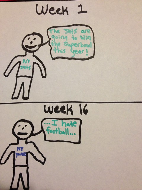
The “A change of emotion(in two panels)” assignment immediately attracted me as I knew exactly what to draw. The two-panel drawing portrays the cyclical, year in, year out struggle of being a New York Jets fan. I am all too familiar with the heart-wrenching feeling of your sports team falling short. One day these two panels will be proven incorrect, one day!

A change of emotion


I’m not very assertive

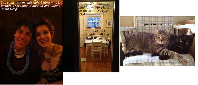
I had the most fun this week with the “Love: In Three Frames” assignment and knew almost immediately what to make mine about.  As my URL indicates, I’m really a dog person. Like…REALLY really.  Unfortunately, my girlfriend is very much a cat person, and the place we live is too small to have any dogs in it.  The following three frames more or less sum up our entire relationship.

3 photo


For this one, I just had to open up the three images, which I already had on my computer (one of these from a different assignment!) and come up with the captions.  I actually used Microsoft Paint for this one, which is pretty archaic but the easiest for just moving some images around.  The only problem I ran into was that I accidentally made a typo and Paint doesn’t allow you to go back to a textbox once you click away from it, so I had to just move a different textbox over the original.

This was my favorite assignment from the bank though since it was the most personal to me!

Ever since I can remember I’ve been poppin’ my color

That’s not true.

I haven’t been.

But I DID this week! The color popping assignment was a lot of fun. I’ll admit I got a little bit of a hand cramp erasing the black and white image to reveal the colored layer.  Did anyone else find a less complicated way of popping the color than putting a black and white copy of the image over the original and erasing the top layer over the part you wanted? It worked – it was just a bit tiresome.

Here’s what I came up with!

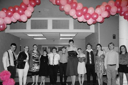
pink


This picture is from PRISM Prom this past fall, where the theme was “Pretty in Pink.”   The balloons and pom-poms really stood out in this picture so I decided to pop the pink.  I really like how it turned out.  I wasn’t sure if I was supposed to do it this way though because the pinks are different shades.

Like I said, it was a pretty simple process.  Open the image in GIMP, open another copy of it and paste it over the original after converting it to black and white.  After that, you can choose the eraser option (on transparent setting) and erase away the black and white part over where your color is. Ta-da!

fat cats DO make everything better

annunciation

I own one of the chubbiest cats ever and it’s the perfect look for him, so when I saw this assignment in the assignment bank, I knew I had to try it.  When I realized I’m close friends with the person who created the assignment, it just solidified my decision.  I didn’t have a whole lot of luck making the picture blend in, unfortunately, but I had a lot of fun finding a painting to use and a cat to insert into it.

This portrait is titled “Annunciation” and is by Leonardo da Vinci (although I cut it in half).  This cat is just a cat.  I actually used Adobe Photoshop’s online editor, which I know now was a mistake.  I’ve been having much better luck with GIMP’s photo editing tools.  I cut the cat out of its own picture,  and pasted it onto the painting by da Vinci.  I adjusted the filter to try to make the cat fit in more with the  reds and browns in the image, but the closest I could get was that funky purple-ish color.   The next step was to try softening the image, hoping that it would make the picture of the cat less realistic.  The final touch was attempting to burn the edges of the cat in an effort to do the same thing, but it still didn’t come out looking how I had wanted it too.  I feel REALLY silly but when I created this I didn’t realize GIMP had photo editing options, so I didn’t think to use it.  Big mistake.

That being said, the cat does make this painting look funnier and I’m a fan of the assignment!

How Things Change & Stay the Same

I was disappointed that I couldn’t do Return to the Scene of the Crime with a photo that wasn’t directly linked to me.

But then I found this assignment called Before and After!!

The task: use a photograph from the past and digitally blend it with an image of the present.

A History major getting to use history?!?!!


Now this took me awhile, so I’m glad it’s worth four stars.

I needed digital images of UMW. Luckily, I have done quite a few projects in the Archives of UMW, so I went back to the site and grabbed a number of photos that I thought I could recreate.

Then I wandered around UMW for awhile. I took hundreds of photos and changed batteries five times. I wouldn’t know if I got the right angle until I got back into Photoshop to test it. I would love to know if anyone knows how to not wait until Photoshop, though!

I took my many images and put the ones that I matched up with my eyes into Photoshop.

I really wanted to do Monroe Hall, and I took some EPIC photos for my scrapbook, but they weren’t matching the archival photos.

Alas, I had to turn to my Trinkle photos.

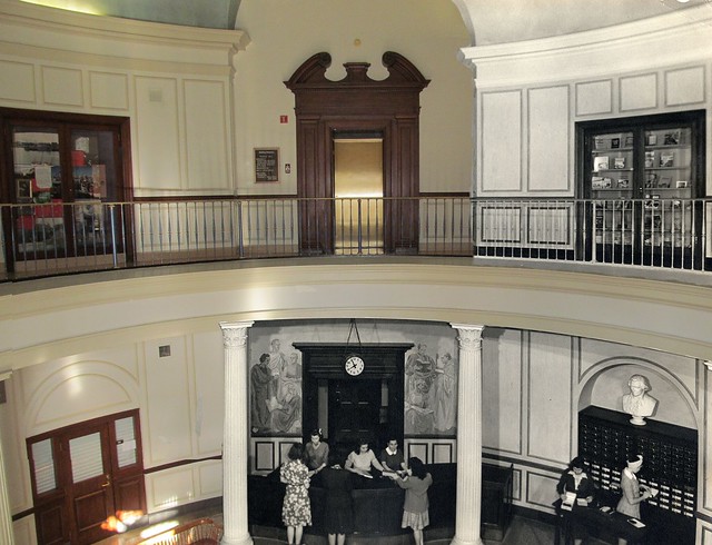
This is the photo I found to match up the most:

bp5 076

Then I took this photo from the Archives @ UMW:

Large Format JPG (2)


The photos don’t match up completely, though, so I had to do some finessing.

Here is the final edit:

Using a Paintbrush of History

How I did it

1. I opened both images in Photoshop in separate windows.

2. I copied the archival photo on top of the new photo. At first, I didn’t know where to start. I just used the Eraser and erased parts of the archival photo to see if it would match up.

3. I remembered the layer options, though, and changed the opacity so I could see both images. With this method, I was able to match up most of the edges.

4. I stretched parts of the image, but you can’t really tell.

5. Then I started erasing! I used the Eraser with 75% thickness and 100 size for most of the erasing. I didn’t really know where I wanted the lines to be between the old and the new. I realized, since some of the edges didn’t match up completely, I needed to direct their eyes elsewhere.

6. I picked areas that could easily be concealed, like the rim of Trinkle in the middle and the door to the second floor elevator.

And viola! That’s all it took.

Triple Troll Link

When I saw this one, I just knew I had to do it. As a Redditor, it’s something I often see.

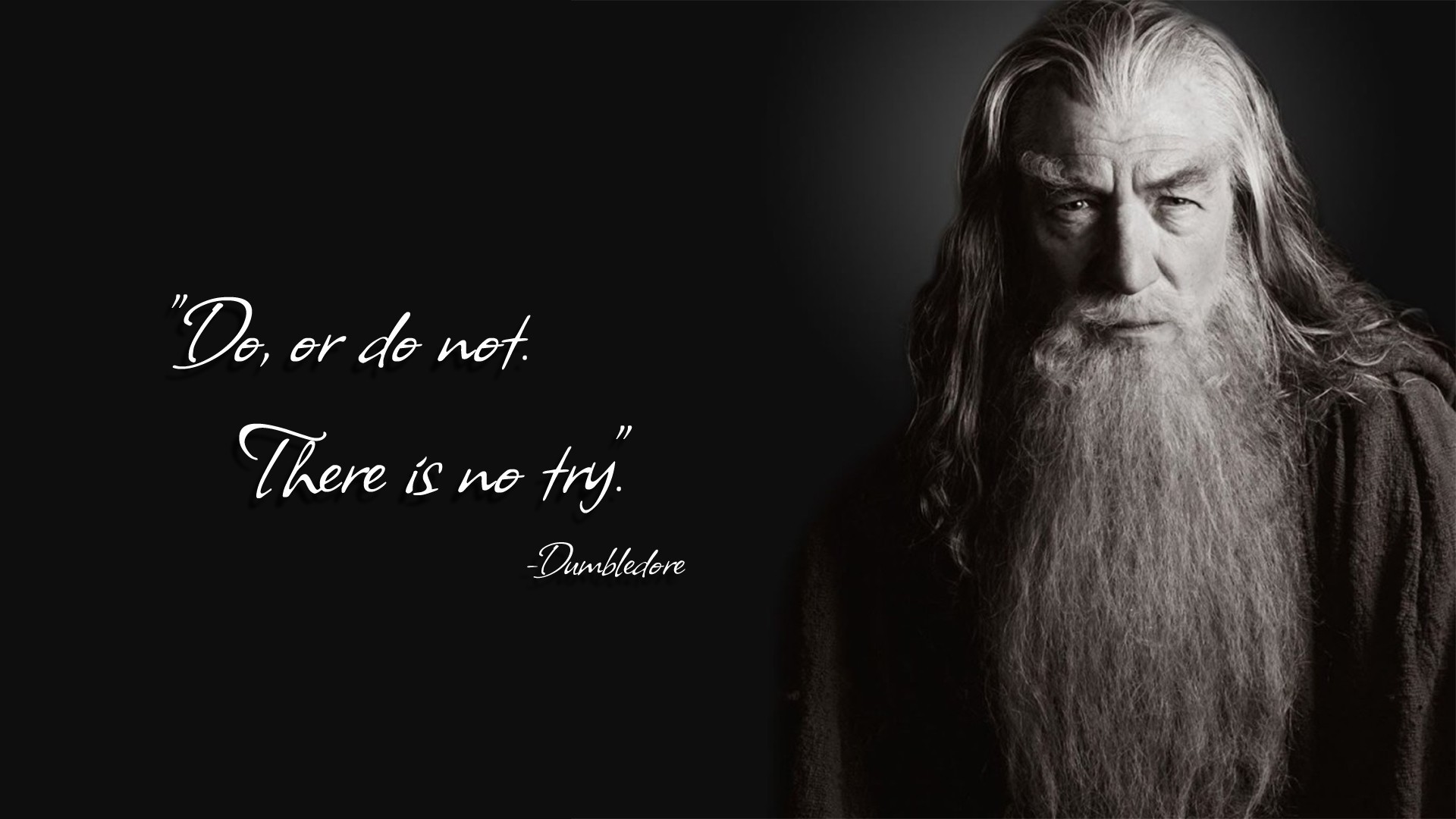
The assignment: Find an image of a well-known figure, add to it a famous quote by someone related in some way to the figure in the image and then attribute the quote to a third, related figure.

I thought long on what to do for this assignment. You just can’t beat Gandalf as Dumbledore quoting Yoda.

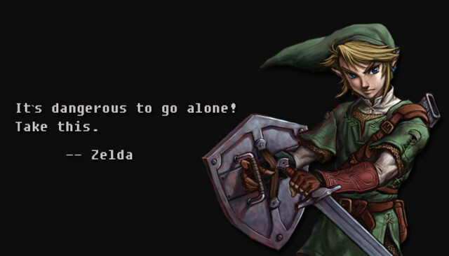
Movies and books are too plenty, so I started thinking about video games. Immediately, I thought of The Legend of Zelda.

How many people think that the main character of The Legend of Zelda is named Zelda?

So that’s how I came up with this one:

The Legend of Link

I tried to do a similar style to the Gandalf one because I think it’s more powerful and “realistic” looking…even with a video game character.

I began with this image. Since I wanted to imitate the Gandalf image, I got the color from the back with the dropper and filled the background of a new image, clean image.

Then I used the Magic Wand to get rid of the background from the Link image. I copied it to the dark background and erased any extra bits of white from him.

Then I used the Fixedsys font that I found from this Daily Create page. I gave Link some drop shadow, 3 distance and black multiply.

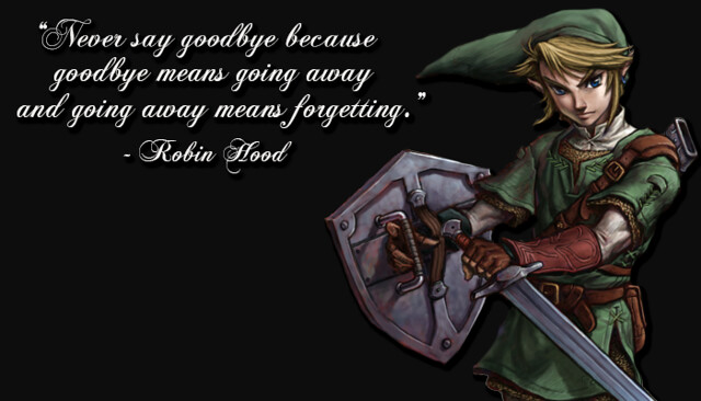
But then I realized that I didn’t quite follow the directions of this assignment. I was really supposed to have three different universes of characters.

So I went into Photoshop again and changed it around.

The Legend of Robin Hood

When my roommate dressed up as Peter Pan for Halloween, most people thought she was Robin Hood or Link from Legend of Zelda. So I think this works much better.

I just deleted the text from the other Photoshop file, and then added the new text with Chopin Script for the font. I made this distance 5.

I’m pretty happy with this last one, especially since I think a lot of people can relate to it!


Color Splash is like Dying a Photo…

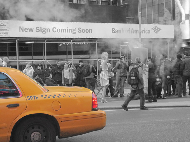
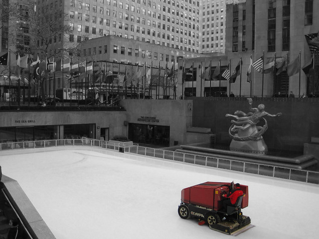
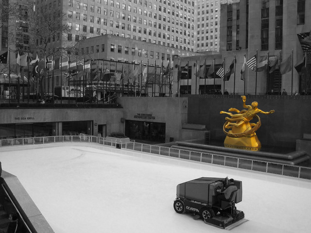
I fell in love with the Color Splash assignment as soon as I saw it. My original plan was to use a photo of The Green Monster that I had taken when I toured Fenway Park in Boston last summer but I struggled with it and decided to focus some photos I had taken on my Spring Break trip to Manhattan last year.

To do my assignment, I opened up Photoshop CS (yes, people still use it even though it is nearly 10 years old) and imported my photos. I then created a new layer which was a copy of my photo and changed the saturation on that layer to 0%. This made my top layer grayscale. I then took my eraser tool, made it small, about 9 pixels in diameter and carefully erased around the inside edge of what I wanted in color. Once I was satisfied, I finished erasing the inside edge of my top layer so that the only part of my photos in color were one object in each photo.

Nothing Says NYC like a Taxi

When I originally took this photo, I did not plan on having the taxi in the shot. I was trying to get a photograph of the model, standing in the middle of Times Square freezing in the early March weather. I’m glad that I did not delete the shot since I love how I was able to use it for this assignment and make the iconic yellow taxi the focus of the photograph.


The Red Zamboni

I have never actually skated on the ice at Rockefeller Center but loved the juxtaposition of the fancy ice rink in the middle of the city and the bright red Zamboni cleaning the ice.


Prometheus in Gold

I took the same shot and wanted to emphasize the iconic statue of Prometheus guarding over the ice rink. The gold color of the statue contrasts well with the grayscale color of the rest of the photo.

I’m happy with how my photos turned out. Once I figured out how to do them, I had so much fun that I decided to do the two extra photos.

Natural/Unnatural PhotoGifs

Two more for the GIF pile of ones made not by downloading video clips, but using my own photos– the ds106 assignment is Photo it Like Peanut Butter:

Rather than making animated GIFs from movie scenes, for this assignment, generate one a real world object/place by using your own series of photographs as the source material. Bonus points for minmal amounts of movement, the subtle stuff. See a bunch of examples at http://cogdogblog.com/2012/02/10/photo-gif-peanut-butter/

I found these in my own backyard, a place I have photographed 1000s of things, yet I find two new ones today. The first was noticing the patterns in water dripping out of one of my conduits that transfers runoff from my roof gutters out to my apple tree. I thought it would make a nice photo, but once I got my belly on the ground, I fired off 5 shots in rapid fire mode in my 7D. The GIF first:
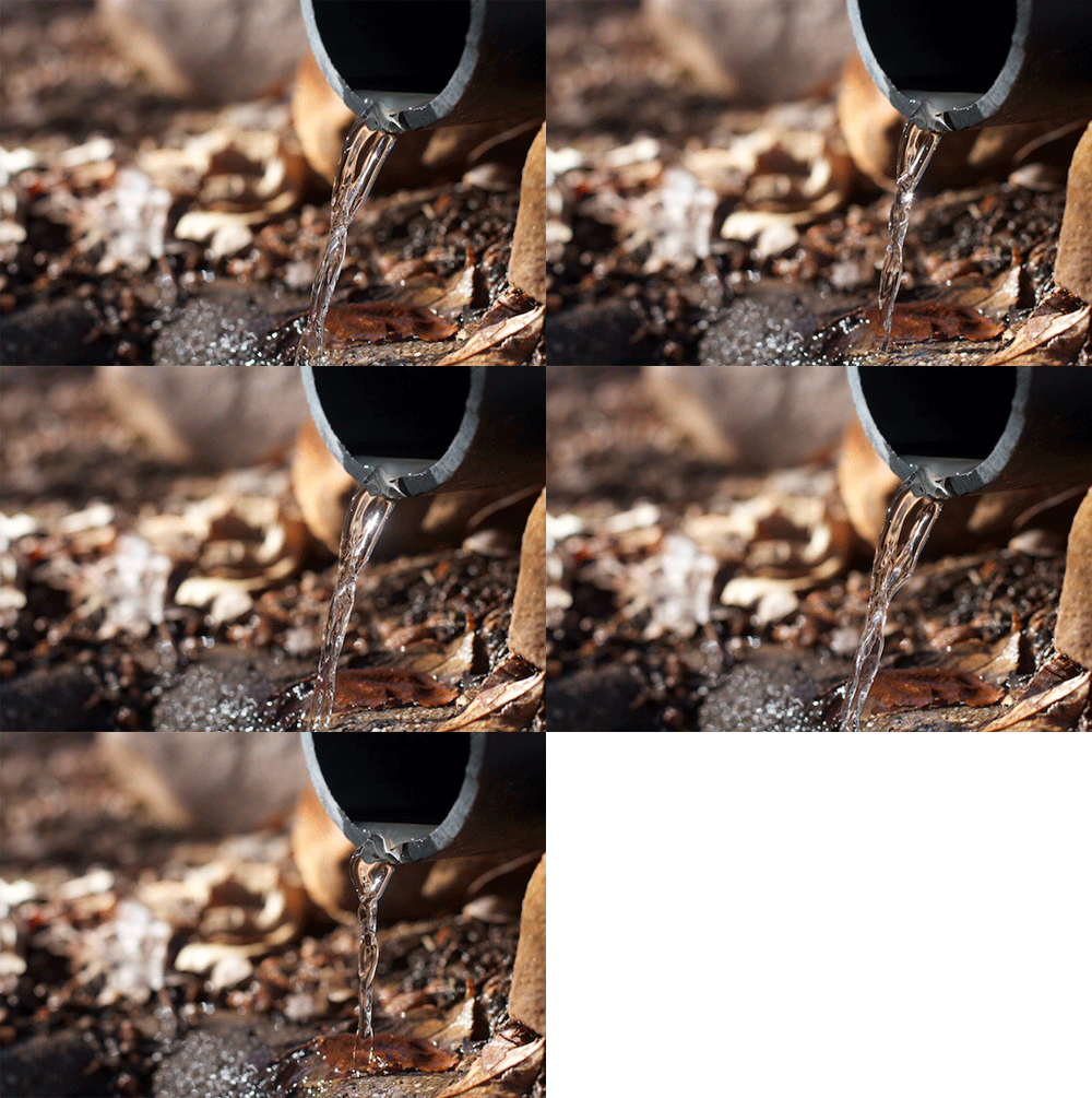
warer-flow-pipe3

The water really dances a nice loop there.

I use Photoshop, and use the command File -> Scripts -> Load Images into Stack. I select all of the files, and check the box to Attempt to Automatically Align Source Images. This gives me 5 layers, one for each image. In the animation palettes, I select Make Frames from Layers to put them on the time line.
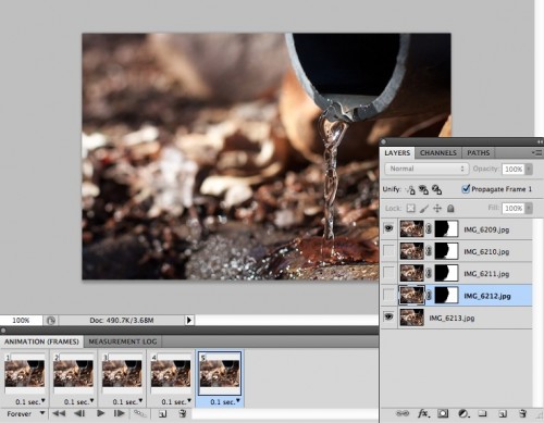
water-pipe-pshop

I go through the frames, and crop the photos so there are not see through spots on the edges (a side effect of the alignment) and resize te image to 500px wide, my target size. The animation is good, but the left side has some water splash that ends up looking like noise. Time to mask things out.

I select the bottom frame to activate, and then all frames, and click the “on” radio button in the layer palette- this makes thids layer visible across all others. This is my base/backround. I then go to the second frame, select the active frame, use the lasso to select the portion I want to keep (right side, and the water flow), and click the add vector mask in the layers palette (second from left icon on bottom). This essentially cuts out everything not selected (black on the mask icon).

I then control click on the mask layer, and select “Add Mask to Selection” (this re-selects based on the mask). I click te next frame, and the active layer, and repeat the process for each subsequent layer. What this is doing is removing the left side of the layer and letting it see through to the bottom layer.

When I make this a GIF, the only motion will be on the right side. An added benefit is that my file size is smaller since I have tossed away data. The final GIF is only 360k.

This is a naturally occurring object that I have capture in place as it moves.

The next one is conjured- I noticed the interesting shadows on my outdoor chairs, and snapped a few photos. I noticed as I rotated the chair, that the curvy shadow transformed. I took four images, each time moving the camera to keep the seat edge in the same relative location.
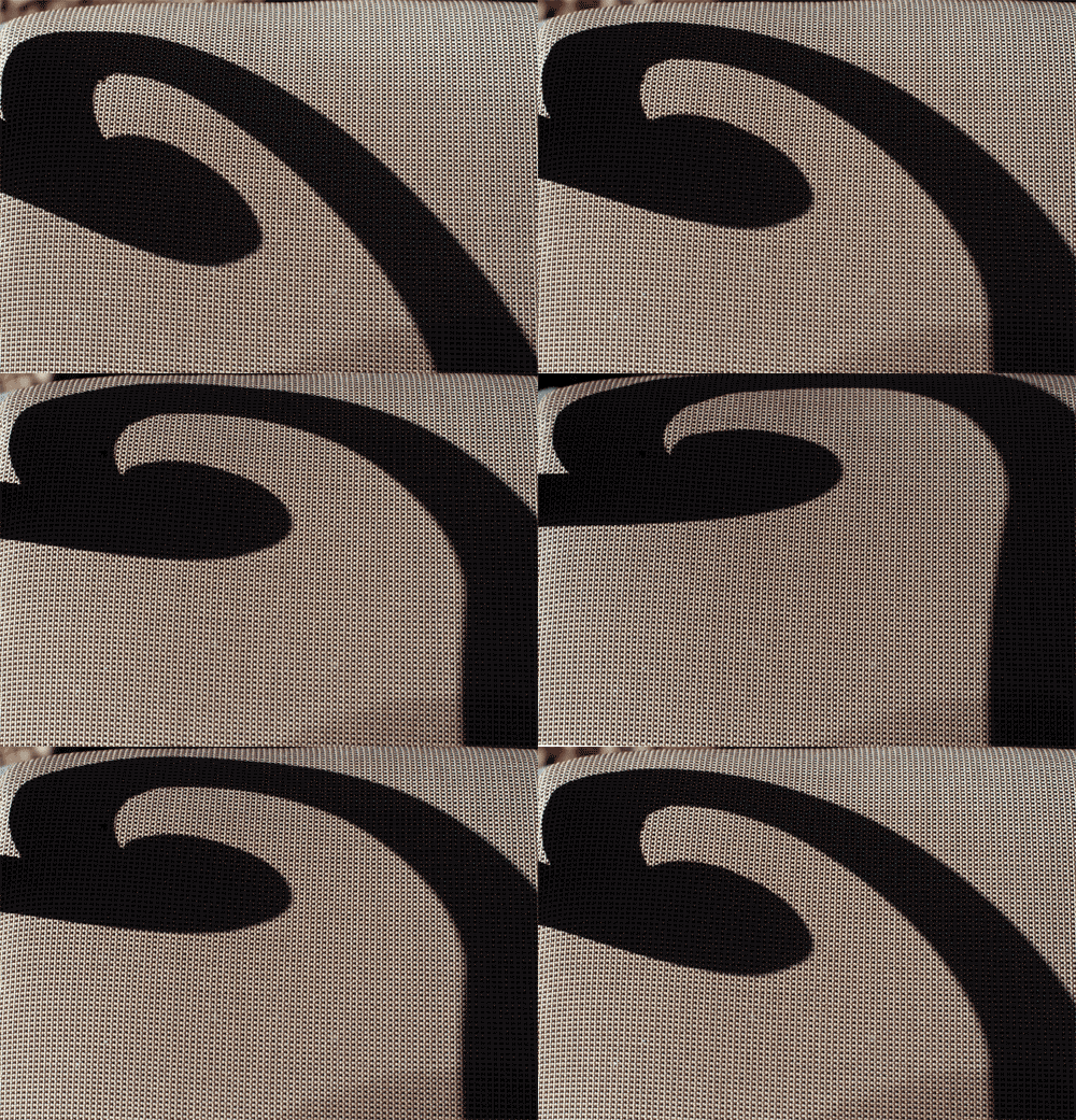
floppy-shadow

The process here is the same as above, but no masking for this one. The four frame animation was kind of jerky, so I use a trick I learned to make the movement cycle back- I copie2 the 3rd frame and pasted it after te 4th one and copies the second one and pasted it after this new one. This way it cycles back, the frame order becomes:

 1 - 2 - 3 - 4 - 3 - 2

so it loops back to where it starts.
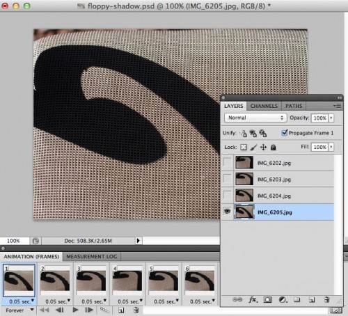
shadow pshop

Because of the limited color range in the photo, I was able to save the GIF down to 32 colors, and the file size dropped from 1 Mb of the first one to 483k.

This one almost looks like a cartoon animation, it is more surreal than the first one. It is motion that did not really exist in the world, I am conjuring the movement in this GIF.

Two GIFs from my back yard, one captures the dance of water falling, in an infinite loop; the other fabricates te dance of a shadow, in its own loop. The purpose? It’s a study in motion, a suggestion

And made from just a few static photos.