Uncle Sam Goes Digital

My first ever design assignment task was to create a DS106 propaganda poster {***}. This was the one I chose from the Designing Posters category. We had to pick a poster from WW2. I know these propaganda posters are well-known and I was excited to get started to inspire my fellow DS 106ers!

I decided to design this WW2 poster:

ww2 poster

I had a lot of ideas running through my head when I chose this picture. This has never happened to me before. Normally, an idea pops into my head and I have to write it down before I lose it. So this was a nice change.

To start, I opened GIMP and uploaded my picture that I got here from Flickr. I tested out the different ideas in my head, but none of them went how I was picturing it. {I wanted to promote DS 106 Boot Camp, but that had already been done and I wanted to come up with a new, fresh idea} After about an hour later, it brings me great pleasure to give you my finished product:

ww2 posterFINAL

I matched the colors {as best as I could} and tried to make the words look “vintage” but GIMP is not like Instagram. I wish I could post all of the posters promoting DS106 from current and past DSers on EagleNet so people can see it when they sign up for classes. I mean really, how cool would that be??

Never Grow Up

I had planned to stop working on my ds106 stuff about an hour ago but I decided I wanted to “try out” one more before calling it a night.  Turns out “try out” means play with gimp continuously until I make it look exactly how I want it to.   At least I did two more stars right?

So the assignment that I ended up doing next was called Lyric Typography Poster.  As I was skimming though this I was right away intrigued by the sample on the assignment page:

example

I found this so stinking cool and began trying to recreate this myself.  After about twenty minutes of playing around with gimp, I realized that I didn’t know how to recreate this and that everything I was making turned out to be a boring looking version of this.  So I started playing around and ended up changing the assignment a little bit.

The direction for this assignment were to “Choose one of your favorite lines from a song and illustrate it using only typography. Consider how the font, color, sizes and placement of the typography can reflect or emphasize the meaning of the words” and I almost followed all of them. While I was playing around I ended up putting this simple picture of a little girl as my background. I had decided to do the song Never Grow Up by Taylor Swift so I found that picture to capture the song really well.  I then started to add in the words.  At first I just was trying to lay them on the picture, but I then decided I wanted to mount them on something first.  I decided to use notebook paper as that mount. I opened the notebook paper into a new page and cropped it to be the size and shape that I wanted and then just copied it in over by background. I did this for each set of words that I had on my background.  I then added my words using the text tool.  I played around a lot with the angles, fonts and size of everything before finding something that I really liked.  I am pretty thrilled with how this came out (which I probably should be since I changed the assignment a bit).

Hope you enjoy this!

nevergrowup

Eight stars to go!

Guess What? **

This week in ds106, we’ve moved on from visual assignments straight into Design Assignments.  To get better acquainted with designing, we have to complete at least 15 stars worth of design assignments from the ds106 Assignment Bank.   Everyone must complete certain assignments in order to achieve fair exposure to design elements.  My first assignment, One Story/Four Icons, is a 2 star worthy assignment in which we choose a movie or novel and reduce it to four key symbols to represent the plot.  I chose this activity over the others, because it seemed more stress-free and fun!

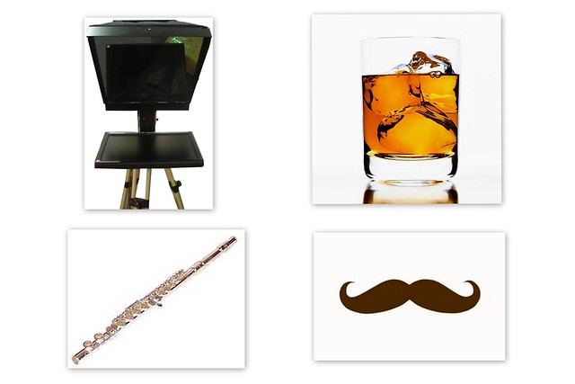
I chose one of my favourite movies, but I can’t tell you which one!  You have to guess!  Below are my four symbols:

Which Movie?

I found each of the images via Google: the mustache,  drink, flute, and prompter.  I added them to a folder which I opened in Picasa, highlighted them all, and clicked “Create Collage”.  I then sorted them the way I wanted and uploaded my final photo to flickr.

Design a Memorial For Fairuz’s PC

We got some really sad news today, a death in the ds106 family.

Yes, a computer has died. While Fairuz is in mourning (or shopping), let’s deal with it in the ds106 way — and make some art! Hence a new design assignment, A Memorial For Fairuz’s PC:

Fairuz is a UMW student for the Spring 2013 ds106 class, and suffered a catastrophic loss of her PC. We should honor its memory by designing something as a memorial- a funeral announcement, an animated GIF headstone, a floral wreath of RAM chips. REMEMBER THE PC!

I made up a bit of graveyard commentary:


cc licensed ( BY SA ) flickr photo shared by cogdogblog

It must have been ds106′s fault! It is the Raven! The weight of all that media, the taxing of the CPU by the strain of animated GIFs, what kind of machine can take this kind of stress and live!

Let’s bow our heads for a moment of silence…

and go make some art now!

A Massive Welcome from London

Let me start off this post by saying that I totally wish I was British.  If the accents weren’t enough some of the most adorable people ever are from there (think Sophia Grace and Rosie and One Direction).  So when I came across A Place I’ve Never Been I knew I had to do it. This assignment was worth two stars and the directions were “create a photo collage or illustration of a place you’ve never been to.”

To make my collage I used gimp.  To start off I used a picture of the British flag as my back ground.  I then opened a picture of the London Bridge in a new screen.  On this screen I cut the bridge out form the background by using the free select tool.  To be completely honest, this took quite some time.  At first I was trying to cut the whole background out at once.  I quickly realized that there was no way that was going to work without loosing my mind.  Instead I ended up taking chunks out little by little until my picture looked like this: bridge2

I then copied and pasted this onto the flag background that I had previously created.  I had hopes that since I had just gotten rid of the background in a different screen that it would remain gone.  Sadly this did not happen.  I was going to go back and take the back ground out completely again but as I was going I realized that I liked it much better with a little bit of white around the edges.  After I finally got my picture cut out and on the background, I was trying to decide how to put London on there somewhere.  I originally was going to type it on there but I was anything but pleased with how it looked.  I decided to take an old London Olympic poster and crop the word London out of it so I had this (which looked way cooler than any font I had on my computer):

word london

I then pasted the word London onto my project. I played around a little bit on exactly where I had wanted it.

Overall I am thrilled with how this turned out.  Who would of thought I’d like design week more than visual week? Not me!

london

Hope you find this lovely! Only ten more stars to go!

Texas Forever

So we have officially made it to design week.  For this week we have to get fifteen stars (and I’m kind of freaking out a little bit).  I decided to get an early start of this week since I have awful at getting started anytime before last minute lately.

For my first assignment of the week I decided to do Minimalist TV/Movie Poster which was worth three stars! For this assignment you had do “create a tv/movie poster that captures the essence of the story through the use of minimalist design/iconography.”

I wasn’t quite sure which movie or TV show I was going to pick at first.  As most of you know, I love everything Disney but I decided to pick something else for this assignment.  I am much more of a TV person than I am a movie person, so I decided to choose Friday Night Lights.  I have talked about Friday Night Lights on here before in my post about the shape of a story but in case you missed it I am going to share my all time favorite Friday Night Lights video on here again.

After I decided what show I was going to use the rest of this came pretty easily.  I decided that the picture I would use for my poster had to be a picture of the state of Texas.  One of the greatest thing about this show is how they make the setting a character.  Dillon, Texas is almost important than any of the characters.  I also knew that I had to use blue and yellow as my color scheme because those are the colors of the Dillon Panthers.  I used gimp to make my poster and was pretty pleased with how it turned out.  Hope you enjoy it.

fridaynightlights

Texas forever! And only twelve more stars to go.

DS106 Propaganda (***)

The war on education has arrived and we need more production!! For my propaganda poster, I took this WWII image I found on Google and transformed it into something less violent:

DSPropaganda

I used GIMP to erase (or rather stamp) the words to leave just the white background so that I could have a space to work with. I then tried to match the font of the original as much as possible by using the closest font I had in my library, Impact Condensed. I had some trouble making the text look old and faded, the most I could do was turn down the opacity and feather the edges a bit.

Sidenote: Does anyone else think the guy counting looks like Cogdog with a haircut? Just me? Okaaayy.

Six Words From 1970

Each go around of ds106, one assignment seems to take off in popularity, with no real explanation why. Previously we have seen bursts around Say It Like Peanut Butter, One Story / Four Icons, Splash the Color, and Messing with the MacGuffin.

I’m guessing, maybe wrongly, we will see a burst around the Six Word Memoir assignment, hot off the press. It mixes the challenge of a SAix Word Story with designing a graphic poster of it, as recently shared in Brainpickings. Our assignment is:

How would you tell your life’s story if you could only use six words? Come up with a six word autobiographical story and then design/illustrate it (more than just a photo). See examples from Illustrated Six-Word Memoirs by Students from Grade School to Grad School.

The idea for the six word memoir is credited to Larry Smith’s Smith Magazine back in 2006, and plays on the legendary idea of Ernest Hemingway writing a novel in six words: “For sale: baby shoes, never worn.”

Maybe not my whole life story, but certainly a pivotal one is illustrated now:


cc licensed ( BY SA ) flickr photo shared by cogdogblog

In October 1970, for some reason I wanted to stay home from school, unusual because I liked going to school. I am pretty sure I wanted to watch something on TV. I had this big old giant black and white TV in a wooden box in my room. I told my Mom I had a stomach ache and wanted to stay home from school.

She surprised me by saying she would take me to the doctor.

I felt sick then because they would find out I was faking.

I did not know it but she had been observing unusual things, in a Mom’s Instinct kind of way, I had unusual thirst, irrational outbursts (but then again I was 7), excessive bed wetting, lovely stuff.

Off we went to Dr Kramer’s office. I don’t remember if he just asked questions, if he took blood. I sat outside the office while they talked. Wow, I was going to be in so much trouble. Yhen they called me in and he started to explain that I have this thing called diabetes and I would have to go to the hospital and –

I busted out in tears, “I admit it! I was faking sick!”

No it was actually a good thing that this happened. I then spent 10 days at Sinai Hospital as I learned about diet and insulin and not eating candy any more. Can you believe they kept me in for that long? That was how different health care was in 1970.

From there it was summers at Camp Glyndon (a diabetic camp), testing urine for sugar and doing my injections, learning to always carry lifesavers with me for low blood sugars… it became and is pretty much something I face every day. I’ve been fortunate, now into my 43rd year, but it all seems to stem from that day when I tried to fake being sick.

I never tried that again.

Ah the makings of this poster. I found images of an old tv set and insulin syringes in the google. I had to stretch the TV to fit a portrait perspective on Photoshop. I used the magic wand and several clicks to select the screen area, and used the graphic pen filter to make that stippled effect on the TV. The syringe I rotated, resized, and erased out the tail end to make it look like it was coming out of the screen .I then found a few brush shapes that looked liek cracks to paint in behind the syringe layer.

The font is a fun one I have called “billieboldhand”. I use the Layer -> Layer Style -> Stroke to put an outline on the text, and Layer -> Layer Style -> Outer Glow to put a bit of a halo behind the text.

C’mon this is a great design assignment, because it combines the story form of the six word story with some play with graphic desigm. Add your six word memoir at http://assignments.ds106.us/assignments/six-word-memoir/

Overachiever in the Palace*

I find it very funny what I get really into and what I don’t, especially when it comes to school. It’s not secret that I really enjoy this class, but when I first saw Design week I was a little intimidated by what was to come. I wasn’t sure exactly what it entailed, so I went through the design assignment bank searching for a project that would inspire me. I had no idea what was just about to happen. I came across a one star challenge that involved creating a what do people think I do meme. Immediately I knew that I wanted to do Princesses (I mean afterall I am a princess). It seemed so easy, they even gave you a website to complete what had to, but easy is not in my vocabulary. While looking for pictures I came across a GIF that I really wanted to use of Jasmine saying “I’m not a prize to be won” (one of my favorite lines that I say probably way too much, and seemed perfect for the rebellion aspect of princesses that parents seem to see). I knew that this point that I wasn’t going to have an easy time. I found amazing GIFs for every caption that I had and tried putting it in the website, but the picture then saved as a jpeg. So it was official, I was hopping on the overachiever carriage and I was on my somewhat merry way.

I now had a new goal, make a What People Think I Do meme using GIFs instead of just simple pictures, and that was a whole new challenge in itself.  I tried to insert the GIFs into GIMP and see where that would take me, but it just had me more lost, so I sought the help of my fellow ds106 steeds on twitter (what a magical place).

I got distracted for a bit looking a different tutorials that involved GAP which stands for GIMP Animation Plugins, and so I started my trek to finding how to get GAP on my computer, and proved to be unsuccessful, so I went back to the drawing board. I used a great resource from Professor Levine which took an already made GIF and broke it down into different images for you to save, which was such a life saver! So I put all of my GIFs there and saved my photos into a folder (files for DAYS). I started opening them up into layers on my background and sized each and every layer appropriately using the Scale Image tool (this took forever). I discovered this beautiful linking layers feature on GIMP which you can see in your link toolbar (it’s the box next to the eye). If the link shows it is linked to every layer that also shows the link, this way you can move them all at the same time so I could tweak my placement of the layers with ease. Once I had all of my GIFs in place I hit the Filters -> Animation -> Playback, and I was so frustrated with what I saw. The layers just simply go in order, so only one meme would show at a time. Back to the drawing board I go. I then was messing with the layers and saw “Merge Visible Layers”. I knew exactly what I had to do. I merged all the text and background together to be my base and then had some more editing to do. All of my GIFs had different layers depending on how long the animation was, so I had to make them all have the same number of layers, which was the number of the smallest layers (which turned out being 9 layers). So I went back to the drawing board and deleted some layers so that it would be consistent. From there, I merged the layers from the first layer of each GIF together, then the 2nd, 3rd and so on. So my end result had 10 layers including the background.

So I bet after all of this rambling you want to see what I ended up with, right? Here you go!!!

WhatPeopleThinkIDo

The first one, what my parents think I do is the “I’m not a prize to be won” from Aladdin. This shows how the kings and queens think that their princesses (or Prince in Prince Harry’s case) are rebellious and don’t do as they are told.

Next was what society thinks I do, this was a no brainer. Kate and William <3 <3 They are such a classy couple and she is the ultimate princess. If only being that awesome was that easy.

What my prince thinks I do, they think that we take forever to get ready and are always caring about our hair and looks, so I had Ariel from the Little Mermaid brushing her hair with a fork.

What Disney thinks I do is the typical fairy tale story of Princess and the Frog. I was between doing this GIF of Tiana kissing her frog looking for a prince or doing a book closing saying “and they all lived happily ever after” but I’d like to think that I will live happily ever after despite what Disney says.

What animals think I do was from Enchanted right before Giselle starts singing and cleaning with her New York animal critters of pigeons, roaches and mice. If only life was that easy.

And finally what I really do. I check myself out in the mirror just being classy as always, just like Mia from the Princess Diaries.

Thanks for reading!

Princess Karissa

Some people just like to show off

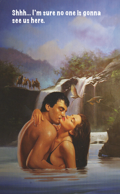
For the Valentine visual assignment I chose to caption the following picture

Ds 106 Valentine Assignment

I looked at all of the other cards in the set and thought of captions for a few of them but in the end I chose to do this one. This one seemed to be a bit more ridiculous than the others and the caption just seemed obvious as soon as I saw it.

I used gimp to caption it. I had already used gimp once to add text to a gif so only doing an image was much easier. After I downloaded the image from flickr I opened it in gimp. Then I used the text tool to highlight the area where I wanted the text to be then added the text. I changed the font and color and enlarged it so that it was easier to read.