On December 24th…

I was born. Yes, I’m a Christmas Eve Baby.

But something else really cool happened that day, in 1970 that is. Hold on to that thought though, I want to explain this assignment first. This has been my favorite one so far this week!

This 2-star design assignment “On this day” allows you to take your first or last name and make it Google-esque: using Google’s colors for the letters. Then using “on this day in history” using your birth month and day, not year, search through the years until you find a theme you like to go along with your Google-esque name.

I google my birthday and searched through this website to find my theme. I landed upon the year 1970 and knew I found a winner, especially since I just blogged about my upcoming trip to Disney.

So what happened on December 24, 1970? Walt Disney’s “Aristocats” was released! I love this movie, so I knew it would be perfect. To create this design I first went to Picmonkey and wrote up my name and tried to match Google’s colors to my best ability. From there I uploaded it to GIMP. I found all my “Aristocats” pictures from google images and then had to  use the free select tool in gimp to crop all the images. From there I layered each picture over my Google Name and tried to match them with the letter they “fit” best with.

I absolutely adore how it came out and it’s definitely my favorite assignment of the week! I hope you enjoy it as well!

Google-Kaitlyn + aristocats

Star Point total: 10/15

Greetings Loved Ones

Brownie Points (sorry I don’t have the power to give out extra star points) for whoever can name that song I’m pulling that line from in the title!!

Since I have an impending trip coming up in a week and a half(!!!), I thought this was an appropriate assignment. This 2-start design assignment is about creating a greeting card sharing where you are, where you are from or where you would like to be.

For my greeting card I simply took the picture off of google images, opened it in Picmonkey and added the text. I was a bit concerned about using to types of fonts, but I actually LOVE the way this turned out.

I can’t wait to visit this place in a little over a week and a half with Brittany and two other wonderful friends!

Disney

What do you all think?

PS I know this pictures kind of small, but going up in size makes it too large, Flickr doesn’t have a good inbetween :(

Star Point Total: 8/15

Zombies Took Over My Blog

For this assignment, we had to remake logos to be more fitting for the zombie apocalypse.  I did a couple of them for fun.

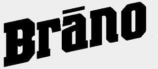
drano

Brano, for cleaning your brain filled pipes (or maybe to clear out your chest).  For this one, I took the Drano logo and just made the d into a b in gimp.  It was really easy and I only used the paintbrush to draw a line and the eraser to make the little indent for the b.  That was it.

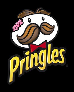
pringles-logo

On this one, I just made some brain-flavored pringles.  Not too hard of a task.  I took the pringles logo and opened it in gimp.  Then I used the oval selection tool to delete round pieces in the head, making them look like teeth marks.  Then I used the Pencil Tool and outlined the circles in black so there would be an outline just like the rest of the image.  After that, I opened a brain in as a new layer by going to File>Open As Layers.  From there, I just moved the brain around so that part of it was sticking out, and the rest was within the head.  Then I used the layers dialog (control+L) to lower the brain behind the head so it was only visible in the tiny part.  You can just click and drag for this.

THEN I rotated both corners of the mustache down in attempt to make the mustache look like a frown.  It didn’t really work, but I’ll explain anyway.  First, I used the Smart Select Tool to cut around half of the mustache.  Then I rotated the mustache using the Rotate Tool (Shift+R).  Then I did the same thing to the opposite side, taking special note of angle I had rotated the other half, mirroring it in this half.  After some moving around, I completed the connection and used the sharpen tool (Shift+U) to clean up the edges.  Unfortunately I had empty space on the face that was uncovered and I just filled that in by first selecting the correct color using the Color Picker (Shift+O, but regular white would’ve worked), and then the Bucket Fill (shift+B) to make everything white again.  And that’s how I did it.  Unfortunately I couldn’t think of a clever name to change it to.  The only thing I could think of was Dingles.  And that’s just dumb.

Let’s All take a moment to pause

Here’s a quick 1-start assignment that was fun, easy and quick to do.

Pause [Four] A Moment requires you to take your favorite photo of yourself, keep one as the original and edit the other 3 photos in different ways and then make a collage.

I picked my favorite photo (of myself) from this past summer when we were at the beach. My mom is all about snapping random pictures of me, but I must admit this one is by far my favorite. I adore that beach hat and tunic and I must admit that I thought I looked pretty nice- which is rare because I don’t think I’m a photogenic person AT ALL and normally don’t like pictures of myself.

I used Picmonkey (shocking, I know) to create the different effects, which consisted of clicking a my mouse on the setting and then creating a collage. To be honest, I chose the settings that I did because I thought there were not to crazy and you don’t lose the essence of the photo. I’m not huge into editing, which can be bad, but I liked the simplicity of each setting I chose. Beach Collage

Star Point total: 6/15


Collect Them All! Fan-made My Little Pony trading cards! (****)

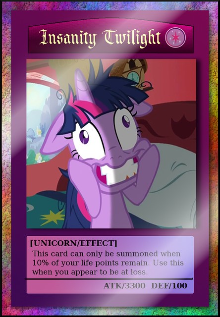
Now for a limited time you can get the new “Insanity Twilight”  Trading Card! Once played on the field, this card is unstoppable!
"Insanity Twilight" MLP Trading Card

I love Yugioh cards, and I love My Little Pony, so why not combine the two and see what happens? I created this for the Movie Trading Cards assignment.Instead of using a movie, I ended up using a screenshot from one of my favorite episodes of MLP (Movie, Episode…they sound the same to me. I don’t watch many movies.)I tried to duplicate the format of an actual Yugioh card to create this. I used 12 layers in all, including the background, border, title template, text, and drop shadows. The background is a mix of a tile filter, and a multicolored gradient.

I took a screenshot from an episode called Lesson Zero where Twilight only has 24 hours to submit her weekly friendship report. She ends up going crazy because, as a straight-A student, the thought of being tardy is devastating to her. She ends up going to extreme lengths to make up a report to turn in. What this episode and the card have in common is that both are results of waiting until the last minute to do something. Only when the player’s life points are almost gone can this card be played, and when it is played, it deals an immense amount of damage to the other player’s life points or card. (Life points are like…points that keep the game in motion. If you lose them all, you’ve lost the duel.)

There’s already a kid-friendly version of MLP Trading Cards, but I figured mine is what they would look like if they were characters that you could actually battle each other with. If they all looked like this I would TOTALLY collect them all!

Stitching Together a Movie in 4 Icons

When it came time to do my One Story, Four Icons assignment, I’ve realized that I have a bit of an odd taste in movies. I’d much rather see live theatre or go to a concert than watch a film, and the films I do tend to watch tend to be not all that mainstream.

Because of this, and because I was having fun while doing my first one, I decided to give people three films to guess.

To do this assignment, I made a blank canvas in GIMP and imported the four icons I chose from The Noun Project for each movie into the canvas. I scaled some of them up so that they were the right size and added text to the bottom of each before saving them as a gif.

It was my first time using GIMP since I could not get the files to open in Photoshop. I like GIMP but I don’t plan on using it all that much since its font selection process was tricky. I like to be able to see all of my fonts in a list since I have quite a large collection and do not know many by name and GIMP makes you type in your font name.

Leave your guesses in the comments, and I’ll reveal the movie title during my weekly summary

movie1


movie2


  • Peace from the public domain via The Noun Project
  • Farm from the public doman via The Noun project
  • Music designed by Madebyelvis from The Noun Project
  • Marijuana from The Noun Project

movie3


Animated Movie Poster

For this assignment, I designed a moving poster for the move Inception.  Here it is.inception gif

For this I loaded the poster of Inception into Gimp.  I smart cutted the head of Mr DiCaprio out of the image and reversed it.  I had to play around with the clouds on the other side using the airbrush and imagine what would have gone in there so it’s not quite perfect.  Then I loaded another copy of the poster into a new Gimp file.  From there, I decided to paint the back of Leo’s head with the paintbrush, added in some airbrushed highlights (too keep the shiny part on the top, and airbrushed in some more clouds.

After I finished everything in Gimp, I loaded the three pictures into my gif creator app that I got from the appstore (I think its just called gif creator).  The final product was the original picture, followed by the third picture of the back of his head, the image of his flipped head, and then the back of his head again.

Guess the Story!

I decided to do the 4 Icon Story assignment. As soon as I read the assignment I knew immediately which story I wanted to do. I loved this story and it is still very fresh in my mind. I would be impressed if anyone guessed this one.

4IconStory

I didn’t find this assignment too difficult, although it was a little difficult to find the images I wanted. I used the icons from The Noun Project and then used gimp to merge them together.  I did have to struggle with it a bit before I realized I had to open each as a separate layer. Before that, it was just a big blurry pile that didn’t want to cooperate. I just thought gimp was mocking me again.

door - Designed by Michael Rowe, The Noun Project

gun - Designed by Olivier Guin, The Noun Project

wheelchair - Designed by Pieter Willems, The Noun Project

medicine - Designed by Emmanuel Mangatia, The Noun Project


I Don’t Know What It’s Called But it’s About…**

How many times have we said that sentence before, we are talking about a movie and want to reference it but can’t remember the title!!! Maybe we know an actor or two, but other than that we pretty much are left to Goolge-ing random things or trying to trace IMDB actors to the desired film. Well, sadly these things won’t help you with this two star design assignment which calls for getting pictures of four things and putting them together to try and describe a movie, what a task! Here was my end result:


FinalProduct


I got all of these pictures from the website recommended in the description which I absolutely loved! I love how you could search a topic and see all of results, it was simplistic and had tons of different options as well. It is definitely a site I will keep in mind  for future design projects! I saved each image by using the print screen tool and then cropped just the picture in GIMP. Next I opened each design as a layer in GIMP and moved them in the order that I desired. I wanted to go more in chronological order, but I think you should get it no matter what :)


Happy guessing!

Princess Karissa

PSA Billboard (***)

billboard

This is my design for the PSA Billboard assignment. I created the image in GIMP by first taking a photo of spilled medication, then overlaying each pill in the foreground with family members. The pills in the background have keywords that relate to important parts of an individual’s self: goals, memories, love, talents ect.  This represents how those who commit suicide are leaving behind their capabilities and also the people who truly care about them.

I got the inspiration to create this from a friend of mine who’s had to deal with multiple suicides in her family and didn’t know who to talk to about it. I think there should be more billboards like these around because there are many people in the U.S. who are coping with suicide in their lives, and they believe that ending their own lives will take away the pain. This method doesn’t take away the pain…it just creates pain for someone else.