Tales Of The City: Minimalist Style plus a Tutorial

Tales Of The City: Minimalism

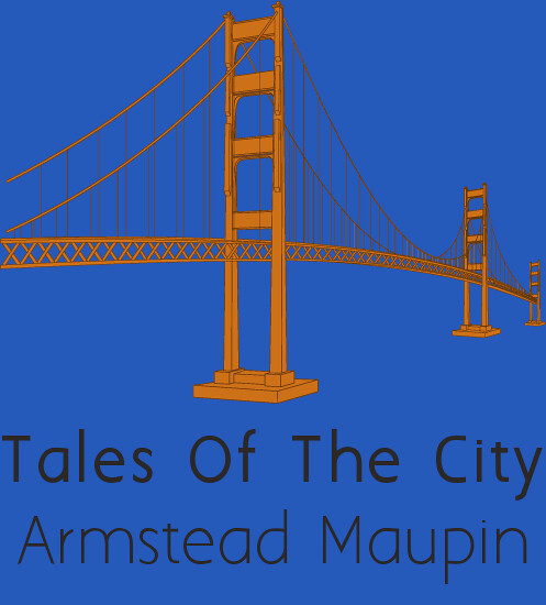
I wanted to do a minimalist cover for Tales Of The City, one of my favorite book series, but I noticed that there was no minimalist book cover assignments, so I made one.

I wanted to show off the location of the books, which are set in San Francisco, and chose the Golden Gate Bridge to represent the city. I used this image and a free font that I downloaded called Aaargh and put the book cover together in GIMP while screen sharing my entire process during the Open Lab, as I was struggling with GIMP this week and unintentionally created the tutorial that way. I show up around 10 minutes in and did the entire assignment while screen-sharing in the Google Hangout.

It was my first day using GIMP and I’m slowly starting to fall in love with it, minus the issues I’m having with the font selection.

Clicka Clicka

My last design assignment {:(}was to Design a Computer Book for Kids (***). The task for this assignment was to take a well-known children’s book and redesign it as a computer book. I looked at the website that was in the assignment details. I loved looking at all of the redesigned children’s books.

I love and am familiar with children’s books because I’m going to be a teacher {I’m sorry, I know I say that in like every post :)} I knew I wanted to do this assignment right away!

I started with one of my favorite children’s books. Chicka Chicka Boom Boom.

chicka-chicka-boom-boom

I love this book because:

  • It’s funny
  • Children can really learn about the alphabet
  • It has polka dots on the cover {for those of you who know me, you know I’m obsessed with chevron and polka dots. Almost unhealthy.}

I covered the original title on Paint. I saved it and then opened it in Powerpoint {I did this on campus and did not have my GIMP software} In Powerpoint, it was easy to match the font and colors. It was also nice that to happen at least once this week!! :) Here is my finished product:

Clicka clicka doom doom

The words seem pretty clever because usually when you click too much or too fast, you’re doomed.

That brings me to 16/15 stars! I wish the rest of the semester could be photo and design assignments!!!

DS, the Movie

I have been loving every second of design week. The assignments are my favorite part. The next assignment I chose was to create a movie poster for DS106 (***). This was very fun! I almost want to do it again.

DS movie poster FINAL

When I read the assignment details, I had no idea on what movie poster to do. I could have done any one but it needed to be perfect. I actually ended up searching for ‘movie posters’ on Google. I scrolled down until I saw ‘the one’:

original movie poster

I saw it and knew right away. I have no clue why. I’m a psychology major but still know nothing about how the brain really works. I opened up this picture in GIMP and covered the original title. I wanted my font to fade like the original title does. I couldn’t figure out how to fade it. I’m still kind of new to this software!

So I opened the picture in Powerpoint because I remembered playing around with the different word art features when I was younger and thought that was the “cool” thing to do!

I still couldn’t find how to fade the font! I was beyond irritated now. I couldn’t get it to work and I missed eating dinner because I was working on this for so long. I ended up just outlining the words in one color and having the words another color. I think it works in the same way, you still get the same firey effect.

I chose to have my movie poster be about boot camp because that would be an interesting movie. And Indiana Jones looks like he is about to conquer that firey skull guy. I think that’s what we all felt like when we conquered DS boot camp! Remember those days?!

That brings me to 13/15 stars! Why does it have to go so fast??

The Perfect Truth

For my next design assignment, I clicked on the “random” button. I tried reading through all of the assignments and picking which one I wanted to do, but I couldn’t pick!!

The assignment I was given was If Movie Posters Told the Truth (***) Boy, do I wish this was true! I watched a movie the other day and I thought of it right away when I was reading the assignment details. Here is the original movie poster.

true movie poster

Yes. Pitch Perfect is a funny movie. I laughed and cried…yadda yadda. However, this movie is “perfect” for this assignment! Here is my truthful poster for this movie:

true movie poster FINAL

I did this assignment in GIMP. I started off by covering the original movie title. You can kind of see where I covered it because it gets kind of ‘choppy’ at the bottom. I tried using the spray paint feature to cover that up. I also matched the font as best as I could to the original font because I wanted to make it look as real as possible.

I really enjoyed this assignment because it is something everyone can relate to! Like many other assignments I do for this class, this one can be used in my future classroom. Kind of like a book report? Or a final project?

Less is More***

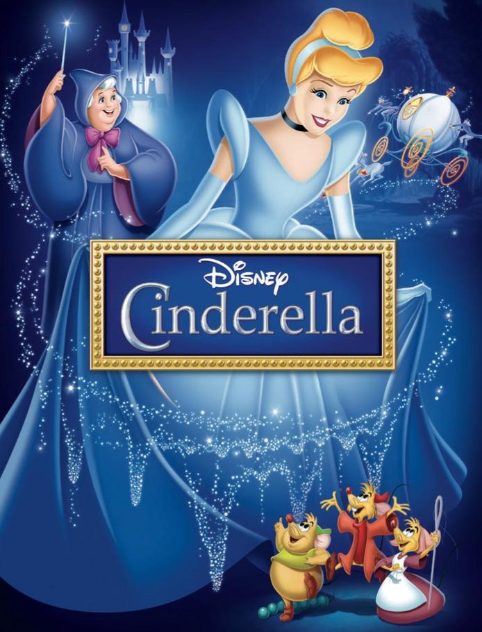
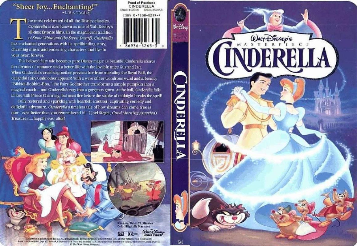
As per usual, another post is being dedicated to Cinderella. What can I say? She’s my favorite. So it was only natural that when I had the opportunity to create a movie poster in the most simplistic manner, I chose to do Cinderella’s cover. Just out of curiosity, I decided to search what some Cinderella covers had looked like in the past, and certainly came across a large variation depending on the version and the year. Here were just a few:

but the one that caught my interest the most was:

Sure this last one may not be a movie cover, and typically playbills are a bit more simplistic (I am absolutely obsessed with Broadway Plays). But I just loved everything about this. In fact, I actually saw this picture after I had already made my movie poster. The first time I saw this assignment I knew I wanted to do the iconic glass slipper, because it is after all the dream.

So I wanted to make my poster have the glass slipper, so I googled an image of a glass slipper and I put a light blue background as the background layer. I did have to also paint the blue around the slipper, which was a very tedious process. I then added some text and wanted to put it on the right side just to create a bit of a balance between the shoe location. I did all of this with the lovely help of GIMP, and got this amazing result that I really like:

FinalProject

Thanks for reading!

Princess Karissa

Caption that

For my last star design assignment of the week I chose “The Big Caption,” mainly because it was one star and that’s all I needed.

For this 1-star assignment all you have to do is pick a picture off of “The Big Picture” and add a typography caption so that it changes the message of the photo. I had no idea what typography was until about a week ago. I mean I’ve seen it before, but I didn’t know that’s what it was called. Though I understand what it means, I’m not really sure what I did in this picture is considered typography. I looked at some other examples and so based on that, I think my work can be considered typography, but then again maybe not. Please let me know what you think!

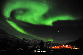
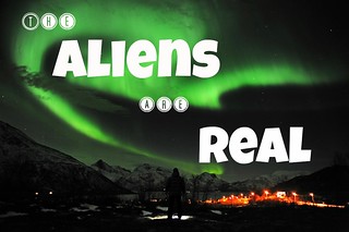
For my picture I chose an image of the Northern Lights, which are gorgeous! Can you imagine seeing this in person?! Amazing!

APTOPIX Norway Northern Lights

When I saw this picture, the caption immediately came to me. I don’t believe aliens are real, but I thought this picture was to good not to add an alien caption too. I created this in Picmonkey.

APTOPIX Norway Northern Lights

Feel free to give me some help on improving my typography! I’d love to learn more.

Star Point total:15/15 DONE!


I’m leaving on a jet plane

Well not just yet…

For my next 2-star assignment I chose “A place I’ve Never Been before.” I saw this over on Brittany’s blog (her’s is amazing) and new I wanted to do it too.

The premise behind this assignments is to just pick a place you’ve never been before and create a photo collage/illustration of that place. There are a lot of places I’ve never been, but want to go so I figured it would be hard to decide upon one choice, but a conversation with my mom earlier this evening ended my search quite quickly.

First, I have to provide some background information. My dad works in Jordan, yes the country in the Middle East! He’s been there about 2 years now and my mom and I have yet to go visit him because of work and school schedules, among other things. He’s come home a bunch of times, which is awesome, but I’ve been wanted to go visit him and Jordan for some time now. My parents were talking earlier today and my dad suggested that we try to come over sometime this summer! So I think we are going to go late July, early August. I’m sure it will be 120 degrees Fahrenheit (HA!) but I’m excited about the possibility of going this summer!

So that’s how I came about my decision to pick Jordan. For this college, I picked the country’s Flag, camels, and Petra- which we will probably go to on our trip. I’m obsessed with camels (they are so cute!) and I’m most excited about the ability to get to ride one while we are there! It’s been a dream of mine!

I got all the picture from google, uploaded them into GIMP and used the free select tool on the camel and Petra. I actually flipped both photos so as not to interfere with the star on the flag. For the name, I went into PicMonkey and then imported it into GIMP. I’m just not a fan of using the fonts in GIMP.

Flag_of_Jordan

I like the way it turned out! Have you ever ridden a camel?

Star Point Total: 14/15


One Story Four Icons

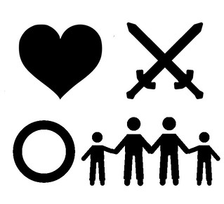
For this assignment, we had to summarize the main plots of a movie into four icons.  You can try to figure out what it is.

one story four icons

I got all the pictures from The Noun Project and compiled them into one image using Gimp.

New and Improved Bumper Sticker

I’ve got another 2-star assignment for you all!

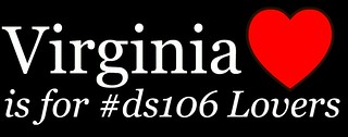
I’ve recreated a classic Virginia bumper sticker to incorporate some ds106 love in it.
For this assignment I used Picmonkey. I grabbed “black wallpaper” from google images and added in text and the heart.

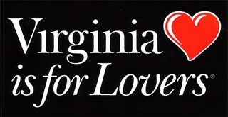
Here’s the original that I got my inspiration from:

Original Bumper Sticker

And here is an updated version with some ds106 added in:

Updated ds106 Bumper

So would you sport this on your car?

Star Point Total: 12/15

Disney World

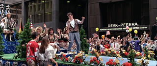
Joe Flacco got lost on his way to Disney World.

ferrisbuellersdayoff-12

For this Assignment, we had to insert someone into a picture where they don’t belong.  Since Joe Flacco was Superbowl MVP, he was supposed to go to Disney World for a parade afterwards.  Instead I made him get lost in Ferris Bueller’s Day Off.

This was actually really easy to do, it just took a lot of effort to get a good smart cut.  First, I loaded an image of Joe Flacco into Gimp, as well as the image that I wanted to place him in, in this case being the parade scene from Ferris Bueller.  I went at Joe first using the Smart Cut Tool (I).  I probably used around 200 points to get a good shape off of the smart cut–sometimes it gets a little crazy so the closer you put the points together, the better the cut gets.  After I finally got around him, I copied the image (Edit>Copy) and pasted it as a new layer into the parade picture.  From here, I had to shrink it to an appropriate size using the Scale Tool (Shift+T).

Once I did that, I tried a bunch of different things so that I could put him into the background.  I found that the thing that made the best effect was using the Smart Cut Tool again so I could select some of the flowers instead of just using a solid block (Joe was only half there when I used the solid block).  By selecting some of the background to move into the foreground, I made it look more realistic in having Joe there, so he wasn’t just floating around and actually looked like part of the picture.  Once I had the flowers selected (using the smart select tool (I)), I used the layering options (control+L) to move the flowers in front of Joe, covering some of him up.  Then I used the Move Tool (M) to move everything into place, lining up the flowers in the foreground with the flowers in the background, enveloping Joe into the picture and that was that.

Also, don’t forget to export the photo so you can make it a .jpg or .png because otherwise Gimp will format it in some weird file type.