DS106 Propaganda

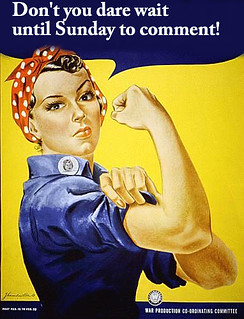
This assignment was to create a propaganda poster for DS106 using a WWII poster. The process of completing this assignment was rather simple. I scanned through Google images to find the perfect poster to convey my message, and I came up with this one:

WWII_poster

After that, I used Pixlr to edit the image and change the message. I am fairly new to pixlr, so there are definitely some flaws to my final product, however practice makes perfect right? My primary difficulty was working around the top portion of the lady’s bandanna in the blue text area. Anyways, Here it is!

Edited_WW2

Crack Spirit Guide: The GIRLS Trading Card

Crack Spirit Guide trading card

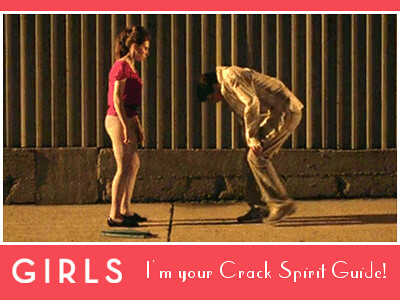
Making movie trading cards is easier than I thought it would be when I decided to do the Movie Trading Card Assignment. I wanted to make a more traditional movie trading card and not a Pokemon card so I lucked out when I found this trading card from Silkwood.

I chose to base my trading card on GIRLS, which if you hadn’t noticed from my previous work, is one of my favorite tv shows. One of my all time favorite scenes from the show is from season 1 when Shoshanna accidentally takes crack at a party and Jessa appoints Ray to be her “Crack Spirit Guide” to help keep her safe. The pink background on the trading card was extracted from Shoshana’s shirt and the text and the border are in white. I used this image that I found from the scene and scaled it up to fit better in the frame.

After reading this article about the typography used for the GIRLS logo, I searched for some art-deco inspired fonts for the text of the card and after trying a few fonts, decided to use Parisish for the quote on the trading card. I copied the GIRLS logo and edited it in GIMP before pasting it into the card.

The whole process was simpler than I expected and I love how my trading card turned out.

One Story, Four Icons

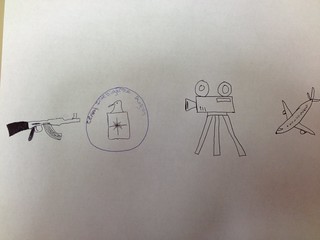
Can you guess this movie? The assignment was to depict a movie in four basic icons. I had a lot of fun working on this assignment, and worked hard to create identifiable objects with my minimal drawing skills. While I could have done this assignment using Pixlr, or another photo editing software, I chose to draw it as I thought it might be a bit more enjoyable. I hope you can guess the film!

Guess that movie

HINT: The Oscars are tonight!

The Truth about Tangled

For my last design assignment I decide to do If Movie Posters Told the Truth which was worth three stars.  I decided to to Tangled as my movie poster.  I started out with this movie poster for Tangled.

tangled-movie-poster-1020560376

I decided the truthful bit of information that should be included into this poster is how wonderful her hair is.  Throughout the whole movie all I ever think about is how much I’d love to have longer hair (however I do realize that hair as long as hers may be a bit difficult to deal with).  And on top of her hair being super long and beautiful, it also has magic power.  How is that even fair?

To remake this poster I first downloaded this Tangled Font so that my words would look similar to that of the words already on the poster. I then added words describing how this movie will just wish you had long, magical hair like hers.  I played around with the size placement of the font to make it as natural as I could.  Here’s what I came up with!

editedposter

That’s all my stars for the week!

Hi from the Happiest Place on Earth!

I totally got this idea from Kailtyn and her post greetings loved ones.  As you may have read on here by now (at least twenty times),  I AM GOING TO DISNEY IS LESS THAN A WEEK.  And I’m kinda pretty excited about it.  So I find it totally fitting to do the assignment greetings from ds106 which is worth two stars!

I started off by importing a picture of Cinderellas Castle into gimp.Castle

I the wrote the words DISNEY WORLD over the picture in the font summertime lovin. Then using the free select tool I cut around the words so that all that I had left were the words and the part of the picture that was inside the words.

words

I then found a picture of a red fabric covered in mickey heads and cut it and put in it a new window of gimp as my background.  pattern

After that I pasted my words that I had over top of my background font and used the free select tool to cut them out again.  I decided to leave a little bit of white space around the words to really make them pop off of the background.  I then used the font honey script to add the greetings from at the top of my post card and cropped it to the size I wanted it to be.  Here is what I came up with.

greetingsfromdisney

Hope you like it! Only two stars left!!


When You See it — ???

As soon as I saw this assignment that asked us to photoshop someone or something that shouldn’t be there into a picture, I knew exactly what I would do: Slender Man.

Slender Man

Now, if you don’t know who Slender Man is, I pulled a few lines from a Wiki article on him:

Slender Man generally appears (in modern times) as a tall man in a black or grey suit, red or black tie, and white shirt, with no eyes, mouth, or clearly defined facial features. It has no hair, and generally has normal-looking bare hands. Slenderman typically is depicted in imagery and literature as between 6 and 15 feet tall, depending on the situation, and in video as around 6-7 feet tall.

You can also learn more about the myth of the Slender Man in popular culture and history here.

I learned about him from playing this random game online called Slender: The Eight Pages. I hate scary games, but I gave it a go and it has continued to fuel my nightmares for a while now.

I also made door decs for my residents this past October. I’m a big fan.

tumblr_mbfwtorZdE1qf0ej3

Back to the assignment

I went to Creative Commons on Flickr and searched for “kids” in the “park.”

Why did I search kids in the park? Well, because Slender Man has a weird connection with kids. He often shows up around kids playing a park if you look online for photos of him. I thought it would be creepy.

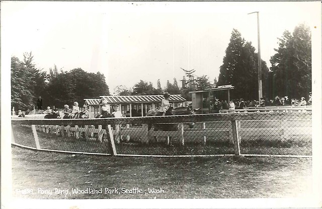
I found this photo from the Seattle Municipal Archives

Pony ring at Woodland Park, circa 1910

With a little Photoshop magic (layering, making him look grainy, and changing his face to look less pixelated), I created this.

When you see it..

Now he doesn’t fit in completely, but I just couldn’t make the photo even grainier than I already had.


Don’t You Dream Impossible Things?

Earlier in the week I did the Lyric Typography poser assignment and ended up changing the assignment around a little bit because I had so much fun with it. Even though it ended up being my favorite thing that I had done this week, I realized that I got a little bit off track and decided to try it again.

I started off by downloading two fonts to do this assignment.  The first was learning curve and the second was Bella K. dings are cool.  I used learning curve for my letters and Bella K. dings are cool for the stars that I added around the words.  

I decided to do the lyric “don’t you dream impossible things?” from the song Starlight by Taylor Swift.  I loved pulling my favorite lyrics out of signs and making different signs and posters out of them (I guess kind of like typography, but with makers and paper instead of computers) and my little sister asked me a couple weeks ago to make her one with this lyric on it.  I hadn’t ever noticed that part of the song before (because Starlight is one of my least favorite songs from her CD) but I LOVED this lyric when my sister pointed it out.

I made this using gimp.  I started off with a plain white background and then added my words to it.  I used the dashed version of learning curve and made the size a little bit bigger to on the word impossible to make it stand out a little bit more.  I then added stars one by one around the outside of the words (I tried to add a couple a the same time but I couldn’t quite get them to fit how I hoped that they would).  Here is why I ended up coming up with the second time I tried this assignment.

typography

Bumper Sticker

For my next assignment I decided to do ds106 Bumper Stickers which is worth two stars. As soon as I saw this assignment I knew that I had to recreate this bumper sticker

bumper sticker

As a resident of Virginia, I see this bumper sticker EVERYWHERE.   I guess the Outer Banks is a popular popular vacation destination for people around here and that every feel like they need to get a bumper sticker when they go.

To make this into a ds106 bumper sticker I started by editing the previous words off the of bumper sticker in gimp.

crop1

I then went to the website myfonts to find a font similar to the one that was used in the original bumper sticker.  My results showed that Microsoft Trebuchet was a close match so I used that when I added my new words to the bumper sticker.

font

I first added ds106 where OBX was previously located and then added 4life where it had said outerbanx NC.

Here’s my final result:

final

Four stars left!

Brought To You By… | Three Stars

The Assignment:

These projects all involve some aspect of re-editing existing content to change the meaning or making something new that visual represents an idea.

PSA Billboard

starstarstar

This is silly, But I had fun making it, and figuring out how to say what I wanted to say.  PLUS!  I can’t even tell you how hard it was to get a sponsor for the billboard.

This is a serious problem ladies and gentlemen, seriously.

final billboardPSA

“For the love of all that is good:

Stop using the word WOMEN when what you really mean is WOMAN.

E=plural.  A=singular.

You are not a women.

You are a WOMAN.


Brought to you by there, their, and they’re.”

———————————————————–

image of the ladies found here

image of the billboard found here

A little cut, a little paste, a little playing with the color to give it a more comic-y feeling.

___________________________________

Pass it on.


Six Word Memoir | Three Stars

The Assignment:

These projects all involve some aspect of re-editing existing content to change the meaning or making something new that visual represents an idea.

Six Word Memoir

All I’m gonna say is this.  This is worth WAY more than 3 Stars.

starstarstar


A memoir in 6 words.  Sounds easy right?  Well, I guess it could be, but if you are really gonna do yourself justice and summarize your life into six words you really have to rack your brain, or at least I did.

Oh sure, I could have done something fun and easy.  Something that would make me laugh, make you laugh, but I really thought long and hard about ME. My LIFE.  What I stand for, who I am, and who I strive to be every day.

And so, I give you…

6 word story