Talking + Alcohol = Watch What Happens: Live

Watch What Happens: Live Minimalist Style

I guess you can say that I’ve fallen in love with making minimalist posters this week since this is my third one. I have been enjoying the challenge of making them this week and learning how to use GIMP in the process. My best friend got me hooked on Bravo’s Watch What Happens: Live with Andy Cohen, the only talk show on late night tv to feature an open bar. I wanted to emphasize two key elements of the show, the talk and the alcohol through the symbols I used for my take on the Minimalist TV/Movie Poster assignment.

I cropped down this image of a martini glass and cocktail shaker and recolored it with a gray and a grayish pink and changed it’s background to a medium gray. I added this speech bubble to the image, resized it, recolored it from black to a darker gray and rotated it so that it looked like the martini glass was talking and added the text using Raleway, a minimalist font I discovered this week in a slightly paler gray than the speech bubble. I prefer to use shades of gray, even subtly over the standard black and white, which I have heard people find too harsh.

This was the hardest assignment for me this week and honestly, I’m not totally happy with how it turned out. I love the design and layout of it but not the edges of the martini glass, which I could not figure out how to make sharp while removing the darker pixels around the edge of the glass.


Bagman for President!

Bagman for President!

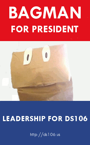
One of my favorite things about ds106 is Bagman. The character created by Brian Short is a bit of a legend among those involved in ds106 and rightly so. When I saw that there was an assignment to help out Bagman’s Presidential Campaign, I jumped on the chance to make a poster for him.

After seeing Cogdog’s tutorial, I got a sense of how to do the work and went upon finding a campaign poster to base my poster on. I chose this JFK poster and imported it into GIMP where I remade it, making each block of color solid before remaking the text using TW Cen.

I cropped and cut Bagman from this photo before resizing him and putting him on the background I made. My cropping is a little rougher than I wanted it to be but I’m still learning GIMP and could not find an edge finder to use so I free-handed my cropping. I chose to keep Bagman in color since I thought that it added to the look of the poster even though the JFK poster I used had the portrait in black and white.

Visit District 7!

District 7

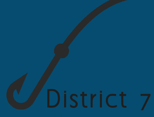
One of the few problems that I had when I read The Hunger Games was the lack of description about most of the Districts. This did not really affect me in any way until I saw the Minimalist Travel Posters Based In Movies Assignment and I wanted to pick a District to create a travel poster for. I decided on District 7, where Finnick Odair, from Catching Fire and Mockingjay comes from. Although it has yet to be portrayed on film, it will play into Catching Fire when it is released in November.

District 7 is most notable in Panem for its fishing industry and its watery landscape, which I wanted to display in the poster. To keep it minimalist, I settled on focusing just on the water and intentionally chose not to put a fish in my image. I imported this image of a fish and a fish hook into GIMP and cropped out the fish. I then shifted the angle of the fish hook and recolored it before adding “District 7″ in Aaargh, which is becoming my ‘go to’ minimalist font.

I’m really starting to enjoy making minimalist posters and plan to make at least one more for the design challenges this week. They are trickier than they look and they have been a good way for me to learn how to use Gimp.

A Death Notebook — ???

This was the quickest assignment I have ever done, but it was still some fun.

The assignment was to take a title of a well-known book and re-design the cover to suggest something entirely different.

I looked at the best-selling books on Amazon to get an idea. Then I figured, why not make something Nicholas Sparks has done into something really dark and not romantic?

So I took The Notebook.

I took the original cover from his website:


But there really wasn’t any point in saving any of it. So I positioned a picture of Light on top of the bottom image, then erased the top. Then I used Optimus Princeps font from dafont.com to make the title cover text.

I then decided to do something with a similar name: Death Note.

This is what I came up with:

New Book

Zero Crash Burn — ????

I started this assignment with high expectations. I was going to make a movie poster into something animated.

Making a poster even more epic? Definitely going to be good.

I researched some posters of movies that came out this year on IMdB.

After browsing around for awhile, I picked two posters that I thought would be easy, but also could be animated in a way that makes sense.

For the Prometheus one, I had planned on making her flashlight turn on and off, sort of like how it happened in the movie.

For Zero Dark Thirty, using the poster for inspiration, I would put a gif behind the words.

I started with the Zero Dark Thirty poster first.

The Steps

First, I needed to remove her photo from behind the words.

I figured the easiest way to do this was to use the background eraser.  I tried using the Quick Selection Tool to select the inside of each letter, but when the letters had black marks on the inside of the letter (like the “O”), it took the entire letter out.

So, I was stuck with using the Background Eraser. And boy was that hard.

The blue areas were easy. Her face and hair and dark shirt on the other hand… took me an hour. I wanted to preserve the quality of the lettering, so I had to be super careful with the Tolerance level.

After getting most of the photo behind the lettering gone, I had to go back in and use the Erase Block to get the darker spots that even Tolerance couldn’t help.

I ended up with this.

step 1

The checkered part is the transparency.

Then, Adobe fought back. It crashed and left me staring at my computer in complete dismay.

I let it do its thing and just waited until I felt my computer could try to open Photoshop again.

I tweeted while I waited.

Finally, I got up the courage to click on the shortcut on my desktop and wished with everything in me that it would come back. If I knew how to speak whale, I may have sounded a lot more like Dory.

Photoshop said it had recovered something!

YESYESYES.

Alas, it didn’t recover everything. I had lost about an hour’s worth of work.

I didn’t feel like going through it all again, though. So, I sucked it up and kept going with what it had recovered.

Making it into a GIF

I downloaded the trailer for Zero Dark Thirty with Fastest YouTube Downloader. Then I used MPEG Streamclip to trim it down and make a gif out of part of the trailer.

I then opened that gif in Photoshop.

I had no idea how to put the top image on top of the gif, though.

My only idea was to increase the Canvas size of the gif to the height of the poster. Then I copied the poster onto the gif and put it as a top layer.

That was it!

Ta da!

After making it into a gif, I realized you can’t even tell that I didn’t go back through and clean up the transparency.


WWII Propaganda ***

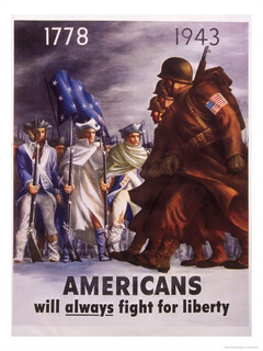
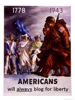
To continue on my 15 star design assignment quest, I completed a poster redesign called DS106 Propaganda Posters from the ds106 Assignment Bank.  This 3 star rated assignment called to take a propaganda poster and tweek it to publicize ds106.

I found the poster I wanted to use via Google from ww2propagandaposters.com.  Below is the original poster:

WII Prop original

I opened the poster in Picasa and retouched the text under Americans.  I only wanted to change the word “fight” to “blog”, but instead of trying to match the font perfectly, I took out the entire line and rewrote it in as close a font as I could find. I also enhanced the colours to modernize it.  Et voilà!

WWII Propaganda

If I Had to Describe Myself It’d Be…**

For my final design assignment for the week I decided to do the two star assignment that has you create an icon to describe yourself. As the picture they had Mickey Mouse’s ears, which made me a little sad because I wanted to do Minnie with a tiara (I just love her). So I decided to take a new approach and look at the things that really mean something to me. First of all my family is everything. I love them more than they will ever know and I’m so glad that they will always have my back. So, I wanted to put two things in my icon to represent them, a heart and a four leaf clover (we always have the luck of the Irish, plus I am superstitious like crazy). So I decided, why not make the four leaf clover be my base and put something in each leaf? Brilliant, I know.

So that’s exactly what I did. I opened up paint and set a drew of a four-leaf clover to be my background. I then drew in a heart (for family and love), Mickey Mouse (for believing in my dreams), an apple (because my passion is teaching and that is what I want to be when I grow up, trust me it is not because I like apples (unless they are covered in sugar)), and finally math symbols (since math is the first thing I was ever truly passionate about). I believe that these things all represent who I am as a person and who I want to be as well, so it’s the perfect icon for me! I was proud because I drew all of this freely, which is impressive considering my lack of artistic abilities. Here was my final result:

icon

Thanks for reading!

Princess Karissa

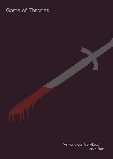
“Anyone can be killed.” — ???1/2

For this week’s assignments, I am focusing on design.

For my birthday on February 23rd, I received both seasons of Game of Thrones on Blue-ray/DVD. I can’t stop watching it. So my mind has been on Game of Thrones all week.

The moment I saw this assignment to make a minimalist movie/tv show poster I knew I had to do Game of Thrones.

I started by writing down a bunch of ideas for the poster. How can I represent an entire series with one symbol?

I thought about a crown or the throne of swords–but how overdone is that?

So I went with something that is poignant and representative.

Power resides where men believe it resides.

If you haven’t seen the series, you may not get the reference, but it’s a pivotal moment in the series.

Resources

The colors!

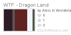
I wanted soft colors that weren’t too bright. So, I went to a palette site called Colour Lovers. Naturally, I searched, “Game of Thrones.” On the first page was this masterpiece:

WTF_-_Dragon_Land
Color by COLOURlovers

I knew I wanted something with grey for the sword, but also red for the blood. How perfect is this?!

Sword Clipart

Blood Drip Brushes for Photoshop

I found my blood drip brushes on Deviant Art. You can see and download them here.

65edfaf95e5e2b49b4c2da151b57c7ed-d34dgsb


The Font

Comfortaa on dafont.com

comfortaa


Some final thoughts

I would write a tutorial for this if I didn’t have to switch between Photoshop and Corel PaintShop Pro to complete it. Photoshop, I learned, does not like to replace black and white colors. So while I needed to use Photoshop for just about everything else, I had to turn to PaintShop to use color replacer.

I absolutely loved making this poster, and I wish I could make a ton more for this class (if I had the time, I would do it for fun!).


“Big Wedding” Coming soon to DS106TV (***)

This image was created for the “Really Reality TV” assignment where you generate 2 words and create them into a TV show. I decided when I was going to generate my pair of words, I would NOT change them no matter how silly. The first pair of words that appeared were “Big Wedding.” What’s funny about this title is that there IS going to be a movie coming out this year called “Big Wedding“. “You gotta be kidding me,” I thought. Since I’d promised not to change it no matter what, I decided to do my own rendition of the movie using the paragraphs I’d acquired from the Google searches.
Source Articles:

http://www.avclub.com/articles/the-big-wedding,83227/

http://www.joe.ie/joe-life/life-features/big-wedding-cake-required-in-south-korea-as-3500-couples-marry-in-one-location-0034281-1

bigwedding

DS106TV Presents Big Wedding

More than 3,500 couples from all around the world gathered in South Korea to tie the knot in a wedding ceremony organised by the Unification Church.

Anyway, add a superfluous Topher Grace and a soundtrack composed of every overplayed trailer musical cue save “Born To Be Wild,” and you’ve pretty much got the entire history of modern mainstream American comedy, all condensed into a scant two-and-a-half minutes. If only Zackham had included Steve Martin and Kate Hudson confusedly wandering through the wedding party, so sure they’re meant to be there, everyone could have officially stopped making movies.