Minimalism

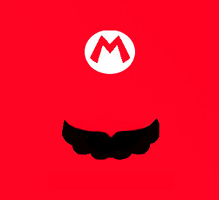
For this assignment, we had to make a minimalist design that reflected a movie or tv show.  Instead of doing exactly that, I chose to do video games.  The first one I did was Mario.  Here it is.

minimalist mario head

I did this all in Gimp.  First I took a picture of Mario’s head and opened it with Gimp.  Then I highlighted the area around the M of Mario’s hat and then loaded it into another frame that I had opened and just simply painted red.  Then I just drew a moustache in.  I didn;t really like the entire work, mostly because of the high amount of red.  I think realistically I should have made the entire hat on a white background instead of making everything red.  I made another because I was frustrated with it.

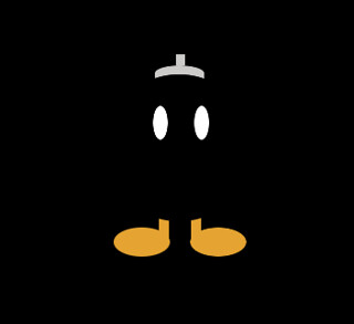
minimalist bob omb

I did a Bob Omb instead and it turned out a lot better I think.  The dominance of the black really makes everything come out better.  I only used the shapes and paintbrush for this.  First I made the background black using the Bucket Tool.  Then I used the oval tool to shape the eyes.  When I decided on a good shape, i painted it white.  Then I copied it, pasted it back in, and used the move tool to put it in a good place.  Then I went for the feet and, again, put in some ovals using the oval shape tool and put them where I wanted them.  After that, I copied and pasted it across to the other side again using the move tool.  Then I made the legs using the rectangle tool.  After I found a good shape, I painted it the orange color using the bucket fill tool.  Again, I copied it into the opposite foot.  The last thing I made was the fuse-cap.  I used the oval tool to make a round top and then the square tool to make the fuse and extend the oval down to make a box with a round top.  I filled all these using the bucket fill tool.  The last thing I did was use the oval tool to shape the body of the bob omb.  I didn’t fill this one because it wouldve gotten rid of the eyes.  Instead, I used the paintbrush tool to simply go around the edges of the circle with black.  The advantage of this is that the paintbrush can’t paint out of oval selection, so nothing will be messed up.  This made the round edges of the legs and the round edge on the cap, finishing everything.

Hold On To What You Believe

I am finding out that I love design week just like I loved photo week, not as much but it’s getting there!

The next design assignment I did was the Lyric Topography Assignment (**). The task was to take lyrics from a song and illustrate them using only topography. I love topography. I had no idea that this was considered “desgin”, now it makes sense! This is an example of topography:

fba04f40db04ec2724670541049a0ea5

I got this photo here. I had already seen this before this assignment came up, so I wanted to try to create something as cool as this! I played around in GIMP and Powerpoint for a while {seems like a reoccuring theme this week – and I’m not complaining!} and this is my finished product:

typography

The lyrics are from Mumford and Sons – Hold On To What You Believe. This song is so powerful, I knew it would make a good typography. Granted, I’m not pro like the person who created the image that was my inspiration, but I think I did a pretty good job for a “new-bie”! Things that I had to consider were font size, placement of words, what {if any} images I would place around the words in GIMP. The important words are big and bold. Luckily, I had cute font from this website {I use cute fonts when I create a worksheet or activitiy for a practicum classroom :)}.

Three Wrongs Make a Right?

You always hear how two wrongs don’t make a right, but what about three? When approached with the opportunity to design a Venn Diagram involving pop culture I decided to do the pop culture I’m best at, Disney! I’ll pause for a second while you be surprised. You good? Okay. So I immediately had this idea to somehow make it so that way a villain would be associated with one of the good guys! This was so hard to do!

So the way that I started planning this was writing down different characters of interest (which I wrote on crayon in a napkin in IHOP). On the villains side I had characters like Ursula, Scar, the Shadow Man, Jafar, Evil Queen, Stepmother, and Malicifent. On the good guys side I had the fairy god mother, Timon and Pumba, Mushu, Mama Odie, Genie ans the 3 good fairies. I knew right away that this was going to be a challenge, but once I started I really wouldn’t stop. I haven’t dedicated too much blog posts to one of my favorite Disney movies, Mulan, so I decided to make Mushu be my character of interest. Brainstorming with my friends we start listing different things that happened to Mushu or qualities that he may have. One of the first things that we saw he had in common with two villains were that he changed his state of being. At the very beginning, Mushu is actually a metal statue where he then transforms to the dragon. Looking at our villains side, Ursula transforms from an octopus to a woman in order to throw off Prince Eric for falling for Ariel (nice try Ursula), and Jafar gets what is coming for him when he turns in a genie at the end of the movie and ultimately gets trapped (he also turns into a huge snake, but I hate those so it gets little recognition). So now that I had three of the four characters locked in, I had to start thinking about similarities and difference between them. Looking just at Mushu and Ursula I noticed that they both played a major role in the princess’s transformation throughout the movie. Mushu helped transform Mulan into acting more like a man (and even gave her a cover up name), and Ursula transformed Ariel from a mermaid to a human. So now I looked back at my list of villains and noticed that the Shadow Man is the one who transformed Prince Naveen into a frog, which was pretty major to the movie. Now I had all of my characters, so it was show time! All I had left to do was find a similarity between Jafar, Mushu, and the Shadow Man. Easy right? Nope. Any similarity that I could find seemed to include Ursula as well, which would make her belong to the middle category with Mushu. Until finally I found a trait that she did not have in common, she’s a girl! Yes that is right, Mushu, Jafar and the Shadow Man are all male figures, Ursula certainly is not. Therefore I had my last quality and was ready to design.
I made my design in Microsoft Word since I felt comfortable using those tools, I then print screened the end result and saved it to a jpeg file using GIMP. I based it off the example that was shown in the instructions because I really liked the way it looked. I played with the fonts a little bit to make certain things stand out more than others, but I was pleased with the end result.

VennDiagram

Thanks for reading!

Princess Karissa

Take A Guess

To really get you thinking visually, I chose to do the One Story/Four Icons assignment (**). It may sound easy at first, but picking four images to represent a story, without giving it away, is actually challenging! And I loved creating it! I chose this assignment because I enjoyed looking and guessing at the ones previously done by DSers, so I wanted to give it a shot. Can you take a guess at what it is??

4 icons-1 story

No hints are going to be given. And I am not going to tell you if you are right or wrong until SUNDAY the 24th because I want as many people to guess! Also, if you read that someone already guessed what you were going to say…it’s ok! You can still comment with your guess — it’s not for a grade…or is it??

Photo Credits:

•Apple = http://bestclipartblog.com/23-apple-clip-art.html/apple-clip-art-2
•Broom = http://www.funfonix.com/clipart4.php
•Bunny = http://www.freeclipartnow.com/animals/rabbits/bunny-BW.jpg.html
•Jewelry Box = Microsoft Clip Art

This Class is Propaganda

So this assignment was literally propaganda.  I had to redesign a WWII poster to propogate our class.  Now, everyone has seen the craze of Keep Calm and Chive On, Keep Calm and Shop On, Keep Calm and Drink Coffee, etc.  Now what most people don’t know is that that the original one was a set of three posters that the British had in store in case the Germans invaded.  The posters would be placed around the city to keep the peace.  The original one was Keep Calm and Carry On.  Here’s the original.

Keep-calm-and-carry-on-scan

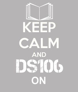
Now for mine, I adapted it for our ds106 class.

keep calm and ds106 on

I loaded it into gimp, got rid of the crown and everything after the “and” in the picture using the color picker to pick out the gray background, and then the paintbrush to paint over all the white.  I ended up with only the Keep Calm part of the picture.  Then I stole the ds106 logo off the site and loaded it into the picture, enlarging it using the scaling tool.  After that, I added the “on” in the photo.  Eventually I decided on a book to replace the crown, and loaded up a clipart image of a book at the top, enlarging it enough to fit nicely in the picture.  That was it.

One Story/ Four Icons: Guess the Movie!(**)

For my One Story/Four Icons image, I used 4 images from The Noun Project website. That’s all I am going to say, and it is up to YOU to guess the movie! :)

guessthemovie

What’s the name of that movie again?

The next assignment I decided to do was One Story/Four Icons. This assignment was to “reduce a movie, story, or event into its basic elements, then take those visuals and reduce them further to simple icons, four of them.”

Another part of this assignment was to NOT share what movie you were doing!  So I’m obviously not going to share the process I went though to decide which movie I was going to do.  I will share the process I used in making this though.  In the description of this assignment they suggested going to the The Noun Project for the pictures for this project.  I went and looked around and was thrilled with the choices.  I choose the skull, flying saucer, sheriff hat, and pizza as my four icons. I imported these four icons into gimp and aligned them side by side.  I found this project really easy to do!

So can you guess which movie I did?

namethatmovie

Nine stars down! Six stars to go!

Being Minimalistic

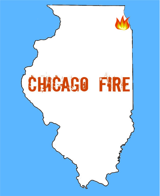
Here is my second design assignment for the week! This one is a 3-star Minimalist TV/Movie Poster. All you need to do is pick a movie/TV show and then create a poster that “captures the essence of the story.”

For this assignment I choose the TV show “Chicago Fire” it’s one of my favorites currently and if you are not watching it now, I highly suggest you check it out! The show is basically about firefighters and EMTs lives in a Chicago Firehouse. There is drama, romance, and action- I feel it’s a show that can apply to many.

In trying to be minimalistic, I decided I’d go with an outline of the state of Illinois. The blue background represents a color in Chicago’s Flag. The little fire marks “Chicago” on the map and I just added the title.

I used GIMPpaint and Picmonkey for this project and it was very annoying and frustrating. I just couldn’t really get things how I wanted them, thought I’m pretty happy now. I choose this font in picmonkey because I thought it had a “fire-y/burnt” look to it.

Chicago Fire

What do you all think?

Star Points: 5/15

My Newspaper Poetry looks like the AIDS Quilt…

I did not think that my Newspaper Blackout Poetry assignment would be so challenging when I started it, but it was. I chose an editorial about Obama’s Inaugural Speech from the New York Times and managed to turn it into a poem about the history of the Gay Rights Movement.

I had to scan my piece into my Macbook in two parts due to the length before splicing them together in Photoshop, blending the scans as best I could and honestly, over all, I am happy with my result. I think that my poem has a message and meaning. It talks about something that I am passionate about as a Gender Studies major, which is nice.

Here is the text of the poem for those who cannot follow the scan.

Human Dignity

Stonewall.
poetry waiting
speech and music
bold
something to hear
progress
years spoke volumes
today
all of us
equal

blood

A Stonewall
A I D S

America
subjected to bullying
L.G.B.T dignity
denied

gay
Americans questioned their decisions
explicitly shocked about how
sex
was in news
coverage

drew attention

I want
I’m proud
minds open
laws change
But the “gay”
American ideal

reality
love must be equal
the right to marry
gay and lesbian don’t have that
we’re not honorable

Despite our strides
no
weddings
taxes
benefits

treats gays and lesbians differently
An inferior class

validate L.G.B.T

Human Dignity

Can you guess?

We are on to design week, this week. And I’m ready to show you my first assignment!

This is a required 2-star assignment called “One Story/4 icons.” Basically you need to get 4 icons that describe the movie/story/event you are trying to portray. Don’t tell people what it is, but rather have them guess!

I got all of my images from google image and created a collage using Picmonkey, which was SO much easier than using Gimp!

I ended up making two DIFFERENT Collages, so you have two chances to guess what I am trying to represent here. I feel like one is a bit easier than the other, but I’m excited to see what you all think about them!

Set 1:

Collage 1 for ds106

Set 2:

Collage 2 for ds106

Any guesses??

Star points: 2/15