Super Fast Mode! Catching Up!!

Winding down with time and taking these moments out to post up assignments I have not posted up consolidating my posts into this one post to save sifting through a bunch of posts Visual Assignment 1 – 10 stars 3½ Stars – Minimalist TV/Movie Poster 3½ Stars – Minimalist Book Covers 3½ Stars – PSA [...]

Visual Assignment – Draw it

This was a cool and insightful assignment. I actually learned something new about photoshop in this assignment. I chose a picture of naruto (anime character) and used a sketch tutorial to create a actual sketch version of the original vector. The tutorial is Use Photoshop To Make A Picture Look Like A Sketch 2 STARS [...]

Some people just like to show off

For the Valentine visual assignment I chose to caption the following picture

Ds 106 Valentine Assignment

I looked at all of the other cards in the set and thought of captions for a few of them but in the end I chose to do this one. This one seemed to be a bit more ridiculous than the others and the caption just seemed obvious as soon as I saw it.

I used gimp to caption it. I had already used gimp once to add text to a gif so only doing an image was much easier. After I downloaded the image from flickr I opened it in gimp. Then I used the text tool to highlight the area where I wanted the text to be then added the text. I changed the font and color and enlarged it so that it was easier to read.

Slide Guy Visits the Sphinx

This is another Visual Assignment.  I couldn’t resist the opportunity to join in on the fun of placing the image of DTLT’s own Tim Owens in an unlikely spot.

I immediately thought of the pyramids, though I’m not sure why.  But then I found this great image from Flickr User wilhemja of the pyramids and the Sphinx, and I made a slight change in plans.  I used Photoshop to flip the image using the Image Rotation–>Flip Canvas command and then rotated Tim so that he could slide down the Sphinx’s face (that daredevil).

Slide Guy Visits the Sphinx


Two final comments:

1) This image is not to scale.  If Tim were this tall, he wouldn’t be able to fit into DTLT’s offices…or any other building on campus.

2) Umm Tim, where’s the nose?

Postcards–A Legoland/Minecraft Mashup

So, after nearly three weeks away for a conference (and panel comment), a new talk for a Civil War Round Table, and a family trip to California, I’ve finally returned to DS106 work.  These means that I’m woefully behind as the rest of the class has moved into audio assignments.  I’ll catch up as I can, first by doing some of the Design Assignments from Week 4.  This one is for Postcards from Magical Places.

The assignment reads (corrected for typos because I can’t help myself):

Design the front and back of a postcard that might be sent from the location of a movie or a work of fiction. Both sides of the cards must be created as graphics.

The front should use graphic design elements that provide a sense of place or use the classic motifs of old postcards (“Greetings from ______”), both pictures and text. The back of the post card should contain a stamp and postmark that fits with the theme of the movie, as well as an addressee and a message that fits the plot as well.

The modification that we had from Alan and Martha was that the image was supposed to come from the DS106 Minecraft server where there is some absolutely amazing stuff created by DS106 participants.  Unfortunately, the server was down when I went to it, so I ended up taking an image from a regular Minecraft instance.  But that was pretty boring, so I added an image I took on a recent trip to Legoland California.  [I took the Minecraft image as the background, and then, using the Quick Selection tool in Photoshop, removed the material in the upper right of the Lego version of Mount Rushmore, allowing the Minecraft background to show. This is all after some resizing of the two images so they matched.]

I then added some text, using a phrase that should be reminiscent on one commonly seen these days to those of us in Fredericksburg, and is an approved font from that institution.  The result was this:


Minecraft postcard--Side 1

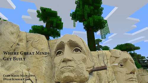
For the second side, I created the stamp from the image of Lego Jefferson.* The expensive postcard price is an homage to the founding of UMW (as well as a tease to a relative who always scolds us when we spend more that the needed price on postcard postage).  The postmark is a stylized font in Photoshop and refers to the location of Legoland, as well as UMW.


Minecraft Postcard--Side 2

There are a few other nods, if not homages, in the letter and address.


* I think the thing next to his eye is supposed to be a Q-tip cleaning Washington’s ear, but given the past month at Mr. Jefferson’s University, I’m interpreting it as something wiping away TJ’s tears.


Visual Assignment: A Debut Album

An Album Cover: Create an album cover to a fictional band.

Following the assignment’s directions, I generated the following:
Band Name: Philipine Legislative Election, 1946
Album Title: “Save what you choose to impose” (Which comes from Alan Moore’s Watchmen. The full quote is, “Existence is random. Has no pattern save what we imagine after staring at it for too long. No meaning save what we choose to impose.”)
Album Image: “nightways” by Flickr user brian hefele

Here’s what I came up with after several hours of trial and error:

Album by Phillipino Legislative...

Preparing to go platinum

CC Attribution_NonCommercial_ShareAlikeClick here to see this image on Flickr.

It’s got a real grunge or rap feel to it, which wasn’t intentional. It just kind of went that way. I wanted to stretch myself in both Photoshop and graphic design, so I tried mixing texture and colors, messed around with filters and just about everything I could think of. Oh, and also the colors. I’m terrible at picking out matching/appropriate colors. Thank goodness for my trusty color wheel. I didn’t go into the project with a plan in mind, and it resulted in a hefty amount of work. Next time, I’d like to have a picture or end result in my head before I get to it.

I visited dafont.com, where I picked out some Horror fonts.

The most difficult part of this was finding a place for the band name, and the right font. It needed to match the grunge of the album title, but it couldn’t be too similar or it would all look the same. Photoshop doesn’t do much in the way of grunge and dirty fonts, but I finally settled on the one you see now.

Maybe I’ll make a little video showing you all the layers and the settings I worked with to create this thing.

I’m not completely happy with it the way it looks, but I’m not repelled by it, either.

An Album Cover

Screen shot 2012-06-05 at 9.57.36 PM

First, go here: http://en.wikipedia.org/wiki/Special:Random The title of the article is now the name of your band. Next, go here: http://www.quotationspage.com/random.php3 Go to the bottom of the page. The last four to five words of the last quote are the title of your first album Lastly, go here: http://www.flickr.com/explore/interesting/7days Select the 3rd image. It is the picture for your album cover. Manipulate the picture, resize it, add some other color, whatever. Do the same with the band name and album title, put them over top. However you wanna do it. Make it look cool.

Not usually one for the visual assignments, I saw Jeff McClucken’s effort to capture the essence of his new band, Swiss Emigration to Russia, and succinct breakdown of how to create the album cover and went through the brief process of creating a band and finding an image.

After being introduced to the Dactyloceras lucina – a species of moth of the Brahmaeidae family found in central and west Africa – I went a little further with the image search, consulting Flickr’s the Commons under the search tag for Interesting and found my base layer, which I then uploaded into pixlr.com, an online photo editor that let me add text and diffuse the picture to give it the grainy/painting effect.

Other than not creating a square image – as I believe is one of the requirements – I also think I could have done a better job capturing the essence of my randomly generated quotation, which I’ll share in full here as a fond greeting to my camp and bunkmates, but also an acknowledgment of Camp Macguffin’s initial honeymoon period (I mean, not in Bunk X, but for the other campers):

The only thing that lasts longer than a friend’s love is the stupidity that keeps us from knowing any better.

Randy K. Milholland

Visual Assignment 1 — An Album Cover

An Album Cover — DS106 Assignment here

So here’s something fun for everyone to do, should be quick and easy, but try to make it pretty. First, go here: http://en.wikipedia.org/wiki/Special:RandomThe title of the article is now the name of your band.

Swiss Emigration to Russia is my band name


Next, go here: http://www.quotationspage.com/random.php3 Go to the bottom of the page. The last four to five words of the last quote are the title of your first album

“Contemplate What Is Happening” is my album title.  [Appropriately enough for a digital media course, it's from a line by Marshall McLuhan.]

Lastly, go here: http://www.flickr.com/explore/interesting/7days Select the 3rd image. It is the picture for your album cover.

I had several great images, but none of them were creative commons licensed.  Given that I was going to be changing it around, I decided I wanted to have something with some clearer copyright.  So I thought of the Flickr Commons, the partnership Flickr started with the Library of Congress (though its promise is mostly unrealized still).  There I found this image (3rd in the random Commons Sampler). Given my band’s name and album title, it seemed perfect.

Views in Sydney and New South Wales, 1930-40 / by Charles F. Walton

Views in Sydney and New South Wales, 1930-40 / by Charles F. Walton

Manipulate the picture, resize it, add some other color, whatever. Do the same with the band name and album title, put them over top. However you wanna do it. Make it look cool.


Then I dumped it into Photoshop, cropped it to a square, and used the Sun Faded Photo style to make it a little more yellow so that I could more easily put text on it.  I did some new layers with the text of the band name, which I changed to red.  I had initially thought I would try to place the title of the album on the hanging clothes, but “contemplate” and “happening” are awfully long words.  So, instead I went with this, which I like better in terms of spacing.  I also like the way “happening” ends up highlighting the two people just visible at the edge of the album cover.  Contemplating what is happening is exactly what I hope this design causes people to do.


Fake album cover for DS106 class

Swiss Emigration to Russia (2012)

Visual Assignment: Pippin a la Warhol

Warhol Something: Andy Warhol was an iconic pop art mastermind. Now you can be one too! Take a photograph, or use an existing one, and create a piece of pop art.

Pippin a la Warhol

Son of a Took!

Click here to see this image on Flickr.

I’d wanted to do this assignment for a while, and since graduating, I’ve had a bit of time on my hands. I began with a photo I’d taken about a year ago of my boyfriend’s dog, Pippin, and followed the very useful tutorial provided by the assignment’s creator. The process was more complicated than I thought, and I had to bite down the urge to go off on my own. I’m glad I chose to stick with the directions, because I learned several new things, like creating sets/groups, texturizing, and the “load selection” ability, which wowed me.

I’m happy with the way it turned out, and I may even print it off at Kinko’s!

One thing the tutorial suggested that I couldn’t do was attached a signature. I may end up pulling out ye olde clunky scanner and digitizing my John Hancock, since I thought that was a neat idea. I might as well “own” my creations. I’ve been really surprised by my skill for this stuff.