Loyalty… (Demotivational Poster)

60720794

I chose the assignment, Demotivate Yourself! (2 stars), which I found to be very cool and easy to make. Demotivational posters are everywhere, some funny, some not so funny. Once I figured out the message that I wanted to incorporate into the poster, my next step was to figure out how to make one properly. With a simple search, I came across a site called Despair, which is a DIY Demotivational Poster Generator.

All it took was four easy steps, and BOOM, I had a finished product. I loved that the layout was already set up. First, I added my image, followed by the title of the poster. The last step was to type in my caption. That was part that took the longest for me because I kept going back and forth with it, editing different sayings. Lastly, the only thing left to do was hit the download button, and the poster saved instantly in my downloads folder. I did not bother changing the font or adding color, although it gave me to option to.

Screen shot 2014-09-28 at 12.39.55 PM

The part of the assignment that took me the longest was figuring out the title and caption. I finally decided to focus on the word, Loyalty. Before coming up with my caption, I viewed some similar posters pertaining to Loyalty, just to get an idea on how to flip the meaning on my own. I wanted my caption to be “Real”, and less about being funny. People throw the word loyalty around too loosely these days. From past experiences, and experiences from others around me, I’ve learned that it is really hard to find loyal friends and partners. I’ve had friends who had their so-called “friends” stab them in the back by messing around with their girlfriend. So thats where the inspiration came from. I just wanted to remind people to keep their eyes open, because these types of situations can happen to them. Just like the saying goes, “Keep your enemies close, and your friends even closer”.

Cogdog’s Illustrate 106

Screen Shot 2014-09-27 at 8.54.59 PM

I chose to put Ds106 radio on a picture of a building because I thought it could represent Ds106 growing. Through taking this class I have realized how extensive this class is. There are people from all over the country who are involved in Ds106. I think that a radio headquarters could be something in the future.

I also chose this picture because it was an amazing angle. Bulidings in the city tend to spread across street corners and I thought this captured how unique this buliding is.

Assignment:

Screen Shot 2014-09-27 at 8.45.17 PM

Visual Assignment: Recolored lanyard!

I chose this assignment as it seemed fairly simple but also rather unique.  Most people do not think to take pictures of ordinary, everyday objects, so I took the opportunity to do it!  I took of my school lanyard laying on my desk.  IMG_1985

As I do not have any photo editing software (like Photoshop!) I simply opened the picture up in Microsoft Powerpoint and used some of the picture effects! How I recolored my keys

After clicking through the effects, I decided on this as my finished product!

RECOLORED keys

I feel this filter gives the picture a kind of a dark and antique vibe.  Overall, a quick, easy, fun assignmet!

Splash of Color: Betta Fish!

For my first Visual Assignment, I decided to do the Splash of Color assignment!  At first, I was unsure of how to start, but after a quick Google search I came across the Touch Color app.

IMG_1981

After downloading the app, I opened it up and decided I would color a picture of my Betta fish in his bowl!

IMG_1982


The app was very easy to use, you simply touched the spots on the picture that you wanted to add color to!  After a little while, I came up with this!

IMG_1980

Now you can see Cy’s vibrant blue color!  Overall, I think the picture turned out pretty well!

2 Pencils, 3 Hit Movies (Apophenia)

Our assignment, Apophenia, was to take a picture of something in your house, and make augmented pictures of it. This was a very VERY difficult task. It had to take me at least an hour to think of something to use as my base picture. Eventually I decided on this:

photo (3)

And yes, I have a reason behind choosing this. It was honestly because I could see each pencil being a lightsaber, and having Darth Vader and Obi Wan fight one another. A Star Wars themed picture, just like this:

Star Wars

From here, I decided to make this assignment movie themed. Having all the pictures I created to represent a hit movie. I actually really liked this one. I feel that the images of the characters faces combined with their stick figure bodies, add a comical feel to this picture. For my second picture, I decided to do Harry Potter.

Harry Potter

This one was simple to do. All I needed was the images of Voldemort and Harry’s faces, then I was golden. The adding of their bodies was pretty easy, simply because they were just straight lines, but I thought the clouds in the background were a nice touch.  And lastly, my Ghostbusters themed picture:

Ghostbusters


This last picture has to be my favorite. In my opinion, it’s definitely the funniest. I mean not only is Ghostbusters a hilarious movie, and one of my personal favorites, but the faces that I got for the characters are perfect. Also, the images of the Ghostbusters’ bodies are simply Halloween costume images.

To accomplish this assignment, I used Google Draw to edit my images. I found Google Draw perfect for this, because it’s easy and simple. I wanted my pictures to give the feel of being lazily photoshopped, because I think it makes the images much funnier in the context that they are placed in. It is ridiculous to make up the situations in these images that derive simply from a picture of two mechanical pencils. And this “lazy photoshopping” aspect really complements this idea. Other than the images, I mainly just used straight lines for everything else, bodies, lasers, etc.

I really liked this task because it definitely made you think outside of the box. And this assignment was not easy at all. The idea of it is easy, but to actually create images that are creative and well-done is very difficult. It definitely took me a few hours to think of all of these.

Overall, I thoroughly enjoyed this task, after I found my base picture. This assignment, Apophenia, is worth a total of 3 out of 5 stars.

Meaning I have a total of 6 stars for the week. I’m looking forward to getting my next two, and I’m hoping everyone will join me for that next post. Til’ next time everybody. And in the spirit of it being friday tomorrow, here’s how we all handled this week, in the words of Peter Venkman, “We came, we saw, we kicked it’s ass!”. Well, hopefully. Peace out my homies.


Places I want to see after college

For my next visual project I wanted to experiement with StoryMap, a website that I had never used before. Overall, I found the whole experience really awesome actually; it was super easy to use, and I’ll have to remember it for future projects.

 Assignment :Screen Shot 2014-09-25 at 8.38.30 PM

ATTENTION! New release from Renee Short

Renee Short (1)

So I must say… this assignment is pretty cool. It was really neat finding common themes in each random choice. This was the first time I had done something like this but I remember back in high school people would take pictures and make them album covers. They would then put them as their profile picture on MySpace and I would literally roll my eyes.

 The person that I received in the random wiki search was Renee Short. I had no idea who he was but I did a little research to find out that he was a politician. Not a great name for a musical artist but I figured I could work with it.

 I found a number of good quotes but I really liked the third one in because the picture I got was flowers. As a writer I often find myself journaling outside. So I found a personal connection between the two.

 I deal with Photoshop quite a bit in my everyday work so I just popped this picture in Photoshop, made a frame, and inserted the writing. It was so easy. Eventually I will do a tutorial on how to work more with Photoshop because I feel like it is a great skill to have in a class like this.

 I feel like this would be a cover of an artist like Sarah McLachlun or Jewel. Nonetheless I really like how my album cover turned out.

Assignment: Screen Shot 2014-09-25 at 7.58.42 PM

Take your teeth out and be creative…Gross.

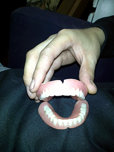
           For the Apophenia assignment I thought of using something, well, unusual? This may be weird, nasty, and not normal, but I had been talking with my family about what I had to do for this assignment, and my grandmother had the idea of using her dentures. Well we all laughed for a good ten minutes, and then I thought to myself…well, what the hell? Going outside of the box and using an object I don’t think anyone else will, might be interesting. And no I never touched them AT ALL. Gross.

Start
           I took the original picture and had my grandmother hold them open because I felt as if I could think of more pictures to create that way. After snapping the picture, I uploaded it to my computer and opened it up in paint. That is where I became an artist…for the time being (and saying I was an artist is definitely an exaggeration).
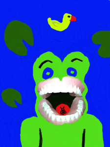
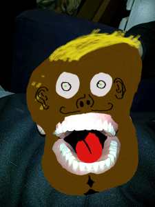
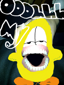
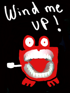
           For each of the pictures I created from the original picture of the dentures, I thought of an idea in my head and then found a picture on google of what I wanted to create as a cartoon-ish smiling picture. After thinking of the first idea, the frog, I decided to draw a monkey as well. Then to make things funny I drew the banana man with the teeth just to make the assignment fun and different than what I would usually do. And for the last picture, I remembered the wind-up teeth toy, and definitely knew I needed to try and draw that out on paint as well! Here are the final products below with the links to the images I found on google that I wanted to resemble while painting the pictures on Paint!

Smiling Frog!
3

 Monkey Showing It’s Teeth!
1

Smiling Banana Man!
2

Giant Teeth Wind-Up Man!
4

You Create What You Will

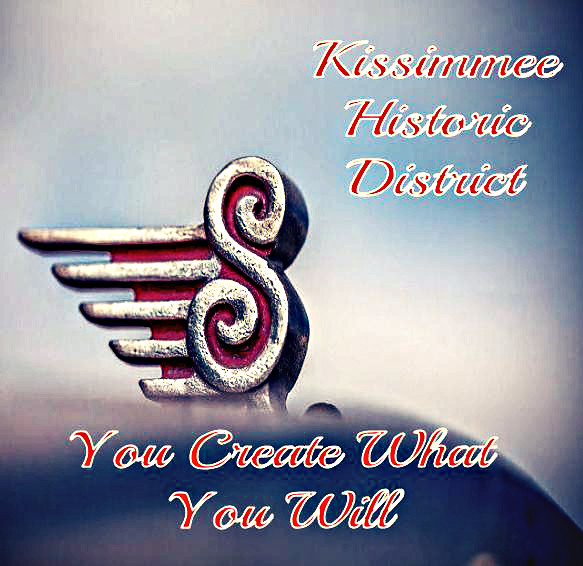
This blog post is dedicated to my first Visual Assignment for the week, An Album Cover. For this assignment we were given a random article title from Wikipedia, which would be our band name. Then some words from a random quote from quotationspagewhich would be our album title. And lastly a random image from flickr, which would act as our main cover art for the album.

To start off, I was given Kissimmee Historic District as my band name, which is obviously a winner. For my random quote, I was given a quote by George Bernard Shaw:

quote


So choosing the last five words for my album title would be, You Create What You Will. So this far I had the album You Create What You Will by The Kissimmee Historic District. I’m not 100% sure, but that definitely sounds like a Grammy Nomination in the making.

My third step in the process was to get my random image. And here’s the one I landed on:

15125576337_3eb676098c_z

Now that I had all that figured out, the rest was a cake walk. I used Google Draw to create my cover art, and then I used to Pixlr express to further edit it from there. So here’s my album cover:

Kissimmee Historic District

As far as my inspiration goes for this, I chose the script type font because the band’s name is The Kissimmee Historic District and to me, that gives the vibe of an old school, cursive writing type thing. It’s hard to explain. Initially, I really wanted to incorporate the “S” from the picture into the band name or the album title, but seeing that there were no words beginning with an “S”, that made it hard to accomplish. On the positive, the “S”, does, in a way, look like a G-Clef in music. That’s just my opinion though. I again, also chose the grainy but sharpened filter to help really give this album an old school feel. An image that someone could look at and think in their mind, “This must be a classic rock album from the 70’s or 80’s.” So there’s my first visual assignment for the week, it was worth a total of 3 stars

I hope everyone enjoyed, and definitely go buy Kissimmee Historic District‘s album You Create What You Will, it’s in stores next tuesday (only kidding). Til next time amigos. Adios.

Look at the picture and take a wild guess!

Acrostic Picture

For the second Visual Assignment, I chose to create an Acrostic Picture. To start the project I made a list of all of the things I liked that started with all of the letters in my name. I searched on Flickr for all of the pictures and narrowed it down to the pictures I liked best: apples, softball, headphones (music), lightning bugs, eyelashes (false), ice cream, goldfish crackers and Halloween. I then used those as the picture for each letter in my name. I opened up an app that I had downloaded on my HP laptop called El Collagero and inserted the 8 pictures I chose into each space. I picked the layout that was an open 8 picture layout, and after inserting the pictures into each spot, I changed the shape of them into flower-like shapes. I arranged the pictures in way to spell out my name with four pictures on the top row (first four letters) and four pictures on the bottom row (last four letters). I saved the completed collage, and then opened it up in PowerPoint. That was where I added all of the headers to each photo. I was going to underline each beginning letter, but I did not want to make it that easy on figuring out what my name was (even though it is all over my blog and twitter!).

A quick reasoning on why I chose each picture.

  • Apple – Favorite fruit!
  • Softball – Favorite sport, played it for 15 years J
  • Headphones – I love listening to music and chance I get!
  • Lightning bugs – represent summertime, and as a kid I loved going out at night to catch them in a mason jar and watch them glow!
  • Eyelashes (False) – When I go out or decide to get all dolled up, these are a must!
  • Ice cream – well, who doesn’t like ice cream?
  • Goldfish – A snack time favorite and when I was a teacher assistant in a kindergarten class we used these for math exercises all of the time and the students loved them!
  • Halloween – An awesome holiday and I love baking all kinds of goodies for this holiday!