Post-its

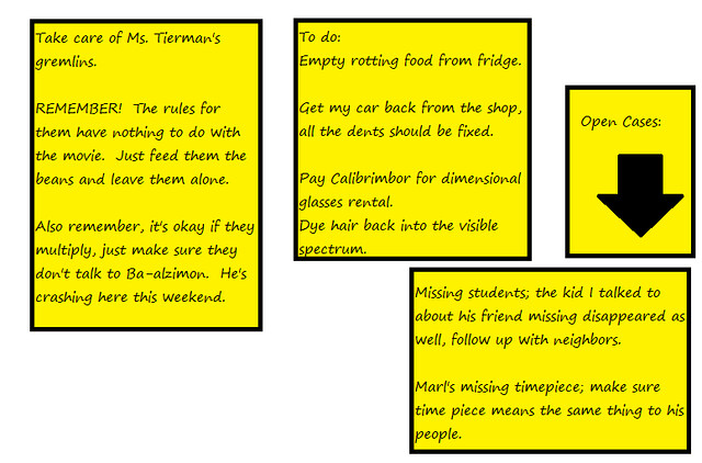
This is for the “post-it notes and grocery lists” visual assignment.  Sardic’s day can get pretty hectic, so he has to leave himself all kinds of post-it notes so he doesn’t forget some small but crucial things.  It was a pretty simple assignment in terms of design overhead went.  It was nice because it allowed me to focus on just the writing within the format, very creative focused.

to do notes

Watch Patents

For the Patent Pending Visual Assignment, I felt that I would hang some old patent drawings of pocket watches on my walls at my home or in the Steadfast Sleuths office. I found the pocket watch and stopwatch images through a Google image search and used the photo-editing elements of Powerpoint to make the patents look older and newer by altering the color of the paper, making the drawing lines appear darker or faded, and stuck the two images side by side as they would be together in one frame. My parents gave me a pocket watch when I was a child and patent drawings such as these are helpful for figuring out what is wrong with the watch if it’s broken. Also, looking at the intricate work that goes into creating something so small but important in our daily lives is fascinating to think about.

Patent Watch Drawings

Assignment Value: 2 Stars

ElephantZebraDog

An assignment I decided to do this week was to create a hybrid animal. I decided to mix Scott’s favorite animal, a dog, my favorite animal, an elephant, and another animal that I think portrays the mixing of Scott and I’s very different personalities, a zebra. The zebra’s black and white pattern signifies just how different we are but it ties together Scott’s favorite thing and my favorite thing. Somehow, our agency just works.

I created this using a website called http://switchzoo.com/default.htm
Here’s the assignment guidelines. This assignment was a visual assignment and is worth 3 stars.

Here’s the final product:
Screen Shot 2015-04-04 at 4.11.46 PM

Design to Shock

Tree_in_field_during_extreme_cold_with_frozen_fog

I made new logo for JBrown’s Law Agency. I was inspired by the assignment called Design to Shock (4 points). To create this logo, I used 3 pictures combined by using Adobe Photoshop and put some text on to it.

Since John is lawyer, he loves the quote that would make clients to trust him 100%. As he search for quotes that have strong meaning, he found this quote, “good lawyers know the law; great layers know the judge” and he thinks that it would fit with the images of the gavel and balance scale. The point of putting foggy effect on to two pictures is that he would clear the fogginess, which represents false charge. In other words, the propose of creating this logo was to show that he would find the way to get out of the problem.

Hit Me Warning Poster

3 Stars

hitmewarning

This has been a warning brought to you by the Hit Me Agency. Keep your eyes out, and trust no one.

I wanted to make a warning poster for my agency so here it is. I started with the noir themed background. To be there is something symbolic about the street lamp in the dark. It sheds light but only allows you to see so much in the darkness. I made the “warning” title red and a larger font to catch readers attentions quickly. This is also to insure that no one can say they DIDN’T get a warning. I made the rest of the font smaller and white because it doesn’t need to be that eye catching. For the phrasing I came up with a phrase that would make people question and fear at the same time. Make them think, “Do they have a hit on them? Do they want someone hit? Do they have the nerve or the money?”. This poster is intended to get people to think. I hope that it does that for you. At the bottom of the poster is our agency’s contact information. A small font of course because I did not want it to take away from the warning.

Clouded Words

noir word cloud


I made this word cloud based on the first words that came to mind about the new agency I’ve joined, House of Noir Getaways. As I’ve stated previously, we specialize in quick, mysterious getaways. This was relatively simple to make. I used the website http://www.wordle.net/create to create the word cloud. First I entered all of the words that came to mind pertaining to the agency. Next I hit “create” and edited the word cloud till I found it to be aesthetically appealing. I decided to maintain a sense of order by using the “horizontal/ vertical” setting. Next I chose a sleek font and made the color scale in a grayscale. I feel that this embodies our agency nicely. I will be using this as my cover photo on facebook.

http://assignments.ds106.us/assignments/word-cloud/

A-Z of guns

I decided to make an A-Z photo collage with guns (3 stars). This collage fit all but one gun and I decided to leave out X because the XT 97 is an assault rifle, not a pistol. All of the guns listen below are pistols and I have them all on hand. I may or may not be a gun enthusiast so be careful when you cross my path…

gun collage

Guns are something I’m passionate about and I use one daily so I know them well. Very well.  This gun knowledge helps with Hit Me. Not only am I able to do my part well, but I am able to teach some lovely ladies more about guns and how to use them. I can’t really complain about that, now can I?

The names of the guns (in order from A-Z) are as follows:

AA Arms AP-9

Bren Ten

Colt M1911

Dan Wesson M1911

Erma LA 22

FN M1903

Glock 17

High Standard 22

Intratec Tec 22

Jennings J-22

Kel-tec PF9

Lancaster Pistol

M15 Pistol

Norinco NP 22

Ortgies Pistol

Phoenix Arms Pistol

QSZ 92

Remington R51

Smith & Wesson SD9VE

Tanfoglio Force

Union Automatic 

Victory Arms MC5

Walther GSP

XT 97

Yavuz 16

Zonda C22

cute lesbians kill people and steal stuff

I took on the character description video assignment. The directions were to take a few clips to describe a character. My one character, Cleo Barrow, wouldn’t be complete without her Bonnie, so I made it a video about both of them. I was inspired by the trailer for the 1967 Bonnie and Clyde movie. Then I used clips from the avicii music video, “Addicted to You,” for the girls because it was the inspiration for the characters.  I used the song Sundown from Free Music Archive.

For the title cards I probably could have remade them completely, but I cheated and just took it from the trailer and used photoshop to put in the pictures of the girls. If it were a design assignment I would have remade the title cards but I wanted to focus my time and efforts on the video editing part. I used the selection tool and mask to cut out the parts I wanted from the screenshots I took from the trailer. For the “and they kill people part” I made the text myself because it was easier than cutting it out from the trailer. Below is the outer glow settings I used to emulate the style of the text in the trailer.

screenshot glow

I spent the first half of my time trying to figure out how to use windows movie maker and yelling at my computer because it wouldn’t do what I wanted it to do and I didn’t really have a direction at the beginning. But I got it worked out!  Mostly I used the split tool and moved clips around. I realized after I uploaded the video that I forgot to fade the music out and the end and fade the video to black.. so just imagine that it does


Sardic Documentary

This video is for the Character Description assignment.  It said to make a video of any character, using pictures for them and narrating his or her personality and story.  It was a fun one to do for Jim Sardic, my character.  It allowed a very direct approach to expand on the character’s traits themselves and really define him.  For the images, I used the one’s I had made for older assignments.  This was especially cool; it allowed me to bring together all the things I had written for Sardic, and have them all relate in one video.  It feels like his universe is being tied together by all its different parts.  In the narration, I talk about his history, where he came from, and his relationship to the Puncture.

Lost trailer

This is for “The Complete Package” video assignment.  The objective was to make a trailer for a tv show that is already out using shots from the show.  So I decided to make one for my favorite show, Lost.  I thought it would be fun to make a trailer that spanned all six seasons of the show linearly, but as I moved through the first two, I realized wayyy to much stuff happens in Lost to make a short narrative trailer.  So I shifted gears and made it more music heavy, quieting down the sounds and speech from the scenes.  The focus became the survivors landing on this strange island, and slowly discovering its mysterious dangers.  I really like how it came out, but unfortunately the video quality took a hit in exporting the finished product.  I’m not sure why, but I think the codec I used just didn’t like the source files.  Regardless, it came out well and it was a lot of fun to make.

Enjoy