It’s All In The Beads, Yo

  My bead story begins with my first undergraduate degree in Biology, symbolized by the green and blue glass bead at #1. Pretty much beginning around that time, I began rudimentary computer gaming. I say “rudimentary”, because it was pretty primitive stuff back in the late ’80s. The 20-sided die (at #2) is frequently used […]

I Made A New Visual Assignment! – “Story Beads”

I’ve been slowly working on a set of bead/charms for a bracelet and so far I’ve got the beads, but not the actual bracelet.  I’ve played with the order of things, and ran across a website called “North America Great Story Beads” where they use beads to create a timeline around which they narrate a story. […]

Rainbow Showcase

For my third visual assignment, I decided to do Rainbow Showcase.

I’ve acquired quite the collection of screen shots from episodes of The Wire, since I’ve been writing a blog post for each episode, so I thought it would be fun to sift through them all and assemble a rainbow of colors. The screen shots are pulled from Season 1, Episode 10 through Season 2, Episode 9.

RED

Screen Shot 2014-09-02 at 10.40.53 AM

D’Angelo has been see around a lot of red through the episodes, especially toward the end of his existence.


ORANGE

Screen Shot 2014-09-03 at 9.08.25 AM

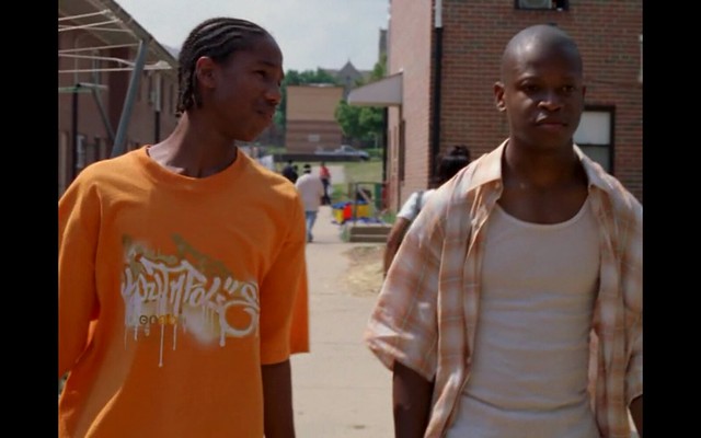
I still find it very interesting that Wallace and D’Angelo were both wearing orange in an episode that ended with Wallace being killed and D’Angelo being arrested. Orange has been an important color throughout the series, showing up in the pit during season 1 and on the docks in season 2.


YELLOW

Screen Shot 2014-09-10 at 10.05.55 AM


Here is the yellow truck used to carry cargo away and be resold and used to make drugs. There’s also red and orange in this picture, which is very warm and bright against the drab, wintery surroundings.


GREEN

Screen Shot 2014-09-10 at 9.25.24 AM


The green road signs really stand out here. Normally, this color appears as grass or trees or some other sign of life, but it is winter, so the sign is the little bit of green left.

BLUE

Screen Shot 2014-09-10 at 9.20.08 AM

The blue clothes really stand out against the lighter background colors in this stained glass. Blue has been everywhere in the show, but being the color of police uniforms, seems like the most important meaning.


INDIGO/VIOLET

Screen Shot 2014-09-15 at 9.36.52 AMNick’s daughter is wearing a purple coat, which stands out against the more neutral colors her parents are wearing. This may be the only time purple has not appeared in cohesion with yellow or red.


Take Me Back to (8-bit) Paradise

Another Visual Assignment that I did was “Real Life 8-Bit Art.” From what I read and saw of Groom’s assignment description, I figured we were supposed to find an 8-bit picture in real life. Well, this picture was real life but I edited it to be an “8-bit” picture. I took some liberties the way we are supposed to do and came up with this 8-bit picture.

Real-Life 8-Bit Art #VisualAssignments #VisualAssignments1072

How I did it:

Since I didn’t really know how to go about doing this, I Googled how to do it in GIMP and found these instructions. They are for making an avatar but I figured I could modify them a little bit to do what I needed to do. So rather than cropping the picture, I clicked on  Image>Scale Image and changed it to 128×171 pixels. Originally I tried to do it with the full size image but it was too big for the pixels to be visible, even at 20×20. So I shrunk the picture. Then I went to Filters>Blur>Pixelize and made the pixels 5×5. I tried 10×10 and that was too blurry. So once it was pixelized, I exported it and posted it to Twitter, Flickr, and the Hub via Known.

I hope you enjoyed my take on this assignment.

Size Matters

For my next Visual Assignment (I have lost count at this point haha) I decided to do “Larger than Life.” I chose it because I was like oh this will be easy, I like taking pictures in different perspectives to see how they turn out. Yeah, well I was wrong. It wasn’t as easy as it seemed, especially with live subjects.

How I did it:

Weeeeell, I started out just taking close up pictures of my boyfriend’s dog and that didn’t work because there was nothing to compare her to. Then I remembered that you have to have something to compare your subject to in order for you to be able to tell perspective. I took a bunch of pictures–probably close to 50–trying different angles and things of that nature but these four turned out the best, in my opinion. I couldn’t pick just one (and yes I know they only count as doing this assignment one time). Well here is a collage of the pictures that I took (I made them into a collage using iPiccy on the internet).

My attempt at "Larger than Life" #visualassignments #visualassignments1028

I like the top left one because you can compare the food bowl and the cat to the shelf in the background. I like the top right because you can compare the cat (who is gigantic anyway–about 25 pounds) to the computer and the chair in the background. The one of the dog in the bottom left is good, in my opinion, because of the ground and how close it is to her nose and then the couch in the background. The ring one is actually the first that I took out of this group but I wasn’t completely satisfied with it. I guess maybe because you can almost tell what I was doing with it. But the more I look at it the cooler I think it looks.

Anyway I hope you enjoyed these!

She Thinks We’re Just Fishin’

For my third Visual Assignment for this week I did “My Favorite Lyric.” This isn’t exactly my favorite lyric but it is a memorable one and since I am in my final year of undergrad, I am feeling a little nostalgic. Missing childhood and all of the memories that I have, as well as feeling super old. When I saw this assignment, I knew exactly the lyric I wanted to use. Then I was going to get a picture from the internet  but then I remembered that I had a picture of myself fishing when I was little. And that was how I decided what to do.

How I did it:

I used GIMP to make this. I opened my picture in GIMP and added the text. I tried to get fancy with it but I couldn’t figure out how to make the background of the text fancy even though I looked up some tutorials, I couldn’t find what I was looking for. Nonetheless, I am happy with how it turned out. I like the font that I chose, though I’m not sure why. I was just going through the fonts and found one that I liked. This one is Century Gothic.

Here is my picture:

A memorable lyric and baby Brittany #visualassignments #visualassignments1039

The song is by Trace Adkins and the picture is by my mom (haha).

Should Google Change to Courier New?

For my second Visual Assignment this week, I did “What a Crappy Font Will Do.” I decided to go with Google because their font is so well-known. I wanted to change it to Courier New because everyone always makes fun of how ugly it is.

How I did it:

I saved a picture of the Google logo from here. I copied and pasted it into Microsoft Word so I could look at it while I made the new logo. Then I selected Courier New, made it bold and typed Google. I then changed the colors so that they matched the actual logo. I then screen shotted it and pasted it into word so I could save it as a picture. When I saved it as a picture I opened it with Microsoft Photo Editor and cropped it so it was just the two logos. Then I posted it to Known.

Here is my creation. I think it is uglier in Courier New but I expected it to look significantly worse than it does. It actually doesn’t look terrible but definitely not as good as the actual Google logo.

What a crappy font will do #ds106 #visualassignments #visualassignments704

Keep Your Eye on the Ball

For my first Visual Assignment this week, I had a lot that I was choosing from but this one really caught my eye. Then I was going through my pictures from another assignment when I saw this one and I knew I had to do this assignment for this picture. Unfortunately I didn’t take the picture, but it is one of my favorites taken of me last season.

How I did it:

Well, since I have very little experience editing pictures, I decided to Google how to do it in GIMP since that is what I have loaded on my computer already from doing the GIFs. This website came up when I searched how to edit colors in pictures using GIMP. I pretty much straight followed the directions on the website. First, I duplicated the layer. I then selected the top layer, clicked on Colors>Desaturate and I chose Luminosity because it looked the most realistic to me. Then I had to right click on my black and white layer and clicked “Add Alpha Channel.” I then chose the eraser tool and erased the black and white from the part of the picture that I wanted color to be on–the softball. I used a size 10 eraser at first and then went down to size 7. The closer I got to the edge of the softball, the closer I zoomed in.

I am happy with how it turned out. I almost like the picture even more with only the ball in color. Here is how it turned out! I like how you can tell that I am looking at the ball so that kind of draws your attention to it even if the ball wasn’t the only thing in color.

Splash the Color #ds106 #visualassignments #visualassignments340

Journey to Somewhere

For the Journey to Somewhere visual assignment, I decided to get nostalgic, and tell the story of the study abroad trip I took this summer. The assignment said to use Google presentation, but I decided to use Knightlab’s Storymaps. I had used this website for a previous project and it was really fast and easy. The hardest part about it is that to embed it on a wordpress post, you have to have the Knightlab Timeline plugin installed and activated, and set to the right parameters for the map you created. You then post the map through this plug in, otherwise the map will not be embedded right and will only show up as a link.

How I Procrastinate

I did the Visual Assignment “Multiply Yourself,” worth 5 stars.

How I did this was I simply put my camera on our dining table, set the timer to ten seconds, and took siz different pictures of myself doing different things in the living room. I did not move the camera at all, and made sure the objects in the room did not move in between shots.

After I took my photos, I imported them into Pixlr, even though Photoshop would have made the process easier. After the were in Pixlr, I picked one of the images to be my base image. The image I picked to be the base was the one where I’m sticking my head through the door. I then used the lasso tool with the feathering set to eight to cut myself out from the whiteboard picture and paste myself into the base picture. In order to make sure I lined everything up between the cut out and the base image, I made the opacity of the cut out layer about 50-70%  until it was in the right position. Once lined up, I raised the opacity of the cut out layer back to 100%. Then, I cleaned up the edges with the circle eraser tool that has feathering. I repeated this process of cutting myself out of the other pictures and pasting myself onto the base image four more times until I had all six of me in the same room. The hardest Jess to clean up was definitely the dancing/jumping Jess because I had to make sure that the Jess laying down on the couch was actually visible, so I really had to basically outline the dancing/jumping Jess with the eraser almost down to the pixel. Once I got all of the Jesses in same image, I double checked to see if there was anywhere the furniture or the wall colors were off and touched up the spots I found with the eraser tool to make sure that the room layout was all from the base image.

If I try to do this kind of image manipulation again, I will definitely go out and buy a tripod for my camera, that way I won’t have AS much erasing to do.

twitterredditpinterestlinkedinmail