PNG IS The Way To Go!

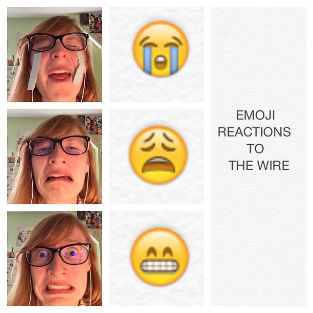
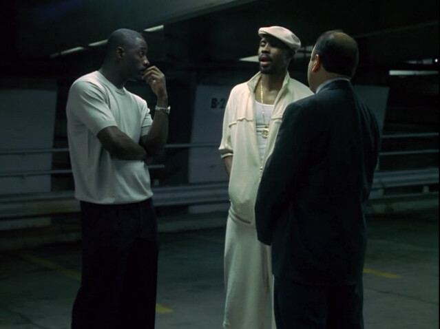
Wow. That is the only word that is appropriate for this assignment. So I was eager to start on these assignment through the assignment bank! I always like pictures, who doesn’t? I was looking through the visual assignments and stumbled upon the word “Bae”. I was a little sad, yes. Only because I find it difficult to take that word seriously, but this only made me want to see the assignment even more! So as you can see, the task is to crop out the faces of a famous couple and insert your face in it. How does this connect to The Wire you may ask? EVERYTHING. The Wire is ALL about relationships, right? Avon has his relationship with the judges, his homies, and even congressmen! The relationships in this show are crucial. What I wanted to do was figure out a way to capture Stringer and Avon’s relationship because come on, they’re a power couple. Stringer has the brains and Avon has the goods.

Episode 13

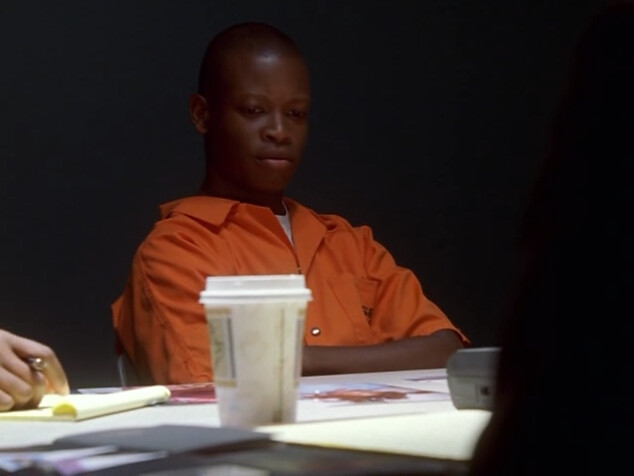
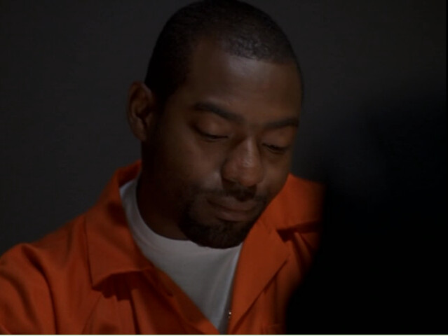
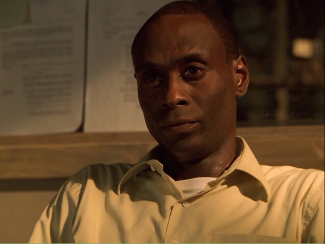
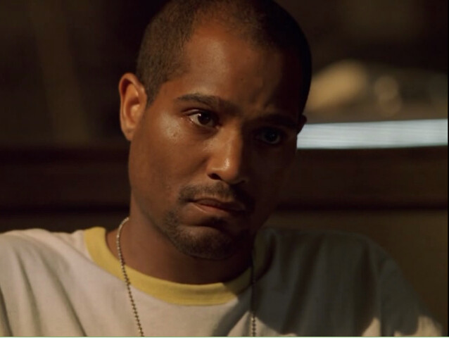
So It turns out I accidentally watched it last week. Was it really an accident though? I ended up rewatching it because I wanted to find a great couple to summarize this episode. Since we’ve all watch this episode (right?), we all know that the case in the end wasn’t what we wanted. Like McNulty, we wanted to see long sentences for Avon and his crew. McNulty, including myself, believed that D’Angelo was truly going to give up his family for a better life. I mean, WALLACE. That’s all i have to say. He should have done it for Wallace man. Well, D changes his mind because of his mom (ugh). When I first watched this episode, I didn’t understand why D got 20 years. WELL! When I watched it for the second time, I caught D saying to his mom that when he was in jail, he felt more free there than when he was legally free. BOOM! That’s why he got that sentence. To me, this just makes the relationship with Avon and Stringer stronger. He gave the business to me! Avon goes away for, what, 7 years? Stringer is left free as the king of the business, at least until Avon gets out.

THE Power Couple

For my power couple, I chose Will Smith (legend of the 90s) and his wife, Jada Smith. Now,the reason I chose Stringer and Avon was because at the end of this episode, they were the real team. Like I said before, Avon left everything to Stringer, so he’s obviously his main man. Finally! my picture. This took way too long to make.

Before:

Willie smith

After:

Will Smith(Wire assignment)


Okay, don’t laugh. I know this isn’t a great job. It was my first time cropping! But here it is.

Death (Process)

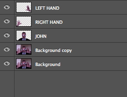
Like I said, this thing was the hardest to make considering i’ve never used GIMP before, except for the GIfs and we all know how those turned out… My first step was to find the right picture of Will Smith and Jada. Just look at their bodies. They look so happy and Jada is enjoying a snow cone of some sort. What else could you ask for? Then came Avon and Stringer. Avon was the easiest head to crop because it worked the first time. Here are the steps for cropping:

Cut Head:

What I did here was open GIMP and chose the scissor icon thinking it would cut, and yes, it did! I cut around Avon and Stringer’s heads. After not knowing what to do next, I watched this tutorial which helped me a lot.

Layers: As the tutorial says, you go under the “Layer” menu and choose transparency then choose “Add Alpha” which I did.

Select: Now you go under the “Select” menu and choose “Invert”. After invert you now have the background selected. Now go under “Edit” and press clear.

DON’T FORGET PNG LIKE ME!: Now, Please… Please… don’t forget to save the image as a PNG so the background is not white. I was stuck on this for almost 2 hours wondering why my background wasn’t transparent. Then after emailin/tweeting/bothering Groom, he gave me his words of wisdom. Keep in mind, this whole process is just for cutting the heads out…. There’s more.

Open As Layers: Yes, open the pictures as layers. From here, you select the tool that is for moving layers and you shift the floating heads over the bodies of the soon to be headless. That’s really all it takes. I wish i could say that with more sincerity but this process was frustrating for me. Hopefully you will avoid frustration.

ART: Yes, I do consider this assignment art.


Emoji IRL Reactions to The Wire

I decided to do this visual assignment, which asks to take pictures of yourself making the expressions of 3 emojis and then use those emojis to tell a story. I added a little twist to it, and framed the emojis & my recreation of them as my most common reactions to watching The Wire.

Visual Assignment for DS106

I used my iPhone 5S to create this. I typed the 3 emojis and “Emoji Reactions to The Wire” onto a blank page in the Notes app and then took screen shots of the emojis and words. I zoomed in on the screenshots and took new screenshots. The emoji selfies were pretty easy, as I just used the front-facing camera on my phone to take the pictures. For the crying emoji, I stuck strips of light blue Post-It Notes to my face to mirror the tears. Once I had all the pictures I needs,  I used the Frametastic app to put the pictures into one of the frames available. This app also allowed me to zoom in on the photos as much as I desired. I then uploaded the finished picture to Flickr.

I think these three emojis really represent the emotions viewers experience while watching the show (or at least I have these reactions). The crying emoji is felt in moments like when Kima is shot or Wallace is killed. The emoji pictured in the middle is representative of my reaction to a lot of the depressing, inescapable circumstances many of the characters are in, which is an idea the final episode of season 1 seems to cover. The teeth clenched emoji is something I feel when strenuous/ dangerous maneuvers are being pulled, such as the police apprehending various members of the drug ring or when all the players are moving in on each other and something bad is about to go down.

As far as my execution of this assignment, I think my biggest error was in the teeth clenched emoji, as I didn’t execute my recreation of it well. A lot of my recreations fell short because I was too busy looking at my phone, trying to see if I was doing it right or not, and thus my eyes did not match the emoji. On that same note, I think it might have been better if I had chosen the emoji where the teeth are clenched and the eyes are open rather than shut, because that seemed to be the face I was making and seems to better represent that reaction I have to watching the series. I also should have taken my earbuds out, but I also usually have my headphones in while watching The Wire, so maybe that’s a more accurate representation.

Colors in the End

For the finale of the first season of The Wire, I decided to make my own creative assignment here. One thing i noticed while watching this amazing episode was the wide variety of color use throughout the various scenes. Actually, if one looks closely, one can see important use of all the colors of the rainbow.

Red:
red

This episode shows us that the Barksdale organization includes more family than we previously knew. Brianna Barksdale, D’Angelo’s mother, discusses important matters with leaders Avon Barksdale and Stringer Bell. Seems that she maintains some authority and power of her own.
Orange:
orangeorange2

These two images highlighting D’Angelo and Wee-bey in their jail i=uniforms also illustrates another contrast. The look of remorse on D’Angelo as he talks about Wallace, and the look of cold indifference as Wee-bey describes his various murders. Two characters with two very different moral compasses in the same situation.

Yellow:
yellowyellow2
This one is a bit of a stretch, but I couldn’t help but adore the lighting in this scene, and the soft golden glow that results. Here Lt. Daniels confronts Carver on his spying, and gives him a lesson on his future in the police force.

Green:
green
This scene shows a lot of greens, from the background to the bench, to even the money. The beautiful emerald park was a scene to symbolize Bubble’s path to staying clean from drugs. However, the dirty green of the money sadly illustrates that in the end, temptation and addiction won over.

Blue:
blue
The blues of the water, uniforms, and boat as McNulty is “exiled” to the marine unit of the police.

Purple:
purplepurple2
The purple signs of the funeral home that are to be the new home base for the Barksdale organization. Here again we can also see the sharp red of Brianna’s dress.


Bonus- Black and White:
bw
Not really “colors” per se, but I like how much Avon and Stringer stand out in their white clothes in the darkness of the parking garage.

Triple (or Quadruple?) Twitter Troll WIRE106 Quote

“Triple4 Twitter Troll Quote WIRE106 Major Willam Gibson Valchek” by Andrew Forgrave, on Flickr

This is my first attempt (I think) at the (Triple) Troll Quote assignment: Visual Assignment 24, by the responses to which I am frequently impressed. There is a simplicity to the technical execution of the assignment which emphasizes the connections that happen before the Art is made. While not a new Jim Groom Triple Troll Wire Epigraph (the text does not come from an episode epigraph), it does relate very nicely to The Wire and #wire106.

The inspiration for this piece came directly from the Twitter stream this morning. Roberto Greco replied to Audrey Watters‘ comments about the events in Ferguson, Missouri in August, 2014.

Roberto tweet mashes up quotes from author William Gibson (whose ground-breaking (and award-winning) cyberpunk novel Neuromancer was published in 1984) and George Orwell‘s character Major from Animal Farm. I figure it is a perfect setup for a Triple (or Quadruple?) Troll Quote WIRE106 assignment. Valchek (pictured) could very well quote the constitution or law, but he’s pretty much motivated use it to subvert others for his own personal and petty interests (the stained glass window, in season two).

Anaglyph Tutorial, Part 2 – Separating the Foreground and the Background

Anaglyph-Tutorial-Part-2

Think Before You Act. Save and Save and Save.

As you start to work with your image, please bear in mind that you should always work on a new duplicate layer each time move ahead in the process. Although Photoshop can be considerably forgiving with the wonderful Edit>>Step Backward, it is always good to be able to delete a layer attempt that isn’t working out and go back to a previous stage to start over.

As we work through the process of separating the foreground(s) from the background(s), it is prudent to carefully name each new layer and keep them logically organized so as to avoid confusion.

Isolating Elements

Let’s start with the foreground. In Part 1: Selecting the Image, we identified John’s hands and face as elements we decided to work with as our foreground.

My first step now is to isolate John’s hands and John’s body, making a layer for each of the left hand, right hand, and head/body. For your image, select what you want, and then use Layer>>New>>Layer Via Copy to get that selection on its own layer.

Here is my image of John with the hands and his head/body selected.

John is selected. The Marching Ants show what I want to use for the foreground.

John is selected. The Marching Ants show what I want to use for the foreground.

My technique for getting clean elements tends to depend on how close the Magic Wand or Quick Selection tool can get me to what I want. I will err on the side of getting more, and do some pixel cleaning of the new layer with the eraser (and sometimes the clone brush) to get as best an image as possible. What you select will depend on the image you are working with.

John is cutout. The Layer>>New>>Layer Via Copy action makes a new layer with only the selected parts of the picture.

Once each foreground element is its own layer (in this case: right hand, John, and left hand), we can move on to the background.

NOTE: The “marching ants” image above may be misleading in that I actually selected each element (2 hands, John) one at a time, and made each it’s own layer over three steps. For John’s image, it was a bit finicky and it was easier to work each one on its own. However, we are going to use a nice photoshop trick in a moment to get easily back to this same “marching ants” state from our 3 new layers.

Now for the background.

Although the foreground image will be in front of the background in the completed 3D Anaglyph, I have found that there can be artifacts or ghost images that can interfere, and so it helps to “remove” the foreground objects from the background wherever possible.

Select foreground layers (while hidden) using SHIFT+ COMMAND and then apply Edit>>Fill>>Content Aware to the background. Then tidy up.

At this point in time, I have 5 layers in my .psd file.

  1. left hand
  2. right hand
  3. John
  4. Background copy
  5. Background

We are going to “remove” the foreground element from the background copy layer using the Edit>>Fill>>Content Aware action.  This will create a sixth layer (in my example to the right it is shown as, “Background copy 2″)

First, we need to return to something that looks like the “marching ants” image above.

  1. Hide all layers except for the Background copy layer.  (watch the GIF to the right)
  2. Hold down SHIFT and COMMAND (or SHIFT and CTRL on PC) and click on the thumbnail images of the foreground layers (see the three clicks in the GIF on the right)
  3. This returns the “marching ants” for the foreground layers, but only the Background copy layer is visible and active.  In my example, I am back with something that looks like the marching ants image above.
  4. Use Edit>>Fill… >> and Content Aware option in the dialogue. After a bit of processing (spinning cursor), Photoshop will provide you with a new copy of your background layer with the foreground stuff removed.

In my case, this is what I got.

John is removed. There is still some cleanup to do, but it's a start!

John is removed. There is still some cleanup to do, but it’s a start!

And without the ants.

Messy Background after the Edit>>Fill...>> using Content Aware. We'll clean it up!

Messy Background after the Edit>>Fill…>> using Content Aware. We’ll clean it up!

To get something a bit neater, I just used the Clone Tool to make things more uniform. I lost the door lock and re-defined the back of the sofa, but it all works in the end. It doesn’t have to be super perfect, because the foreground will be back in front shortly, but something like this without the foreground elements is desirable.

Background Tidied Up Some

Here is an animated GIF that shows the process from start to finish.

  1. Original image
  2. Foreground elements selected.
  3. New Foreground layer created via selection
  4. Back to a copy of the original image
  5. Use SHIFT+COMMAND to select the foreground layers to apply Fill …>> Content Aware
  6. New Content Aware replaced background layer (showing selection)
  7. Content Aware background layer (no selection)
  8. Edited background layer (liberal use of the Clone Stamp Tool)
  9. Final Background with Right Hand (foreground)
  10. Final Background with Right Hand and John (foreground)
  11. Final Background with Right Hand, John, Left Hand (foreground)
"A GIF of the Process"

“A GIF of the Process”

 So exactly what do we have now?

We have our image now separated into independent layers that represent elements of foreground, mid ground, background, etc. With this saved, we will be ready to move on to colour treating our layers in preparation for making our anaglyph.

In the case of the “John Gets His 3D Glasses On” anaglyph, we have four layers

  1. our heavily edited background
  2. right hand
  3. John
  4. left hand

At this point, you may want advance to Part 3: Colour Filtering (link to follow), but first take a look at the result of separating the foregrounds, mid grounds, and backgrounds of the Sisyphus anaglyph:

Separated Layers for Sisyphus Anaglyph (animated)

Separated Layers for Sisyphus Anaglyph (animated)

In the case of the Sisyphus anaglyph, we have six discrete layers:

  1. Sisyphus and hill foreground
  2. Large Trees (to the right)
  3. Smaller Trees (behind)
  4. Village and Mountain
  5. Sky
  6. Ring

As you can imagine, with more layers, this took a bit longer, but some aspects of the separation were easier due to the fact that the edges are very clearly defined and thus easier to select. The monochromatic nature of the image also made it easier to retouch as well.

A couple of notes regarding this one:

  1. My first step was to remove the ring from the main image, and following that, I applied a 101% scale factor (very small) to the circular image so that its outer edges would be slightly hidden behind the inner edge of the ring. I did this because I noticed a bit of noise/artifacts at the inner ring edge of the pg 8 Skeleton anaglyph.
  2. Similarly, I extended the “sky” layer outwards slightly in a couple of places using the clone tool because there were a couple of “holes” visible between the ring and the sky.
  3. I also applied a similar minor scaling of the Large Trees layer, and translated them slightly so that they would blend nicely with the inner curve of the ring.

Some of these adjustments were made later (during steps 3 and 4) but I mention them here as they are part of the layer preparation process. In practice, it is sometimes necessary to return to Step 2 with a layer or two and make adjustments before re-processing that layer again with Steps 3 and 4.

As I said earlier — think and save as you go. Backup if you need to, and keep all of your experimental layers until you know you don’t need them.

  • At the end of Step 2, the “John Gets His 3D Glasses On” .psd file has 4 layers.
  • In my final .psd file: 29 layers  (not all used in the final image, but used in the getting there!)
  • At the end of Step 2, the “Sisyphus” .psd file has 6 discrete layers, plus a couple copies of the original image.
  • In my final .psd file: 22 layers  (again, not all used in the final image, but necessary along the way.)

Next up: Part 3

Next: Step 3: Colour Filtering (link to follow)
Then: Step 4: Positioning the Layers to Simulate Depth (link to follow)
Then: Step 5: Extending the Technique to make an Anaglyph-a-GIF (link to follow)

Get your 3D glasses ready! 

This Rolling Stone Ain’t Rolling … Yet!

"Sisyphus Anaglyph" by @aforgrave, based on illustration 11, Emblemes, Illust. by Geo. Wither (1635)

“Sisyphus Anaglyph” by @aforgrave, based on illustration 11, Emblemes, Illust. by Geo. Wither (1635)

Sisyphus pushed the stone up the hill — and George Wither captured it in his 11th Embleme in 1635.

After last week’s introduction of #GIFfight! entries based on Emblemes, Illustrated by Geo. Wither (published 1635), I’ve enjoyed not only the opportunity of creating animated GIFs from his art, but also some nice learning from the challenge of creating 3D anaglyph GIFs as well.

The image above represents my second attempt at a 3D red/cyan anaglyph, and I will say that the process went considerably faster the second time than the first. I started developing this anaglyph with the intention of wrapping a complete Anaglyph Tutorial around it, but I have this afternoon encountered and anaglyphed another image that will also be used to describe part of the process.  Follow the links below (as they are developed) to each part of the process.

An Outline of the Process

Note that I have used Photoshop, and so you may have to alter the technical steps somewhat if you are using another image editing program. However, the four steps listed below will be consistent regardless of what you use. Greater details, should you require them, will be linked to each of the following.

1. Work with an image that has clearly defined background and foreground elements.
2. Separate the foreground element from the background into separate layers.
3. Make two copies of each layer, and filter one for red and one for cyan.
4. Adjust the x-positions (left or right) of the red and cyan layers to effect a perceived change in their z-position (into or out of the screen)

The Tutorial

Part 1: Selecting the Image (link to follow)
Part 2: Separating Foreground and Background  (link to follow)
Part 3: Colour Filtering  (link to follow)
Part 4: Positioning Layers to Simulate Depth  (link to follow)
Part 5: Extending the Technique to make an Anaglyph-a-GIF  (link to follow)

As previously indicated, there are two new assignments in the DS106 Assignment Bank that you may wish to explore:

I’m looking forward to seeing what you come up with!


Depth of a Field with Skeleton

Now that the Anaglyph-A-GIF has been a little more clearly defined, I’ve decided to add it (along with the simpler, static 3D Anaglyph to the ds106 Assignment Bank.

I did a search for anaglyph and 3D, and didn’t really turn anything up that is similar aside from Bill Genereux’s Wiggle Stereoscopy (Visual Assignment 352),  the similar 2-frame stereoscopic wiggle gram Stereo GIFs (Animated GIF assignment 991),  and iamTalkyTina‘s Monster Chiller Horror Theatre 3D GIF (Animated GIF Assignment 1191). So I think it’s a safe bet that these two items featuring a cyan/magenta anaglyph can be added in.

Having decided that, I then spent a bit of time revisiting the George Wither illustration 8 to come up with a couple of clear examples for the assignment pages. One needed to move, and the other needed to illustrate the static “popping out” that seems to be nice to have in a 3D image. Knowing that the assignment bank GIF thumbnails are best at 300 pixels square, I wanted to plan to fit into that space. The extra space required in my original “Boo” Skeleton GIF wouldn’t work well there.

With that in mind, I revised my original Depth of A Field image (separated layers) and added the Skeleton back in (minus the hand, stick, and cup). I scaled the skele up a bit to obscure the bits of content-aware fill that existed in the existing background layers that were previously hidden by the hand. (I had branched off from the original Depth of a Field .psd to create the Boo image with the Skeleton. The Boo .psd simply had a merged and static anaglyph background and so editing in that file wasn’t going to work if I wanted to stay within the bounds of the circle. I decided to remove the bounding lines to result in something with as clean and distraction-free as possible.

The Results

First, the static “Depth of a Field, with Skeleton” image, with the popping out skeleton.

"Depth of A Field, with Skeleton (Static)" 3D Anaglyph by @aforgrave based on Geo Wither Illustration 8 (1635)

“Depth of A Field, with Skeleton (Static)” 3D Anaglyph by @aforgrave based on Geo Wither Illustration 8 (1635)

And the new badge to go along with it:
3D Glasses_FLAT AnaglyphBADGE GREY fill BLACK

Second, the animated “Depth of a Field, with Skeleton” GIF.

"Depth of A Field, with Skeleton (Static)" 3D Anaglyph-A-GIF by @aforgrave based on Geo Wither Illustration 8 (1635)

“Depth of A Field, with Skeleton (Static)” 3D Anaglyph-A-GIF by @aforgrave based on Geo Wither Illustration 8 (1635)

And the other new badge for the animated GIF anaglyphs:
3D Glasses_FLAT Anaglyph-A-GIF BADGE GREY fill BLACK

New Assignments

The new assignments in the ds106 Assignment Bank are as follows:

I’ve been working on a new George Wither Anaglyph/Anaglyph-A-GIF over the past day, and I’ve been assembling some components for illustration and tutorial purposes. I hope to post a tutorial in the next day or so.

Let the submissions begin!

A Different View to Car 106

"A Different View to Car 106" animated GIF by aforgrave (dedicated to @JimGroom)

“A Different View to Car 106″ animated GIF by aforgrave (dedicated to @JimGroom)

Yesterday Jim Groom (@jimgroom, on Twitter) was writing about Silicon Valley (End the Domination of Silicon Valley) and the 1985 Bond film, “A View to a Kill,” when he came across Car 106. Having long sought an image of a police car bearing the 106 number, he captured the image and posted it.

Now I see image captures of 106 frequently in @cogdog‘s photostream. He seems to have a sixth sense in operation and he finds them all the time. He has over 106 of them! Me, I look periodically, but really don’t have a lot of success. I likely need to look harder.  Such images respond to Visual Assignment 35, “Cogdog’s Illustrate 106.”

But upon inspecting Jim’s image, I noticed that the number appeared to be a bit crudely positioned, and I wondered whether the image had been visited a Doctor (Oblivion). After all, creative juices are always flowing in the DS106 community, and a lot of Art gets made through the magic of image editing programs.

My curiosity piqued, I decided to go to the source, and a few moments later, determined a couple of things.

  1. catching sight of police car numbers during chase scenes in movies is tricky business.
  2. the numbers appearing on the cars in the film ARE crudely positioned — either hastily renumbered by the prop company, or just naturally messy.
  3. the car on the bridge is indeed numbered 106.

Not only that, the car perched on the edge of the bridge was ripe for GIFfing.

And so, as a token apology to Jim for doubting him, I dedicate the above GIF of Car 106 to him.  And thank him for creating the conditions for a little pause for creativity.  (And more profusely thank him for creating the conditions for a much larger community for creativity!)

#ds106  #4life

Charlie and the Lion Perform the Circus Jig

Here is my new take on Charlie’s story! When watching the final clip, once I was able to get the audio to line up, it reminded me of a dance. I decided to base my new take on the story as if Charlie and the Lion were competitive dancers on Dancing with the Stars. I used a clip from the show for the intro and and a piece of audio from another clip for the conclusion and saved them using savefrom.net and a google chrome extension called Backtick. I edited the video in Microsoft Movie Maker and compiled the audio in Audacity. Here is a screenshot of the video editing.

Charlie Chaplin

I also decided to show you my Audacity edits as this is where I pieced together the various Foley clips. I ended up using clips from Dr. Levine, Mariana Fumes, lhampson23, cbedross1, cwyrough, and Kaitlyn Crotty.

I then added the music soundtrack (Bushwick Tarantella), and the soundbyte at the end from the show.  and I had to do all of the sound editing in Audacity because Movie Maker limits the user to only being able to layer one audio sound over a video, and it took a while to line everything up.

Chaplin Audio

It was much more difficult than I originally anticipated, but I am happy with the result!