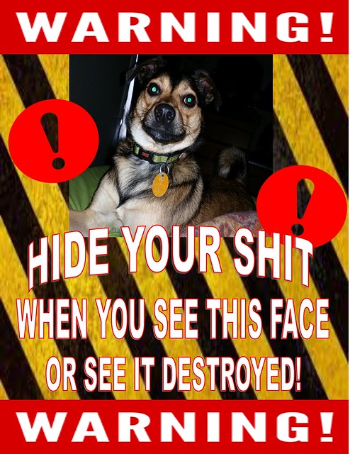
This assignment, Create a Warning Poster, requires you to make a poster warning someone about something.
I thought this assignment was a good way to help me develop my digital creation skills, so I decided to give it a shot.
I wanted to make this assignment relate to our 80’s theme since there are a lot of “horror” movies from the 80’s that could fit into this poster.
As mentioned in one of my earlier blot posts, I love the Shining (and Stephen King). I also watched Ghostbusters this semester, so I thought it would be kinda funny to combine the both of them.
Ghostbusters has more to do with ridiculous ghosts, but the Shining is a lot more serious with the respect to the supernatural, as you can see when Jack Torrance tries to murder his family.
The poster is a little ridiculous because of how I combined the two contrasting movies, but I had a good time with it.
Check it out!

Although I didn’t use any “photography” skills in this visual assignment, I tried to follow some of the guidelines mentioned, such as keeping it balanced, clear, and incorporating color contrasting.
This assignment was worth 2.5 stars.


