Wind Plain, ruined city of the Gradient-Masters

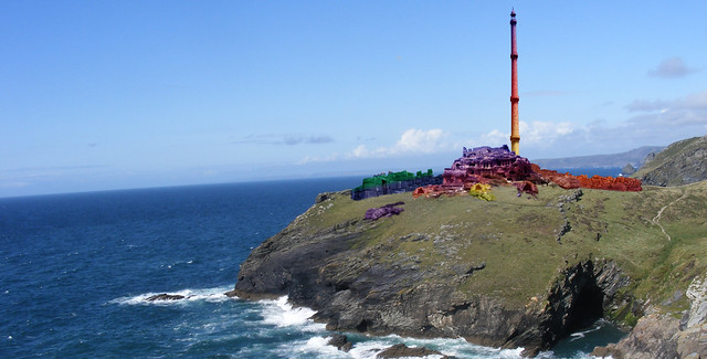
Seriously. Someone needs to take the gradient tool away from me. Oh whoops, damage done, TOO LATE. I created this rendering of a ruined Earth-Master city from McKillip’s trilogy to complete my own Imaginary Places assignment.

Wind Plain

First things first, here’s a list of all the stock images I used to create this image:

Main ruins – http://fav.me/d2k842p
Cairns – http://fav.me/d1gwgth
Walls – http://fav.me/dhizbr
Walls and boulders – http://fav.me/d162n6r
Sea and cliff background image – http://fav.me/d1non7z
Tower – http://fav.me/d5hrp55

Many, many thanks to all of them for sharing their images so dorks like me could slap ugly gradients on them in an attempt to create fanart. MOVING ON.

Technically, I kind of screwed up  my own assignment here. This is kind of a mashup of three different places in McKillip’s world: King’s Mouth Plain and Wind Plain. Both are sites where the ruins of Earth-Master cities can be found, but they’re miles apart, and only King’s Mouth Plain is near the sea. That said, I really wanted to depict the dramatic image of the tumbled stone perched atop a cliff and the striking tower on Wind Plain that is so important to the end of the story. There were two descriptions of these places that always caught at my imagination while I was reading. The first was of Wind Plain:

It was a maze of broken columns, fallen walls, rooms without roofs, steps leading nowhere, arches shaken to the ground, all built of smooth, massive squares of brilliant stone all shades of red, green, gold, blue, grey, black, streaked and glittering with other colors melting through them… the one whole building in the city [was] a tower whose levels spiraled upward from a sprawling black base to a small, round, deep-blue chamber high at the top.

Riddle-Master Trilogy, pg. 40

The second was the first sight Raederle ever had of King’s Mouth Plain:

There was a stonework, enormous, puzzling, on a cliff not far from the city. It stood like some half-forgotten memory, or the fragments on a torn page of ancient, incomplete riddles. The stones she recognized, beautiful, massive, vivid with color. The structure itself, bigger than anything any man would have needed, had been shaken to the ground seemingy with as much ease as she would have shaken ripe apples out of a tree.

Riddle-Master Trilogy, pg. 248

I tried a few different methods to create the gorgeous, vivid stonework McKillip described, and honestly nothing quite achieved the effect I wanted. Part of that is simply my lack of practice with manipulating and combining images in Photoshop; it’s decidedly harder than it looks to do it well! The other part of it was trying to alter the color of each section of the ruin without losing any of the detail of the original image. I ended up creating layer masks for each section and colorizing them differently. At some point I decided to try screwing around with gradients just to see what would happen, and found that gave me by far the most interesting results in terms of color. As I’d been working for hours by that point on this one image, I made the dubious decision to throw aesthetics to the wind and run with it. You have seen the results, and may judge them for yourself.

In combining the two locations from McKillip’s work, mostly through the inclusion of Wind Tower, I’m committing to an inaccuracy that really bugs me in fanart and drives me up the wall in official adaptations. Why can’t people just get this stuff right? It’s not that difficult! I’ve now realized through firsthand experience that some of the alterations that occur when adapting print to visual mediums happen not because artists aren’t trying to be accurate, but because they are trying to convey more in a single image than they might with several more “accurate” pictures. Here, I wanted to capture the feeling of the looming, desolate city hanging over the sea as well as the iconic image of Wind Tower, giving the viewer in one glance what McKillip spends pages on. That ability to condense and distill a concept is one of the biggest advantages of any visual medium, and it was interesting to be able to play with it here in a way I’d never attempted before.


Impressionate It How

http://assignments.ds106.us/assignments/impressionate-it/

Take a painting, drawing, ceramic or sculpture from history and change the style of it. For example, take a painting from modern day artists and turn it into an Impressionist painting like that of Claude Monet. Or you could take a Grecian urn and change the images on it to make it a scene about people going to a Victorian ball.

I want something like Sunflowers by Claude Monet, Impressionist.

Monet

And turn something like:

KW

Kehinde Wiley, Naturalist.
Napoleon Leading the Army Over the Alps, 2005
…into this:

KW imp

Open up a photo-editing program like GIMP and File -> Open an image.  Play with effects under filter.  For a challenge blur a lot with your individual brush strokes and play with the different hardnesses and opacities of the blurring brush.  Don’t forget about changing the hue and saturation to match that of the colors of the impressionistic flair where the changing light was shown, a new vantage point, everyday subjects, etc.

For something like replacing a Grecian urn image into an image of the present you could create your own in a simple program like paint and then copy the image into GIMP.  Using the selection tool you could draw a line on your new creation and cut and copy it onto a new urn.  Using distorting tools match the curvature of the urn.


Hail, Quiz-Bearer!

Check it out! I created YET ANOTHER assignment, and for this one you get to make your own online quiz. Pretty nifty, huh?

Surprisingly, this turned out to be one of the easier projects I completed for my final portfolio. The website I used to create the quiz, PollSnack, is exceedingly user-friendly, quite unlike some of the other online quiz services I used way back when.

The goal behind using this quiz as part of my project, and for the assignment as a whole, is to give anybody who takes the quiz a taste of what the characters are like without revealing too much about the overall plot. It’s supposed to function as a fun little taste of the story in a really easily digestable format. Each question reflects an important plot point or theme—Morgon actually does get attacked on the trader’s road, and his greatest struggle is reconciling his idea of himself with his destiny—and each answer gives you little hints about the characters. The most fun answers to write were definitely for Lyra, the headstrong young guard captain who relies on little more than her spear and her belligerence to get her through any situation she encounters.

If completed thoughtfully, this assignment could be used to tell stories in any number of ways. Students could take the route I chose, and reveal just enough about the source material for their quiz to get people interested, or they could use the progression of questions and answers to tell a completely unique story, like each question and set of answers slowly making less and less sense to convey a character who’s going insane. It’ll be interesting to watch this assignment from afar to see what students do with it, and how they incorporate it into bigger projects.

Riddle, Answer, Doofus

In which I look like a total dork for the sake of my final project. I definitely took my own spin on the Text + Diagram -> Into a Movie assignment, and instead of fining “a written explanation of a concept and a diagram that illustrates that concept,” I adapted the ideas of riddlery from McKillip’s work and illustrated it with an extended visual metaphor. Hopefully that counts!

I just want it to go on record that I spent over an hour rearranging furniture in my room, deciding on an outfit and jewelry, putting on makeup and pinning up my hair to complete this video. I also had to jerry-rig a ridiculous camera-holding device with the elastic from my tiny Molskein notebook and a pile of other books underneath so I could film myself drawing. Ds106 does weird, weird things to your life.

For this video I kind of ran with the spirit of the assignment instead of taking it literally. In illustrating the riddle-answer-stricture construction of all the riddles within McKillip’s work, I decided to go with the metaphor of a house, and literally draw it out as I explained how the structure of her riddles works. I’m not sure it’s as effective as it could be, but considering the narration was done with only a few sketchy notes worked out I’m pretty happy about it.

I decided that to open and close the video, I wanted to make it seem as if I myself was part of the Riddle-Master world instead of just talking about it as if it’s just a story. To that end I hung a tapestry behind me for filming and got all fancied up in vaguely fantasy-esque garb to help set the mood. The riddle I chose to read is also pretty important; it’s the one Morgon uses to win a riddle-game with a ghost locked in an ancient tower. Had he lost, he would have died, but in winning he not only won the crown of a long-dead king, he earned the right to marry Raederle, second most beautiful woman in An. That, for a guy from an island nation full of simple farmers, is a pretty huge deal, and kicks off the whole rest of the story.

Filming and editing were quite simple for this particular project—it was the setup that killed this time around. Finding the proper distance and angle to use to film myself (I ended up perching the camera on my bookshelf), sorting out how to hang the tapestry so it would actually show up and cover the wall, and then trying to work out how to film myself drawing… it was a hassle I really wasn’t expecting at all. But if ds106 has taught me one thing, it’s that you work with what you have and make awesome stuff anyway. While I’m fairly convinced that this could have been better (WRITING. IT’S ALWAYS WRITING. ARGH), I’m pleased that I was able to overcome those technical challenges and record the video I needed.

“Who is the star-bearer, and what will he loose that was bound?”

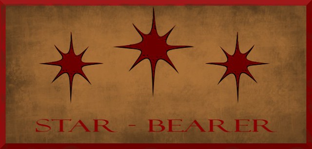
Although I didn’t quite complete the Iconic You assignment in the more minimalist spirit it was perhaps supposed to reflect, I am still SO. DARN. PROUD. of the work I did here. This might actually be my favorite project from the whole semester. I’m SO HAPPY with the balance here, the way I was able to add a little texture to the piece, and how nicely the emboss effect emphasized the design of the stars.

"What are three stars?"

Throughout the Riddle-Master Trilogy, the main protagonist, Morgon of Hed, is describe as having three blood-red stars across his brow. He was born with them, and they are the catalyst to his destiny.

And I swear to God, if anybody even MENTIONS Harry Potter I will flip tables, SO HELP ME.

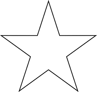
I’ve actually put a LOT of thought into the way I visualize these stars. The idea of a “star” is pretty deeply encoded into our visual lexicon; most often, when someone writes the word “star,” the visual looks like some iteration of this:

The thing is, these stars are literally part of Morgon’s face. They’re not images or symbols, not really, they’re organic flesh and blood. I always thought they would be closer to scars or birthmarks than the perfect five-pointed design our culture has chosen to represent the concept of “star.” I started thinking about how scars look, how the skin pulls and stretches and puckers around them, and came up with the basic shape I used in the design above. They’re imperfect, and I always envisioned them as sort of recessed in his skin, as if the upper layer of his epidermis had been torn off somehow, exposing a thinner layer of skin beneath that clearly shows the color of his blood.

Yeah, so when I said “I put a lot of thought into this,” maybe I meant “I am mildly obsessed.”

The background color is also significant, though for a different reason. The first time I read through the Riddle-Master Trilogy I was pretty young, and didn’t have much knowledge about diversity in fantasy and scifi except the nagging suspicion that there was a rather marked dearth of brown people in all the books I was reading. A lot of really prominent fantasy, especially, written up until the mid to late 90′s doesn’t really address that, and just posits that since things are vaguely medieval in terms of setting, everybody is basically white. Sadly, McKillip’s work is no exception; although I don’t think any of those writers were consciously excluding people from their writing, it just wasn’t something anybody was trying to address. Either way, it’s buckets of problematic, and while re-reading this series again I decided I wanted to change that up a little bit.

Early in the books, Morgon’s little sister Tristan is described as a “thin, brown reed of a girl,” and from there I decided that in my head-canon, she and her siblings, as well as the rest of the people from their land, all have brown to light brown skin. This is borne out by various descriptions of Morgon and other people of Hed throughout the books. As a reflection of that, I made the background to the stars an approximation of Morgon’s skin color, though lightened a bit so the stars would stand out (the scuffed-up details in the background are just to add a bit of texture). In contrast to my minimalist poster, Morgon’s lover Raederle is what we’d consider white; again, that’s borne out by descriptions throughout the book, so I figure that most people in the Three Portions, where Raederle and her family are from, have pale skin.

Did I say “mildly obsessed”? Let’s just go with “I have basically been living this story for a month and I can taste it when I breathe,” and leave it at that.

Dorothy and Robert Mix It Up

This should be the last piece of media for my Dorothy ds106 story. I have been wanting to the dialog mashup assignment since I heard the first examples from listening to the stellar examples from The Truth’s episode of Movie Mashups:

As demonstrated by the Movies Mashup episode of the radio show The Truth, take two different movies and extract the dialogues scenes of actors form each, then re-edit them to create a story as if the characters from different movies were in the same conversation.

Listen to examples from the show including The Terminator and Legally Blonde (“Terminally Blonde”) and from the TV shows that become “The Sopranos in the West Wing.”

The challenge is to take two different movies, slice up the audio for different characters in each, and then re-edit them as if there were having a coherent dialogue.

That should be about 92 stars.

I knew my Oz example would be when Dorothy first lands in Oz “We’re not in Kansas anymore” and where she meets Glenda and the munchkins:

I went through a lot of gyrations to find the companion piece. it would need to eb something that involved someone talking about going to a place (since she mentions not being in Kansas) and ties in to her denials of being a witch. I had this idea of finding a 1960s travel film, since I felt the colors and weird people of Oz were right out of the hippy era.

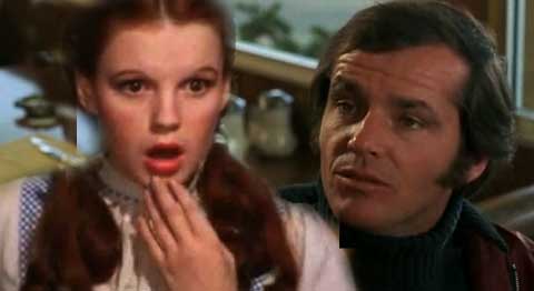
For some reason I came back several time to Jack Nicholson in Five Easy Pieces, notably his Robert Dupea character’s over the top end around in the diner to get that waitress to give him his ” omelet, plain, and a chicken salad sandwich on wheat toast, no mayonnaise, no butter, no lettuce. And a cup of coffee.”

Its such a classic playing out of tension.

I was not sure how they would work, but just decided to put it together. Here is what I ended up with (along with a merged image of Dorothy and Robert):

What I wanted was for Dorothy to have a confrontation in Oz that would set her into confusion, does she want to be there or Kansas? Dupea messes with her, yells, throws things, and maybe even abuses her.

I made this by downloading both of the segments as mp4 using PwnYoutube. I imported them directly in Audacity. For each track, i separated out the phrases the lead character says by using thee Edit->Clips -> Split tracks command, and deleting the other stuff. I end up with little fragments that I can slide around or copy paste, and more less got luck assembling them:

There has to be some gaps between people talking (like real conversation, pacing, etc), but these sound weird if there is silence between them.

So I took some but of music from OZ, about 3 seconds, and pasted it back to back in a new channel. I copied it end to end, reversing a few sequences, and dropped the amplitude to it is background. I did the same from the Five Easy Pieces scene, using a few seconds of diner crowd noise in the beginning. This lower background gives the audio a bit of texture.

I cannot say this is nearly as good as the examples I heard from “the Truth” – this is one of those assignments that really take a lot of work and/or a lot of familiarity with dialogue to do it up.

But it was fun to try.

What is Dorothy Doing Shopping at the Villaggio?

Another element I am using in my story is that Dorothy figure ut that to return to Oz, she would need to go shopping and find a new pair of ruby slippers, since you cannot expect to just fall out of the sky again and land on another witch.

So she has to go shopping somewhere upscale. For this piece of the story, I used the Wait, Where’d That Guy Come From? assignment (fun because I never dis that one before):

Photoshop someone(s) (or something(s)) into a picture that isn’t supposed to be there.

I did some searching on photos of high end shoe stores, but somehow the thought of Dorothy shopping for shoes in the Villaggio (located in Doha, Qatar) worked for me- using this Travelblog photo.

Here is Dorothy (and Toto too) slyly shopping for magic shoes in Doha:

To mix her in the crowd, I would need an image of Dorothy standing or walking, and isolated (no arms around Scarecrow, sorry). The one that worked was for an ad for a life size cardboard cutout.

In Photoshop, I deleted the bit of ground around her feet, and dropped in the main photo. Her layer is on top of the others, but to make it look more real, I position her to overlap with someone standing closer to the camera, and use that person’s shape as a selection to delete a bit from the Dorothy layer, so it looks like she is behind (it is likely better to extract his shape later first and they drop it in.

Dorothon was very tiny. I went to make a blowup of the area after putting a circle around it- I zoomed in the circle to about 400%, and did a screen shot. I then can paste that back to the normal size, so it looks pixelly like it is a real blow up.

Travel Hippy Style With Ozmomatics

As part of a ds106 final project story I am doing based on the Wizard of Oz, I have a part where Dorothy decides to go back to Oz. Not knowing how to find another tornado to whip her house (no one in Liberal, Kansas could explain how the house that was whipped to Oz was back in Kansas in tact. Continuity issues at the tourist trap).

I decided to to the Storytelling Within the Web assignment hoping to find a travel agency with a hippy theme:

From the Spring 2011 ds106 class came the idea of changing up an existing web page to tell a new story ” you will be intervening in the code and design of a website of your choice to tell a story. You are not to photoshop the design of the site, but rather intervene in the actual html and CSS of the site—though you can photoshop particular images on the site. Essentially you alter the content of a web page (content, images) to make it tell a new story.

But I failed it surface anything useful. I did find that the authoritative hippy.com site is sporting HTML vintage 1997 (tables, baby, it’s all tables and no CSS),

The Tecnomadics site seemed to come close enough to give me something to play with – the “hippies on http? banner drew me in. I set about in Hackasaurus to bend the text and media to my story. The one place I could not edit was the slider widget the have below the main header. Once I had saved the HTML from Hackasaurus, I opened it in a text editor, and deleted the DIV that contained they slider widget (as well as the fraebook iframe). I also got rid of a few lower blocks of content; the page was already long and I have enough for my purpose.

You (and Dorothy) can find my web edited version of this site at http://cogdogblog.com/stuff/gotooz/ozmomatics.html- its pretty heavily edited, all text and menus.

The idea is that it appears as this cool kind of travel site for hippies, but when Dorothy reads it, the content shifts to match her own personality and desires.

In fact, if you go under the “Take a trip” menu there is a link to “oz”, a page that uses the earlier animated gif I made of the ruby slippers, and I set up that page when clicked to go to an embedded version of my backwards video.

The story pieces are getting more connected!

emoH ekiL ecalP oN s’erehT

In my story of Dorothy getting bored in Kansas, I wanted to have a way for her to go back to Oz, and the easiest way would be via the Play It Backward, Jack ds106 assignment:

Things always look super weird when you play them in reverse, don’t they? So take a video of something in your life–someone running, the toilet flushing, the sink dripping, someone spitting, whatever–and reverse it!

They not only look weird, but they sound weird.

I used the “No Place Like Home” clip from YouTube, already saved as mp4 from my previous work. I brought this into iMovie, and edited the Clip to make it go in reverse. I added a bit of fade out on the end, visual effect of “Cartoon” and Audio effect of “Echo”, all to give it a freaky kind of satanic feel:

Just keep repeating that, and you might go back to Oz, Dorothy.

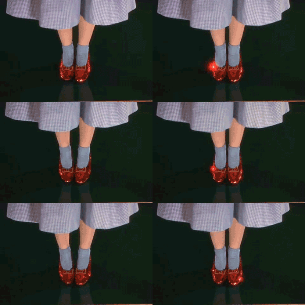
Keep Clicking Those Ruby GIF Slippers

What could be more key and symbolic of the magic of Oz than the red slippers that Dorothy snagged from the Wicked Witch who got mushed by her flying house? The fact that Dorothy always had the magic but did not know it until sparkly Good Witch clued her in.

This GIF is done for the classic ds106 Say it Like Peanut Putter assignment

Make an animated gif from your favorite/least favorite movie capturing the essence of a key scene. Make sure the movement is minimal but essential.

I knew an animated GIF of the shoes would be part of my new story. So I used PwnYouTube to download the video for the “No Place Like Home” clip as an mp4

I opened this in MPEG StreamClip to snag just the 2 second segment of the shoes flopping. I opened it in QuickTime player to then save it as a .mov file (since Photoshop 5.5 cannot import mp4 files). I brought this in using File -> Import -> Video Frames to Layers. Since it was short I snagged 3 frames a second, and from there deleted frames that were not showing much difference from previous frames. Lastly it is exported as a GIF, we get not only shoe movement but some twinkling of highlights:

Poor Dorothy might have to click those heels forever.