She Would Rather Party in Oz

Why was Dorothy so set n going back to drab, black and white Kansas? Was Auntie Em that much of the life of the party? If the truth were told, she would have expressed her desire to hang out with those wild Munchkins:

As part of my evolving Dorothy story, this is the ds106 Truthful Movie Poster assignment

Imagine if movie posters told the REAL story about the fillm they’re advertising. Redesign an existing movie poster by changing the text/images to tell us the real story. More examples at http://www.holytaco.com/classic-taco-if-movie-posters-were-honest.

Of course, I am making up what is real (cause that serves the higher concept of my story, meh). There are lots of posters out there to work from- I liked the bold motif of a poster for the Tybee Arts Association:

The bottom text was easy to clone brush out in PhotoShop. I went for a few more details, and clone brushed out “The Musical” to replace the text with “The Psychedelia”. It’s the small things that make a difference right? Right?

For the main text, I gave upo on matching the font and just went with a art style one, Kino MT – the lower text is Helvetica Neue.

And for a crowning touch, I tossed in a spilled Martini glass to lay on the road.

Which Side of the Rainbow, Dorothy?

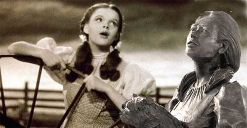
Dorothy seems timeless even looking back at the Wizard of Oz from maybe 80 years past its time. But her statue I saw on the streets of Liberal Kansas seemed kind of old, maybe it was just the texture of the metal, but I speculated she might get nostalgic for her own youth (or at least mobility):

I made this for my story project as a response to the Then-Now-Together ds106 assignment:

Edit a childhood photo of yourself to include a more recent photo of you in a pose that makes it look like you were part of the original scene. Pay attention to matching pose, detail, and color values to match the original. You can go back to your past, at least in your own edited photo!

Okay, it was not “me” but my character. And Dorothy is young and innocent enough in Oz to qualify for childhood.

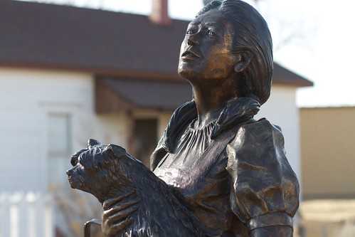
I cropped the photo of her status I took:


cc licensed ( BY ) flickr photo shared by cogdogblog

and overlaid it in Photoshop in a sepia toned screen capture of the Kansas set of the movie. I had to stretch the status to make it close to the proportion of the screen capture of young Dorothy. I had to flip that one horizontally and do some clone brush of the fence to leave enough room for the pasted statue photo.

I dropped the saturation on the statue and used the Image – > Adjustments -> Hue/Saturation tool to try and make the statue less glossy and match the tones in the mage. Its far from perfect, but the idea is to mae them look like they are singing a duet across time.

GIFing the Streets of Liberal

On my trek home earlier this month, I picked off of the map a route in Kansas that would take me through the near Texas border town of “Liberal” – which I read on a plaque has nothing to do with politics– it was in reference to the sharing of water liberally by the first settler.

It’s created draw of interest is being where Dorothy’s house (a replica thereof) sits so there is a lot of Oz-ification


cc licensed ( BY ) flickr photo shared by cogdogblog

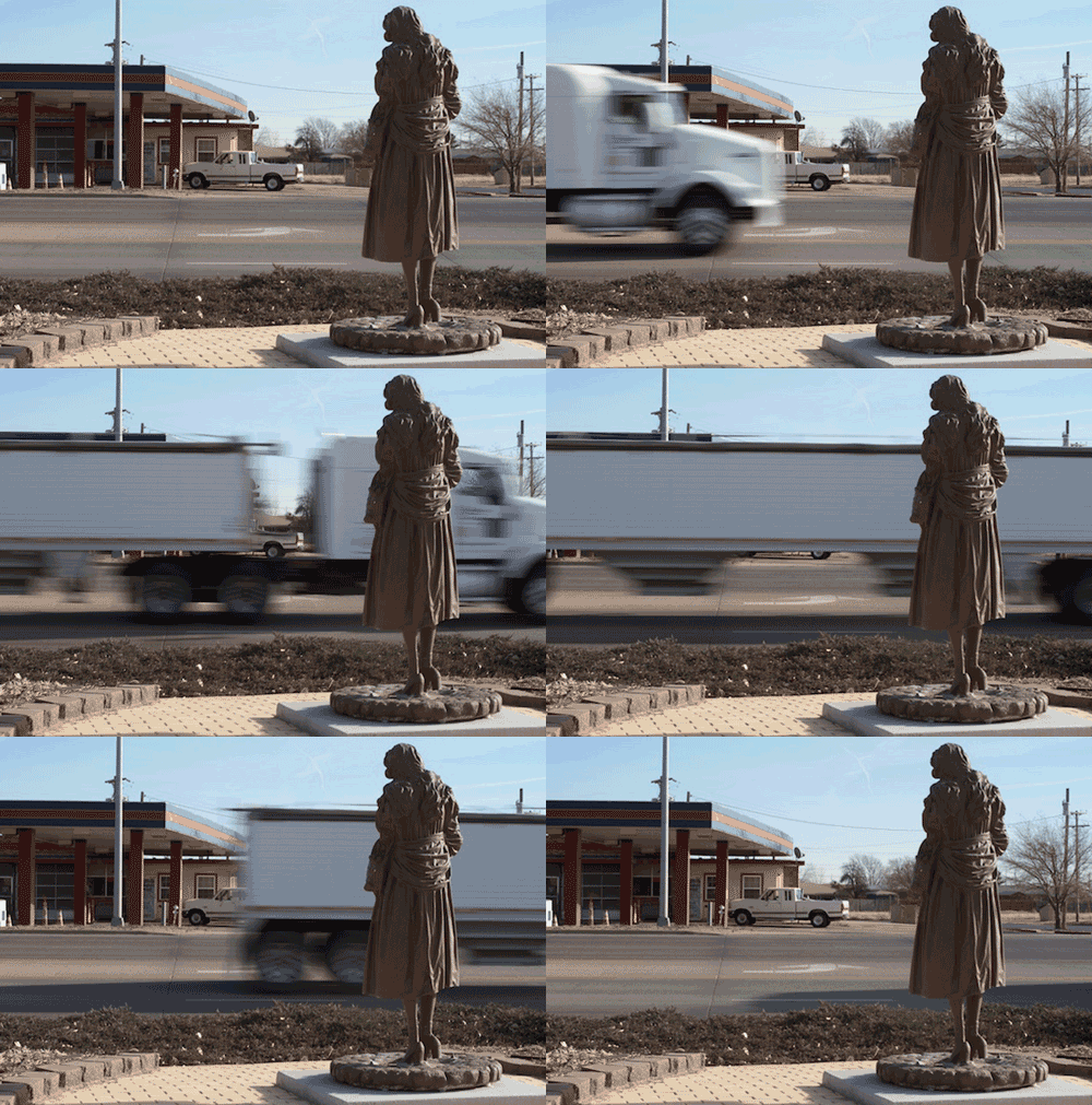
There are a number of Dorothy statues on the streets. I was intrigued of some over the shoulder photos as maybe she gazed wistfully at a fun shriner convention across the street:


cc licensed ( BY ) flickr photo shared by cogdogblog

This lead me to do a series of rapid shots in succession to get the blur of traffic going by Dorothy, which I molded into animated gifs.
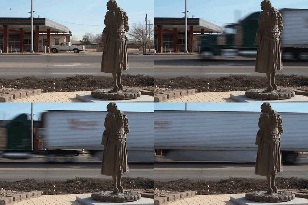
This is the ds106 Photo It Like Peanut Butter Assignment (created by yours truly):

Rather than making animated GIFs from movie scenes, for this assignment, generate one a real world object/place by using your own series of photographs as the source material. Bonus points for minmal amounts of movement, the subtle stuff. See a bunch of examples at http://cogdogblog.com/2012/02/10/photo-gif-peanut-butter/

And this became the seed of an idea I wanted to do as an extended story that spans multiple assignments, the task I am asking my students to do for their final project.
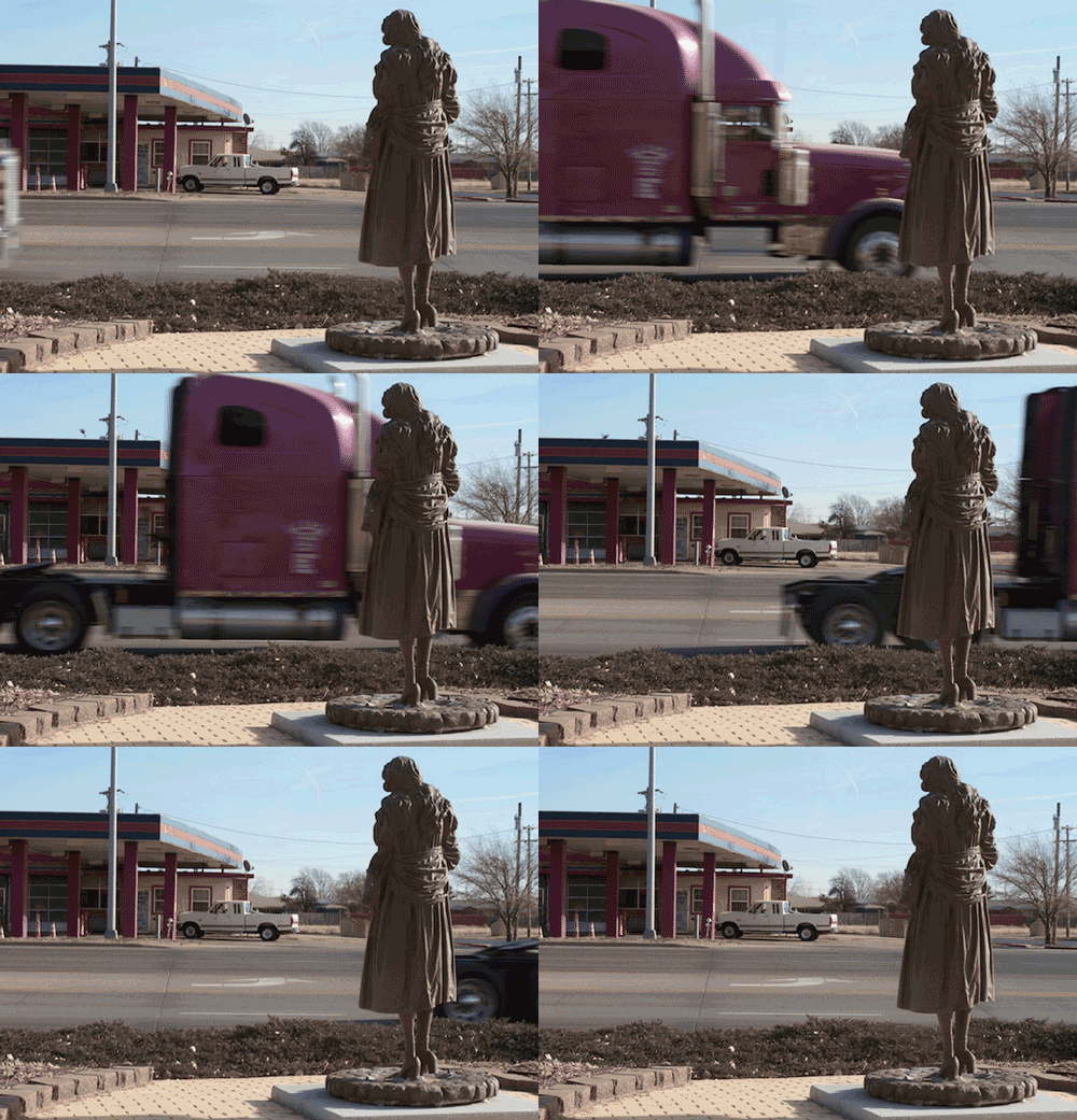
These were all done the same way. The photos were taken in the camera mode on my Canon 7D that does sequential shots as long as I hold the shutter. The idea is to get a lot and not move the camera much (a tripod would be a smart way to go).

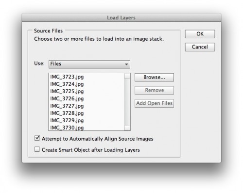
I bring them into PhotoShop via File -> Scripts -> Load Files into Stack. I select all of the images in the sequence, and let PhotoShop do its work. For most of these I check the box to “Automatically Attempt to Align Source Images” which minimizes the differences between photos from slight camera shifts. I import images that are 640 pixels wide since I plan to downsize them to 500 wide.
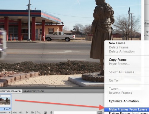
When done, I go to the animation window. In the past I would go to the timeline layout and nudge the tracks around, but I found a simpler way- From the menu in the top right of the Animation palette, I select make Frames from Layers so ti converts each layer to a different animation frame:
This now sets up my frames, and I can do things like adjust the timing of all frames (selecting all and then use the time menu) or make different frames have different durations:
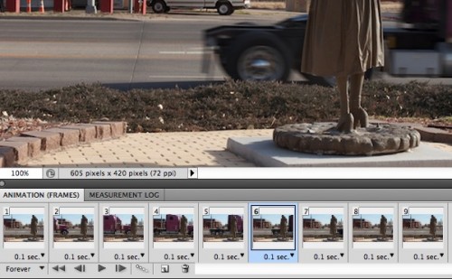
I can delete un-necessary frames, ones that do not show enough change, since this reduced my file size. I also go frame by frame and crop them because the image alignment can leave blank spots on the periphery.

then its a matter of exporting for the web as an animated GIF. I usually go for 128 colors dithered to try and save file size.

One more truck goes by:
I have a bunch more of these assignment posts to make as I get my story together. It has something to do with Dorothy getting bored…

What’s Inside You? (Tutorial)

the WIRED Feature – What’s Inside You? assignment is actually quite simple despite the 4 star rating. The most difficult part was figuring out What’s Inside Me? Even this can be quite simple if you ask yourself the right questions.

I used this assignment to create character profiles for my final project.

Getting Started

  1. First thing I suggest doing is open up your favorite word processor program and type “What’s in Me?” This is the fundamental question for this assignment
  2. Now we need to come up with 5+ words which represent us, these will usually be nouns or adjectives. Think about extracurricular activities you are involved in (Music, Sports, Art), Courses you Enjoy (Math, Science, History), Anything you are passionate about (Games, Coffee, Hiking), and especially anything words which positively describe your personality (Think “I am…”).
  3. Now you Should have a bulleted list of your words. Next we need to give each word a description. This can be something serious or something funny, or a mix of both.

For one of my characters I used “Noble Blood- from a family of noble baring he was born with a silver spoon in his mouth and trained in most every skill he could think of however, he found this lifestyle to constricting so left home. He took the spoon with him.”  It explains something about the person in question but adds a bit of humor to the end.

Design

Now that we have the words it’s time to start the design portion of this assignment. The design should also reflect your personal sense of style and design, I like the clean minimalist look so the ones I completed are fairly simple

  1. Open whatever photo editing/design program you want. You need something that can work with both Text and Photos which I’m sure most can.
  2. [Optional] Start with a picture of yourself, or one that represents you. (I’m sure if Alan where to be doing this assignment he would use his trademarked dog photo over one of himself).
  3. Create the Background. Depending on your picture (size, free space to put text over, and the style you want to convey) your background will differ accordingly just make sure you use a background which is easy to read text placed over it.
  4. Once you have your picture and background figured out and oriented it’s time to add the text. Start with your name, be sure to choose a font and color which compliment your personality as well as the background. The key to every element of this assignment is to be an extension of yourself.
  5. Now it’s time for your words. you can orient these in any way you want just be sure to use a font and color which is easily legible on your background as this will likely be smaller then your name it’s better to use simple fonts like Time’s New Roman or Ariel.
  6. Now that we have everything on your picture you need to reorganize each element. Remember this should be an Extension of yourself so if you put that you are “organized” don’t have each word hazardously placed on your background.

Now you are done, it’s not that hard to do as long as you ask yourself the right questions. Be sure to be creative with this, as I reiterated throughout the guide is that the entire thing needs to reflect you so make sure that every element is coherent and emphasizes your personality. If you put that you were funny but every description was dry and cold, I’m not going to believe you. If you said you liked hiking use a picture of mountain trails as your background.

Evolution and Natural Selection

At my house we are currently in the middle of a move, so this means going through all the millions of boxes of your family’s stuff and deciding what stays and what goes. While rummaging through these boxes I came across my sisters old cell phone… a brick of a phone if I ever saw one and it made me think about how this thing come to be the slim things we have today. Thus we have Product Evolution, an assignment where you make a YouTube video showing the progression of technology through the ages.

There where already these types of videos  out there, and plenty on computers and cell phones.  So I had to think of something different, I’m a math major so a calculator is a daily companion to most everywhere I go so why not Calculators through history? Now I made a  tutorial on how to make one such video already so this is mostly on inspiration and implementation. It’s hard to get much story out of this type of video but it was interesting enough to see how calculators started as these hulking devices and ended as something which can fit into your hand. My favorite was probably the Curta, 1948 as the size difference between the ones before it was so fast it was amazing to see this one pop up. Though I’m sure the picture I was able to find is not of one from 1948 they were able to fit into your palm like a manual counter.

I really liked how the transitions had this sense of fighting and tension between each picture, like the next one pushed the previous one out of the way so it could shine. The music was mostly chosen just cause of the math reverences but it was humorous that the line “we made our own computer” came up just as the “Comptometer” was shown. Happened completely by accident but I’ll take it.

Impersonations

This is an assignment I did way back but Alan had suggested I use my version of it as a assignment submissions so I created Text Impersonations, where you took a text based conversation and impersonate their voices. The process of making the conversation was quite simple. I recorded my voice reading the messages, as close as possible to what I wanted them to sound like, and changed the pitch, speed, and frequency of each clip. I knew the person who posted the Status though most of the people who commented I had no idea who they were so I had to get creative with the way their text conveyed into sound. The two people with the most personality where the stuck up girl saying how face paint wasn’t a good idea, she sounded very superior and snobbish as if she were looking down upon all other mothers. The other was the almost ADHD kid who suggested like  five different costume ideas and cuts off the guy before him. The other voices of the Mom and the more relax humorous guy stat having a pretty relaxed funny conversation before the others join in.


Post Card from Paradise

Greetings from ds106

“Tell us where you are, where you’re from, or simply where you’d rather be and build a greeting card.”

Part 3

Being the good daughter she is, Eliza sent her parents a post card from paradise filling them in on her amazing trip.

The back says:

“Mom and Dad,

I am having the best time. I picked up this post card outside the Pantheon, and sat down outside to enjoy the sunshine and culture. Rome is a huge city, luckily their subway only has 2 lines, so it’s not too hard to get where you’re going. Can’t wait to see you when I get home, and start applying to jobs with a fresh global perspective.

Love,
Eliza”

I made this postcard by taking a picture I took on my amazing trip, uploading it to Picasa and adding text.

Second Created Assignment: A Dose of Family Recollections

For my second created assignment, I wanted to explore the aspect of childhood memories. The assignment can be seen here!

Here is my example of what this assignment might look like!
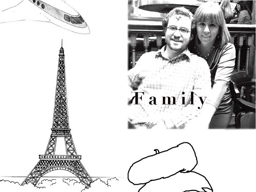
Family Recollections

For my version, I went back to the year 2000 when my family and I took an amazing trip to Paris, France. I thought this would be a cool memory to reflect on and construct an assignment out of because it entailed such a cool experience and one which I’m sure I will never forget. I think it is an interesting idea to reconstruct a very fond memory in the form of a visual design, where you really have full control about what you want to be included and how you want to organize everything. That is the inspiration for the assignment.

In executing my version of it, I wanted to give it a sketchy look, and I thought a black and white visual element would go well to kind of represent it as something that has passed by and is cemented fairly deep in my past. So off I went, searching le Google (which can be a dangerous thing sometimes) and found some images that I wanted to include. These were an image of the Eiffel Tower, a sketched plane and a head with one of those French hats with the thing sticking up on top. I’m pretty sure that’s the actual description so. One of my first memories in Paris was sitting in this breakfast place, and it just had such a different feel to it. I was in a completely different culture than in America and one of these hats came up quickly in my memory bank.
Of course, I can never forget going up atop the Eiffel Tower. It is certainly an incredible landmark, but I feel that it has also grown ever tourist-y at the same time, but nonetheless, it was a great experience. Anyways, since this was one of my most memorable trips of all time, I figured that I would incorporate it into an assignment, which I hope you all enjoy! Thanks!

Capture the Moment

Screen Capture Story

“get footage of something you do on your computer that tells a story.”


This is part 3 to my final story. Part 2 Eliza has shown her parents the Newsweek and they bought it! They are buying her tickets to her Italian adventure as a graduation present.

Part 4

I made this video by downloading CaptureMe and taking a series of 10 second screen recordings. Then I combined the recordings with iMovie.

Newsweek Provokes Need

Mocking Up A Newsweek Cover

“Make up a Newsweek cover. You may design this in such a way as to satirize the topic, or Newsweek, or both.
You must select a powerful image and a pithy title.”

Here is my cover
 This is part two of my final story. Part 1

Eliza really wants to go to Italy, but how will she pay for an extravagant trip right out of college. Her parents have been pressuring her about applying for jobs and finding an edge to be noticed above her peers, what could make them think wasting a few weeks in Italy would be worth their money.. a Newsweek cover story perhaps? Eliza just happens to come across this Newsweek issue to convince her parents this trip is what she NEEDS. Part 3

I made this by opening a picture of Pisa and the Newsweek Logo in Word, setting Pisa to background and Newsweek to foreground, then typing my witty title.